Time to check in with Spirit's "low-end" set, Clubhouse. This is traditionally a bright and colorful design and this year is no different.
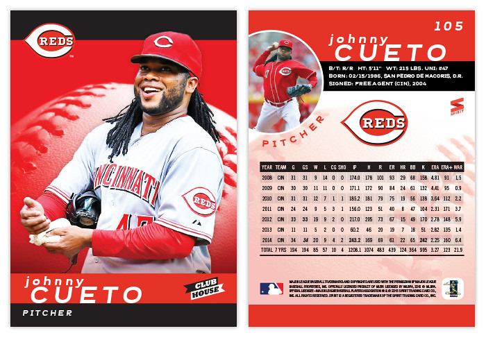
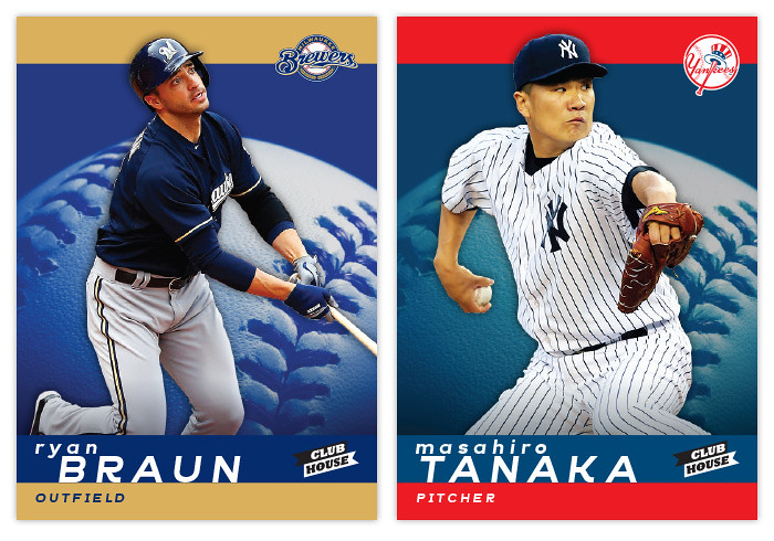
I seem to be alternating between horizontal and vertical each year so I guess we're back upright following the 2014 design. The front of the card has solid team-color stripes along the top and bottom with team-colored baseball close-up in the center. The players are cut out and overlapping the stripe at the top which also is an anchor for the team logo. The last names are big and spaced out with the player first name running off-center above it.
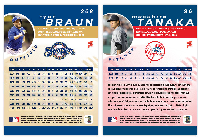
On the back, the color stripes return to house the player name and vitals. There's a circle bleeding over from the edge for an additional player photo with the position following that curve below. Right in the middle is an even bigger team logo with a pretty full stat box below. Underneath that middle section is a screened-back version of the baseball from the front. For some of the younger players, there's plenty of room below the stats for a few lines of more information.
Unlike last year, I decided to keep these parallel-free so hopefully they'll be more inserts to fill out the packs. I already have the annual All-Star design done and ready to write once I get around to it, so it looks like I'm well ahead of last year's pace.


No comments:
Post a Comment