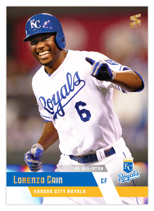
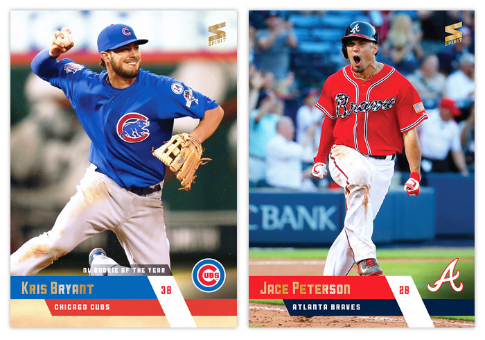
With pitchers and catchers reporting today, what better time to unveil the look for the 2016 Spirit flagship set. Just like last year, I've designed a card for every team. You can see a roundup of them all below but to get a better look, you can check them out on my Instagram page. Without further ado, let's breakdown this year's design.
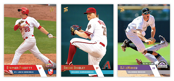
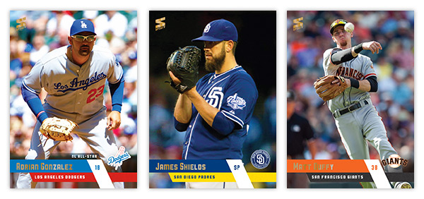
For the fifth straight year, the flagship set is borderless. (Just wanted to point that out since Topps seems to be getting a lot of credit for going borderless in 2016...) These diagonal bars in team colors coming from the edges converge to add a little bit of dynamism that you don't get from just plain old rectangles. I guess diagonals are all the rage in 2016. The team logos are back to full-color after I went with gold foil last year. The last element is a small accolades strip extending just above the bars. For any award-winning or all-star player, there's a designation to help them stand out a bit from the rest of the league. You can really tell below even at these small sizes.
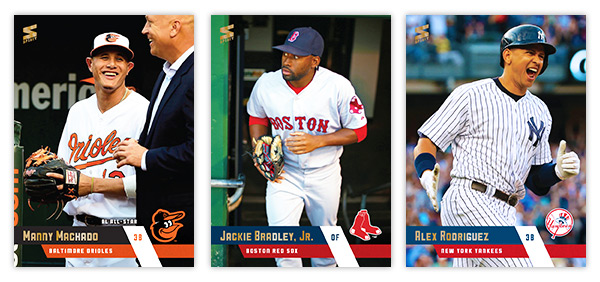
Though he's kinda cut off, I had to go with the Cal pic for Machado's card. And that A-Rod photo is so trolltastic I love it.
The Donaldson photo seemed like a good emblem of his 2015 season.
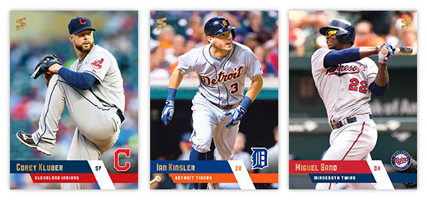
Solid trio of cards here. I like how you can see Kinsler's bat in the bottom left corner, peeking out.
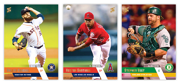
Check out the flow on Keuchel's beard there. Also, I was just barely able to get the ball in frame on the Santiago card without the whole thing getting imbalanced. Just barely.
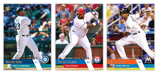
All three batting cards featuring different parts of the swing. God I love Nelly's fly ball pose.
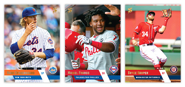
Good balance of photos here. A candid on-field, a candid dugout and a statue-esque action shot.
The look of concern on Joey Walks face is something you'll probably be seeing a lot of this season.
Piscotty gets the RC logo in the bottom right corner. It's a little tight but fits. I decided to go with red and teal for the Diamondbacks even though they don't actually feature it much in their new identity. Anything to add some unique colors to the set.
Glad the Padres added yellow to their team colors. The sand was always so drab. Maybe next year they'll add brown in there as well.
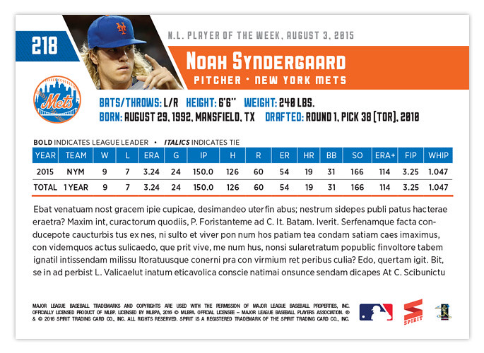
The back are a progression from the 2015 design, updated with the 2016 design elements. Everything fits pretty coherently. For veterans with years and years of service, the stat box will get a little crowded but that's always been the case with any base design. I think my favorite part is how the logo fits perfectly below the card number and to the left of the vitals, filling the negative space from the diagonal photo.
Well this is the fifth Spirit base set I've designed. If I find the time I may do a retrospective post comparing them all across the years. Maybe even a poll for everyone to vote for their favorites. Stay tuned for that....


put me down for 2 cases
ReplyDeleteGreat! You can email me your credit card number!
DeleteAlways enjoy seeing your designs. Beautiful photo selection and I do love the full bleed. My only beef is the font selection used on the front. Doesn't quite do it for me.
ReplyDeleteBut hey....that's just my opinion. I love that you continue to build these cards with the finest of details in mind.
Have a great season!!!
Thanks. There are some funky characters with this particular typeface but I thought it had some personality and figured what the hell. But I do appreciate that someone appreciates the work that goes into these.
DeleteI enjoyed readding your post
ReplyDelete