Tuesday, June 26, 2012

No-Hit Club


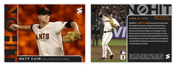
I may be a few weeks late here, but since Matt Cain's perfect game, this insert has been kicking around in my mind. (Plus, how can I resist the opportunity to brag up a Giants milestone?) With the influx of no-nos the last few years, I think there's finally enough members of the No-Hit Club to warrant a full insert set. There are currently 22 active MLB pitchers who have tossed no-hitters (excluding the combined efforts by the Mariners this season and the Astros in 2003.)

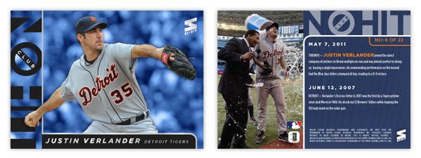
The list includes some marquee guys like Roy Halladay, Justin Verlander (below) and Johan Santana, but it's mostly comprised of some second-to-even-lower-tier guys. I kinda like the idea of guys like Anibal Sanchez and Dallas Braden showing up in something other than base. Through their performance, I think they've earned it.


Design-wise, the front is team-colored with the full-color cut out, along with a "No-Hit Club" logo straight out of Ghostbusters. There's little bit of silver foil here just to keep them from looking low-grade. The back side has a brief write-up along with a celebration photo. The design is pretty clean and uncluttered and fits in very well with the rest of the Spirit line.

Monday, June 11, 2012

Don't Skip Class

The 2012 edition of the MLB Draft happened a week or so ago so I've kinda had it on the brain for a bit. Baseball's draft is really unique when compared to the NFL and NBA versions. Most of guys are complete strangers before getting drafted, unlike the top college football and basketball players who get national attention for a season or two along with the copious amounts of coverage leading up to the draft. And unlike the Cam Newtons and Kevin Durants, the top picks aren't expected to lead their teams the following season. The timeframe for these players to start contributing is stretched much further, so by the time a guy reveals himself to be a bust or not, fans have moved on. Basically, it'll take years before anybody has any clue whether or not a particular class is strong.

I took a little trip back to the draft results from the past dozen years or so and decided to do a draft-focused set to pick out the best picks and see how they stack up from year to year. Clubhouse Head Of the Class. This is a 100-card insert set that spans 10 drafts, from 2000 to 2009. That's a pretty good cut-off as far as singling out the 10 best players from a draft. Outside of Harper and Chris Sale, I'm not sure anyone from 2010 has made a mark in the big leagues yet.

The first thing I did was compile the checklist. It's pretty interesting to see the stacked 2005 draft (8 of the top 12) compared to bottom-heavy drafts like 2000 and 2001. Some years were a little thinner than others but I think I did a good job find 100 guys that deserved to be featured.

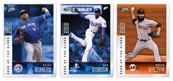
Looking at the design, we have a silver foil border that goes around approximately 2/3 of the card edge. The left side is a bit thicker and has the "HEAD OF THE CLASS" text in black running over it. Above that is the draft year in silver foil as well. This is one of the few asymmetrical inserts I've done, so it was nice to change that up a bit. We've got the team color backgrounds behind the player cutouts along with an info bar at the bottom with the player name and team logo.

On the back, the silver border has been turned the team color and the background is solid black. We have a small player portrait on the right with the card number and player position/team below. The top spells out which year the player was drafted along with the top 10 picks from that respective draft. The picks are listed in order but obviously skips ahead to the pertinent draft slot. The player depicted on the card has his name and draft slot bigger, bolder and italicized. Beneath that is a brief write-up about what makes them one of the 10 best from their draft.

This was a fun insert just to figure out the players to include and to take a look back at drafts of the past. The fun part is, I'm sure that even 2 or 3 years from now, these checklists could look drastically different as some late-bloomers or Renaissance men start to emerge in the league. As a Giants fan, though, I sure hope the #10 pick from 2006 could stay included in the future.

Saturday, May 19, 2012

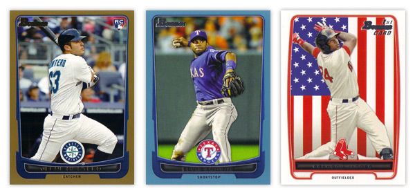
REVIEW - 2012 Bowman

A full week after it hit shelves, 2012 Bowman finally made its way to the Walmart in my town, so this is the first chance I've had to take a look that the set.

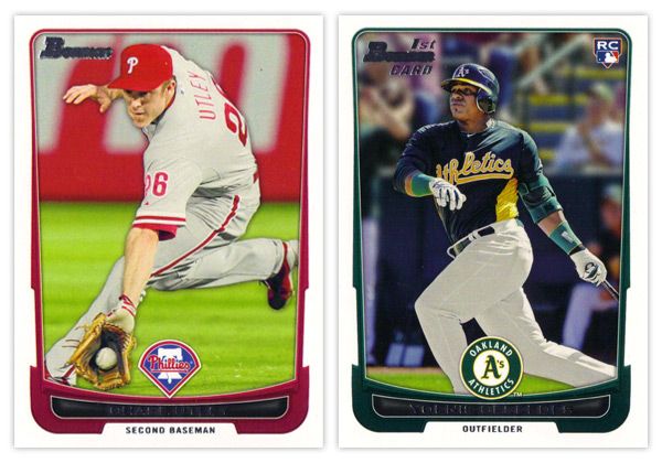
Starting off with the base card design, the first thing you'll notice is the familiar black borders are gone. I'm a little torn on this one. For the last decade or so, Topps did a great job of branding Bowman with something as simple as having a consistent black border on the base design every year. Looking at these all-white borders, I'm kind of missing that Bowman feel. But on the bright side, the black borders are notorious for showing every little imperfection along the edges, so their absence here helps rectify that.

Another change of pace is the introduction of team-specific colors into the design. In years past, the only colors to go along with the black borders were a small bit of red for veterans or green for rookies. Now you'll find blue and purple and a whole host of other colors.  The team logos return in full color after showing up in gold foil last year.

There are a few things I'm not crazy about. The names being in silver foil on top of black is just as hard to read here as the the gold on black was on the flagship design. I'm also not a big fan of all the unnecessary bevels around some of the frame elements. Those are, however, small quibbles. Something that's subtle but really helps the players shine here is the light drop shadow you'll see around the guys. It more noticeable on lighter backgrounds, like the Utley one up there, but helps to add focus to subject of the card. If it were any heavier, I'd probably be bitching about it forever, but they got it about perfect here.
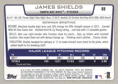

The back side of the base cards continue the same feel as the front, only the border here is gray instead of white. Can't figure that one out. Only having stats from the 2011 season seems like a trade-off they had to make for the veteran cards since Bowman's primary focus is prospects. The 'RESUME' 'SKILLS' and 'EVOLUTION' things are fine, though I prefer the 'UP CLOSE' section on the backs of the prospect cards, which replaces 'EVOLUTION.' One thing they kind of messed up on is having the card number in the right corner instead of the left. BASEBALL CARD LAW: horizontal backs have to be numbered in the upper left corner to help for storage box sorting.


The design for the prospect "inserts" is really, really similar to the base design. In fact, it's almost problematically similar. For the 2011 set, the prospect cards had a white border to differentiate from the black bordered-base, so it didn't really matter if the designs were similar or not. This year, though, the made the designs almost identical on top of having the same colored borders. Not sure what the thinking was there unless they're really trying to test the MLB's patience with the whole Bowman prospect worship thing. Regardless, I think it was a dumb decision.

There are parts where the designs differ, though: prospect has a symmetrically convex border compared to trapezoidally-shaped base border with the little weird notches on each side; the cutout for the position on the bottom is wider and rounder for the prospect design; the base set doesn't have those weird wing things on each side of the logo. I think if the base design didn't have those notches or if the prospect set didn't have the wings, you'd have an all-around better design for one or the other. But holy hell, they shouldn't look this similar.

I'll give them credit regarding the autographs, though. They did away with the facsimile autos on the 'base' prospect cards, which really helps the make the actual auto cards more unique.


Just like every other Topps product, this one comes with lots of parallels. Gold, blue, red, orange, green, blue, international, blue, red ice, silver ice, Dentyne ice, blue. I think the flags on the international is kinda neat. The silver and red ice versions are basically just atomic refractors. Really, they have at least twice as many parallels as they should, if not more. But in honor of the Preakness today, I'll refrain from beating that dead horse.


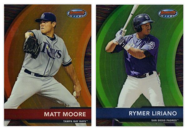
Finishing up here is this year's edition of the Bowman's Best insert. Again, they have the red version for veterans and blue for prospects. There are also die-cut versions, which have all kinds of crazy refractor parallels themselves. Design-wise, I like the different textures on the swoosh and the background. Along with the type and name bar, I appreciate the simplicity of the design.

Overall, I think there's some pretty good, modern design here even if it's not completely "Bowman."

Base cards: 4.25/5
Parallels: 3.5/5
Prospects: 4.25/5
Inserts: 4/5
OVERALL: 4/5

Friday, May 18, 2012

Pennant Throwbacks


So one of the things that really jumps out at me when thumbing through retro sets like Gypsy Queen is when you see a card like this next to a card like this. No matter how many filters you run on photos of current-day players, they'll never quite match that historic feeling you get from old photos of retired players. One way to help bridge the gap would be to feature today's guys wearing throwback uniforms.

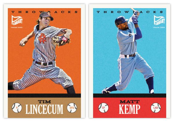
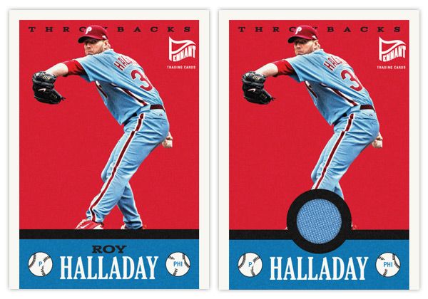
Here's the first insert set for the Pennant brand. The design for Throwbacks isn't specific to a certain era, just a bit of an amalgamation of a handful of characteristics you'll find in various retro sets. It kind of follows the philosophy of the base set, combining a feel for the old and contemporary.

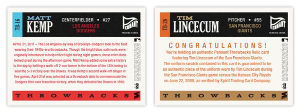
The hard part here is finding the right images in a somewhat shallow pool. There aren't a whole lot of throwback games on the schedule so the odds of finding an actual star wearing these duds in a good photo are a bit smaller than usual. The Lincecum image here is from a 2008 game while the Kemp one is from last season. The color boxes aren't the exact shades you'll find in the teams' styleguides, but they're in the right neighborhood to allow for the sometimes funky colors of the throwback unis.


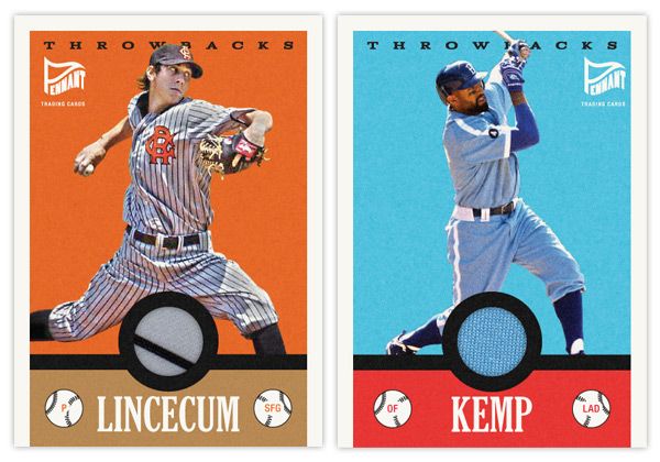
Another wrinkle to add to the set is a relic parallel. With a round cutout just above the last name, it's a perfect place to house a sliver of these throwbacks. And, luckily, since the uniforms depicted are so singularly unique, you know that the swatch is from the actual uniform depicted. Even though it's the Dodgers, you have to love that baby blue relic.

Here's what the base and relic look like side by side.


On the backside, you'll see the write-up is specific to the game in each throwback uniform is involved. The base has a game recap along with a little bit of info regarding the throwback worn. For the relic version, it includes the fine print of the swatch being authentic and unique to the player and uniform depicted.

Monday, May 7, 2012

Spirit Deluxe Portraits


Trying to come up with 'new' or 'innovative' ideas for cards isn't as easy as I thought it was going to be. Even though there are plenty of complaints to levy at Topps for some of their product choices, they actually do quite a few things that are pretty successful and cool. At this point, most of their missteps come from constructing releases and not so much the actual cards themselves. People like autographs and minis and parallels and short prints and die-cuts and memorabilia and just about every other 'gimmick' out there to varying degrees. But all in all, these are basic elements that go into constructing a set.

This blog has basically been me just rearranging some or all of these elements into what I think would be fun to manufacture. If there were another licensee out there releasing product in 2012, these are things I could see fitting into the marketplace, acting as either a supplement or an alternative to Topps.

That brings us to the cards in this post. I was looking for another 'insert' or whatever you'd like to call it for the Deluxe set. I didn't feel like doing one of those triple swatch, nickname cutout sticker autos that you find in Triple Threads. Even though Deluxe is Spirit's 'high-end' product, it's probably more in tune with something like Finest (which is definitely the very top of my own personal price range.) I see that Topps plans on having some die-cuts in Finest this year, but hopefully this doesn't come across as copy-catting.

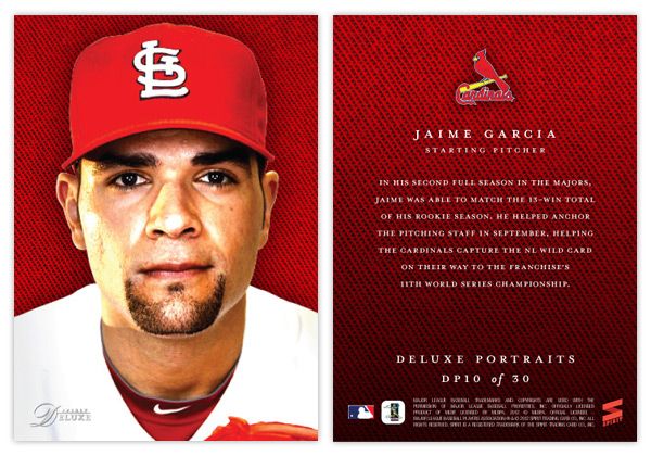
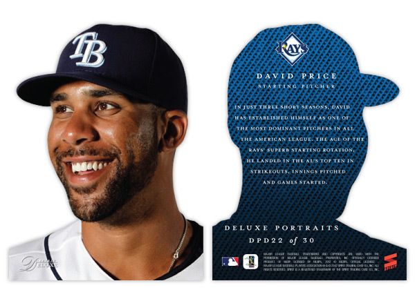
So for the Deluxe Portraits insert, there are 3 different versions you could get your hands on. The first would be the standard Deluxe Portraits insert base, seen here with Jaime Garcia. The design features a tightly cropped portrait with the Deluxe-familiar team-color cloth background. The only other thing adorning the front of the card is the Spirit Deluxe logo in silver foil. Somehow, these seem to come across as more personal and intimate without the player name cluttering the front. The back continues the team-color cloth with a brief write-up.


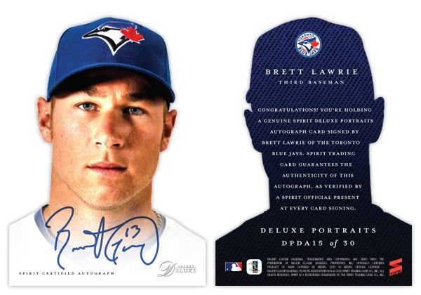
The second version is the die-cut parallel, here with David Price. The design is basically the same except the obvious die cut edges around the player. And finishing off the trio is the die-cut auto version, seen at the top with Brett Lawrie.

Even though parallels can sometimes be redundant and annoying, I feel like this insert captures the best aspects of paralleling a design. Each version offers something different other than just a different color border or refraction. The whole 'cut-out head' thing may seem a little hokey for a 'high-end' set, but I think it's fun. And if you ask me, fun is definitely something we could all use more of in card design these days.

Monday, April 23, 2012

Pennant: Chasing That Old Time Feeling


I've been able to resist it up to this point, but with Heritage and Gypsy Queen being the last two baseball releases, I couldn't help but work on an 'old-timey' set design. Instead of combing through the encyclopedia of trading cards, looking to resurrect the zombie of something 50-100 years old, I decided to just make something up. This is kind of a hybrid between the styles of the old and the current.


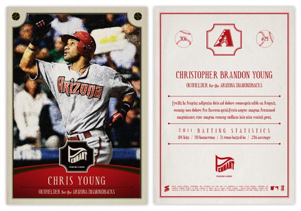
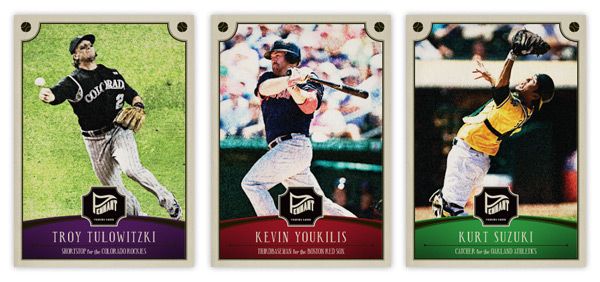
Say hi the Pennant line of Spirit trading cards. You'll notice some of the characteristics of other retro sets: photos doctored to look old and weathered, typefaces from decades past, not-quite-white borders. There's a team-color curve on the bottom to house the player name, team and position. I've used some similar curvilinear shapes throughout the other Spirit designs, so this helps keep them in the family. Another point of 'modernization' is the fact the player name is more than just their last name and first initial and it's actually bigger than the set name/logo.


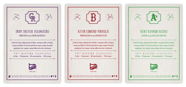
The backside is pretty similar to retro sets of today: 1-color, vertical, a lot of non-informational elements, simple team logos. These here may be printed in a single color, but instead of just black, the ink is the same as their team color. I decided to include players' full names on the back since I really miss that from my youth. Also, there's a simple line of the previous season's stats (hits, homers, rbi, and average) that has numbers instead of 'two thousand and eleven' and such.


I may do some inserts for the Pennant line coming up in the future. I can see myself getting the itch after A&G hits the shelves.

Friday, April 20, 2012

REVIEW - 2012 Gypsy Queen


Welcome to my second product review here. I skipped Heritage* since the design is the same as 1963 and there were only a few inserts to mess with. That means Gypsy Queen is next up on the docket.
*For the record, I really dig the 1963 design so I think Heritage is a winner this year. My only gripes are peripherally design-related (Rookie Stars variations? No thanks.)

So far, I've only opened a blaster and a rack pack, so I don't have an example of everything in-hand, but I've seen enough pics online to have a good understanding of the designs.

Starting with the base design, it's definitely more ornate than last year. They've added some of the flourishes from last year's inserts onto the base here. All of the info has been moved to the bottom. The Gypsy Queen 'logo' is bigger but somehow blends in a little more. That's probably due to the gold neutrals on gray. There may be a little less real estate for photos, but the shots seem to be closer and more intimate, so that's an upgrade in my eyes. Comparing this year's to last year's really makes the 2011 design look pretty drab and dull. Off to a good start with the base set.

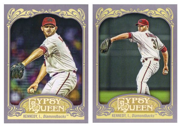
Unfortunately, the SPs this year are photo variations instead of just high-numbers at the end of the set. Right now, the problem is you only know you have an SP if you happen to pull two of the same card number but different images, like I did up there with Ian Kennedy. I'm sure eventually it'll be common knowledge which is standard and which is short-printed, but it's kind of annoying at the moment.  Not only that, there are now 50 less players with a card than there should be.


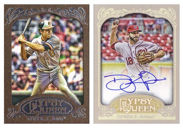
A couple of parallels here are the Framed Paper. There are also a blue version and a retail-only brown version, like the Ripken here. Also a black 1/1 version for some reason. It's up in the air whether these are any nicer than last year's copper/bronze and green. There are also a lot of on-card autos which look really nice on this card stock and design. The white fade on these is the least noticeable on any auto card I've seen lately.


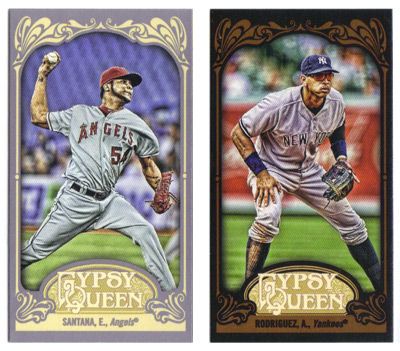
Minis this year come in regular (gray), black, green, and sepia. The black look really nice with the leather brown flourishes. The sepias also work better than the 2011 version.


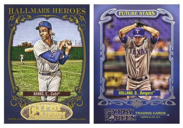
The Hallmark Heroes insert features all-time greats while Future Stars returns with up-and-coming players with bright futures. Both have blue borders, which is kind of a strange choice. Also, the logo situation on both bugs me. For the Hallmark Heroes, that shade of gold on the logo is way too light compared to the darker gold around the photo frame and the text on top. And on the Future Stars cards, not having the GQ logo centered at the bottom is really distracting since everything else is symmetrical but that.


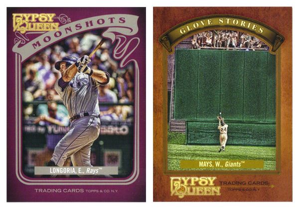
The homerun insert this year is called Moonshots. (Hey, that sounds familiar...) The purple border is surprising and works pretty well. I like the asymmetry, especially compared to the centered-ness of every single other card in GQ. The Glove Stories design is really plain and boring. There's just not a lot going on with the photo frame, especially compared to every single other card in GQ. Maybe its the fact that leather color is too similar to the gold used for that frame. Something closer to the gold on the GQ logo here would work a little better. And what's with the cropping on this image of Mays? Why they felt it necessary to show the outfield wall and keep him so small is beyond me.


The last insert is Sliding Stars, which is kind of like this year's Sticky Fingers in that it focuses on a part of the game that doesn't get a lot of attention on cards. Also, they're both the only horizontal design in both their respective sets. This is a pretty cool design that leaves a lot of space for some great photography. The elements that do enter into the frame don't impose too much, so there isn't much obstruction on display.

Last year, we saw the Gypsy Queen inserts. This time around, they've featured the Gypsy Kings, a mythical baseball squad. Again, they have auto variations, though I don't really get why they have fictional characters sign autographs. Oh well. It's a fun little bit of A&G without going overboard.

Rounding out the set are the hits like the Indian Head Penny and Relics that do a really nice job of adjusting the base design to incorporate the memorbilia. There are also the framed mini Relics and Autos that are exactly the same design as their full-size counterparts, only smaller.

All in all, the 2012 version of Gypsy Queen isn't all that different from the 2011 version. They seemed to have made some improvements here and there without really downgrading anything, so I'd consider that a success. It definitely feels less like a rehash of A&G like I was thinking last year.

Base cards: 4/5
Parallels: 4/5
Photography: 4/5
Hallmark Heroes: 3/5
Future Stars: 3.5/5
Moonshots: 4/5
Glove Stories: 2/5
Sliding Stars: 4.5/5
Gypsy Kings: 4/5
Indian Head Penny & Relic: 4/5
Minis: 4/5
OVERALL: 3.73/5

Tuesday, April 17, 2012

1-2 Punch


The last post focused on heavy hitters so now it's time for mound masters (sounds like a great name for another inserts somewhere down the line.) The hook for this one is spotlighting teams with 2 pretty good or even great pitchers at the front of their rotation. It was a lot harder than I thought it would be to put together the checklist. For quite a few teams, the drop off from number 1 to 2 is pretty big. That's why guys like Kershaw and Sabathia are absent here. On the other end of the spectrum, you've got a couple of teams with deeeeeeep rotations that end up leaving off a some great pitchers, Cole Hamels and Madison Bumgarner* in particular.
* I reeeeally hope Timmy gets back to normal or his inclusion over MadBum will look particularly egregious.


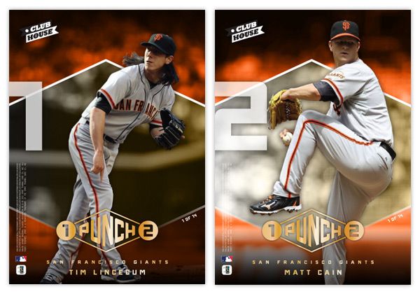
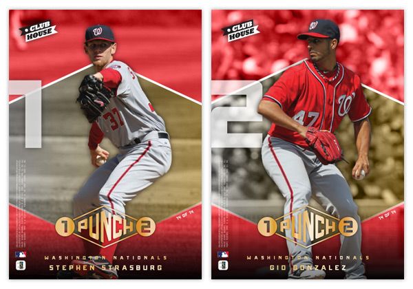
Basically we've got player cutouts on top of a gold diamond (mimicking the 1-2 Punch logo shape) on top of a team-color saturated photo. The big 1 and 2 on the side look really cool with the cards stacked next to each other.


The design here is a little more 'sophisticated' than a couple of the other Clubhouse inserts, but I think it's nice to appeal to some different tastes with a low-end set. We have some gold foil here on the 1-2 Punch logo along with the player & team names. I included the fineprint (copyright, MLB and MLBPA logos) on both sides so the number 2 guy doesn't get dumped on. I figure player collectors would probably appreciate having a full side of their guy on a 2-player card.

Here's the 14-card/28-player checklist I came up with. See any blatant snubs?

GIANTS: Lincecum, Cain
PHILLIES: Roy Halladay, Cliff Lee
TIGERS: Justin Verlander, Doug Fister
RAYS: James Shields, David Price
BREWERS: Gallardo, Greinke
RED SOX: Josh Beckett, Jon Lester
DBACKS: Ian Kennedy, Daniel Hudson
ANGELS: Jered Weaver, Dan Haren
BRAVES: Tim Hudson, Tommy Hanson
REDS: Mat Latos, Johnny Cueto
CARDINALS: Adam Wainwright, Jaime Garcia
MARLINS: Josh Johnson, Mark Buerhle
RANGERS: Yu Darvish, Derek Holland
NATIONALS: Strasburg, Gonzalez

Sunday, April 1, 2012

To the Moon and back


Oh, hi there. It's nice to be back. I sure was gone a looooong time, huh? Well, the vacation was had and spring has sprung. I figured it was time to poke my head out and say 'hello.' Opening Day is a few short days away so let's get this thing back on the rails.

In thinking for another insert idea for Clubhouse, I figured I'd go with something simple like 'guys who hit a bunch of homeruns.' That seemed easy enough. But then came the hard part of coming up with a name & concept. I passed over stuff like 'Home Run Kings' since they have been in recent products and thought that the Clubhouse brand could use something a little more fun. So I started thinking of different slang terms for homers. Unfortunately, most were either semi-perverted (dingers, dongs, goin' deep) or had also been used elsewhere (going yard, touch'em all.) So I was back at square one.

But during my research, I kept coming back to the term 'moonshot,' thinking it really lends itself to something fun and interesting design-wise. Even though Ultra ran an insert in 2003 with the same basic premise, I figured I could update and improve upon it.


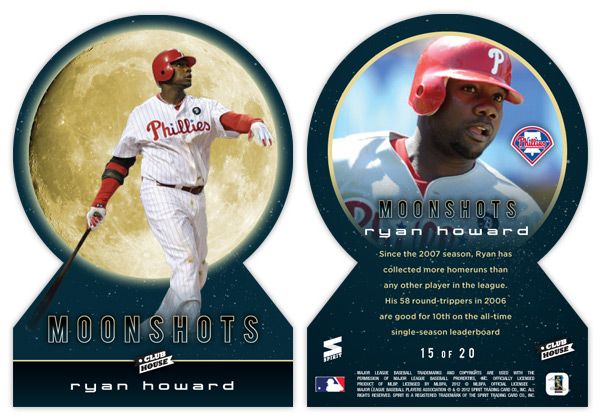
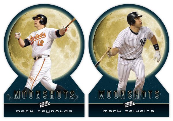
Looking at these cards, the first thing that pops out is either the UGE moon image or the absence of edges on the top. Yep, these are my first die-cuts. Over the years, I've come to the conclusion that die-cuts can be really cool but I always prefer the ones with at least 2 true corners. They need to be able to sit level in a sleeve or toploader, which usually means the bottom corners. I have a feeling that if some other card companies tried to die-cut this, they'd jump for the completely round die-cut and obliviously annoy collectors.

With the full moon image taking up a lot of real estate, it makes a nice backdrop to the player images. The photos here are of the batters directly following their 'moonshot' swings. With the Howard and Reynolds cards, they're stoicly staring down their long balls (or fly outs) while Teixeira is starting his trot towards first. The dark blue color complements the gold moon while adding a little bit of subtlety you wouldn't get from black. The names are below in a 'space' font to extend the lunar motif going on here.


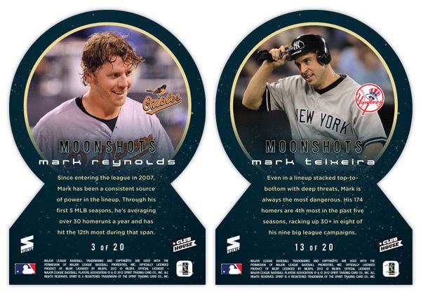
On the back side, the symmetry of the die-cut really helps keep things clean. Instead of the moon, we get a circular close-up of the players, which fades out towards the bottom to make room for the text. I also found space for the team logos somewhere within the photo frame (these all happen to be in about the same spot but that was just a happy accident with these particular photos.) The checklist totals 20 though I didn't really put it together completely. I thought it would be nice to include some guys like Reynolds here who have better numbers in the HR category while not really nearing the leaderboards elsewhere. Adam Dunn would be another candidate but would probably need to get off to a good start in 2012 to justify a spot here. Anyway, 17 of the 20 spots are still open.

Alright, thanks for checking in with me again after the long lay off. I promise the posts will keep coming semi-regularly like they used to. See ya soon!

Tuesday, March 13, 2012

Spring Break

Wow, almost two weeks have passed since my last post. I wish I could say it's because I've been working on some super-special, top-secret project.... but I don't know how super-special laziness is. It certainly isn't top-secret either.

And while next week will be equally quiet here at Design On Deck, it won't be due to laziness. I'm headed to California for my belated honeymoon! My wife and I got married last May but we're just now finally able to take the time off work for a trip. So this time next week, I'll probably be standing in line somewhere in the middle of Disneyland.