Friday, January 27, 2012
Welcome to the Clubhouse
First off, I want to welcome all of you new readers out there. I'm sure a lot of you came here thanks to Robert over at $30 a Week Habit, so thanks again to Robert. I really enjoy your blog and marvel at your restraint to stay within your budget. You are much stronger than I.
Now onto the card design. I was looking to create a 'low-end' set for Spirit, along the lines of Collector's Choice from the 90s or Topps Total from the early 00s. I think having a product come in at $1 a pack is important to keep growing new collectors in their youth. I know we have Opening Day but I don't like the idea of a product being tied to a single day early in the season, especially since Topps Series I is still somewhat fresh at that point. The Clubhouse set would hit the shelves right around Memorial Weekend, which, to me, always signifies the start of summer.
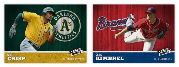
The base set consists of 810 cards total: 25-man roster + manager + team checklist x 30. The front of the card features the player cut out and placed in front of an old wooden fence in team colors with the team logo 'painted' on. At the bottom is the player name, position and team name placed on top of a team color dirt patch. The two sections are separated by a white chalk line and the Clubhouse logo. I think this is a pretty good 'kid-targeted' design with the solid colors and player cut out. It has a bit of a 'Sandlot' feel to it.
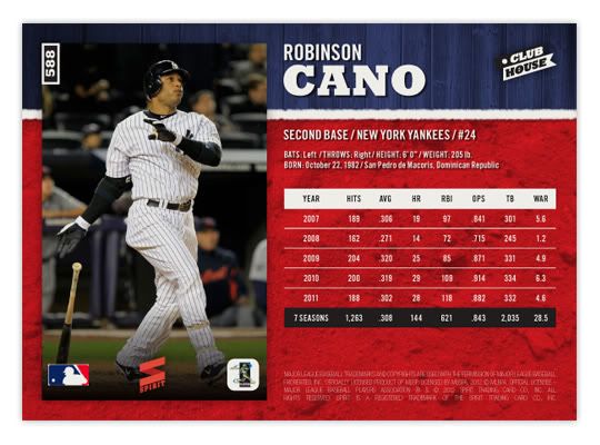
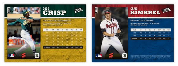
The back of the card features the same team color sections but with the proportions flipped. A full-frame picture of the player is found on the left with the stats & info on the right. The stat lines only cover 5 seasons and a small selection of statistical categories. They're a blend of traditional and sabermetric stats, whichever floats your boat. The card numbers in the upper left hand corner, rotated 90° counterclockwise. This makes them easier for sorting when stored vertically in /ct boxes and also keeps from covering up too much of the photo.
The production is pretty no-frills, with no foil stamping, crazy shiny patterns, parallels or any other gimmicks. Just full-color printing on a coated card stock with a semi-glossy coating. There will be a few inserts coming up later and maybe even something like a relic or die-cut. This would be a simple, fun, colorful release for set-builders on a budget or kids spending their lemonade money or whatever kids do to earn money during summer break.
Subscribe to:
Post Comments (Atom)


Those look great. It's too bad we'll never see anything like this because Topps doesn't seem to listen to good ideas.
ReplyDeleteThanks. I dunno how much attention Topps or Panini pay to the blog community but there's always hope.
DeleteGood stuff here Ross, would love to see a couple of Blue Jays as well for this set...
ReplyDeleteI'll have to track down a vector file for their new logo. Plus, it'd be really nice to get some actions shot of them in their new unis. Can't wait 'til April.
DeleteThese are awesome!
ReplyDeleteI'd buy 'em!
ReplyDeleteHey, would you be willing to design a new logo for my blog?
ReplyDeleteSure, I'm game. What did you have in mind?
DeleteTake a look at what I have now. I think its too big (tall) and kinda boring. I'd like you to just use those creative skills and come up with something. Feel free to email me if you want and we can discuss off blog.
DeleteThanks!
Sweet designs! Love the simplicity and your color choice is excellent.
ReplyDeleteWell done. :-)
See now, this is exactly why we should pair up on a TTM endeavor. Great work as always!
ReplyDelete