

I remember in 1992 when Pinnacle had the Team 2000 insert set. The first guy I pulled was Jim Thome. At that point, I had no idea who Jim Thome was. This was of course the time before a prospect would show up in 2 or 3 different MLB releases before getting called up into the bigs, so it was weird to get an insert card of some "nobody." But this was a forecasting insert, featuring players who many thought would be league leaders in the year 2000. In hindsight, they did a decent job, picking guys like Thome along with your Griffeys, Madduxes, Bagwells and the like. But then again, there were plenty of Cuylers, Naehrings and Plantiers. I believe that's called 'baseball.'
Since it's 2012 and there's not a nice round-numbered year to look towards (I believe 2020 has been covered somewhere,) I decided to just call this the All Future Team. It's comprised of 22 players (2 at each position along with a 5-man starting rotation and 2-man bullpen) that each come in at 25 years old or younger. That extends the prognosticating window about 10 years. Here are the 22 guys I decided fit best.
1B • Mark TrumboAs you can see, we have some players that already have some accolades accumulated and are among the league's elite, regardless of age. Then there are quite a few that are already achieving beyond what most players their age traditionally do. Whittling the number down to 22 also helps minimize the probability of potential busts.
1B • Freddie Freeman
2B • Jemile Weeks
2B • Jose Altuve
3B • Pablo Sandoval
3B • Brett Lawrie
SS • Starlin Castro
SS • Elvis Andrus
OF • Mike Trout
OF • Bryce Harper
OF • Andrew McCutchen
OF • Giancarlo Stanton
OF • Justin Upton
C • Buster Posey
C • Jesus Montero
SP • Stephen Strasburg
SP • Chris Sale
SP • Madison Bumgarner
SP • Clayton Kershaw
SP • Yu Darvish
CL • Craig Kimbrel
CL • Aroldis Chapman

For the front design, I decided to go with a high-contrast, monochromatic image with a dynamic crop. Behind each cut-out is a big "ALL FUTURE TEAM" screened over some nice cloudscapes. I think this shows 'future' without going the high-tech route that would end up looking cheesy and dated a few years from now. The player position is set in a big silver foil circle in the bottom left-hand corner with the player name in silver foil just to the right of that.
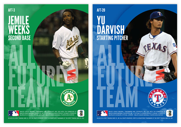
On the back side, we have the cloudscape screened back a bit and the circle from enlarged and moved to the upper right to house another player photo, this time in full-color. The "ALL FUTURE TEAM" text is scaled down a bit and moved to the bottom left, leaving room for the player name/position above and team logo to the right.
Are there any glaring snubs to the 22-man roster? I'm sure there's a starting pitcher or two that could make a very good case for inclusion. What say you?
Moustakas
ReplyDeleteGreat designs.
I want to issue you a challenge. Panini and Upper Deck are trying to continue making baseball cards without the logos, as they don't have permission.
ReplyDeleteTopps made cards for many years without using team logos on the cards and with sketchy use of identifiable uniforms.
I challenge you to make a set that would not violate Topps monopoly and yet the cards would still look good. Just a base set, a la 1976.
Those Panini make me vomit in my mouth. The players look stupid, like they're standing there in their underwear.
If you succeed! I'll reward you with Giants cards!
Good luck!
I might try to tackle this in the future. Thanks for the idea! I can always use some help getting ideas started.
ReplyDelete