

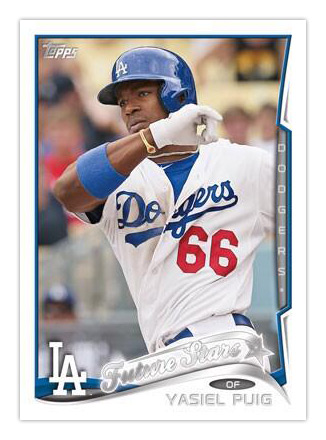
I'll save my detailed review for next year when they hit the shelves but I'll just briefly state here that I'm not a fan. Luckily, though, it presents me the opportunity to share some work of mine from before I started the blog here. My first foray into designing custom cards was actually doing hypothetical Topps flagship designs. You may have seen some of them online in random places but this is the first time I've posted them here. So, let's open the flood gates.
These are all a couple years old and while getting them all formatted for this post here, I noticed a lot of things that I'd probably change up now but I decided to show them warts-and-all for the sake of convenience. I did update some of the players/logos since a lot of them were out of date. Each design has a lot of the same elements Topps has been using for the past 5 years or so: white borders (for parallels, natch), gold or silver foil, team colors and team logos. I made sure to add the player positions even though Topps isn't always consistent with those.
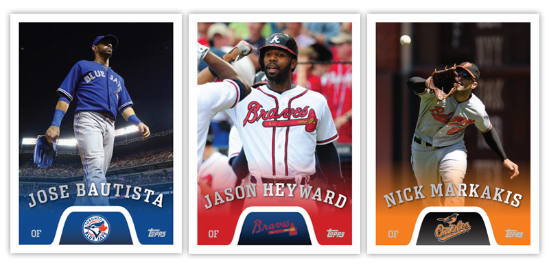
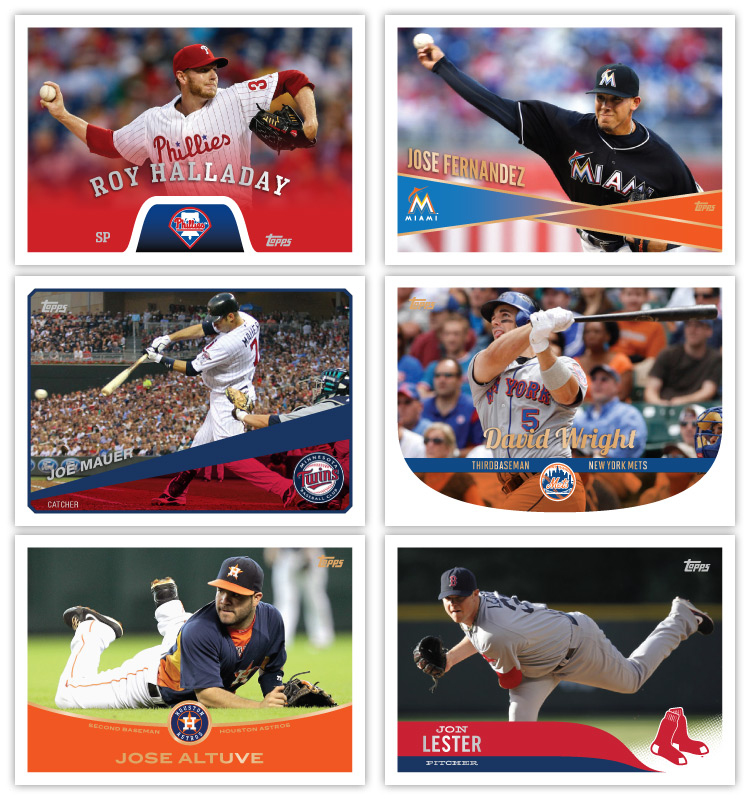
I'll write briefly about each design. The color fading in here would probably be better as a texture instead of a solid color. I like that the names are the most prominent element and very easy to read.

Again, the color fade here would probably be better if it had a simulated felt pennant texture to match the pennant shape. I think the diagonals across the bottom are pretty sharp. The foil names on top of the photos may be problematic but I guess not any worse than foil on white or anything else.
These are probably the simplest cards of the batch. The positions in the bottom left corner definitely need to be beefed up and the amount of color bleeding over the photo could probably stand to shrink a bit. I do like the beveled corners of the colored photo frame, though.
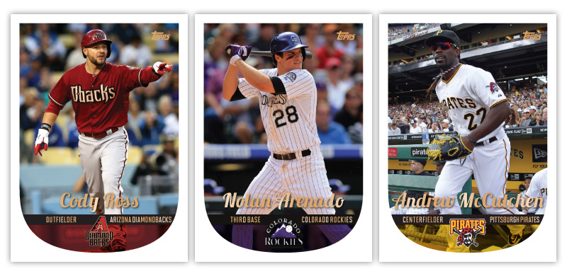
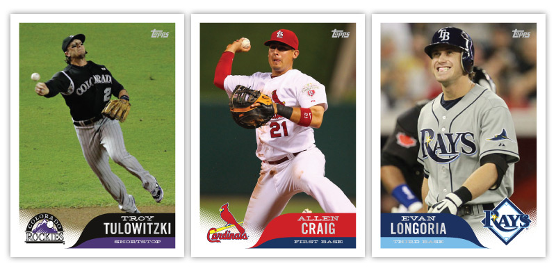
Trading those sharp angles for curves, these cards are a little more 'friendly.' But that negative space in the bottom corners is waaaay to big. I tried to fit the position and team name both on here but they don't really work with this symmetrical design. Look how crowded it is to the right side of the logo on the Cody Ross card.

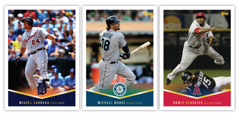
This design is basically the inverse of the previous one. The logo is still centered on the bottom but the names are below in a team color shaped. I went with the same idea for the position/team name usage on this one, too. It looks nice when it works, like on the King Felix there but I can't imagine how unbalanced Chris Ianetta's would look with 'catcher' on the left and 'L.A. Angels of Anaheim' on the right.
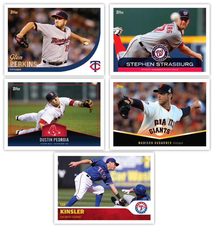
Next up is probably my second-favorite design. These have a bit of a modern retro feel to them with the half-tone fading up under the logo and the teardrop-esque shapes to house the player name and position. Topps has been riding the 'futuristic' look a lot lately so I think this here is a bit refreshing.

I had designed these before the 2013 design was released. Looking that them now, these cards look to be the love child of Topps' 2013 and 1982 sets. The gold foil names spilling over from the photo into the color swoosh is a big problem area for me now. I'd probably thicken that up at the bottom and put the names inside the bar. This design is also the first one that called for the hat logos instead of the primary logos.

This design here is one of the sleekest of the post. The little team-color tabs come up from the bottom to hold all of the player/team information and is topped off by an oversize team logo. Having the part of the image show through the top part of the tab adds a bit of depth.
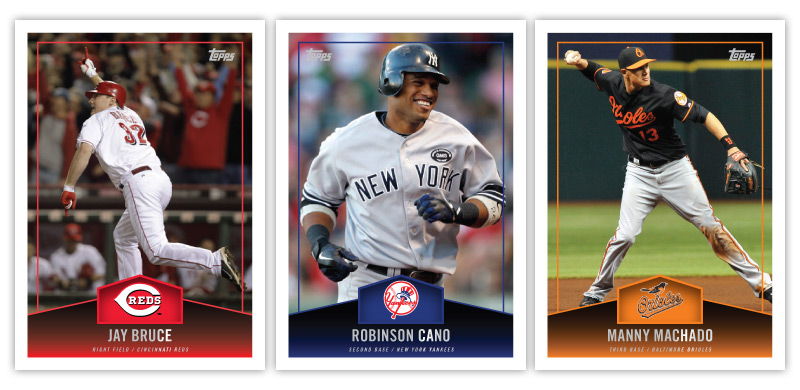
The nickname of this set would probably be the 'batter's box set.' The team logo sits in an inverted and squished home plate shape with a thin color line inset around the photo. Looking at them now, I'd probably inset that line a bit and have parts of the player overlap it, like Cano's helmet and elbows.
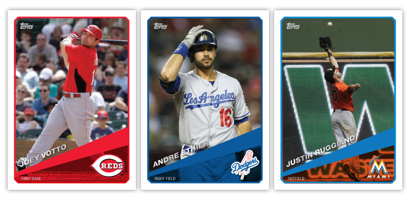
For some reason, these look a little too 'high-end' for Topps' flagship. That reason is probably their similarities to the 1995 Upper Deck SP set. Moving the shape to the bottom keeps the photos from getting too squished and also leaves plenty of room for the name and position.
Finishing up, this design incorporates some old school marble action albeit a little more subtly. Again, the position/team name line at the bottom needs to be beefed up here. I do like the alternating sides of the logo panel from card to card.
Below are the horizontal versions of each design. I figured this would be the best way to present them so they're still big enough to see everything.
Well, there's a look into some of my pre-blog custom work. As I've pointed out, there are some flaws here and there (and typos) but I think a lot of these designs stand a better chance of holding up years down the road than Topps' 2014 design.
Based on the Puig teaser that Topps laid down for their 2014 flagship, it really says a lot that many of your older designs are better than their new designs.
ReplyDeleteThanks. I keep looking at the Puig card trying to find ways I'd improve it but nothing short of 'start over' ever sticks.
DeleteOut of all of them, I like the curved-on-the-bottom (Ross-Arrenado-McCutchen) design the best by far. The extra space doesn't even bother me.
ReplyDeleteSecond choice is the Bruce-Cano-Machado "batter's box" design (although no on horizontal).
Funny how much the one looks like 2013 Topps.
I've never been a big fan of mixing vertical and horizontal cards into the same design so I'd have no problem nixing the horizontal there.
Delete