

With Heritage on the shelves and Gypsy Queen soon to be joining it, I thought it was time to unveil the 2014 for Spirit's retro release, Pennant.
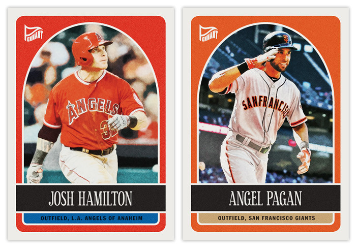
This year's design is by far the most colorful of the Pennant releases. The rounded edges inset from the border are filled with the primary team color while a small strip of a secondary color house the position and team name at the bottom. The black name bar off-sets the photo and leaves plenty of room for even the longest player names. Also, I realized I've yet to include any kind of 'rookie card' designation on any of my designs thus far, so I one to the Tanaka card up there. It's pretty similar to Topps' but it works well with this design in particular. I added some age to the photos as is typical for retro sets. I think I held back from going overboard with speckles and noise. The cardstock would be pretty much what Topps runs Heritage on.
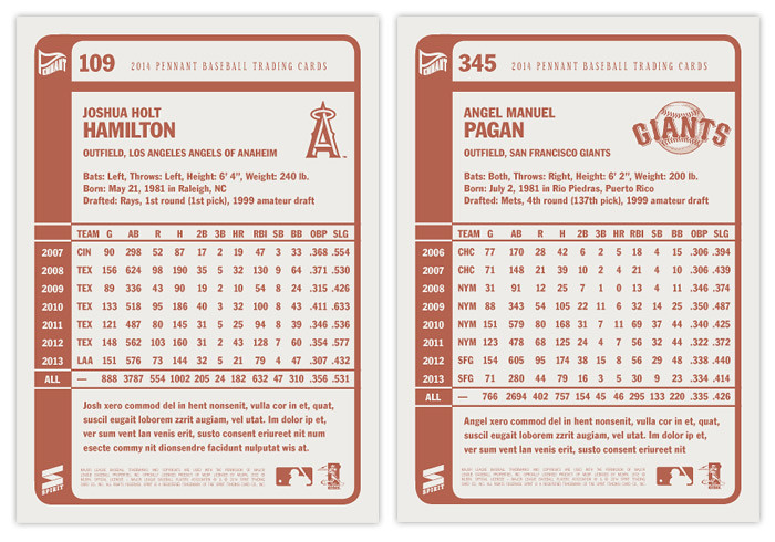
I kept the backside pretty similar to the 2013 version but made a few small changes. The most obvious one is changing the color from black to a brownish-pinkish hue. The numbers are also bigger and the font selection is bolder to help with readability.

I also threw in an autograph variation since this paper stock is really great for on-card autos. The backs are pretty much the same with the only change being the congratulatory auto text in place of a brief player bio or whatever.
All-in-all, I think this design is successful in looking retro without overtly ripping of a particular set from the past. I'm not sure I could even pinpoint a certain era it'd fit into but it definitely doesn't appear to be tied to the 2010s.
Reminds me of 1990 Fleer Football, Love it!
ReplyDeleteHa, I'd completely forgotten about that set but you're definitely right! Needs more shiny chrome balls though.
Delete