

I seem to be going every-other-year with the orientation of the Clubhouse set. Last year, they were vertical. So I guess it's time for horizontal again.
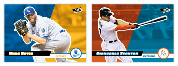
Once again, the design is filled with bold colors and simplicity, with the card cut in half by diagonal color boxes. The player cutout is surrounded by a white outline to keep them offset from the background. Diagonal bars come in from opposite sides for the player name and position with a team logo in a circle in the bottom right corner. It helps tie Clubhouse to the main Spirit base set without being such a overt copy. These simple elements keep the design from feeling overdone or cluttered while also keeping with the "fun" feel this low-end product strives for.
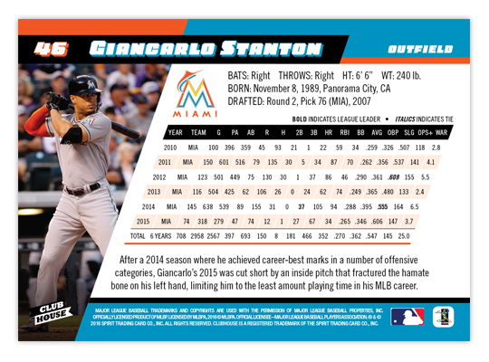
The back has plenty room for career stats while still following the elements and look of the front. Even the stat box is able to keep the angled format. If not for having to cut out every player, I'd consider doing a card for each of the 30 MLB teams just because the designing was so fun for me. To me, it strikes a good balance of modern and fun, without being too ornate like some designs are these days.
We still have the Pennant and Deluxe designs to finish/post and then I'll probably start on some new inserts for all four Spirit sets.
Your ability to seamlessly transition from the front of the card to the back never ceases to amaze me. Great flow.
ReplyDeleteLooks like a very fun set indeed.
Great job.
Thanks! I'm glad I was able to figure out the statbox on the diagonal. It was looking pretty ugly on my first attempt.
Delete