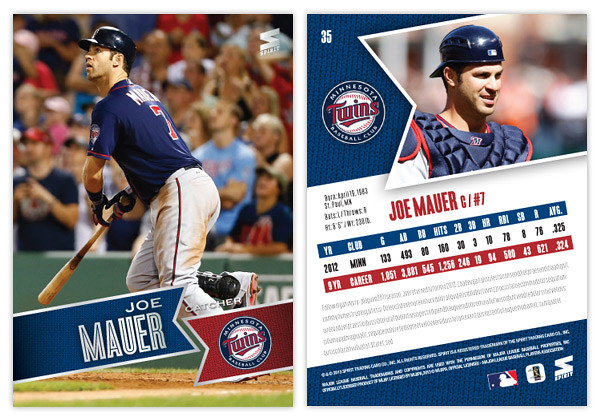
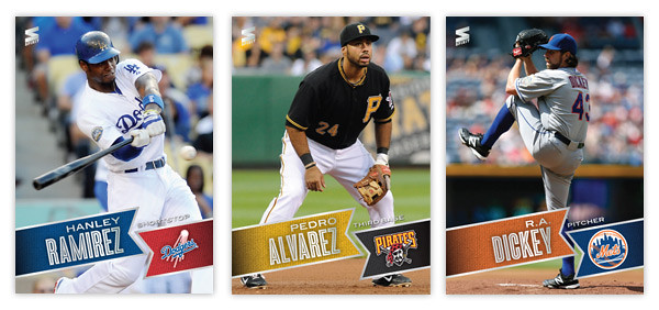
Moving forward with our 2013 preview, here's the base design for the 2013 Spirit flagship. For reference sake, this is comparable to Topps Series 1 if, ya know, someone other than Topps had an MLB license.
Just like last year's design, 2013 features the full-bleed, full-color photo fronts. There's also a team-color banner to house the player names. The fonts here in silver foil are Blair Medium for the first name and position and Enamel Inline for the big, bold last name. In the opposite banner is the secondary color along with the team logo. All of these elements are on a ten-degree angle that helps make the whole a little more dynamic. Also, it conveniently mimics the angle of the Spirit logo in the corner.
On the opposite side, the angled banner is enlarge and filled with a more intimate player photo with the team logo appearing once again to its left. I'm really taking advantage of this MLB license and smearing their property all over this set. Offset from the team-color background, there's a white box for player info. Instead of doing the full-career stat box, I went with the previous season and career totals. That helps keep the design consistent from card to card since there can be quite a variation from player to player. Below the stats are 5 lines for a write-up.
This year is definitely from the same family as the 2012 Spirit design, but it's more like a second or third cousin than sibling. Lots of the DNA is there but rearranged. I love how bright and colorful the backs are and also how the front design doesn't get in the way of the photo, even enhancing it.
What do you think? How does this compare to the Topps 2013 flagship design?
Tuesday, September 25, 2012
Monday, September 24, 2012
UPDATE: Gint-A-Cuffs Spoils
After spending the last few days frustrated by some sort of Blogger snafu that was keeping me from logging in, the bug was serendipitously fixed the same day my Gint-A-Cuffs prize arrived at my door. I was so excited to see the return address from "Mark, Gint-A-Cuffs Commissioner."
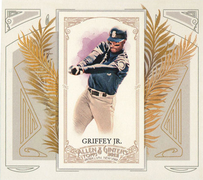
Opening the box, I was shocked, SHOCKED to find an N43 boxtopper instead of the cool cabinet card from my last box. Still, Griffey's a decent one to get I guess. But I could tell this box would be different.
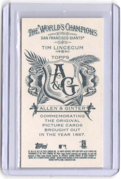
As I moved onto the packs, I was pulling the usually variety of base cards, SPs, inserts, etc. I thumbed through them and flipped each card around to check out the back. One of my early minis was a Tim Lincecum, who, as you may recall, is my favorite player. I flipped the back to see if it was a regular or A&G back since I already have the regular.
"Oh, cool," I thought as I peered the A&G logo. Well what I didn't notice until after I was done with the box and sorting everything is that I had pulled a no-number mini. Needless to say I was pretty excited. The no-numbers are tough pulls to begin with (1:111 packs I believe.) But what are the odds I'd pull one of my favorite player?
Actually, they seem to be pretty good. I don't buy a whole lot of boxes since I don't have an LCS around and don't really like paying for shipping too often. But for some strange reason, I'm like 50/50 at pulling Lincecum 'hits.' My 2012 Heritage box that comes with one color-swap variation per box? Lincecum. My box of 2012 Topps Chrome with one Dynamic Diecut? Lincecum. I bought two boxes of 2011 Update about 4 months apart and got a Lincecum All-Star Stitches relic in both. Unfortunately, I don't have the kind of dough to really test out the odds on something like Triple Threads or Tribute. If I ever do, though, don't be surprised if I get a nice Timmy card to add to my collection.
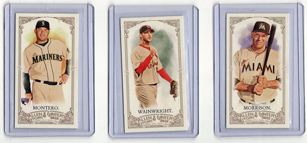
Among the assortment of minis were a couple of SPs and a Jesus Montero 'rookie' mini.
I did pretty well not getting too many dupes this time around. I'd say about a third of the base were cards I already had, so that means I'd probably be somewhat close to completing the set if I were to attempt such a thing. But I'm not. I still have a way to go on the SPs even though I pulled some of the higher value ones here, like Ripken and Ozzie and Nolan Ryan
Now onto the hits. So far, I've done decently on relics. My first box yielded me a Pujols and Bobby Knight relic (though Bobby K. cost me some G-A-C points.) This time around, it was a little off.
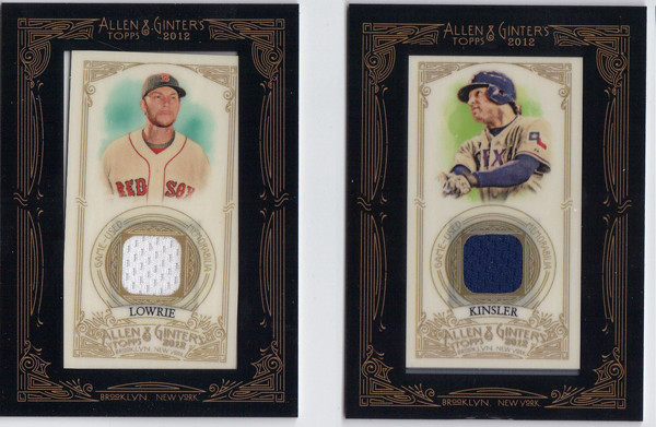
The Kinsler will actually go in my PC and is a pretty nice with the blue swatch. Unfortunately, there's an imperfection along the bottom that's kind of a bummer. The Lowrie, on the other hand, is probably joining my pile of journeyman relics that probably won't find a loving home elsewhere. It's kinda sad, actually.
My final hit of the box wasn't a relic. It was actually an autograph. I've never pulled an auto from A&G so this was pretty exciting. And I must say, if I had to pull an autograph from someone other than one of my favorite players or a Hall-Of-Famer like Mays or Aaron, I can't think of a more fitting subject to come from the Gint-A-Cuffs IV Victory Box. BEHOLD!!
I GOT GUMBEL'D.
Boy, that was a lot of fun. Again, I want to thank Mark for all his hard work overseeing Gint-A-Cuffs. I'm already looking forward to the 2013 contest, anticipating my last-place finish. If you're even thinking about it, you should definitely participate. Believe me, anybody can win.
Labels:
Allen Ginter,
contest,
Gint-a-cuffs,
griffey,
gumbel,
kinsler,
Lincecum
Monday, September 17, 2012
2013 Pennant
Even though there are a handful of amazing pennant/wild card races still going, apparently it's already time to look ahead to 2013 releases. Instead of starting with the Spirit 'flagship' again, I thought the Pennant line would be a good introduction to 2013.
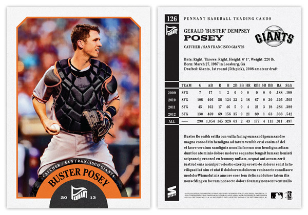
The design is a lot simpler than what I did for last year's version. Since these designs are revisiting specific releases from the past like Heritage or Goudey or 206 do, I thought I'd turn the clock ahead a little bit, closer to something around the '60s or so. We start with an off-white border with beveled edges at the top and a team-color stroke around the frame. At the bottom, there's a half-circle team-color tab to house the Pennant logo. Then extending from that tab is another team-color tab creeping into the picture. The player name (typeset in Cheltenham Condensed Bold) arches around the tab. Moving further, there's a smaller team-color tab multiplied over the photo and housing the team name and player position. The photos have a little bit of grain and aged added to them but nothing too drastic. Altogether, it kind of resembles bunting you'd see on opening day or during the playoffs.
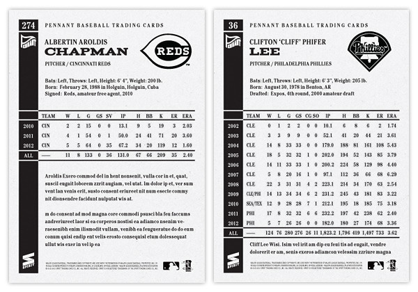
The back side of the card is one-color black and packed with a lot more information than the previous year. We have the player name and background info at the top with room for a black & white team logo. Below, we have the complete career statistics. For those whose careers don't fill the entire space, we have room for a few lines of highlights and/or other information.
I may be a tad impartial, but I think this design has the potential to be timeless. Replace the Pennant logo with a Topps logo, print the name in silver foil and you could have the 2014 Topps flagship design. Or remove the border and airbrush the photos, you could have Upper Deck's next baseball offering. It's definitely and upgrade from what I did for the 2012 version of Pennant. Here's to hoping the rest of my 2013 designs can make the same claim.
Labels:
2013,
aroldis chapman,
Buster Posey,
cliff lee,
pennant,
retro
Wednesday, September 12, 2012
Triple Crown Candidates
There was quite a disparity between the National League and American League MVP races last season. The NL was a 2-man race between a two all-around studs, one on a playoff team and the other on an also-ran. Over in the AL, there wasn't really a dominant enough everyday player to overtake Justin Verlander and he became the first Cy Young/MVP since Dennis Eckersley in 1992.
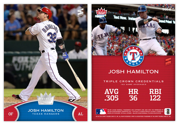
This season, there are probably a half-dozen players between the 2 leagues that could lay legitimate claim to being the MVP and almost all of them are putting up strong triple crown numbers (AVG, HR, RBI.) So that brings us to this Triple Crown Candidates insert, featuring those players that put up big numbers in these traditional categories.
Design-wise, we're starting out with a big, full-bleed photo of the subject at the plate. Towards the bottom, we have a team-color arc with some secondary color notches to house the player position and their respective league. In the middle is the player and team name set on a subtle rhombus pattern to represent a bit of 'royalty.' To finish off, we have some textured silver lines leading to the shiny-shiny Triple Crown Candidate crown logo.
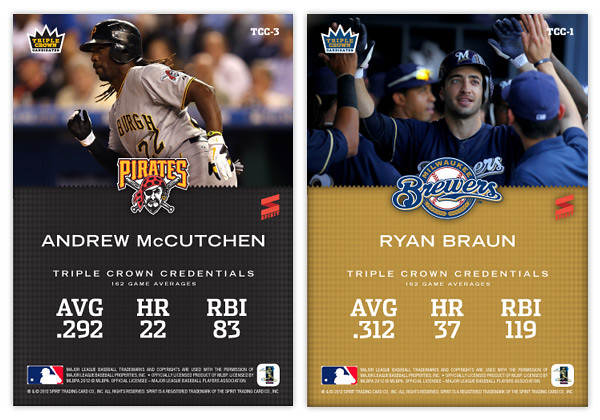
On the back, we have a closer cropped photo up top with the team logo separating it from the bottom team color field. Below the player name is their 'triple crown credentials.' I took these from their Baseball References pages that show their career 162-game averages. Part of me thinks this isn't the best way since McCutchen is having a much better season in 2012 than his previous three, so the numbers are a little dulled. Perhaps after this season is over, their 2012 numbers would be the best representation.
The other guys in the set would be names like Miguel Cabrera, Matt Kemp, Mike Trout, Albert Pujols and the like. I'm sure there would be some others to pop up in upcoming seasons that would work their way onto the list.
Labels:
Braun,
concept,
insert,
josh hamilton,
McCutchen,
mvp,
triple crown
Tuesday, September 11, 2012
Beginner's Luck
If you've been reading this blog for a while, you already know I participated in this year's Gint-A-Cuffs extravaganza for the first time. Well turns out I went and won the darn thing. Luckily, I have my humility intact considering that there was initially a tie between myself and at Play At the Plate. Sensing I may not have all my shit together (probably,) Mark checked my posts to find I had a scoring error. Fortunately, it was an error in my favor and Mark did not institute a stupidity penalty, adding 2 points to my overall score and inching just past Play At the Plate.
This was my first hobby box of Allen & Ginter and I must say I really enjoyed it (and not just because I managed to win the competition.) I look forward to the 2013 edition and urge any and everybody to give it a shot. Take it from me, any idiot can win.
Thanks again to Mark for overseeing the whole thing and doing it so thoroughly. I can't wait to see what box #2 will hold. Hopefully not too many dupes.
Subscribe to:
Comments (Atom)

