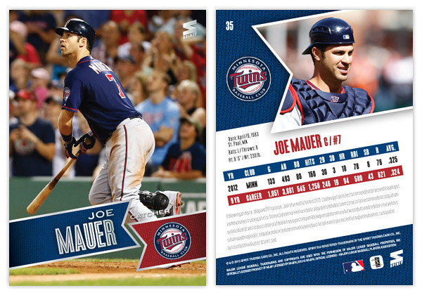
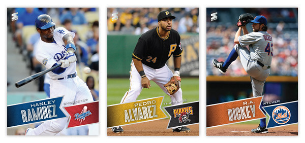
Moving forward with our 2013 preview, here's the base design for the 2013 Spirit flagship. For reference sake, this is comparable to Topps Series 1 if, ya know, someone other than Topps had an MLB license.
Just like last year's design, 2013 features the full-bleed, full-color photo fronts. There's also a team-color banner to house the player names. The fonts here in silver foil are Blair Medium for the first name and position and Enamel Inline for the big, bold last name. In the opposite banner is the secondary color along with the team logo. All of these elements are on a ten-degree angle that helps make the whole a little more dynamic. Also, it conveniently mimics the angle of the Spirit logo in the corner.
On the opposite side, the angled banner is enlarge and filled with a more intimate player photo with the team logo appearing once again to its left. I'm really taking advantage of this MLB license and smearing their property all over this set. Offset from the team-color background, there's a white box for player info. Instead of doing the full-career stat box, I went with the previous season and career totals. That helps keep the design consistent from card to card since there can be quite a variation from player to player. Below the stats are 5 lines for a write-up.
This year is definitely from the same family as the 2012 Spirit design, but it's more like a second or third cousin than sibling. Lots of the DNA is there but rearranged. I love how bright and colorful the backs are and also how the front design doesn't get in the way of the photo, even enhancing it.
What do you think? How does this compare to the Topps 2013 flagship design?


Yours = 100% better. No question.
ReplyDeleteHuge thumbs up, especially on The Holy Mauer!
ReplyDeleteI admit it, I picked Mauer just to get a retweet from you ;)
Delete