Monday, January 13, 2014
2014 Spirit Base Series 1: 61-70
#61 - Cody Ross
I really wish Cody Ross was playing for a team not in the NL West. I love rooting for him but not at the expense of the Giants.
#62 - Jason Heyward
I considered using a photo with his extra long helmet flap since it's unique but it just looked too weird. Plus, I'm sure he doesn't need to be reminded of his broken jaw.
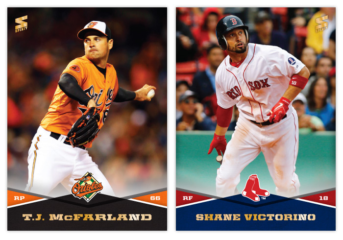
#63 - T.J. McFarland
There weren't a ton of photos to choose from but luckily had a few that were usable. Love those orange jerseys.
#64 - Shane Victorino
If baseball cards could utilize .gif technology, I'd totally use this image instead.
#65 - Edwin Jackson
Thought this was an interesting angle for a pitcher card.
#66 - Alexei Ramirez
Those White Sox uniforms really don't add much chromatically speaking.
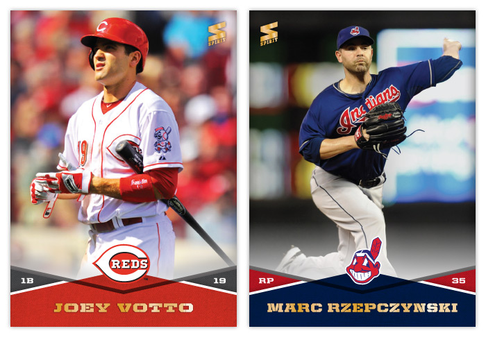
#67 - Joey Votto
Probably one of the nicest combinations of color, lighting, pose and player so far. Very nice looking card
#68 - Marc Rzepczynski
Thank god for copy/paste.
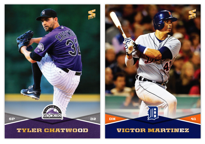
#69 - Tyler Chatwood
I really like when the Rockies embrace their purple-mountain majesty. It's such a unique color in the MLB now.
#70 - Victor Martinez
Maybe it's because I don't watch a lot of AL ball, but I have the hardest time remembering Victor Martinez when it comes to "good hitters." He doesn't seem to have much of a presence on cardboard either. It's really strange when you do realize how good he is.
Friday, January 10, 2014
2014 Spirit Base Series 1: 51-60
#51 John Mayberry
I wasn't sure whether to add the 'Jr.' or not but decided on leaving it off.
#52 Starling Marte
Any chance I get to show a non-collision play at the plate, I'm gonna take advantage.
#53 Joe Kelly
I hope Joe Kelly sticks around with those glasses. This generation needs a Chris Sabo. (By the way, I had those exact same goggles as a kid.) Also, those St. Louis alternate jerseys are cool but would make more sense on the road than at home, no?
#54 Eric Stults
Man, the Padres' uniforms are dull.
#55 Brandon Crawford
Just trying to get everyone aware that Brandon Crawford = excellent glove work.
#56 Michael Saunders
I know you've probably seen better Saunders' catches on cardboard but I like how calm and routine he makes this running catch look.
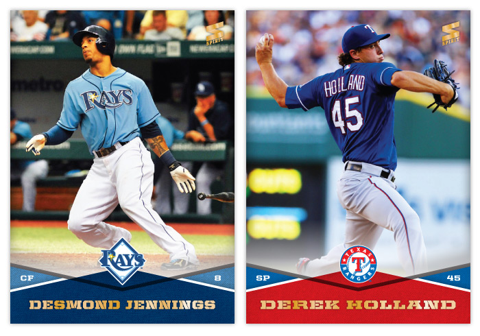
#57 Desmond Jennings
I love the Rays light blue jerseys. They add personality to the rest of their bland visual identity.
#58 Derek Holland
Holland, 1945
#59 Melky Cabrera
Oh, Melky. You were so much fun on the Giants in 2012. The Melkmen. Trollface. All those hits. Why'd you have to go and ruin it? Granted, it was all (obviously) too good to be true. But that sure was some blissful ignorance.
#60 Bryce Harper
It's strange how Harper has pretty much lived up to the hype thus far but he's still overshadowed by Mike Trout and now Yasiel Puig. Strangely, it's made him a little more likable for me.
Labels:
2014,
base,
brandon crawford,
bryce harper,
concept,
derek holland,
design,
desmond jennings,
joe kelly,
marte,
mayberry,
melky,
saunders,
sprit,
stults
Thursday, January 9, 2014
2014 Spirit Base Series 1: 41-50
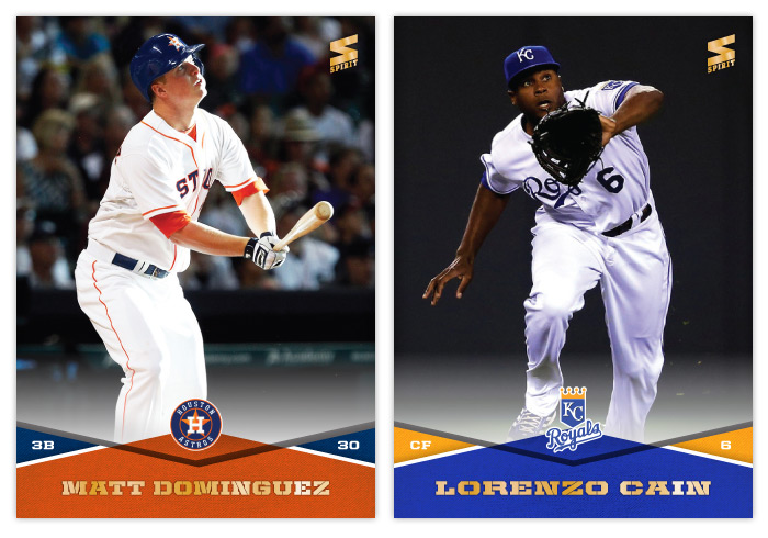
#41 Matt Dominguez
I definitely knew Dominguez's photo was going to be a batting shot. Fielding was not an option.
#42 Lorenzo Cain
Cain had a lot more acrobatic catches but I went with one that actually shows his face.
#43 Hank Conger
#44 Yasiel Puig
Even as a Giants' fan, I can't help but be fascinated by Puig. I decided to go with a shot that's more 'vivacious' than 'hotdoggy,' though there were plenty of examples of the latter.
#45 Steve Cishek
I really hope the Marlins wear their orange jerseys more often in 2014. Having so much uniform black really clashes with the bright team colors on the card design.
#46 Kyle Lohse
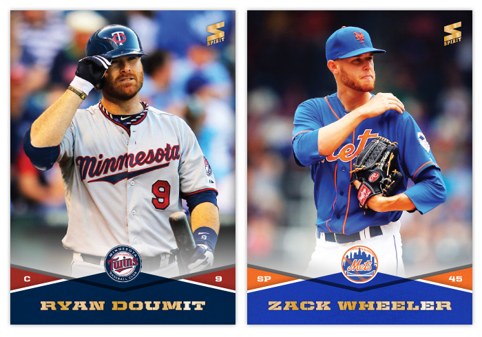
#47 Ryan Doumit
Of all the red and blue teams in the MLB, I think I dig the Twins' hues the most.
#48 Zack Wheeler
I appreciate Wheeler's facial hair matching the team colors.
#49 Derek Jeter
Hey, look, his card number matches his age! (kidding, kidding)
#50 Sonny Gray
This card has necessitated the most Photoshop work for me thus far. Oakland's green is really far more dull than the green here but I can't help but tweak it. The green and gold combo is hard to beat.
Labels:
2014,
base,
cishek,
concept,
conger,
design,
doumit,
jeter,
lohse,
lorenzo cain,
matt dominguez,
puig,
sonny gray,
spirit,
zack wheeler
Wednesday, January 8, 2014
2014 Spirit Base Series 1: 31-40
I'm gonna try a little bit of a format change here to keep these posts from getting stale. Let's see how this goes...
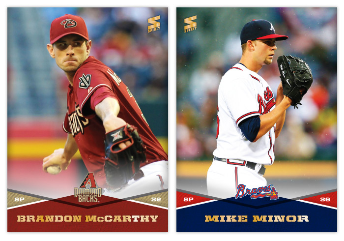
#31 Brandon McCarthy
McCarthy's a lanky fellow so I had to go with a torso-only shot to make the most of the space. If you're on Twitter and you don't follow him, I recommend you fix that. He's pretty funny and very insightful.
#32 Mike Minor
It may look a little like dust but those little specks are raindrops. I don't remember seeing too many rainy cards in the past.
#33 Manny Machado
You've probably seen a lot of Machado cards like this where he's stretched out making the throw to first. He's extra spread out in this one.
#34 Clay Buchholz
I had a hard time finding a photo of Buchholz where he didn't look like Falcor from The Neverending Story. This was the best I could find.
#35 Junior Lake
I don't think I'll ever get tired of seeing that green ivy in Wrigley Field on a baseball card.
#36 Paul Konerko
Before making this card, I had never noticed Konerko's awesome K-face. It's probably too mean to put that on a card, though.
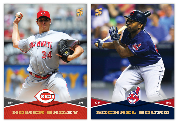
#37 Homer Bailey
"I'm Batman."
#38 Michael Bourn
I'm realizing it's a lot easier to find usable fielding photos than batting ones to fit this design. Whenever I come across one where a guy's limbs aren't hanging off the edges, I feel compelled to use it, even if he's known more for his glove than bat.
#39 Rex Brothers
#40 Max Scherzer
Scherzer's almost as prolific as Hunter Pence when it comes to goofy action faces.
#31 Brandon McCarthy
McCarthy's a lanky fellow so I had to go with a torso-only shot to make the most of the space. If you're on Twitter and you don't follow him, I recommend you fix that. He's pretty funny and very insightful.
#32 Mike Minor
It may look a little like dust but those little specks are raindrops. I don't remember seeing too many rainy cards in the past.
#33 Manny Machado
You've probably seen a lot of Machado cards like this where he's stretched out making the throw to first. He's extra spread out in this one.
#34 Clay Buchholz
I had a hard time finding a photo of Buchholz where he didn't look like Falcor from The Neverending Story. This was the best I could find.
#35 Junior Lake
I don't think I'll ever get tired of seeing that green ivy in Wrigley Field on a baseball card.
#36 Paul Konerko
Before making this card, I had never noticed Konerko's awesome K-face. It's probably too mean to put that on a card, though.
#37 Homer Bailey
"I'm Batman."
#38 Michael Bourn
I'm realizing it's a lot easier to find usable fielding photos than batting ones to fit this design. Whenever I come across one where a guy's limbs aren't hanging off the edges, I feel compelled to use it, even if he's known more for his glove than bat.
#39 Rex Brothers
#40 Max Scherzer
Scherzer's almost as prolific as Hunter Pence when it comes to goofy action faces.
Labels:
2014,
base,
bourn,
buchholz,
concept,
design,
homer bailey,
junior lake,
konerko,
machado,
mccarthy,
minor,
rex brothers,
scherzer,
spirit
Monday, January 6, 2014
2014 Spirit Base Series 1: 21-30
Here are cards 21-30 to round out the remaining teams. I was worried how some of the red/blue teams color combos would look in comparison to one another but it looks like I was able to get some differentiation between each. It may be subtle but you can tell the Phillies and Cardinals cards have a little different hue for both their reds and blues. My favorites from this batch are the ChaseUtley and Jayson Werth. I am pretty proud I was able to find an action shot of Hunter Pence that isn't creepy/goofy as hell.
Sunday, January 5, 2014
2014 Spirit Base Series 1: 11-20
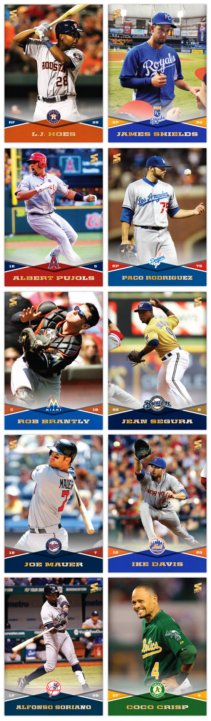
Here are cards 11 through 20, covering from the Houston Astros to the Oakland A's. There's a good variety of colors in this batch. I think my favorites would have to be the Joe Mauer and Coco Crisp. I do like the James Shields card since the photos is him signing for Rays fans on his first visit back to Tampa after being traded.
Labels:
2014,
base,
Coco Crisp,
concept,
design,
james shields,
mauer,
spirit
Thursday, January 2, 2014
2014 Spirit Base Series 1: 1-10
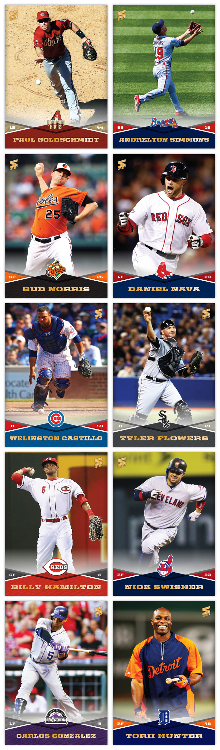
I'm trying something a little different this year. Instead of just posting a handful of cards from the set, I plan on designing and posting them all in increments of 10. Series 1 and 2 will both feature 300 cards with all 30 teams represented on 10 cards each. Players that have changed teams this offseason will be in Series 2, negating the need for airbrushing (which would have rendered this project impossible for me.) I'm still on the fence about what to do for Series 3. It would obviously be a smaller series but I don't want to fill it with crap like Topps does Update. But I know there will be some in-season trades and guys that come out of nowhere that won't make it into Series 2. I guess we'll see what my option are come August or so.
Design-wise, I wanted to make sure I had a template that didn't require me to cut out every photo. I started with a full-bleed photo in the background leaving space at the bottom for the design elements. These criss-cross team color patterns add a lot of vibrancy but leave room for the relevant information without making things too busy. The secondary-color triangles house the player position on the left and number on the right. On the very bottom is the player name in a wide stencil font that matches the angles from the criss-cross. Luckily I have varying widths to accommodate players with longer names. And on top of the center diamond is the team logo. The top and bottom sections have a slight white fade between them that'll be stretched up for future autograph inserts.
The first 10 on the checklist run alphabetically by franchise location, from Arizona to Detroit. There's no particular order for the players on each team. I just kinda grabbed a few stars and non-stars and sprinkled them together. My goal is to avoid having too many similar photos, so there will be a mix of candid non-game shots like Torii Hunter or spectacular angles/actions like Andrelton Simmons. There's no avoiding a cavalcade of standard pitcher delivery photos like Bud Norris' up there but I'll try hard to avoid embarrassing pitch face when possible.
So this was the first of what will hopefully be many more for 2014. I'm just gonna state up front that if I don't make it all the way through Series 3, don't hold it against me.
So this is the new year...
In case you haven't noticed, I've really slowed down on posting anything in the last few months. As the postseason came and went, my desire to create new content evaporated. After a couple months of trades and free agent signings, the fire has been stoked a bit and new posts will be appearing more regularly. So keep your eyes peeled for the 2014 Spirit base designs in the next few days.
Thursday, August 29, 2013
2013 Clubhouse Mitt Masters
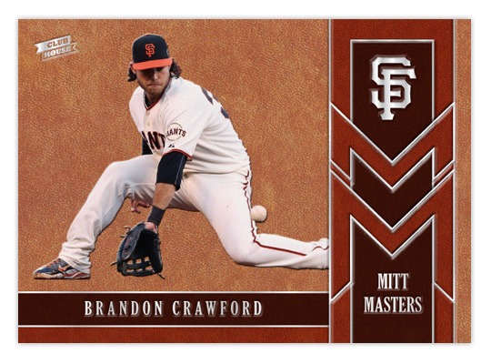
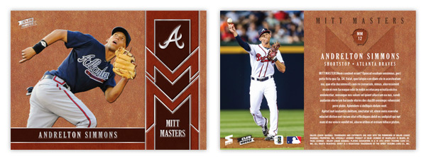
After tackling the heavy hitters of the league, let's shine a little light on some guys that flash the leather. The Mitt Masters insert features some of the league's best fielders that might not put up the offensive numbers to garner a lot of attention. Being a Giants fan, I'm keenly aware of Brandon Crawford's glovework at short. The rest of the baseball world, however, I'm not so sure. The card is almost top-to-bottom leather, or in this case cardboard with a leather texture. By adding some thickness to the stock, we're able to give all the elements a visual and tactile embossed appearance. Gloves come in all shades of leather so we' have 3 tones represented here.
The raised surfaces of all the leather spots makes way for some stamp silver foil to be pressed down. In person, these cards would be a pleasure to hold, running your fingertips across all the bumps of the images and valleys of the foil. The big cap logo in the upper right corner really stands out to my eyes.
The back may have a level surface but the full color photo on the left and the richness of the leather pattern keep things from getting dull. It's a little hard to make out here but the card number (MMxx) is found inside a mitt silhouette with an embossed look, along with the Mitt Masters logo subtly pressed below the text.
I don't know how feasible it would be, but if these cards were produced it would be nice if they could somehow be infused with a leather scent. I guess that would probably make it easy for pack searchers to sniff them out, though. I think the combination of the embossing and the leather texture along with this hypothetical odor would fit in perfectly with the Clubhouse target market.
The raised surfaces of all the leather spots makes way for some stamp silver foil to be pressed down. In person, these cards would be a pleasure to hold, running your fingertips across all the bumps of the images and valleys of the foil. The big cap logo in the upper right corner really stands out to my eyes.
The back may have a level surface but the full color photo on the left and the richness of the leather pattern keep things from getting dull. It's a little hard to make out here but the card number (MMxx) is found inside a mitt silhouette with an embossed look, along with the Mitt Masters logo subtly pressed below the text.
I don't know how feasible it would be, but if these cards were produced it would be nice if they could somehow be infused with a leather scent. I guess that would probably make it easy for pack searchers to sniff them out, though. I think the combination of the embossing and the leather texture along with this hypothetical odor would fit in perfectly with the Clubhouse target market.
Labels:
2013,
andrelton,
brandon crawford,
Clubhouse,
concept,
defense,
emboss,
fielding,
glove,
leather
Friday, August 23, 2013
Gint-A-Cuffs V: Packs 17-24
We're heading into the final third of the box with a running score of 148. I wonder if my lucky streak will stretch another year?
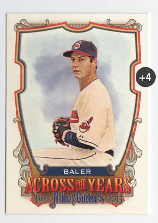
PACK 17
FP/ATY Trevor Bauer +4
PACK TOTAL +4
ROLLING TOTAL +152
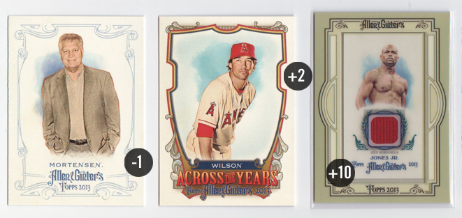
PACK 18
164 Chris Mortensen -1
ATY C.J. Wilson +2
Mini Relic: Roy Jones, Jr. +10
PACK TOTAL +11
ROLLING TOTAL +163
Well this is interesting. All 3 of my hits were relics but none of them came in the same format. The Roy Jones, Jr. here has a different colored frame around it. I think the light blue on the Belle is a lot more flattering. This mauve color is just way to drab here. Plus the plain borders are so far away from the ornate borders on pretty much every other card in the set. I guess the red fabric swatch is cool, though. Really makes me wonder what article of clothing it's from since boxer trunks are usually all silky and shiny, no?
PACK 19
128 Joe Mauer (FP) +2
344 Nolan Ryan (SP) +2
Martial Mastery: Zulu +3
A&G Mini: 288 Chris Davis +2
PACK TOTAL +9
ROLLING TOTAL +172
It's crazy how some packs have 4 scoring cards in them while others only offer 1. Here's my first look at the Martial Mastery cards. I like how the lack of hard borders helps the card breathe. The little logo up top is well done, too. Can't say I'm a fan of the subject matter, though. They just had a military leaders set in A&G a couple years ago.
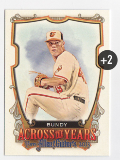
PACK 20
ATY Dylan Bundy +2
PACK TOTAL +2
ROLLING TOTAL +174
This doesn't look like a strong finish...
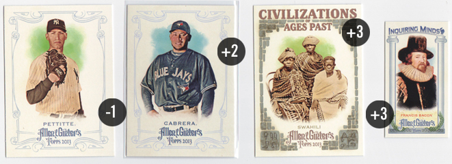
PACK 21
186 Andy Pettitte -1
345 Melky Cabrera (SP) +2
Civilizations: Swahili +3
Inquiring Minds: Francis Bacon +3
PACK TOTAL +7
ROLLING TOTAL +181
I tried to keep it out of my mind and avoid the jinx but there were more than a few times opening this box where I thought "man, I haven't pulled me Yankees so far." I don't know if the checklist was lighter or if I just got a lucky box but the Pettitte here was the first Yankee base card I pulled.
PACK 22
96 Jason Heyward (FP) +2
316 Hal Newhouser (SP) +2
Martial Mastery: Romans +3
SP Mini: 346 Josh Johnson +3
PACK TOTAL +10
ROLLING TOTAL +191
Hey hey, we're picking up some steam here. I feel a strong finish in the works.
PACK 23
300 Bud Selig -1
327 Yogi Berra (SP) +2 / -1 NYY = +1 total
Martial Mastery: Knights +3
PACK TOTAL +3
ROLLING TOTAL +194
Damnit, Selig!
PACK 24
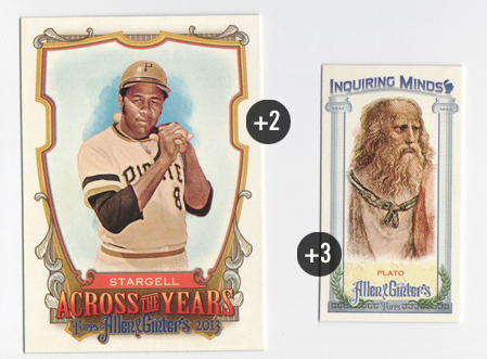
ATY Willie Stargell +2
Inquiring Minds: Plato +3
PACK TOTAL +5
GRAND TOTAL +199
And an embarrassing stagger across the finish line. Actually, 199 is basically 200 and I told myself beforehand if I get to 200, I'll be pleased. It's always fun opening a box but adding the weird scoring into the mix cranks it up exponentially. As always, thanks to Mark for organizing/running this whole crazy thing and also getting Dave & Adam's Card World on board with a Gint-A-Cuffs discount. I can't imagine all the work that goes into overseeing this year after year.
Overall, I like the 2013 Allen & Ginter designs a bit less than last year's. The whole 'theme' seems a little too loosely applied resulting in a mix of carnival and ren faire that I'm not a big fan of. I suppose there are only so many 'yesteryear' eras to cull from. It seems a bit like A&G and Gypsy Queen are on a track to meet each other head on in a few years. A lot of these ornate storybook elements are found in each, along with things that used to be A&G signatures like the minis and such. About the only distinction that remains is GQ is baseball only (minus the gypsies) and A&G is a balls-out quirkfest. The products may be built differently but the looks of each are starting to converge.
PACK 17
FP/ATY Trevor Bauer +4
PACK TOTAL +4
ROLLING TOTAL +152
PACK 18
164 Chris Mortensen -1
ATY C.J. Wilson +2
Mini Relic: Roy Jones, Jr. +10
PACK TOTAL +11
ROLLING TOTAL +163
Well this is interesting. All 3 of my hits were relics but none of them came in the same format. The Roy Jones, Jr. here has a different colored frame around it. I think the light blue on the Belle is a lot more flattering. This mauve color is just way to drab here. Plus the plain borders are so far away from the ornate borders on pretty much every other card in the set. I guess the red fabric swatch is cool, though. Really makes me wonder what article of clothing it's from since boxer trunks are usually all silky and shiny, no?
PACK 19
128 Joe Mauer (FP) +2
344 Nolan Ryan (SP) +2
Martial Mastery: Zulu +3
A&G Mini: 288 Chris Davis +2
PACK TOTAL +9
ROLLING TOTAL +172
It's crazy how some packs have 4 scoring cards in them while others only offer 1. Here's my first look at the Martial Mastery cards. I like how the lack of hard borders helps the card breathe. The little logo up top is well done, too. Can't say I'm a fan of the subject matter, though. They just had a military leaders set in A&G a couple years ago.
PACK 20
ATY Dylan Bundy +2
PACK TOTAL +2
ROLLING TOTAL +174
This doesn't look like a strong finish...
PACK 21
186 Andy Pettitte -1
345 Melky Cabrera (SP) +2
Civilizations: Swahili +3
Inquiring Minds: Francis Bacon +3
PACK TOTAL +7
ROLLING TOTAL +181
I tried to keep it out of my mind and avoid the jinx but there were more than a few times opening this box where I thought "man, I haven't pulled me Yankees so far." I don't know if the checklist was lighter or if I just got a lucky box but the Pettitte here was the first Yankee base card I pulled.
PACK 22
96 Jason Heyward (FP) +2
316 Hal Newhouser (SP) +2
Martial Mastery: Romans +3
SP Mini: 346 Josh Johnson +3
PACK TOTAL +10
ROLLING TOTAL +191
Hey hey, we're picking up some steam here. I feel a strong finish in the works.
PACK 23
300 Bud Selig -1
327 Yogi Berra (SP) +2 / -1 NYY = +1 total
Martial Mastery: Knights +3
PACK TOTAL +3
ROLLING TOTAL +194
Damnit, Selig!
PACK 24
ATY Willie Stargell +2
Inquiring Minds: Plato +3
PACK TOTAL +5
GRAND TOTAL +199
And an embarrassing stagger across the finish line. Actually, 199 is basically 200 and I told myself beforehand if I get to 200, I'll be pleased. It's always fun opening a box but adding the weird scoring into the mix cranks it up exponentially. As always, thanks to Mark for organizing/running this whole crazy thing and also getting Dave & Adam's Card World on board with a Gint-A-Cuffs discount. I can't imagine all the work that goes into overseeing this year after year.
Overall, I like the 2013 Allen & Ginter designs a bit less than last year's. The whole 'theme' seems a little too loosely applied resulting in a mix of carnival and ren faire that I'm not a big fan of. I suppose there are only so many 'yesteryear' eras to cull from. It seems a bit like A&G and Gypsy Queen are on a track to meet each other head on in a few years. A lot of these ornate storybook elements are found in each, along with things that used to be A&G signatures like the minis and such. About the only distinction that remains is GQ is baseball only (minus the gypsies) and A&G is a balls-out quirkfest. The products may be built differently but the looks of each are starting to converge.
Labels:
2013,
a and g,
Allen Ginter,
Gint-a-cuffs,
review
Subscribe to:
Posts (Atom)