Thursday, May 30, 2013

2013 Spirit Rookie Round-Up


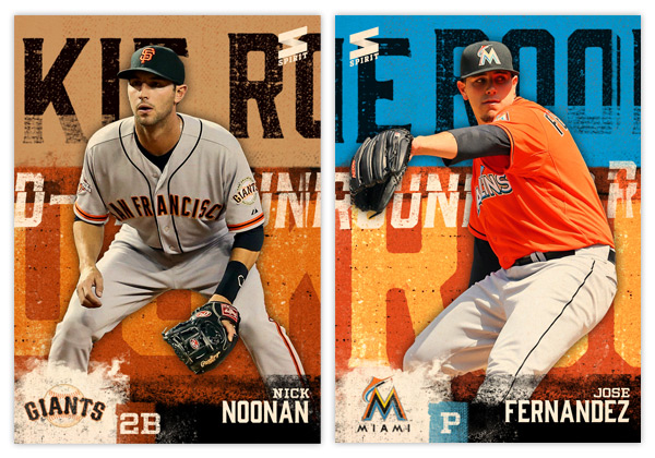
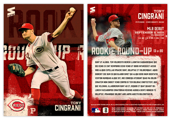
It's been a while since I posted anything for the Spirit flagship series. Time for a new insert. This one features 20 rookies that have gotten off to a good start in 2013. I figured it would be nice to have some MLB inserts of these guys instead of so many minor league cards.


The design is a bit 'in your face,' a little reminiscent of some of the early 90s inserts with player cutouts on top of a busy background. I enjoy grunging things up so I went with that for the look. Big, bold letters roughed up and running across the background set on top of vintage team colors. The idea is that if you had all 20 cards lined up left-to-right, the 'ROOKIE' and 'ROUND-UP' text would stretch across multiple times. As it is now, each card has a slightly different cut of those letters. At the bottom, we find the player name along with position and the weathered team logo in the corner.


The back has a solid team-color background instead of the two-tone from the front. On the left is another player photo with some soft, grungy edges. To the right is the N/P/T along with a little tidbit of his MLB debut. Some may be more impressive than others (note Noonan's 0 for 1, pinch hit debut.) In the middle is a block for a brief write-up (greeked text here since I was too lazy to "write.")

This is one of the few cards I've done without any shiny foil or die-cut or other bells and whistles. The finish would be matte to fit the design rather than glossy. The edginess fits with the subject of rookies so I thought I'd let it stand on its own.

Tuesday, May 28, 2013

2013 Spirit Deluxe Duos


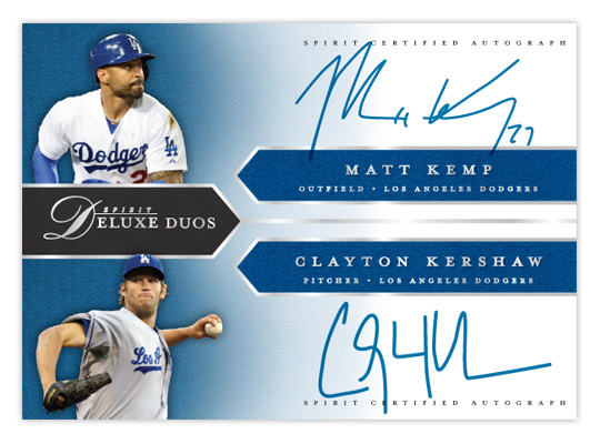
With Deluxe being Spirit's "high-end" product, I figured the dual-autograph Deluxe Duos would be a good place to start with 2013's inserts. These wouldn't be as prevalent as the auto and relic parallels from the base set, maybe about a 1:20 hit.


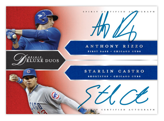
Like last year's version, the design is right in step with the base cards. We have the pointed tabs shooting in from the edges, filled with a team-color twill texture. All of the text (minus the certification small-print) is in shiny silver foil to jump off the glossy finish. It's bisected horizontally with each half of the duo on the top or bottom. A small cutout of the players sits in the left corners on top of another team-color twill texture that fades to white moving to the right, leaving room for the player signatures.


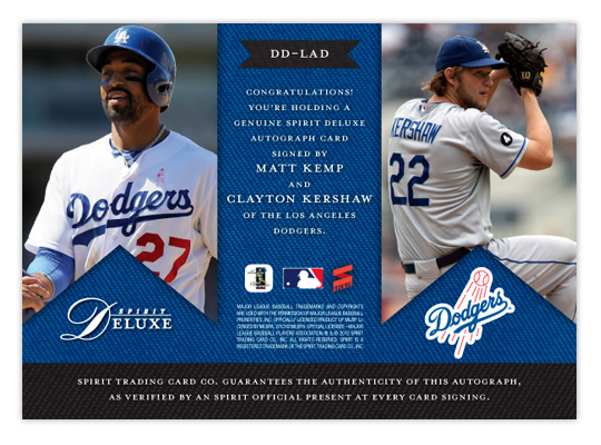
On the back, the tabs are inverted and filled with some bigger action shots. The team-color twill makes an appearance again as a background for the small print and authentication copy. The team logo also finds its way into the mix.

While not every club may have a duo on the level of Kemp/Kershaw here, most would have at least one player of note get excited about. Especially at the SRP of $10-$15 a pack.

Sunday, May 19, 2013

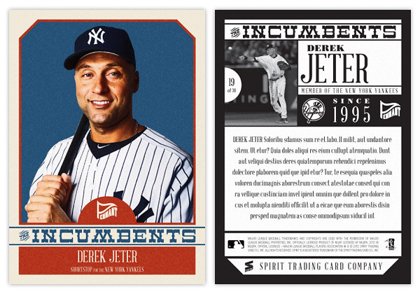
2013 Pennant Incumbents


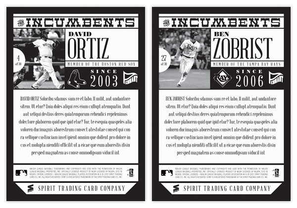
Free agency has become such a big part of the MLB landscape, I thought it would fun to make an insert that shows the impact it's had on all current rosters. The Incumbents features the 30 players that have been on each team the longest. While you have guys like Jeter here who have been around the same place since the previous century, most clubs have a higher turnover rate than that.


The design echoes the 2013 Pennant base design with the beveled top corners, simple team colors and the half-circle tab to house the Pennant logo. The borders here are a little more cream than white, though. Each player is cut out from an personal-type portrait and placed over a solid background. The Incumbents text stretches across the width of the card and separates the color boxes along with the player name & info. With Pennant being a retro set, the photo color levels are altered and some grain is added to the whole front along with the typography meant to evoke some past era.


The backs are kept to one-color and have a black beveled border. The top is packed with the insert title, action photo, player name, card number and team logo as well as a bit of text that reads how long the player has been a part of his big league clube. I left plenty of space for a sizable write-up highlighting the team's successes/failures in the time the player has been around.

Here's a checklist of the players featured.


ARI - Miguel Montero
ATL - Tim Hudson
BAL - Nick Markakis
BOS - David Ortiz
CHC - Alfonso Soriano
CHW - Paul Konerko
CIN - Brandon Phillips
CLE - Asdrubal Cabrera
COL - Todd Helton
DET - Justin Verlander
HOU - Wesley Wright
KCR - Alex Gordon
LAA - Jered Weaver
LAD - Andre Ethier
MIA - Ricky Nolasco
MIL - Ryan Braun
MIN - Justin Morneau
NYM - David Wright
NYY - Derek Jeter
OAK - Daric Barton
PHI - Jimmy Rollins
PIT - Andrew McCutchen
SDP - Chase Headley
SFG - Matt Cain
SEA - Felix Hernandez
STL - Yadier Molina
TBR - Ben Zobrist
TEX - Ian Kinsler
TOR - Adam Lind
WAS - Ryan Zimmerman

It's interesting but I suppose not all that surprising that most of the guys here are kind of no-brainers. They have obviously been good performers or else they wouldn't have stuck around so long. But you also have a few rebuilding teams (Houston and Miami) and others that construct their rosters differently (Oakland, Arizona) where the representative isn't necessarily the marquee guy on the squad. Personally, I think it's nice mixing up the checklists from set to set just to keep things from getting stale. That said, I can't imagine being too excited if I pulled a Wesley Wright insert card, though I have had to suffer with plenty of Ricky Nolasco cards.

Wednesday, May 15, 2013

REVIEW: 2013 Bowman


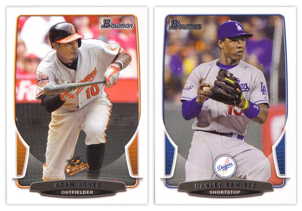
The biggest takeaway from the 2012 Bowman design was how it was a big departure from what Bowman had been putting out for many years past. As we review the 2013 version, it looks like that big year-to-year jump was merely aberration and not a new gameplan heading forward. Just like the 2012 version, this year we have white borders, not-quite rectangular frames in team colors, silver foil names, subtle drop shadows around the players, team logos centered above the name block. Honestly, you could be looking at last year's cards while reading that description and it would be 100% accurate. About the only distinguishing features here are the little tabs folding in on the left and right sides and the soft white overlay to finish out that curve. If we didn't have 2012 to compare this to, I'd really like the base design here. But as a follow up, it looks more like a rehash and suffers a bit.


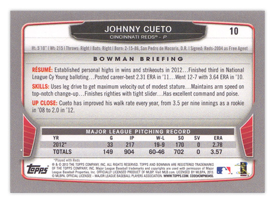
For the backside, the similarities are even more....similar. The layout is identical to 2012 with a little tinkering to fit this year's look. The colored tabs on the bottom and the black nameplate are pretty much where those embellishments are made. I mentioned a couple things on last year's review that I thought were easy improvements to make. I suggested that the last section of the Bowman Briefing be changed from EVOLUTION to UP CLOSE (like it is/was on the prospect cards.) I doubt that any eyeballs at Topps saw my recommendation but somehow it was magically changed for this year. My other suggestion, however, seems to have gone without notice. The card numbers are still in the upper right corner, which means if you store these upright in a cardboard box, the numbers won't be visible. So once I again, I propose this amendment to the Baseball Card Constitution: horizontal backs have to be numbered in the upper left corner to help for storage box sorting.


Now on to what is basically Bowman's reason to exist: prospect cards. For 2012, I preferred the veteran design to the prospect design but I'm flipping it around for this year. The prospect design is a lot easier to distinguish here thanks to the solid team-color wedges above the name. There are some subtle shape differences to the frame and nameplates that also help them stick out. The team logos are removed to help save space for the autographs (I assume.) That means the team names are found below the player name and the position is moved to the right color wedge. 


Like every other Topps release, there are plenty of parallels again. Gold, blue, purple, orange, silver ice, etc., etc. The international cards are a little different this year. The flags have some texture to them so they aren't as glaringly obvious as prior years. Also, for American-born players, they have the flag of their home state up here instead of the Stars & Stripes. I'm all for anything that helps distinguish them from previous years. 


The Top 100 Prospects cards are actually pretty nice. They have a smooth, cool finish to them with some silver, black and blue/red colors around the border. There appears to be a die-cut version as well but, as I've mentioned before, I'm not a big fan of random-shaped die-cuts. I do like how the numbers are nice and big to help drive home the fact that there is a list they're referencing. And keeping with the blue, we have Bowman reprints with blue refractor borders. I'm so tired of reprints that I can't even bother to say any more about them.


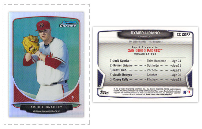
Finally, we've come to what's probably the worst development so far this collecting season. Topps has decided to introduce minis into the Bowman line. Their reasoning is obviously... who knows, but here they are. They're an odd size, they're chrome, they're refractory, they're prospect-ory. I wish somebody with power at Topps could exercise some willpower and stop spreading things across every release like this. It's really getting old.

Overall, I'd feel better about the 2013 release if it all weren't so simliar to 2012. The base and prospect designs look like comps that didn't get picked up last year or were just saved away for a future release. I understand keeping some things consistent but this comes across as a little too lazy.

Base cards: 7/10
Parallels: 6.5/10
Prospects: 8/10
Inserts: 6/10
Minis:4/10
OVERALL: 6.3/10

Thursday, May 9, 2013

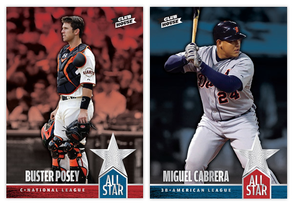
2013 Clubhouse All-Stars


The MLB All-Star ballots went live a week or so ago so I thought it would be a good time for the 2013 installment of Clubhouse's All-Star insert. This is a 74-card set that features all the players named to the 2012 all-star rosters, whether voted in by fans, selected by managers or named as injury replacements. The design kind of follows the Clubhouse base set but with a few embellishments. The most prominent one is the shiny silver concentric star cluster in the bottom right corner. That foil is also present in the ALL-STAR title along with the player name and position/league. The red and blue motifs respective to each league is consistent with last year's version along with the annual Spirit Award Winners designs. Instead of the mowed field background from the base design, I simply kept the isolated players full-color and had the blurry background fade into their league color.


For the back side, a player portrait fills the negative space from the star shape in the upper left corner while the concentric stars fill the color underneath. The NL and AL logos are in the upper right corner with the league's all-star roster listed below with the starters and reserves designated. It's kind of a de facto half-checklist. On the left, below the player name/position/team is a brief write-up (lorem ipsum here since I was feeling too lazy to write.)

Again, I don't understand why Topps doesn't make an All-Star insert instead of relegating it to the Update set where it's basically the same base card with the ASG logo slapped on. Explain to me how at 70+ card insert with the best players (from all 30 teams) doesn't trump another nebulously-themed insert with yet more retired legends (Yankees)? Blargh.

Thursday, May 2, 2013

2013 Spirit Deluxe


Directly on the heels of the low-end offering from Spirit comes the singular high-end release. It's kind of a cross between Stadium Club and something like Tribute, only with out the avalanche of randomly numbered parallels.


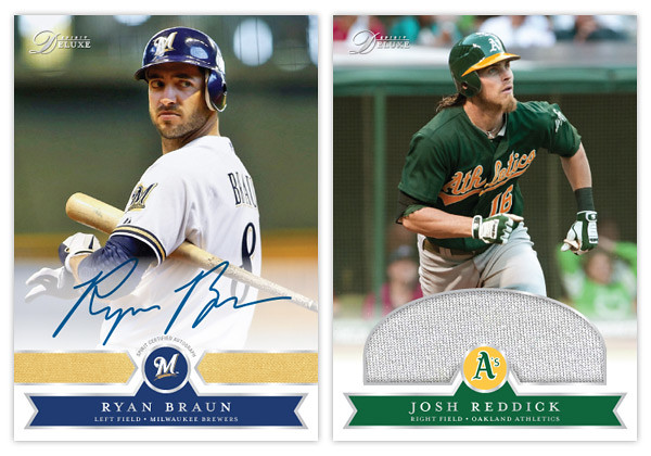
Like last year we have full-bleed photos on a glossy stock with silver foil accents. The team logo sits in the center, flanked by three team-color swatches. The subtle knit texture from last year makes another appearance. Beneath it all is a soft white fade leading from the bottom edge to keep things from getting too harsh.


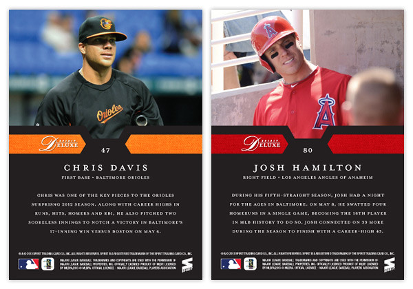
For the back we have the player photo taking up most of the top half with a solid black background below. The team-color polygons from the front make an appearance here to tie together both sides. Underneath the name, position and team is a brief write-up of the player's 2012 season.


Being a high-end set, we also have an autograph and relic variation. The auto just has the white fade up a little further from below. For the relic, I figured it would be nice to have a nice big swatch for such a set. The semi-circle allows for a bigger patch without intruding too much into the photo.

I'm not a big fan of the idea of spending so much for a box of something like Tribute or Triple Threads to where all that matters is the autos or relics as the base cards barely register any notice. The Deluxe set would have a sizable base set with the hits coming like every few packs or something. A standard pack would have 6 base cards with and come with either a pair of inserts or a hit, with relics being about twice as common as autos. I think that would place the price somewhere around $10-$15 a pack, which is still a lot but not ridiculous. To me, that's about as high as I'd like to go on "high-end."

Monday, April 22, 2013

REVIEW: 2013 Topps Opening Day

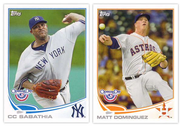
It may be a few weeks into the season but I'm just not getting around to reviewing some cards again. Opening Day is Topps' lowest-end release geared towards getting younger collectors excited for the start of the new MLB season. I'm gonna pass over the base design since it's the same as the flagship series with only the silver foil subtracted and the MLB Opening Day logo added (plus some nice derp-face.) So let's move onto some of the inserts.


The blue-border inserts are a little different this year. Topps must have decided that the Emerald Sparkle from Series 1 was so nice they should try it in blue. I really like this decision as the blue they chose is really vibrant and pretty. Plus, it keeps us from getting them mixed up with the Walmart exclusive blue-bordered parallels. The Ballpark Fun insert features a lot of smiling and/or pie-covered faces which is best-suited for a release like this. We have a swirly team-color section at the bottom with a familiar mowed-grass pattern. Two complaints about this design: I've seen this free cursive font a lot of places so it kind of bugs me that Topps couldn't find a more refined alternative; secondly, the white grunge-feather border seems really unnecessary since the rest of the elements are decidedly clean (minus the pie face.) They've also updated the 3-D Opening Day Stars insert. Returning are the round edges and lenticular surface, but the rest of the design has been refreshed. I think it's an improvement from last year's design with more room for the photo and fewer unnecessary flourishes.


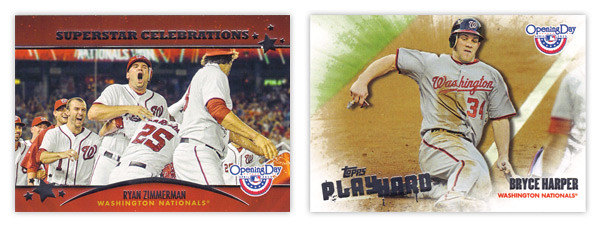
Next we have the Superstar Celebrations cards, which were included in last year's set. These are basically team-wide mobbings of players following what I presume to be walk-off hits. Design-wise, they're pretty standard with red bars across the top and bottom with some silver foil to add some sparkle. Topps decided to keep the fun elements to the photographs and play the rest pretty standard with works I suppose. Compare that to the Play Hard inserts which feature guys in the middle of some 'gritty' baseball moments such as sliding home, stealing bases or laying out to make a catch. The edges have been grunge-feathered which helps with the theme and stays away from a standard design.

I know the target for this set is a lot different than the rest of Topps releases and not all collectors even bother with it, but I usually enjoy spending $10 to take a look at something different like this. Design-wise, Opening Day seems to have a better rate of non-misses than even Topps' flagship. Everything is from decent-to-good and decidedly non-stuffy. In other words, it's fun.

Base cards: 4/5
Blue Parallels: 5/5
Ballpark Fun: 3/5
Opening Day Stars: 4/5
Superstar Celebrations: 3/5
Play Hard: 3.5/5
OVERALL: 3.75/5

Sunday, March 3, 2013

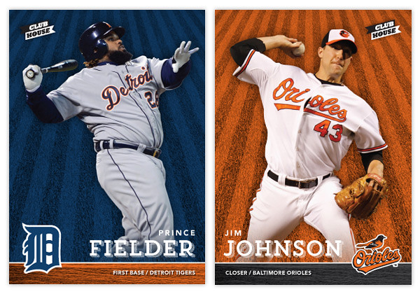
2013 Clubhouse


With spring training and the World Baseball Classic in full swing, my mind is definitely focused on baseball again, which hopefully means more frequent design posts. It'll be interesting to see if I have any fresh ideas after a year or if I'll fall into the same patterns like Topps does on occasion. Anyway, here's a look at the 2013 Clubhouse series. This is meant to be the low-end, Topps Opening-Day-esque product in the Spirit line. Like last year's design, it's a bright and colorful, no-frills design.


The front of the cards feature an action shot cutout of the player on top of a team-colored background with an outfield grass pattern. On the bottom is a bar with the secondary team color and a wood pattern. With the player's last name big, their first name and position/team are found above and below. I always find it important to include team/position on base designs, especially for a product marketed towards those learning the game. Alternating corners from card to card, the team's primary logo is the final element of the front design.


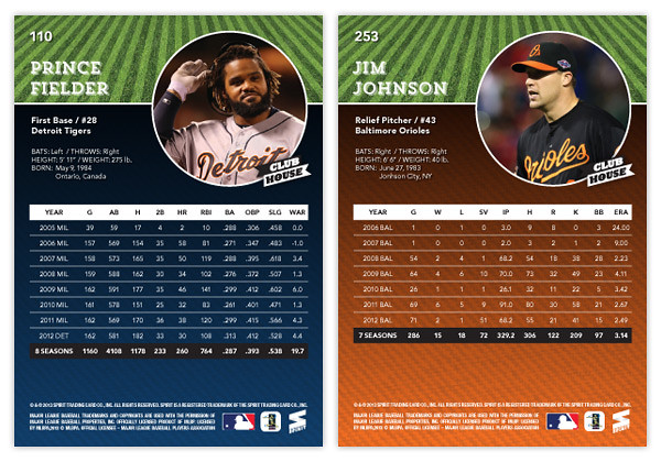
For the back, we've got a full-color player photo to the right and the player name/bio on the left. The grass pattern from the front makes it way to the back, this time in its natural green state. The bottom portion sees a big block of team color with a big chunk of career stats on top.

Keep an eye out for a few Clubhouse inserts coming up. I'll probably do another All-Stars design but hopefully I'll find some inspiration for some new and different insert ideas.


Sunday, February 24, 2013

REVIEW: 2013 Topps Series 1


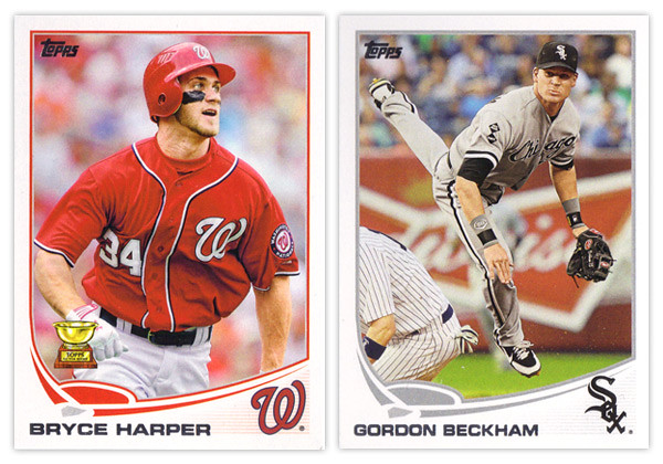
The 2013 season hasn't officially begun yet but the commemorative start happened a few weeks ago with the release of Topps Series 1. Ok, I know I'm really late on this one but better late than never. Anyway, here are my thoughts on the design-related parts of the set.

Starting off, the base card design is a nice step up from 2012's. They went with the clean white border once again, but this year it curves up past a rectangle on the bottom segment. This make the silver foil name easy to read (unlike year's past) regardless of how the light hits it. The most prominent design feature is the abstracted baseball diamond above the name. This adds the biggest pop of team color to the card but is a little whimsical for my tastes. The homeplate lingers a little to close to the name and the curves of the baselines are a little too exaggerated and unnatural. In the bottom right corner is the team cap logo. This is a good anchor for the corner even though the faded lines beneath it can be a little distracting. One thing I do miss seeing is the player position. I could easily see them finding space for this bit of info either in the white space on the left between the name and baseline or in the field shape itself.
The back of the card uses the same field and curve elements so it's a pretty good match for the front. The diamond graphic in the corner leaves room for the number which is in the correct corner again this year after being on the wrong side in 2012. The stats and player write-up look good and are easy to read. The faded lines in the bottom right corner are again unnecessary, this team creeping up into the stat box. The other item of note is the Career Chase line just below the player vitals. This is a neat little extra with some of the listings a little tongue-in-cheek but other still relevant. And I'm sure you've all heard about the whole Pete Rose thing by now. Anyway, I like the Career Chase inclusion here since it fits into the theme they have running through the whole flagship this year.


Now on to the parallels. Once again with have the standard golds serial numbered to the year (/2013) and a sparkly parallel, though this year it's green (emerald). Green has always been one of my favorite colors so I really like them. There are also the black parallels again this year along with 2 new ones: camo and pink. The camos are numbered to 99 and the pinks are to 50. Both seem to be pretty rare finds. Another thing they have in common is I guess they're supposed to be in support of something (military and breast cancer awareness). I really don't know the point of that since it's not like their inclusion somehow make a contribution to those respective causes. There's no DAV or Yellow Ribbon Fund logo on the camos and nothing about Susan G. Komen or similar entities on the pinks. In a way, I find it a little bit exploitative of Topps to do these particular parallels. And to top it off, they're actually pretty ugly to look at.
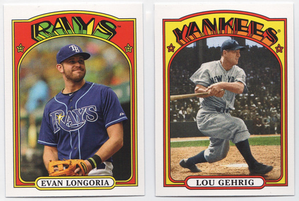

We've got more random minis this year with the 1972 design. Regardless of what you think of the 1972 design, let me say this: Topps, please stop releasing new cards with old design in anything other than Heritage. It's getting really old and you're watering down these designs. You have the Heritage line to celebrate your past so please stop injecting it into the flagship. Stop.


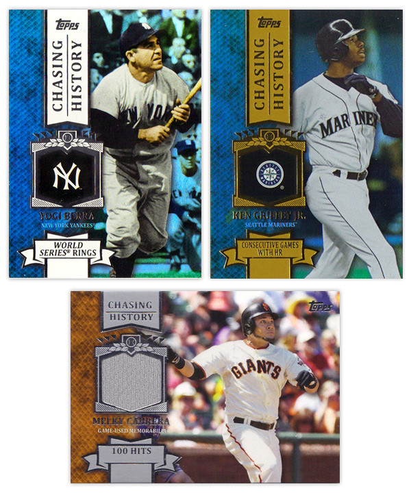
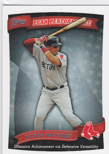
Just as last year, the inserts all follow a similar theme. The gold thing didn't have the flexibility last year that the chase seems to have this year. The big one is Chasing History, which is basically the same as last year's Golden Moments, 2011's Topps 60, and 2010's Peak Performance. The design here is a big step up from the previous efforts. They have to design these in a way they can insert the relics without changing up anything else. The holding frame for the logos kind of look like a medal hanging from a ribbon on the vertical cards. On the left is a team color knit design with an action shot on the right. It's a good balance on the horizontal cards but there seems to be too much space on the left of the vertical cards. The fonts and everything are pretty standard but do look really nice here. And in case you didn't think Topps was parallel-crazy enough already, we now have standard, non-numbered insert parallels. The Yogi card is a holofoil parallel with the team color spot on the left and the background. It's kind of shimmery like Bowman Platinum cards are. Then to top it off, there are retail-only gold parallels (Griffey). These are exactly the same but with gold foil on a gold ribbons instead of silver foil on a white ribbon.
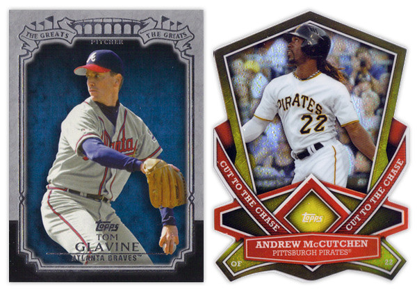
The nicest looking insert from Series 1 is The Greats. The design is actually understated with the gray and black border and some restrained foil embellishment. My only complaint would be the it seems a little top-heavy but that's a minor quibble. On the other side of that coin is the Cut to the Chase die-cut insert. These are incredibly busy with all of the weird cuts and shapes. They're also very similar to the die-cuts we've been seeing lately in the Bowman Chrome, Topps Chrome and Finest sets. I hate how not a single corner is rectangular as it makes it hard to get into holders sometimes. Bottom line, not a fan.


Chasing the Dream is this year's answer to the Gold Futures insert from last year. I like that the design featuring players of the future is decidedly more modern looking than the rest of the inserts. They're nice and colorful without any negative attributes. And finishing up is the Calling Card insert. These look to be about 4 years late in regards to design trends. I'm not really sure how the motif correlates to the subject, player trademarks or routines. The colors are pretty bland and the skinny border on the right side catches me every time. It looks like it's mis-cut.

Wrapping up, this year looks to be an improvement over 2012 across the board. The complaints have more to do with how Topps constructs a set than design decisions. There could be some tweaks here and there but for the most part it's a solid offering.


Base cards: 4/5
Photography: 4/5
Parallels: 3.5/5
'72 Minis: 3/5
Chasing History: 4.5/5
The Greats: 4.5/5
Cut to the Chase: 2.5/5
Chasing the Dream: 4.5/5
Calling Cards: 3.5/5
OVERALL: 3.7/5

Saturday, December 22, 2012

WARriors...Come out and pla-ay...


First off, and admission: I've never actually seen The Warriors movie but have heard it referenced so many times I don't really feel the need.

One of the big topics of discussion this off-season has been the whole Cabrera vs. Trout debate which is really a microcosm of the bigger "old school/new school"divide. One side relies on gut feelings and eye tests, the other on statistics and analysis. Personally, I fall somewhere in the middle, probably leaning more towards the sabermetric side. I feel I'm still in the process of rewiring myself. It's hard to unlearn being impressed by a .300+ average or 20+ wins since those numbers where instilled in me at an early age to be benchmarks of success. I still have to pause and process my thoughts when I see .320 referred to as bad (in the case of on-base percentage.) Hopefully in time I'll grow accustomed to whatever new numbers become the dividing line for bad/average/good.

A few months ago I did a Triple Crown Contenders insert design. As the MVP debate proceeded and I found myself siding with the Trout lobby, I kept feeling these waves of embarrassment that I had posted such a thing. Even though the influences for the idea were previous Triple Crown sets and the fact that such 'contenders' are pretty popular collecting subjects, I felt like I was propagating the "old school" agenda that I no longer identify with. So I decided it would be good to show the other side of debate.

I'm going to assume that you all know about WAR and are as sick of all the "WAR: what is it good for?" references as I am. I know that sabermetrics goes way beyond this singular stat but it really is the best entry point to thinking differently about statistics. So obviously, this set is about WAR.

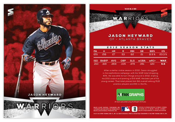
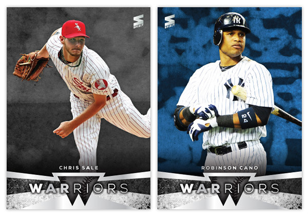
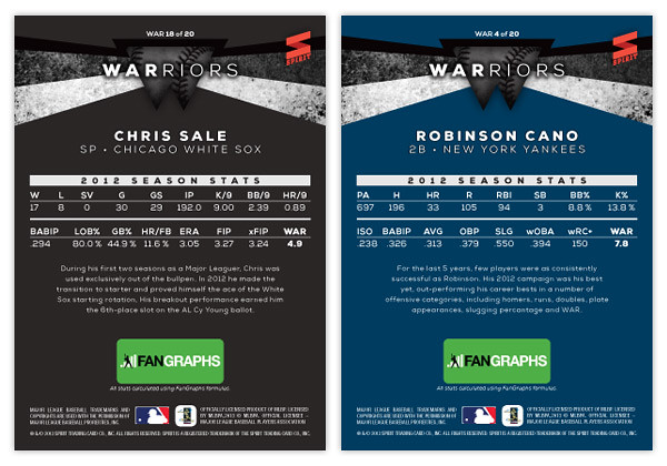
It features 20 players: the top-10 position players and top-10 pitchers according to WAR totals. I think the WARRIORS name is kind of clever since so many find WAR proponents to be frail, nerdy little fellows. Also, when "old schooler" refer to intangibles like "gritty" and gutsy" it drives sabermetricians nuts so this kind of pisses in both sides' Cheerios.


The front design features a full-color player cut-out over a grungy, color-soaked background. At the bottom we have a little abstract W shape in the center with some grungy angular bars shooting out behind and around. There are a couple of silver foil shapes along with the WARRIORS text and the player name.


On the back side, the WARRIORS shape moves to the top and the background is set in a solid team color. The player's 2012 stats are split into 2 lines below. These are the advanced stat lines from Fangraphs and I've included their logo below since they'd probably have to be in on this. There are 3 different versions of WAR so I thought it would be necessary to single out one source and Fangraphs was my first choice.

Hopefully not too many of you out there are grinding your teeth while reading through this.