
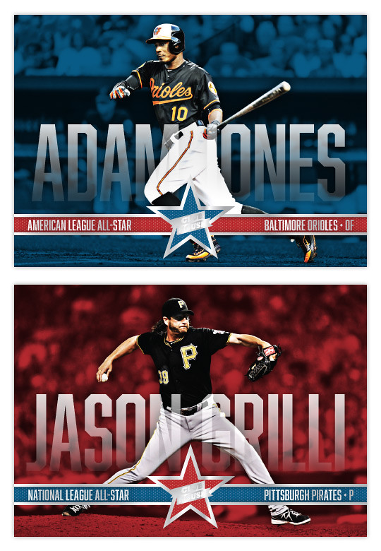
Just in time for the All-Star break..... aww, crap. Well, here's the 2014 Clubhouse All-Stars design anyway. I decided to go horizontal this year to match the 2014 Clubhouse base set. I also wanted to mimic one of the big features from that so I ran the player names really big across the width of the card. To make sure they didn't impose too much, there's a little bit of transparency to them as well as a soft fade. Hopefully they're still readable even if you don't see every edge of every character. The letter height varies depending on the length of the player names. That's why Iwakuma's aren't nearly as tall as Harper's below.
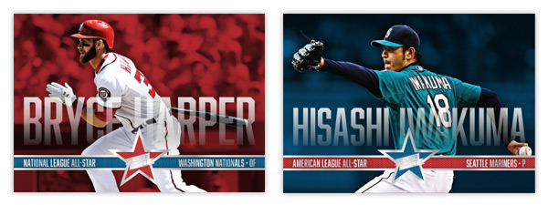
Along the bottom is a strip of info: league, team and position. The color of the bar alternates with the background and star color.
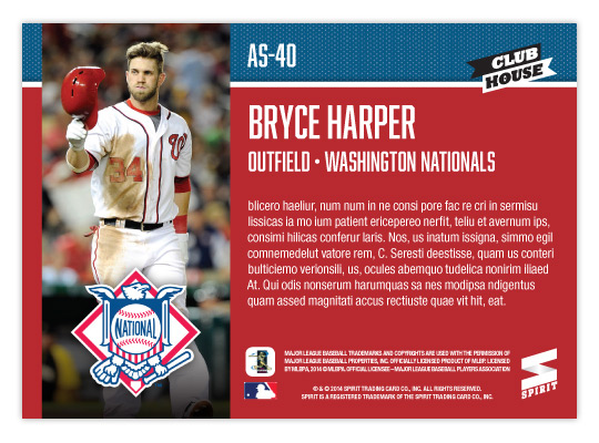
On the back, background color is solid so the text is plenty easy to read (other than it being jibberish here.) There's a vertical player photo on the left with the AL/NL logo on the bottom. I packed last year's design with too much info on the back that I'm sure would be nearly impossible to read. This year, it's all cleaner and clearer.
No comments:
Post a Comment