
I'm trying something a little different this year. Instead of just posting a handful of cards from the set, I plan on designing and posting them all in increments of 10. Series 1 and 2 will both feature 300 cards with all 30 teams represented on 10 cards each. Players that have changed teams this offseason will be in Series 2, negating the need for airbrushing (which would have rendered this project impossible for me.) I'm still on the fence about what to do for Series 3. It would obviously be a smaller series but I don't want to fill it with crap like Topps does Update. But I know there will be some in-season trades and guys that come out of nowhere that won't make it into Series 2. I guess we'll see what my option are come August or so.
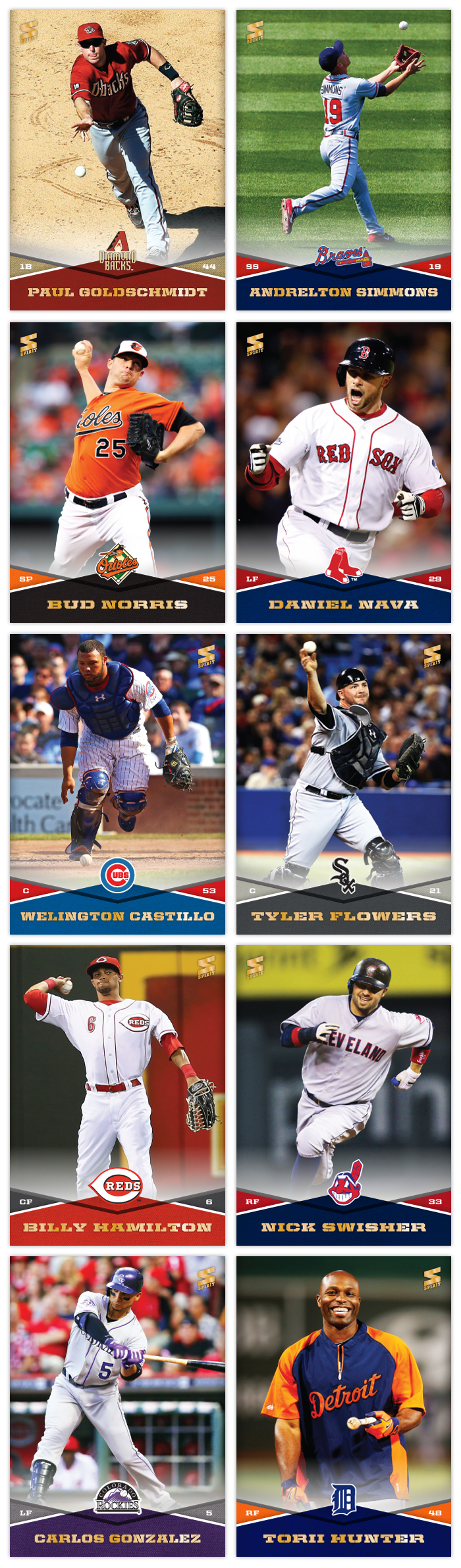
Design-wise, I wanted to make sure I had a template that didn't require me to cut out every photo. I started with a full-bleed photo in the background leaving space at the bottom for the design elements. These criss-cross team color patterns add a lot of vibrancy but leave room for the relevant information without making things too busy. The secondary-color triangles house the player position on the left and number on the right. On the very bottom is the player name in a wide stencil font that matches the angles from the criss-cross. Luckily I have varying widths to accommodate players with longer names. And on top of the center diamond is the team logo. The top and bottom sections have a slight white fade between them that'll be stretched up for future autograph inserts.
The first 10 on the checklist run alphabetically by franchise location, from Arizona to Detroit. There's no particular order for the players on each team. I just kinda grabbed a few stars and non-stars and sprinkled them together. My goal is to avoid having too many similar photos, so there will be a mix of candid non-game shots like Torii Hunter or spectacular angles/actions like Andrelton Simmons. There's no avoiding a cavalcade of standard pitcher delivery photos like Bud Norris' up there but I'll try hard to avoid embarrassing pitch face when possible.
So this was the first of what will hopefully be many more for 2014. I'm just gonna state up front that if I don't make it all the way through Series 3, don't hold it against me.
Great as always.
ReplyDeletePerhaps for Series 3 you could do a mix of trade deadline additions and September call ups.
That's probably the solution, hoping there are enough noteworthy names to make the set commerically desirable. It'd be nice to have some no-bullshit rookie cards, too.
DeleteNice looking cards. I wish you much success on your quest.
ReplyDeleteCard backs? I'm assuming that won't be a part of the full run, but will you mock up a couple for example?
Thanks, I'll definitely need the support. I may do a handful of card backs somewhere down the line to break the monotony. Hopefully it doesn't break me that soon.
DeleteThis is a great design. Looming forward to seeing more.
ReplyDeleteWhen I win the lottery and start my own card company, you will be the first hire.
ReplyDeleteAwesome, much better than what I've seen of 2014 Topps so far.
Ha, thanks! That really would be about the only way to get in the game, huh?
DeleteWow! These look amazing! love that Goldschmidt is the first card!
ReplyDeleteThese look really really cool. Too bad Topps only has the license otherwise this would be a great alternative.
ReplyDelete