Showing posts with label Pablo Sandoval. Show all posts
Tuesday, March 18, 2014
2014 Spirit Base Series 1: 201-210
#201 - Phillippe Aumont
I wonder if Phillippe has gone through life correcting people that think his last name is a typo.
#202 - Russell Martin
So nice to see Martin finally with a team that's easy to root for.
#203 - Matt Adams
Hey look, he can field, too.
#204 - Andrew Cashner
This photo needs some context for sure.
#205 - Pablo Sandoval
I really hope Panda keeps his slimmed down physique for more than just this (contract) year. Even if he *gasp* leaves the Giants, I hope he stays healthy enough to silence all the #fatchat that's been plaguing him the last few seasons.
#206 - Mike Zunino
I'm really enjoying all these catchers' photos I've found thus far. They all look bad ass in their gear.
#207 - Matt Moore
The smattering of blurry red in the background is kind of odd but is a nice contrast for the Rays' uniforms.
#208 - Geovany Soto
Great action shot. I wish the ump was a little blurrier or just out of the frame completely, though.
#209 - Brandon Morrow
I'm really glad the Blue Jays rebranding happened. They look so good in their old/new blue uniforms.
#210 - Jordan Zimmermann
Zimm looks a little Oswalt-esque here. I hope he ages a little better on the mound than Roy did.
Labels:
2014,
aumont,
base,
cashner,
concept,
design,
geovany soto,
matt adams,
Matt Moore,
morrow,
Pablo Sandoval,
russell martin,
spirit,
zimmermann,
zunino
Thursday, July 5, 2012
THIS IS THE REMIX: '91 Score
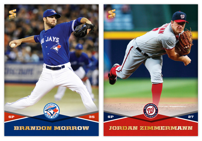
Trying out a new feature here on the old design blog. I'll take a look at a previous card design and do a little remixin' to try and freshen them up a bit for today. This will be a cross between what I normally do and customs that other guys out there do.
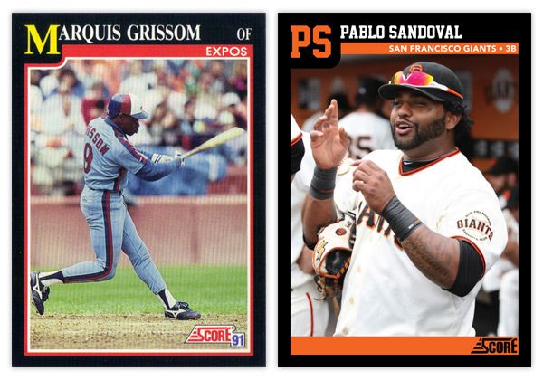
First up is '91 Score. I've always thought this was a vastly underrated design, especially compared to some other designs from 1991. It has a bit of understated dignity to its benefit.
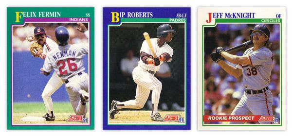
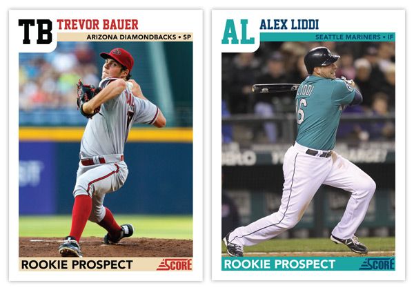
There aren't a lot of elements to the design, so its simplicity is big virtue. The solid color borders add some personality, though I'm not sure the color combinations are the prettiest. That teal & purple combo on Felix Fermin's card just doesn't sit right. In the upper left corner, the first letter in the first name is big and yellow, pushing the colored border down into the frame a bit. This kind of reminds me of playing cards, like a big K or Q in the corner for a king or queen card. It's definitely one of the most prominent and successful features. The rest of the name is spelled out in white at the top, along with team name and player position inside a secondary color bar. There were also some 'Rookie Prospect' cards in the set with white borders and a "ROOKIE PROSPECT" flash across a red streak towards the bottom. Paired with the green inset border, these cards look a little Christmas for a summer sport such as baseball.
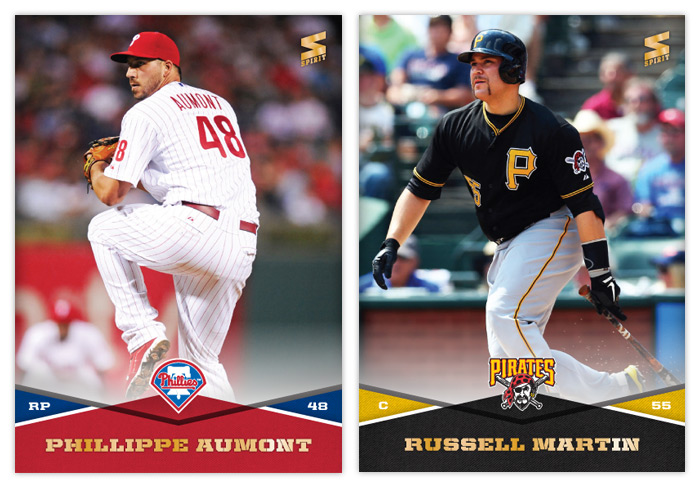
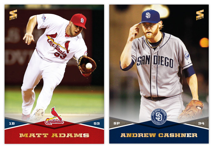
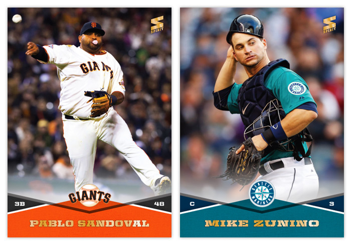
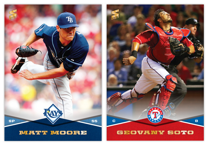
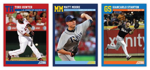
For the remix, I pretty much tweaked every element ever so slightly. The colored borders now reflect the featured player's team, as does the inset stripe. I also removed the strokes around the frame to help clean up the clutter. And instead of having the first letter in the first name biggified, we now have a monogram of the first and last name. This helps with the spacing of the initials and little frame bump. The position has moved from the corner down into the inset bar along with the full team name (city/state and name.) That helps to accommodate some of the longer player names. The one thing that's an addition and not just a tweak is the secondary inset bar I added at the bottom. I though this just helped to balance the top of the card out. Plus...
it makes for a great little spot for the 'ROOKIE PROSPECT' notation to rest, along with the Score logo.
Overall, I think I kept with the tone and feel of the original set but made some minor adjustments to enhance the design a bit. The introduction of the team colors spruces it up along with some different font choices. Hopefully these Remix posts will be sprinkled in alongside some of my original Spirit designs.
What are some sets you think could use a 'remix?'
Labels:
bauer,
design,
giancarlo stanton,
liddi,
Matt Moore,
Pablo Sandoval,
remix,
score,
torii hunter
Monday, January 9, 2012
2012 Spirit FanFare Autos
It's 2012 and time to reactive the blog here. We're less than month from the release of 2012 Topps Series I so hopefully we'll have some product review posts shortly. As for now...
Here's my first autograph insert set for Spirit. The 'FanFare' theme here highlights the players that are 'fan favorites' on each club. Sometimes they're the superstars, sometimes they're the local favorites. I know it'd probably be nearly impossible to have an auto checklist that wasn't littered with pinch hitters or bottom of the lineup guys, but you know that's what everybody wants.
The card design is pretty basic with team-color swatches in the bottom and also behind a full-action cutout. The player name and Spirit logo are in a silver foil along with a thin frame inset around the edge. Peeking up just above the player name is a soft white gradient for the player's autograph. A nice touch to the autos would be having them sign them with a team-color ink.
The back of the card has team colors as well, but with a new 'wooden fence' texture to supplement the mesh fabric texture standard on most Spirit cards. With player names on the left and a candid portrait to the right, the next most prominent feature is the FanFare pennant with the team logos. Below the Spirit logo is the 'official' COA for each individual card.
My intentions were to have a 30-card set but I'm leaving the checklist open since I'm not 'in the know' for every fanbase as to which player would be the crowd favorite. Some would be obvious (Braun-Brewers; Hamilton-Rangers; Votto-Reds) while I wouldn't know where to begin with teams like Arizona or Houston or Baltimore.
Labels:
auto,
concept,
David Wright,
design,
Evan Longoria,
FanFare,
insert,
Pablo Sandoval,
spirit,
team
Subscribe to:
Comments (Atom)