First off, Happy New Year to everybody. 2016 is here so I hope everyone is looking forward to the Giants' World Series win this fall as much as I am. The other 29 fanbases around the league had your chance last season. For you non-Royals fans, 2017 is just a year away. I already have the 2016 Spirit base design completed. I'm just waiting a little bit to start posting them in case one of the players I picked gets traded. (I've already had to scrub my Shelby Miller/Braves selection.) I'll be posting them on Instagram like last year leading up to a full post here, so look forward to that. In the meantime, I plan on posting a "remix" or two, starting off here with 1992 Topps.
The most noteworthy thing about Topps' 1992 release is the use of a coated card stock for the first time in a Topps' flagship release. On top of the smoother surface, the entire card was just brighter than ever before. The design itself was a continuation of the
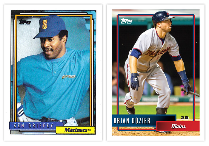
1991 set with the color and info along the bottom of the card and some extra frames inset from the borders. There's not a lot of exciting stuff going on here, basically just colored boxes with text. For better or worse, I stuck with this strategy for the remix while just making some slight adjustments.
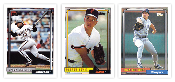
On the original design, the boxes had some hatching added to the bottom and left edges to help add a sense of depth. It's a minor detail that does what it's supposed to. The boxes themselves are mostly team-colored though there are a few random exceptions like the yellow used for the Giants here. The inset frames are also
kinda team-colored along with an additional white line on the outside. Topps was able to use these frames to add a little bit of excitement as they had some periodic overlapping where the photographs called for it. Something as simple as having the player's hat or glove or bat cross over that line really adds depth and interest.
Instead of any kind of branding, the team name is simply spelled out in a cursive typeface on the smaller box with the player name in an all-caps sans-serif font in the bigger box. Again, these colors are seem to correspond with the team colors most of the time but not always.
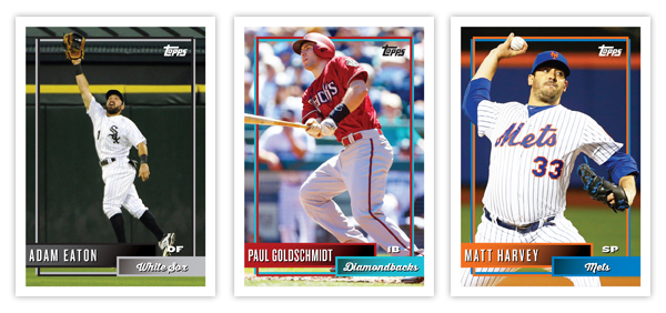
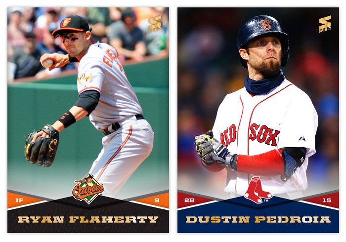
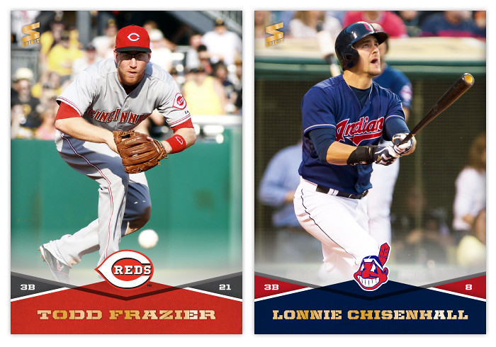
Looking at the remix, the basic feel is very similar with just each area tweaked ever so slightly. The shading of the boxes is gone and instead each ones fades from one team color to a slightly darker version. There's a solid stroke around each with the respective team color. Those strokes then connect with the new inset frames that extend from the boxes. You can see on the original how there was a thick black outline around each frame. Those added a lot of unnecessary heft that imposes on the photograph. I decided to stick with just two simple lines that interact with each other instead of overpowering the borders. The added distance between them and outside white border also keeps things from being as congested. The players still overlap the frames when appropriate.
The text treatments are the same but with different typefaces, though all are in white to keep them legible. (I'm still not sure why the 1992 Bohanon up there has his name in yellow since the Rangers haven't had yellow happening in their branding ever.) I did make the addition of the player position in the negative space between the right edge of the name box and the right frame just above the team box. It can be black or white, depending on the particular image below it on each card.
Like all the other remixes I've done, the feel is intact while the elements have just been tweaked/updated to reflect either more modern design elements or correct (perceived) design errors.
What set(s) should I do next? Surely there are a few designs from the last 30+ years that are just a few little adjustments away from being good. Let me know what you think could use a 'remix.'