Showing posts with label hanley. Show all posts

Tuesday, November 14, 2017

2017 PENNANT BOX BREAK - PACK 17

171. Ian Kinsler

234. Leonys Martin


62. Carlos Beltran


110. Brad Hand

95. Salvador Perez

161. Tyler Glasnow (RC)

81. Michael Saunders

92. Rick Porcello

298. Hanley Ramirez

FF7A. Jake Lamb - Future Favorites Autograph


Here’s the fourth and final hit of the box. A Jake Lamb auto is probably the third best hit behind the Odor/Joey Bats dual auto and Miguel Cabrera Dream Team auto. He has enough potential for it to be a better hit down the road. Still seven packs left. Hopefully they’re exciting enough to make up for their hitlessness.

Saturday, April 29, 2017

2017 SPIRIT BOX BREAK - PACK 19

90. Jedd Gyorko

260. Cory Spangenberg

276. John Lackey

225. Joe Mauer

183. Hanley Ramirez

126. Ben Gamel

197. Adam Jones

180. Raisel Iglesias

282. Braden Shipley (RC)

G269. Matt Moore

TL118. Brandon Belt - Team Leader (SFG - HRs)

It still feels weird to call Brandon Belt the Giants’ team leader in homers AND all-star but they’re both 100% accurate. Granted, 17 HRs being the team high is kind of sad...

Friday, April 14, 2017

2017 SPIRIT BOX BREAK - PACK 6

127. Todd Frazier


102. Justin Verlander

210. Andrew Heaney

10. Alex Colome

38. Ender Inciarte

251. J.T. Realmuto

51. Jacoby Ellsbury

49. Curtis Granderson

258. Andrew Benintendi (RC)

G207. Jurickson Profar

N13. Hanley/Jose Ramirez - Namesakes


New insert here. I did a “Namesakes” insert way back in 2012, my first year blogging. Like then, this year’s version features 20 cards highlighting MLB combos sharing the same surname.  Here’s the checklist:
N1. Bradley - Jackie, Archie
N2. Cabrera - Miguel, MelkyN3. Davis - Wade, ChrisN4. Diaz - Almedys, EdwinN5. Gonzalez - Carlos, AdrianN6. Hernandez - Felix, CesarN7. Herrera - Kelvin, OdubelN8. Marte - Starling, KetelN9. Martinez - J.D., CarlosN10. Miller - Andrew, ShelbyN11. Murphy - Daniel, John RyanN12. Perez - Salvador, RobertoN13. Ramirez - Hanley, JoseN14. Ramos - Wilson, A.J.N15. Sanchez - Aaron, GaryN16. Santana - Carlos, DannyN17. Seager - Corey, KyleN18. Turner - Trea, JustinN19. Upton - Justin, MelvinN20. Wright - Steven, David

Some of them are siblings but for the most part it’s just random coincidence. I can’t wait until Rougned Odor’s younger brother Rougned gets called up. It’ll be even better than a Chris/Khris Davis card (which I opted against since Wade is more noteworthy than Khris.)

Wednesday, September 24, 2014

2014 Spirit Base: 461-470


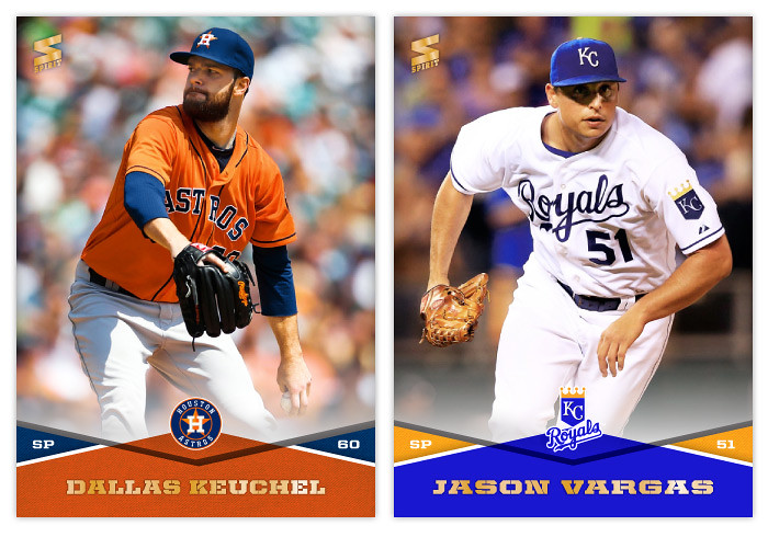
#461 - Dallas Keuchel
I didn't realize Keuchel is from Tulsa and went to the University of Arkansas (where my wife currently works) until making this card. I'll probably take a special interest in him going forward.

#462 - Jason Vargas
Not a lot of pitcher fielding shots so far. So here's one.


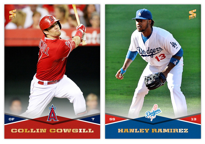
#463 - Collin Cowgill
Is it better to just write something stupid like this or to have nothing written at all?

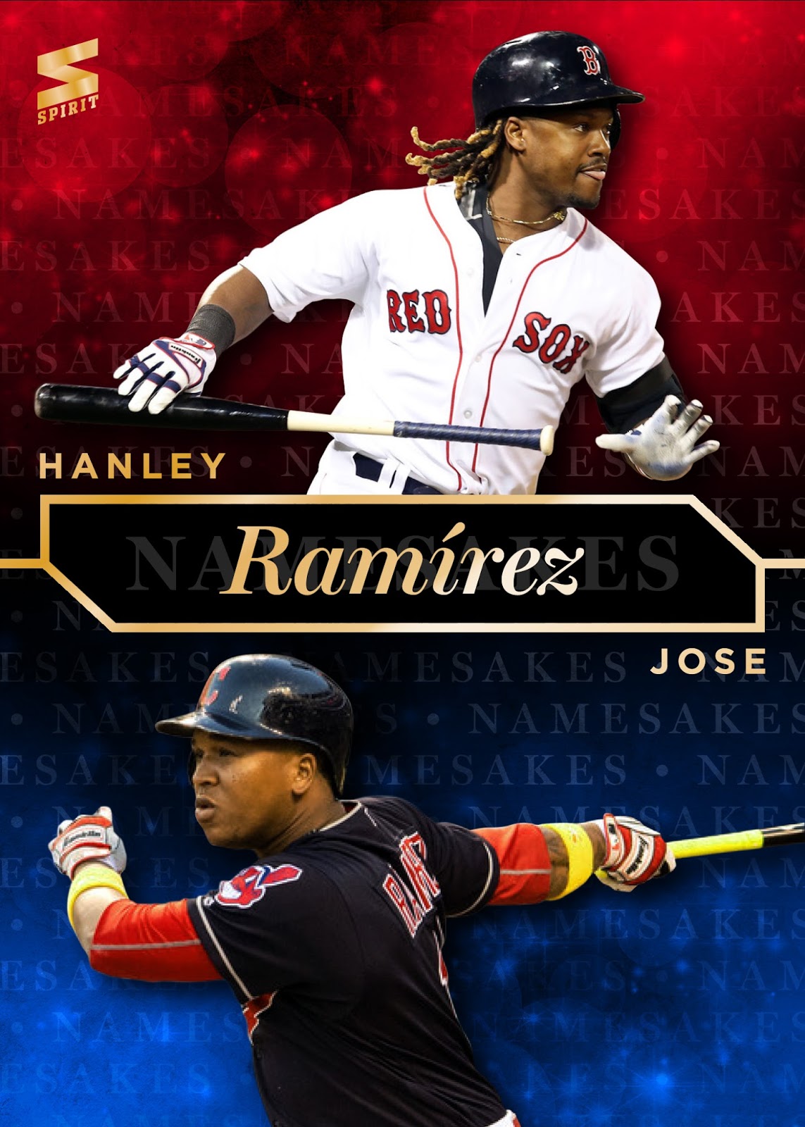
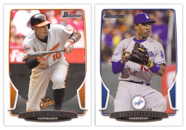
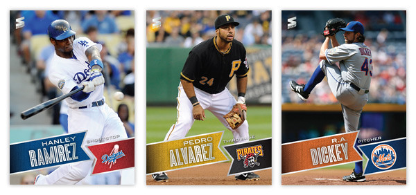
#464 - Hanley Ramirez
It's saying a lot that he's one of the least-detestable Dodgers.


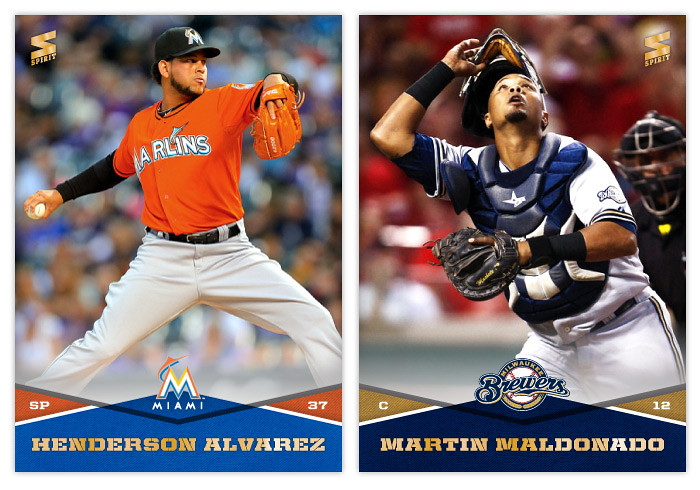
#465 - Henderson Alvarez
I hope Alvarez throws another no-hitter on the final day of the season again and starts making it an annual thing.

#466 - Martin Maldonado
I really hate the lighting inside Miller Park. Every shot there looks kind of dead and lifeless.
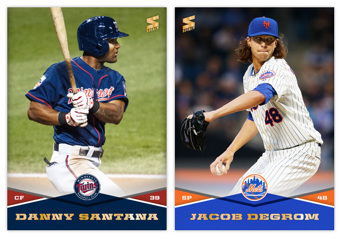

#467 - Danny Santana
I had zero knowledge of his existence until making this card. I needed to replace Pedro Florimon after noticing he was released by the Twins in May.

#468 - Jacob deGrom
I'm guessing it'll be either deGrom or Billy Hamilton to win the NL Rookie of the Year. Could be another Puig/Jose Fernandez situation, though at about half the volume.


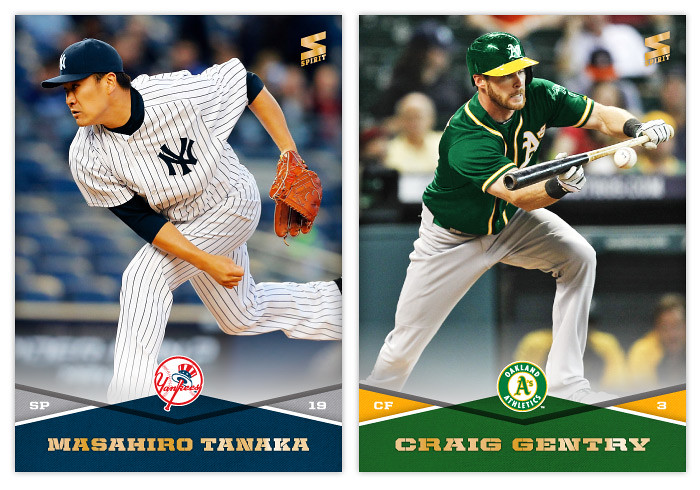
#469 - Masahrio Tanaka
Speaking of ROY debates, I wonder if it'll be Tanaka or Abreu in the AL. There's obviously the Yankee factor to contend with, but since Tanaka spent a good chunk of time on the DL, maybe Abreu edges him out. THIS is your Puig/Fernandez for 2014.

#470 - Craig Gentry
More bunting!

Wednesday, May 15, 2013

REVIEW: 2013 Bowman


The biggest takeaway from the 2012 Bowman design was how it was a big departure from what Bowman had been putting out for many years past. As we review the 2013 version, it looks like that big year-to-year jump was merely aberration and not a new gameplan heading forward. Just like the 2012 version, this year we have white borders, not-quite rectangular frames in team colors, silver foil names, subtle drop shadows around the players, team logos centered above the name block. Honestly, you could be looking at last year's cards while reading that description and it would be 100% accurate. About the only distinguishing features here are the little tabs folding in on the left and right sides and the soft white overlay to finish out that curve. If we didn't have 2012 to compare this to, I'd really like the base design here. But as a follow up, it looks more like a rehash and suffers a bit.


For the backside, the similarities are even more....similar. The layout is identical to 2012 with a little tinkering to fit this year's look. The colored tabs on the bottom and the black nameplate are pretty much where those embellishments are made. I mentioned a couple things on last year's review that I thought were easy improvements to make. I suggested that the last section of the Bowman Briefing be changed from EVOLUTION to UP CLOSE (like it is/was on the prospect cards.) I doubt that any eyeballs at Topps saw my recommendation but somehow it was magically changed for this year. My other suggestion, however, seems to have gone without notice. The card numbers are still in the upper right corner, which means if you store these upright in a cardboard box, the numbers won't be visible. So once I again, I propose this amendment to the Baseball Card Constitution: horizontal backs have to be numbered in the upper left corner to help for storage box sorting.


Now on to what is basically Bowman's reason to exist: prospect cards. For 2012, I preferred the veteran design to the prospect design but I'm flipping it around for this year. The prospect design is a lot easier to distinguish here thanks to the solid team-color wedges above the name. There are some subtle shape differences to the frame and nameplates that also help them stick out. The team logos are removed to help save space for the autographs (I assume.) That means the team names are found below the player name and the position is moved to the right color wedge. 


Like every other Topps release, there are plenty of parallels again. Gold, blue, purple, orange, silver ice, etc., etc. The international cards are a little different this year. The flags have some texture to them so they aren't as glaringly obvious as prior years. Also, for American-born players, they have the flag of their home state up here instead of the Stars & Stripes. I'm all for anything that helps distinguish them from previous years. 


The Top 100 Prospects cards are actually pretty nice. They have a smooth, cool finish to them with some silver, black and blue/red colors around the border. There appears to be a die-cut version as well but, as I've mentioned before, I'm not a big fan of random-shaped die-cuts. I do like how the numbers are nice and big to help drive home the fact that there is a list they're referencing. And keeping with the blue, we have Bowman reprints with blue refractor borders. I'm so tired of reprints that I can't even bother to say any more about them.


Finally, we've come to what's probably the worst development so far this collecting season. Topps has decided to introduce minis into the Bowman line. Their reasoning is obviously... who knows, but here they are. They're an odd size, they're chrome, they're refractory, they're prospect-ory. I wish somebody with power at Topps could exercise some willpower and stop spreading things across every release like this. It's really getting old.

Overall, I'd feel better about the 2013 release if it all weren't so simliar to 2012. The base and prospect designs look like comps that didn't get picked up last year or were just saved away for a future release. I understand keeping some things consistent but this comes across as a little too lazy.

Base cards: 7/10
Parallels: 6.5/10
Prospects: 8/10
Inserts: 6/10
Minis:4/10
OVERALL: 6.3/10

Tuesday, September 25, 2012

BASE IN YR FACE: 2013 Spirit Base

Moving forward with our 2013 preview, here's the base design for the 2013 Spirit flagship. For reference sake, this is comparable to Topps Series 1 if, ya know, someone other than Topps had an MLB license.
Just like last year's design, 2013 features the full-bleed, full-color photo fronts. There's also a team-color banner to house the player names. The fonts here in silver foil are Blair Medium for the first name and position and Enamel Inline for the big, bold last name. In the opposite banner is the secondary color along with the team logo. All of these elements are on a ten-degree angle that helps make the whole a little more dynamic. Also, it conveniently mimics the angle of the Spirit logo in the corner.
On the opposite side, the angled banner is enlarge and filled with a more intimate player photo with the team logo appearing once again to its left. I'm really taking advantage of this MLB license and smearing their property all over this set. Offset from the team-color background, there's a white box for player info. Instead of doing the full-career stat box, I went with the previous season and career totals. That helps keep the design consistent from card to card since there can be quite a variation from player to player. Below the stats are 5 lines for a write-up.

This year is definitely from the same family as the 2012 Spirit design, but it's more like a second or third cousin than sibling. Lots of the DNA is there but rearranged. I love how bright and colorful the backs are and also how the front design doesn't get in the way of the photo, even enhancing it.

What do you think? How does this compare to the Topps 2013 flagship design?