Showing posts with label cueto. Show all posts

Thursday, October 26, 2017

2017 PENNANT BOX BREAK - PACK 14

156. Wilson Ramos


284. Lorenzo Cain

105. Ryan Buchter

18. Jesse Hahn

41. Gregory Polanco

21. Matt Moore

210. Johnny Cueto

230. Mark Trumbo

8. Kelvin Herrera

TB15R. Kolten Wong - Throwback Relic


I always like doing the Throwbacks relic cards with the throwback jerseys. They’re a little more unique than regular old relic cards using the odd colors like powder blue here.

Thursday, March 5, 2015

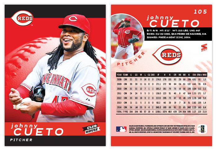
2015 Clubhouse

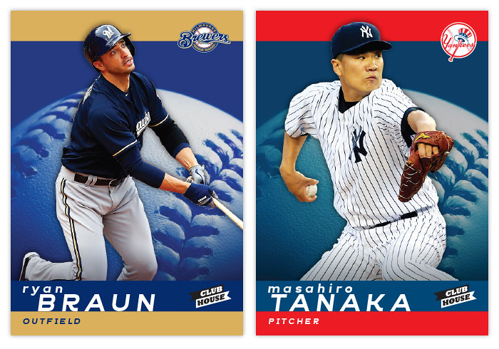
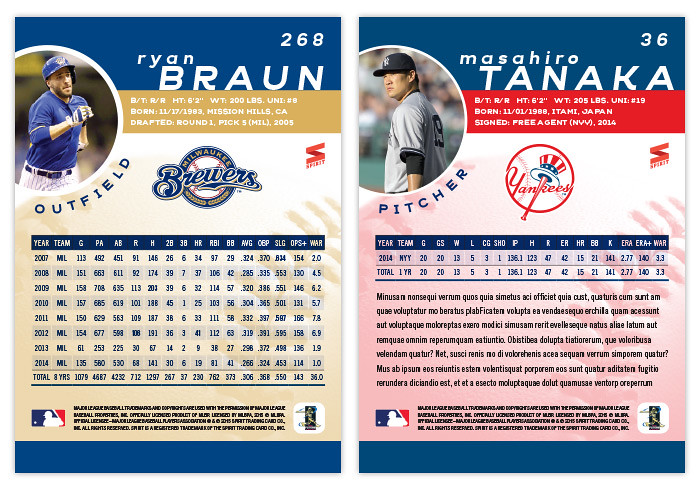
Time to check in with Spirit's "low-end" set, Clubhouse. This is traditionally a bright and colorful design and this year is no different.


I seem to be alternating between horizontal and vertical each year so I guess we're back upright following the 2014 design. The front of the card has solid team-color stripes along the top and bottom with team-colored baseball close-up in the center. The players are cut out and overlapping the stripe at the top which also is an anchor for the team logo. The last names are big and spaced out with the player first name running off-center above it.


On the back, the color stripes return to house the player name and vitals. There's a circle bleeding over from the edge for an additional player photo with the position following that curve below. Right in the middle is an even bigger team logo with a pretty full stat box below. Underneath that middle section is a screened-back version of the baseball from the front. For some of the younger players, there's plenty of room below the stats for a few lines of more information.

Unlike last year, I decided to keep these parallel-free so hopefully they'll be more inserts to fill out the packs. I already have the annual All-Star design done and ready to write once I get around to it, so it looks like I'm well ahead of last year's pace.

Saturday, January 25, 2014

2014 Spirit Base Series 1: 91-100

Sorry for the hiatus. I've had a busy week.


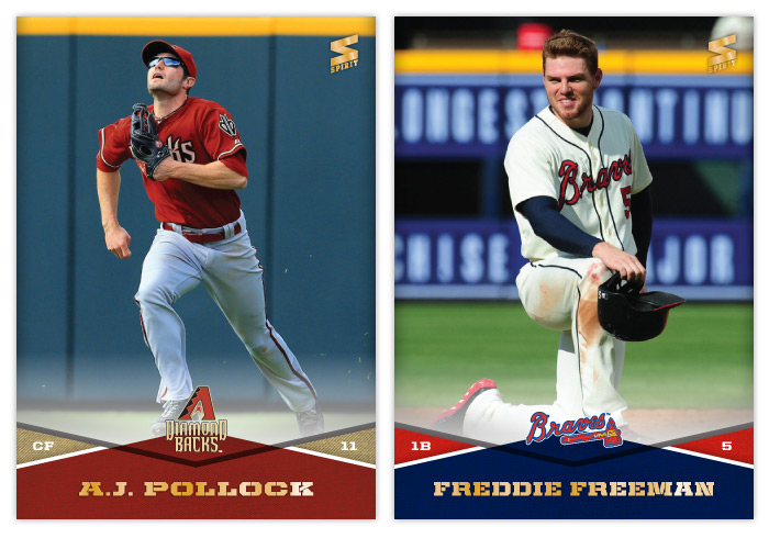
#91 - A.J. Pollock
It's nice to get an outfield shot where the guy's facing the camera, even if he has shades on.

#92 - Freddie Freeman
Freddie's looking like Adam Scott's ugly kid brother here.


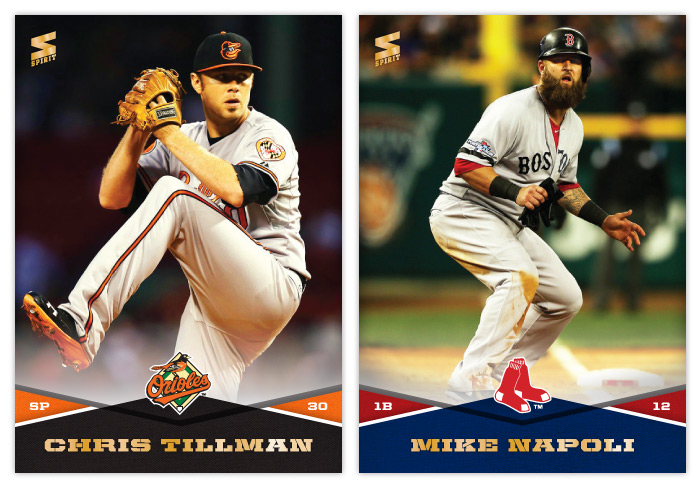
#93 - Chris Tillman
As I'm putting these cards together, I notice how some teams have similar photographs, most likely from the same photographers. This one looks pretty similar color-wise to the T.J. McFarland one.

#94 - Mike Napoli
Decided to go with that postseason beard. If I were Topps, there'd probably be an SP version with a photo like this.


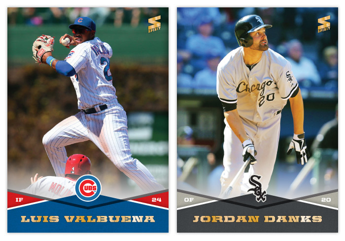
#95 - Luis Valbuena
One thing I like about this design is it allows for these plays at second to be captured without showing too much of the runner sliding. I know you can see a little bit of Molina here but it doesn't command your attention like the main subject does.

#96 - Jordan Danks
I honestly didn't realize there were two Dankses in the majors until I made this card. Them both being on the White Sox is probably the main reason.


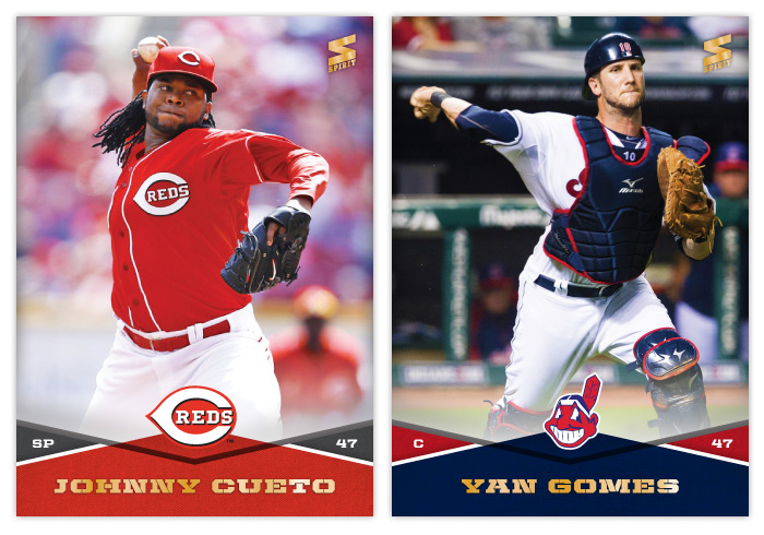
#97 - Johnny Cueto
I really do appreciate how red the Reds' jerseys are.

#98 - Yan Gomes
I wonder how long it'll be before Cleveland ditches Chief Wahoo and I don't have to use it on cards again.


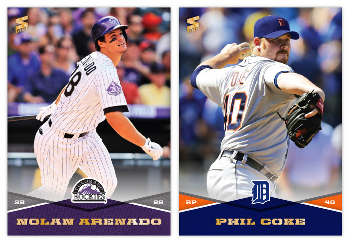
#99 - Nolan Arenado
Arenado probably would've gotten a lot more Rookie of the Year consideration if it weren't for Jose Fernandez and Puig. Not looking forward to having him in the NL West for the foreseeable future.

#100 - Phil Coke
Probably not the most flattering angle for Mr. Coke here but the options were limited.

Thursday, August 30, 2012

No license? No problem.


This post comes thanks to a suggestion by way of Kyle from Juuust A Bit Outside. He challenged me to put together a design tackling the same restrictions as Panini and Upper Deck face regarding baseball cards. Without a license from MLBA, they're not allowed to have any depictions of MLB logos on their cards. Even with a licensing agreement with MLBPA, the players themselves can be featured without any problems, but any type of MLB franchise logo has to go. That means either some less-than-exciting airbrushing or some less-than-exciting wardrobe choices.

Rather than go to the trouble of making the unnatural seem natural, I thought the best method to work around this restriction is to use photos of the players before/during/after the actual games where they happen to not be wearing a hat or helmet bearing a team logo. The most frequent setting for such a photo is the dugout. In between at-bats or after climbing off the pitcher's mound, you'll find a lot of players letting their hair down so to speak.

So that's how the Dugout line was birthed. With these on-field or 'in-the-dugout' portraits, you still feel some attachment to the diamond and these guys a players. It's not too far off from the bat-on-shoulder portraits we see from 40-50 years ago. If anything, they're more candid.


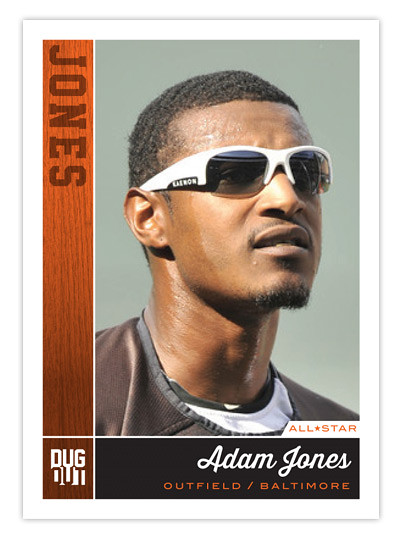
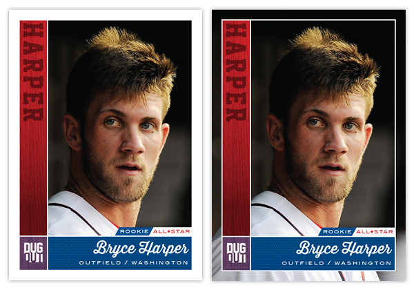
As for the design, we've got the team color boxes to the left and below the photo. The one on the left has a wood/bat texture with the player's last name branded into it. Below is the full player name in a baseball-y script with position and team underneath. It kinda sucks you have to go with the team city instead of team name but oh well.

For one of the first times on this blog, I'm actually offering a parallel. Instead of just changing the border color, I'm removing the border altogether! It helps to put the player into the baseball environment with just a little bit more photo showing. Another feature here are the little designation tabs just above the name box. For Adam Jones above, he gets an all-star tab while Harper gets that along with his rookie tag. 
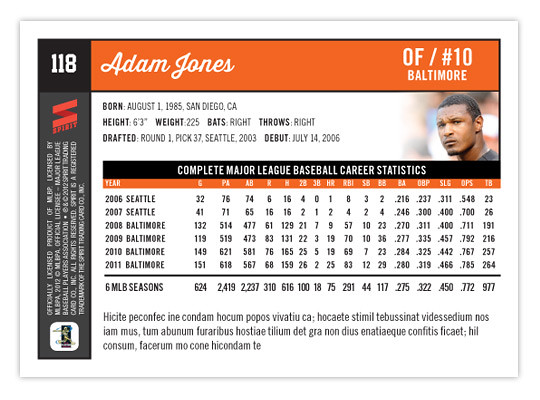
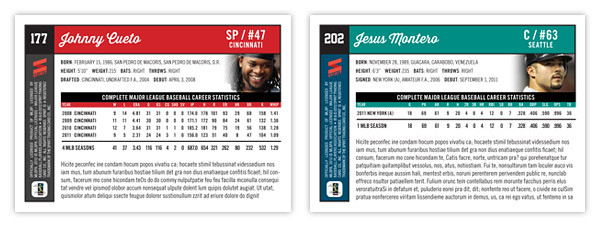
The back side is packed with information like a base card should be. The team color boxes are here again along the top and left edges. There's plenty of white space to keep things nice and readable.

Just above the stat block, we get an additional player portrait. Though small, this location helps keep them de-logo-fied. And below the stat box is plenty of room for a brief writeup about the card subject. Things are pretty clear and orderly. The front and back really match up for a cohesive design.

Though this started out as a set to get around the logo restrictions, I think it would actually be a good concept if Topps were to grab onto it and add some logos. As thrilling as it can be to see some outstanding on-field photography of players doing amazingly athletic things, a set like this that focused on catching players in those candid moments would be refreshing. The more connected a collector feels to the players depicted on these cardboard creations, the better for baseball.