Showing posts with label teixeira. Show all posts
Monday, March 21, 2016
2016 Pennant
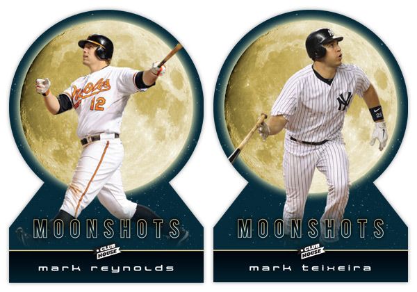
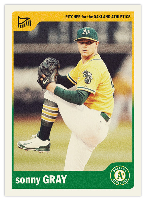
I've posted the flagship and the "low-end" sets, so now it's time for the retro set. The Pennant designs of the past haven't necessarily tried to emulate a particular era. Basically what I try to do is keep them simple while incorporating design elements and trends that are decidedly un-modern. I think it's a good strategy for me so I don't run into a situation like Topps has with Allen & Ginter and Gypsy Queen designs that are hard to differentiate year after year.
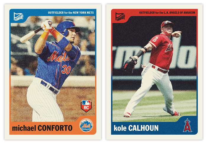
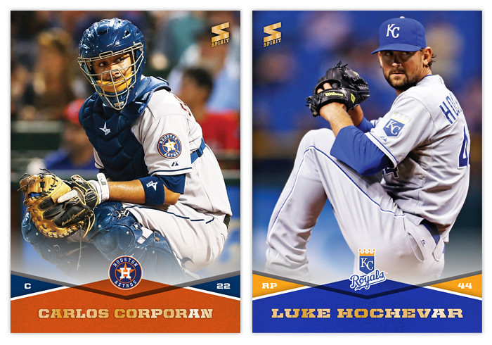
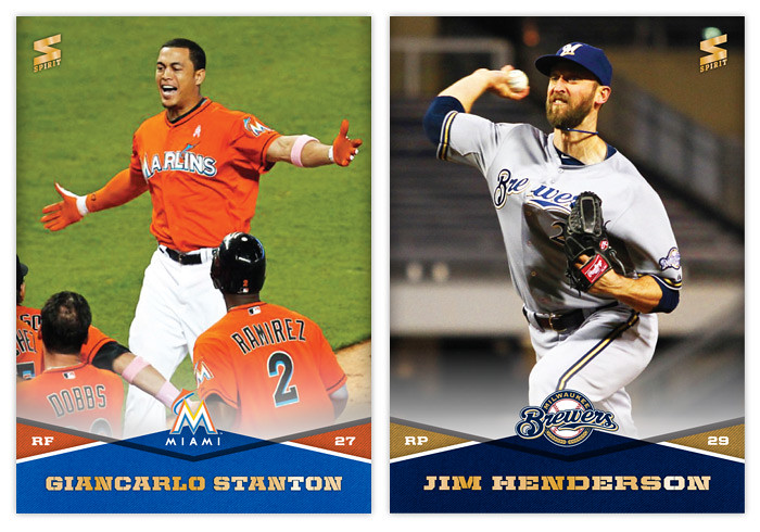
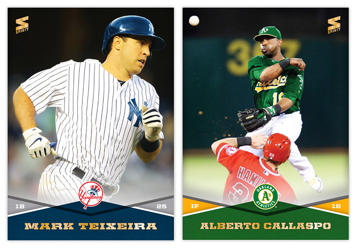
The 2016 version harkens back to the late-'60s, with simple colors and a no-frills typeface (Franklin Gothic Condensed). As I tend to do, the color palette is dictated by the team logos instead of some arbitrary system like you would have found back then. The whites are dulled to represent the old uncoated stock and I added grain to the photos and the color boxes to imitate the look of cards from the era as well.
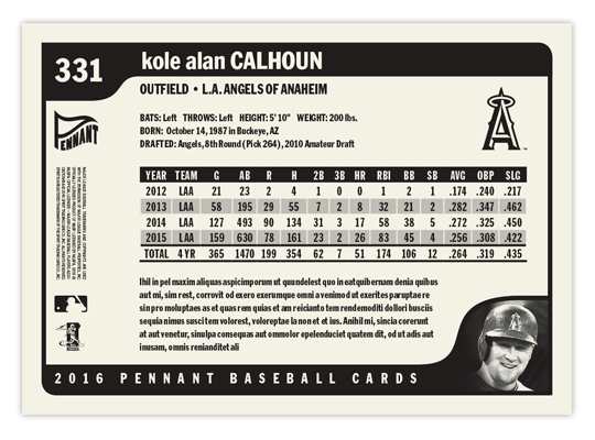
On the back, I went with a horizontal format for the first time with Pennant. All elements are black & white. The little corner tabs which housed the team and Pennant logos on the front are used for card number and a small player portrait on the back. These are definitely my favorite card backs I've designed for the Pennant brand.
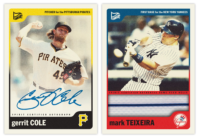
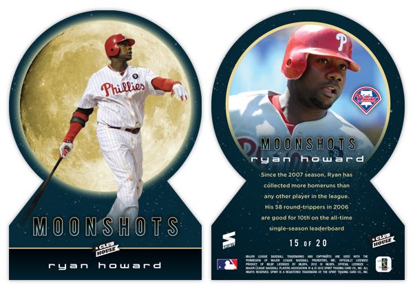
Last year I had a "sepia" parallel but this year's design didn't really lend itself to it. If Spirit ever decided to go the "Chrome/Prizm" route, though, this would definitely be a candidate for it. The autograph parallels are still in existence, as well as the addition of a "jumbo" relic. There probably wouldn't be a parallel of each for every card in the set but the design changes so minimally that calling them parallels works for me.
Of all the designs I've posted here, this is probably the one I'd be most tempted to actually print samples of, especially for in-person autograph purposes. If anybody feels so inclined to do the legwork, I'd be up for the designing.
Labels:
2016,
auto,
conforto,
gerrit cole,
kole calhoun,
pennant,
relic,
sonny gray,
teixeira
Wednesday, April 16, 2014
2014 Spirit Base Series 1: 221-230
#221 - Carlos Corporan
This would be an easy photo for Panini to use if they ever release a set big enough to include the likes of Carlos Corporan.
#222 - Luke Hochevar
Well, with Hochevar set to miss the entire season with Tommy John surgery, this card is pretty obsolete now.
#223 - Erick Aybar
There have been a few rain shots sprinkled* through the set so far but none as cool as this.
#224 - Kenley Jansen
I'm guessing this is him looking at the runner on third but who knows.
#225 - Giancarlo Stanton
Hard to top a walkoff reception.
#226 - Jim Henderson
I was wondering what this guy was up to these days. Pitching in Milwaukee apparently.
#227 - Glen Perkins
I guess the Twins won a game? Cool.
#228 - Bobby Parnell
"What do you think of all the Tommy John surgeries these days, Bobby?"
#229 - Mark Teixeira
There weren't a whole lot of photo choices for Teixeira seeing as how he was hurt for most of 2013.
#230 - Alberto Callaspo
I like how Callaspo seems to be keeping his cool as Hamilton is about to slide face first into his knee. His nickname should be Cool-aspo*.
*Sorry for the puns. I haven't been fully rehabilitated.
Labels:
2014,
aybar,
base,
callaspo,
concept,
corporan,
giancarlo stanton,
glen perkins,
hochevar,
jim henderson,
kenley jansen,
parnell,
spirit,
teixeira
Sunday, April 1, 2012
To the Moon and back
Oh, hi there. It's nice to be back. I sure was gone a looooong time, huh? Well, the vacation was had and spring has sprung. I figured it was time to poke my head out and say 'hello.' Opening Day is a few short days away so let's get this thing back on the rails.
In thinking for another insert idea for Clubhouse, I figured I'd go with something simple like 'guys who hit a bunch of homeruns.' That seemed easy enough. But then came the hard part of coming up with a name & concept. I passed over stuff like 'Home Run Kings' since they have been in recent products and thought that the Clubhouse brand could use something a little more fun. So I started thinking of different slang terms for homers. Unfortunately, most were either semi-perverted (dingers, dongs, goin' deep) or had also been used elsewhere (going yard, touch'em all.) So I was back at square one.
But during my research, I kept coming back to the term 'moonshot,' thinking it really lends itself to something fun and interesting design-wise. Even though Ultra ran an insert in 2003 with the same basic premise, I figured I could update and improve upon it.
Looking at these cards, the first thing that pops out is either the UGE moon image or the absence of edges on the top. Yep, these are my first die-cuts. Over the years, I've come to the conclusion that die-cuts can be really cool but I always prefer the ones with at least 2 true corners. They need to be able to sit level in a sleeve or toploader, which usually means the bottom corners. I have a feeling that if some other card companies tried to die-cut this, they'd jump for the completely round die-cut and obliviously annoy collectors.
With the full moon image taking up a lot of real estate, it makes a nice backdrop to the player images. The photos here are of the batters directly following their 'moonshot' swings. With the Howard and Reynolds cards, they're stoicly staring down their long balls (or fly outs) while Teixeira is starting his trot towards first. The dark blue color complements the gold moon while adding a little bit of subtlety you wouldn't get from black. The names are below in a 'space' font to extend the lunar motif going on here.
On the back side, the symmetry of the die-cut really helps keep things clean. Instead of the moon, we get a circular close-up of the players, which fades out towards the bottom to make room for the text. I also found space for the team logos somewhere within the photo frame (these all happen to be in about the same spot but that was just a happy accident with these particular photos.) The checklist totals 20 though I didn't really put it together completely. I thought it would be nice to include some guys like Reynolds here who have better numbers in the HR category while not really nearing the leaderboards elsewhere. Adam Dunn would be another candidate but would probably need to get off to a good start in 2012 to justify a spot here. Anyway, 17 of the 20 spots are still open.
Alright, thanks for checking in with me again after the long lay off. I promise the posts will keep coming semi-regularly like they used to. See ya soon!
Labels:
2012,
Clubhouse,
concept,
design,
die-cut,
homerun,
insert,
mark reynolds,
moonshots,
ryan howard,
teixeira,
welcome
Subscribe to:
Comments (Atom)


