Showing posts with label bryce harper. Show all posts

Tuesday, November 6, 2018

2018 Clubhouse: Washington Nationals


146. Bryce Harper

147. Anthony Rendon

148. Max Scherzer

149. Stephen Strasburg

150. Trea Turner

Here's the possibly/probably final Clubhouse card for Bryce Harper with the Nats. Fitting that it's the final Clubhouse post of the year. The team set is solid and probably perfect as-is once you take into account that it was made before Juan Soto was called up. He'd probably get Strasburg's spot today.

Rendon and Scherzer are the autographers. Rendon had a sneaky great season, so this is a pretty good non-hobby pairing.

And here's Max's luster parallel to finish of the 2018 Clubhouse posts.

Sunday, December 3, 2017

2017 PENNANT BOX BREAK - PACK 20

88. Jacoby Ellsbury


49. Zack Cozart


134. Lance McCullers

251. Charlie Blackmon

109. Jose Abreu

258. Mike Leake

207. Danny Duffy

87. Bryce Harper

33. Curtis Granderson

FF11. Trea Turner - Future Favorites


I wonder how old Trea Turner will be before he doesn’t look like he’s 14 years old.

Thursday, August 3, 2017

2017 PENNANT BOX BREAK - PACK 4

80. Ryan Braun

36. Hunter Pence


275. Didi Gregorius


70. Nolan Arenado

66. Kyle Seager

172. Luis Perdomo

274. Max Kepler

208. A.J. Ramos

271. J.D. Martinez

TD2. Manny Machado/Bryce Harper - Throwdown


Pack 4 brings the return of the Throwdown insert featured in the 2013 edition of Pennant. Again, this brings together players from rival teams, be it divisional or geographical. Manny Machado and Bryce Harper are an example of the latter with the Orioles and Nationals occupying the same basic market. I wonder what the odds are they’ll end up teammates in New York after next season.

Tuesday, April 25, 2017

2017 SPIRIT BOX BREAK - PACK 15

7. Caleb Joseph

187. Francisco Lindor

221. Bryce Harper

91. Brandon Finnegan

174. Yordano Ventura

205. Ty Blach (RC)

99. Ben Zobrist

252. Cristhian Adames

83. Jose Rondon (RC)

G9. Ichiro Suzuki

TL85. Dan Straily - Team Leader (CIN-Ks)


Pretty strong pack here with 3 all-stars, a future Hall of Famer and two rookie cards. I had already made the checklist and designed these cards when Yordano Ventura passed away, so we have our second posthumous card of the box.

Friday, February 26, 2016

2016 Spirit Award Winners

Now that the base design has been unveiled, I'm keeping with tradition and presenting the Spirit Award Winners as the first insert design of the season. You know the drill by now — 18 Gold Glovers (9 AL/9 NL) with gold foil and 18 Silver Sluggers (9 AL/9 NL) with shiny, shiny silver. After starting out super gaudy like disco balls and gold bars, the foil has been a little more subdued in the past couple years. That's also meant a little bit more actual designing on my part.


The gold and silver is mostly found in the four corners with a little bit of deckled texture added in. These make for a nice way to frame the player cutouts. The backgrounds are once again blue and red, respective to each league. The texture is just stormy/grungy enough to keep things interesting without going overboard. It's a good match for all the clean, modernistic lines everywhere else.


The backs are basically the same design as the front, only flipped vertically with text replacing the cutouts. The small mug shot along the top gives you another chance to see these superstar honorees up close. Overall it's a pretty efficient design with just enough ornamentation to add interest without overwhelming you.

Sunday, July 27, 2014

2014 Clubhouse All-Stars


Just in time for the All-Star break..... aww, crap. Well, here's the 2014 Clubhouse All-Stars design anyway. I decided to go horizontal this year to match the 2014 Clubhouse base set. I also wanted to mimic one of the big features from that so I ran the player names really big across the width of the card. To make sure they didn't impose too much, there's a little bit of transparency to them as well as a soft fade. Hopefully they're still readable even if you don't see every edge of every character. The letter height varies depending on the length of the player names. That's why Iwakuma's aren't nearly as tall as Harper's below.


Along the bottom is a strip of info: league, team and position. The color of the bar alternates with the background and star color.


On the back, background color is solid so the text is plenty easy to read (other than it being jibberish here.) There's a vertical player photo on the left with the AL/NL logo on the bottom. I packed last year's design with too much info on the back that I'm sure would be nearly impossible to read. This year, it's all cleaner and clearer.

Friday, January 10, 2014

2014 Spirit Base Series 1: 51-60


#51 John Mayberry
I wasn't sure whether to add the 'Jr.' or not but decided on leaving it off.

#52 Starling Marte
Any chance I get to show a non-collision play at the plate, I'm gonna take advantage.
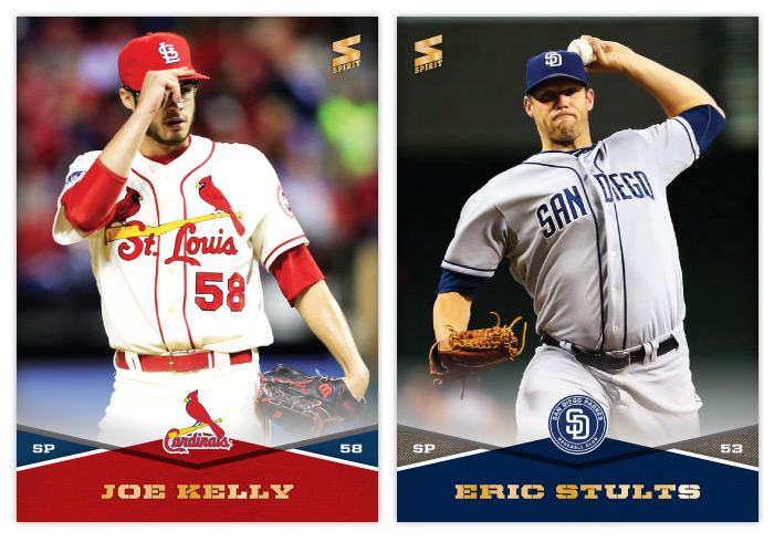

#53 Joe Kelly
I hope Joe Kelly sticks around with those glasses. This generation needs a Chris Sabo. (By the way, I had those exact same goggles as a kid.) Also, those St. Louis alternate jerseys are cool but would make more sense on the road than at home, no?

#54 Eric Stults
Man, the Padres' uniforms are dull.


#55 Brandon Crawford
Just trying to get everyone aware that Brandon Crawford = excellent glove work.

#56 Michael Saunders
I know you've probably seen better Saunders' catches on cardboard but I like how calm and routine he makes this running catch look.
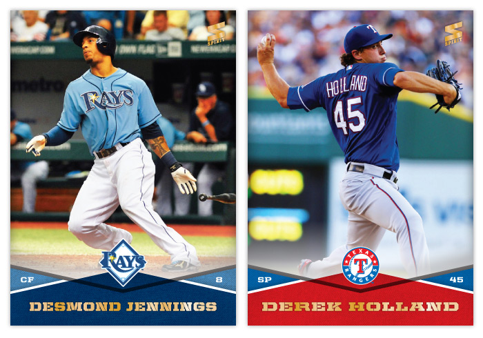

#57 Desmond Jennings
I love the Rays light blue jerseys. They add personality to the rest of their bland visual identity.

#58 Derek Holland
Holland, 1945


#59 Melky Cabrera
Oh, Melky. You were so much fun on the Giants in 2012. The Melkmen. Trollface. All those hits. Why'd you have to go and ruin it? Granted, it was all (obviously) too good to be true. But that sure was some blissful ignorance.
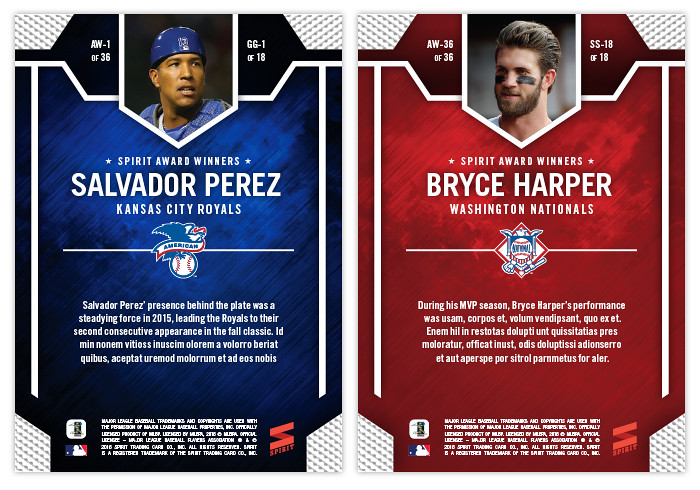
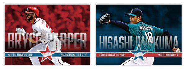
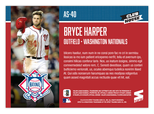
#60 Bryce Harper
It's strange how Harper has pretty much lived up to the hype thus far but he's still overshadowed by Mike Trout and now Yasiel Puig. Strangely, it's made him a little more likable for me.

Monday, April 22, 2013

REVIEW: 2013 Topps Opening Day

It may be a few weeks into the season but I'm just not getting around to reviewing some cards again. Opening Day is Topps' lowest-end release geared towards getting younger collectors excited for the start of the new MLB season. I'm gonna pass over the base design since it's the same as the flagship series with only the silver foil subtracted and the MLB Opening Day logo added (plus some nice derp-face.) So let's move onto some of the inserts.


The blue-border inserts are a little different this year. Topps must have decided that the Emerald Sparkle from Series 1 was so nice they should try it in blue. I really like this decision as the blue they chose is really vibrant and pretty. Plus, it keeps us from getting them mixed up with the Walmart exclusive blue-bordered parallels. The Ballpark Fun insert features a lot of smiling and/or pie-covered faces which is best-suited for a release like this. We have a swirly team-color section at the bottom with a familiar mowed-grass pattern. Two complaints about this design: I've seen this free cursive font a lot of places so it kind of bugs me that Topps couldn't find a more refined alternative; secondly, the white grunge-feather border seems really unnecessary since the rest of the elements are decidedly clean (minus the pie face.) They've also updated the 3-D Opening Day Stars insert. Returning are the round edges and lenticular surface, but the rest of the design has been refreshed. I think it's an improvement from last year's design with more room for the photo and fewer unnecessary flourishes.


Next we have the Superstar Celebrations cards, which were included in last year's set. These are basically team-wide mobbings of players following what I presume to be walk-off hits. Design-wise, they're pretty standard with red bars across the top and bottom with some silver foil to add some sparkle. Topps decided to keep the fun elements to the photographs and play the rest pretty standard with works I suppose. Compare that to the Play Hard inserts which feature guys in the middle of some 'gritty' baseball moments such as sliding home, stealing bases or laying out to make a catch. The edges have been grunge-feathered which helps with the theme and stays away from a standard design.

I know the target for this set is a lot different than the rest of Topps releases and not all collectors even bother with it, but I usually enjoy spending $10 to take a look at something different like this. Design-wise, Opening Day seems to have a better rate of non-misses than even Topps' flagship. Everything is from decent-to-good and decidedly non-stuffy. In other words, it's fun.

Base cards: 4/5
Blue Parallels: 5/5
Ballpark Fun: 3/5
Opening Day Stars: 4/5
Superstar Celebrations: 3/5
Play Hard: 3.5/5
OVERALL: 3.75/5