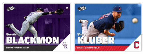
Here's a look at the 2014 design for Spirit's low-end product, Clubhouse. Having lived with the 2013 design for a year now, I decided to shift the
tone back a little more toward "fun" this year. There are definitely
some similarities between 2014 and the initial 2012 design.
Obviously there's the horizontal format but also the bold names and the
bold colors. This is bringing the set back to what I originally had in
mind.
With the horizontal format we'll see more dynamic action shots, different from those on the vertical Spirit base design. There's a full-color action cut-out on top of a team-color shaded background. Just above the secondary color bar with the player position/team name is a big, bold last name. Tucked just above that is the player's first name in a nice script font. In the bottom right corner is a white triangle leaving just enough room for the team cap logo.
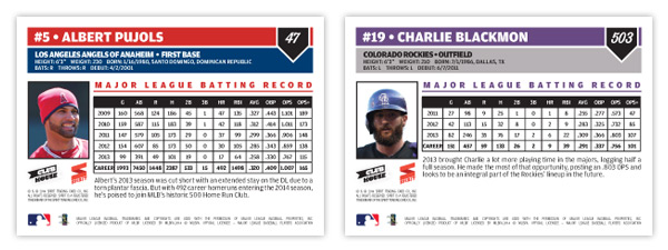
On the back are a couple of color boxes for all the pertinent player bio information. Next to a small portrait is a stat block with the player's five most-recent seasons along with their career totals, leaving room for a few sentences about them. As you can see from the numbering in the upper right, the set is a lot bigger than most non-flagship releases. A 600-card, no-foil low-end set would definitely fill a hole in the current baseball card landscape.
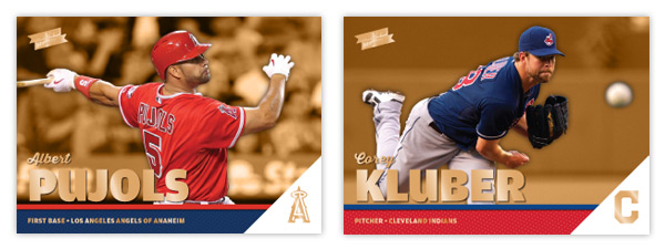
I'm adding a single parallel to the set, Clubhouse Gold seen here. Just like the original Topps Gold parallels, these are strictly the same cards but with gold foil embellishing a few areas. I also made the background color gold, too, to help set them off in case the foil gets overlooked.
Showing posts with label pujols. Show all posts
Wednesday, May 21, 2014
Sunday, March 3, 2013
2013 Clubhouse
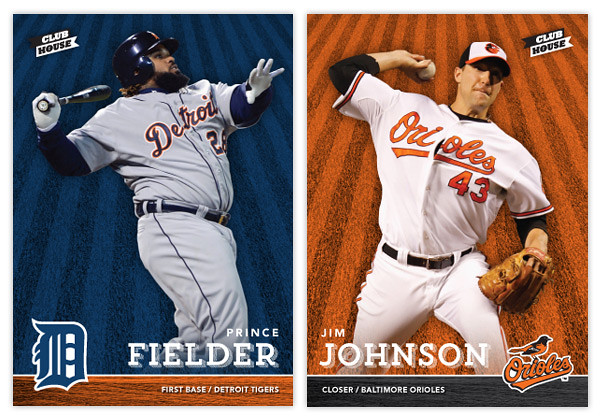
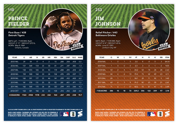
With spring training and the World Baseball Classic in full swing, my mind is definitely focused on baseball again, which hopefully means more frequent design posts. It'll be interesting to see if I have any fresh ideas after a year or if I'll fall into the same patterns like Topps does on occasion. Anyway, here's a look at the 2013 Clubhouse series. This is meant to be the low-end, Topps Opening-Day-esque product in the Spirit line. Like last year's design, it's a bright and colorful, no-frills design.
The front of the cards feature an action shot cutout of the player on top of a team-colored background with an outfield grass pattern. On the bottom is a bar with the secondary team color and a wood pattern. With the player's last name big, their first name and position/team are found above and below. I always find it important to include team/position on base designs, especially for a product marketed towards those learning the game. Alternating corners from card to card, the team's primary logo is the final element of the front design.
For the back, we've got a full-color player photo to the right and the player name/bio on the left. The grass pattern from the front makes it way to the back, this time in its natural green state. The bottom portion sees a big block of team color with a big chunk of career stats on top.
Keep an eye out for a few Clubhouse inserts coming up. I'll probably do another All-Stars design but hopefully I'll find some inspiration for some new and different insert ideas.
Labels:
2013,
base,
Clubhouse,
concept,
jim johnson,
kids,
low-end,
prince fielder,
pujols
Monday, July 9, 2012
Spirit Deluxe Duos
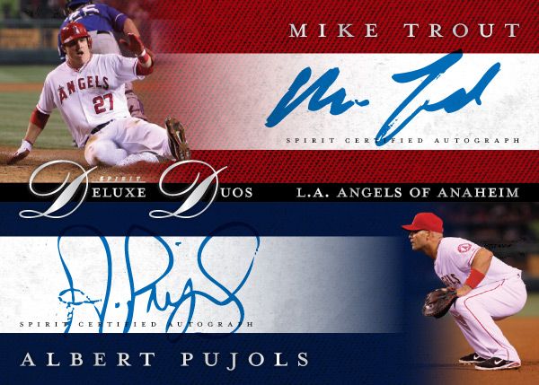
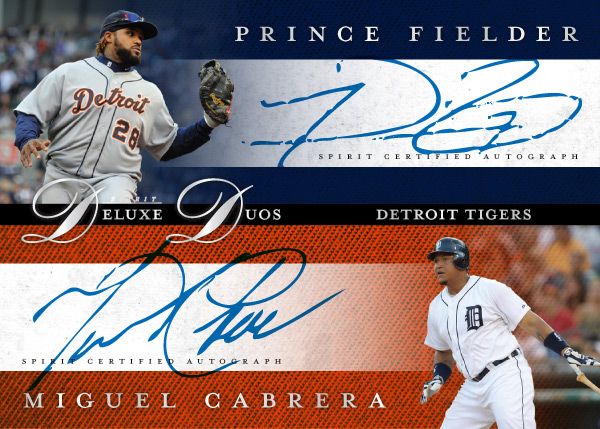
No, not Diamond Duos or Dueling Duos. Deluxe Duos. Two guys on the same team that are among the MLB elite. It may not be the most original concept, but I bet there are lots of people that'd be very excited to pull a Mike Trout/Albert Pujols dual auto. Every good turn deserves another or something like that.
These carry the same hallmarks as the other Spirit Deluxe cards so far. Team color textured backgrounds, sophisticated fonts, silver foil, dynamic fade photos. Hopefully the consistency isn't too boring.
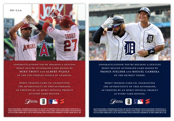
The back features a candid shot of the two featured players together. I really like the Fielder/Cabrera photo. It's nice to see teammates interact with each other like little leaguers do. And for these cards, it keeps the front side from looking like arbitrary pairings of guys who just happen to wear the same uniform.
Some of the other duos in the series would probably be Harper/Strasburg, Kemp/Kershaw, Lincecum/Posey, Halladay/Lee, Pedroia/Ellsbury, Mauer/Morneau.
Labels:
auto,
concept,
deluxe,
duos,
insert,
miguel cabrera,
prince fielder,
pujols,
spirit,
teammates,
trout
Thursday, January 12, 2012
The Who's on first, Mike Watt's on second: 2012 Spirit Headliners
I have 3 main passions in life: sports, design and music. (If I had a fourth, it would probably be fast food... I've said too much.)
Since you're reading this blog, it should be pretty obvious where the first 2 merge. Baseball card design is exciting for me. Even as a kid I would scribble out new card designs with a box of Crayola thin-tipped markers and some 3x5 index cards. The black would always go out first so I'd have to make some bold color choices after that. I assume this is how the 1990 Topps and 1991 Donruss designs were mocked up.
As for the latter, there's no better synergy of design and music than the gig poster. From their humble beginnings as xeroxed flyers on colored paper stapled to everything in sight, gig posters are now beautifully artistic receipts for those rock shows you won't be able to replay in your head once the ringing in your ears is gone. Or, more accurately, they're works of art that help to visually explain the music, if not literally then figuratively.
My wife got me a few gig posters for Christmas (the Avett Brothers, Superchunk and the Decemberists) and it planted an idea in my head. 'Wouldn't it be cool if I could combine all 3 of my passions into a singular product?' Just as gig posters commemorate the date of sometimes transcendental rock shows, why not give transcendental baseball performances a similar treatment?
Hence the birth the Headliners insert set. There are a couple attributes to this set that are very unique and potentially revolutionary. First of all is the artists. Within the gig poster world, there are quite a few remarkable designers. Mikey Burton, Aesthetic Apparatus, A. Micah Smith, Rob Jones and the Heads of State are a few of the all-stars and some of my personal favorites. The idea would be to get 15 different artists on board and have each of them design an original screenprint commemorating one of 15 different notable baseball performances like Thome's 600th homerun, Jeter's 3,000th hit or Verlander and Liriano's no-hitters. Things that made 'headlines' during the 2011 MLB season.
The set would be one of the most unique in memory, with 15 different artists and their 15 different styles on 15 different designs for 15 different events while all being cohesive in concept. As popular as Dick Perez's Diamond Kings cards were in the 80s & 90s, they got pretty stale. This would inject some new life into the baseball card illustration platform.
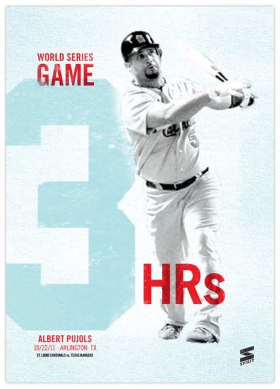
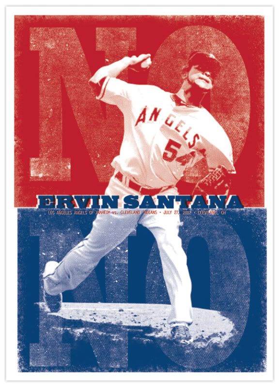
For proof of concept, I went with the two designs you see above: Pujols' 3-homerun display in Game 3 of the World Series and Ervin Santana's no-hitter. While the designs are different, they each incorporate some of the elements you'll see in a lot of gig posters. Hallmarks such as 2- or 3-color inks, intentional mis-registration (ink overlap), halftone patterns, and grainy ink coverage. While you won't find those on every gig poster, they're definitely oft-occurring characteristics that scream 'gig poster.'
What I think puts this set over the top into awesome sauce is my next idea: a redemption parallel. That's right, two of the most loathed things in current card collecting world. But hear me out. For the parallel part, it's not just the same card with 5 different colored borders and shrinking print runs. There are only 2 versions: the standard card and the redemption card.
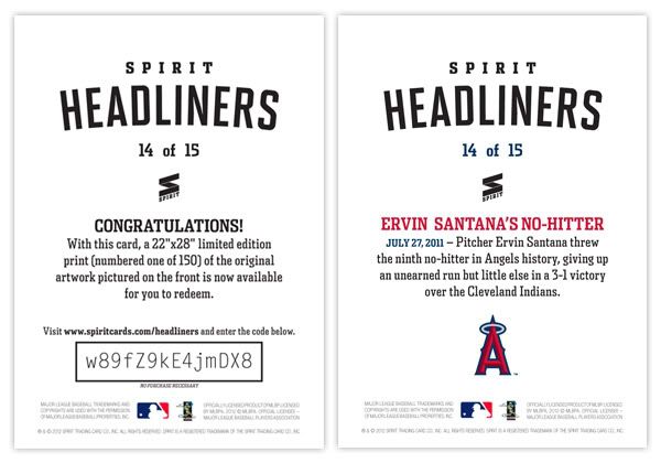
Most people hate redemptions because it takes forever before you get the actual card in-hand and a lot of times, it ends up being something different than what you were supposed to get. Those are two things you don't have to worry about with this set. The redemptions are for one of 150 screenprints of each design. Those will be delivered by each artist before the cards can even go to print. So basically, you get the card and redeem the code on back and get a 22x28 screenprint (/150) of the same design, signed by the artist.
What do you think? Good idea or great idea? Unique card designs, redemptions for full-size works of art, expanding the market for baseball card collectors. I'd love for Topps to steal this idea from me.
Well, maybe not steal. I'd be willing to trade the idea for a job with them.
Labels:
concept,
design,
gig poster,
insert,
no-hitter,
parallel,
pujols,
redemption,
santana,
screenprint,
spirit
Subscribe to:
Posts (Atom)