Sunday, October 16, 2016

2016 Spirit Deluxe Portraits


Well, the postseason is upon us and my interest in the 2016 collecting year is dwindling. I've started looking ahead to 2017 and already have base design in the works. I'll be trying something new when it comes time to roll out the 2017 Spirit releases. Hopefully I'll plan it well enough to not fall on my face like I've done in the past. All of this is to preface the fact that this will probably be the final 2016 Spirit design post. I may have a remix post or two following the World Series, but I'm calling it quits on "new" designs for 2016. And since the Deluxe line has received the least attention this year, I figured it was only right to at least offer up one "insert" design.


If you've been reading this blog long enough, you may remember the Deluxe Portraits design from four years ago. The concept there was just a zoomed in portrait of a guy, cut out and placed on top of the team-colored texture and nothing more. I also had die-cut variations there but I've since come to loathe extreme die-cuts. For 2016, I decided to make them more Studio-esque—a bit more refined and interesting. Incorporating the color fade from the 2016 Deluxe base design, the portraits are less stark and the overall card is less "in-your-face" than before. The only embellishments are the player name and a baseline stamped in silver foil along with the Deluxe "D" logo in the corner.


The backs are even more simple than the front. Just a logo, player and team name and a few brief lines filling you in on the player's impact. Sometimes less is more.

And with that, the 2016 Spirit Trading Cards year comes to a close. Reflecting on the year of this blog, I realize that the gaps in posts can be explained by my disinterest in actually writing about the cards. That's partly due to the fact I'm not a writer. There are only so many ways I can describe what you can just as easily see by looking at the cards themselves. So looking ahead to 2017, I anticipate a lot less of me describing what's on the cards themselves and perhaps more of me explaining my decisions. Or I might just shut up and let the designs speak for themselves. Either way, I hope I post more often.

Tuesday, September 6, 2016

2016 Gint-a-cuffs (2 of 2)

Halfway into my box, I'm sitting at 71.4 points. Let's see how the final 12 packs shake out.


PACK 13:
#63 A&G Mini - Monica Abbott +3
NG-60 Roberto Clemente Numbers Game +2
NW-20 - Harbor of Rio de Janeiro Natural Wonders +2
#4 - Justin Verlander
#53 - Logan Forsythe
#96 - Jason Kipnis
#101 - Roger Clemens -1
#168 - Don Mattingly -1
PACK TOTAL: +5

ROLLING TOTAL: 76.5


PACK 14:
#107 Mini - Matt Stonie
FSRA-CGR Full-Size Relic Curtis Grandson +5
#43 - Jake Odorini
#50 - Daniel Murphy
#137 - Marcus Semien
#179 - Jen Welter
#342 - Trea Turner
PACK TOTAL: +5
ROLLING TOTAL: 81.5


PACK 15:
#191 Mini - Anthony Anderson
NG-48 Ozzie Smith Numbers Game +2
#55 - Hector Rondon
#71 - Matt Reynolds
#74 - Brian Dozier
#246 - Mike Francesa
#257 - Chris Archer
#277 - Manny Machado
PACK TOTAL: +2
ROLLING TOTAL: 83.5


PACK 16:
#219 Mini - Delino DeShields
BL-23 Nolan Ryan Baseball Legends +2
#56 - Carlos Correa
#128 - Aroldis Chapman -1
#173 - Billy Burns
#252 - Cole Hamels +2
#288 - Lance McCullers
#346 - Pablo Sandoval
PACK TOTAL: +3
ROLLING TOTAL: 86.5


PACK 17:
#81 A&G Mini - Brian Johnson +2
NG-20 George Springer Numbers Game +2
#18 - Kolten Wong
#110 - Michele Steele
#131 - Brooks Robinson
#208 - Joe Panik +1
#291 - Kevin Kiermaier
#248 - Jill Martin
PACK TOTAL: +5
ROLLING TOTAL: 91.5


PACK 18:
#28 Mini - Elvis Andrus
NW-17 Cliffs of Moher Natural Wonders +2
#54 - Jose Abreu
#154 - Ervin Santana
#240 - Robert Raiola
#253 - Ozzie Smith
#275 - Jacob deGrom
#337 - Steve Cishek
PACK TOTAL: +2
ROLLING TOTAL: 93.5


PACK 19:
#295 Black Mini - Jose Altuve +3
NG-59 Adam Wainwright Numbers Game +2
#24 - Max Kepler
#62 - Dellin Betances -1
#130 - Gregory Polanco
#136 - Matt Kemp
#155 - Brandon Phillips
#200 - Carlos Gomez
PACK TOTAL: +4
ROLLING TOTAL: 97.5


PACK 20:
#221 Mini - Brian McCann -1
#111 - Lorenzo Cain
#133 - Joc Pederson
#158 - Joe McKeehan
#232 - Hector Olivera
#233 - Adam Lind
#251 - Stephen Piscotty
#348 - Trevor Plouffe
PACK TOTAL: -1
ROLLING TOTAL: 96.5


PACK 21:
FF14 Caracal +2
NG-55 Ryan Braun Numbers Game +2
BL-5 Ty Cobb Baseball Legends +2
#181 - Alex Wood
#212 - Maria Sharapova
#216 - Hannah Storm 
#259 - Jose Pedraza
#284 - Orlando Cepeda
PACK TOTAL: +6
ROLLING TOTAL: 102.5


PACK 22:
#347 SP Mini - Sean Doolittle +3
FSRB-CK Full-Size Relic Clayton Kershaw +8.5
#92 - Steven Matz
#134 - Henry Owens
#171 - Brandon Crawford +1
#193 - Huston Street
#334 - Scott Kazmir
PACK TOTAL: +12.5
ROLLING TOTAL: 115

Thanks to boots for picking Kershaw as his favorite player and also for NOT going with the Dodgers as his favorite team.


PACK 23:
#117 Black Mini - Gennady Glolovkin +3
NG-52 Jose Altuve Numbers Game +2
#47 - Corey Dickerson
#141 - Colin Rea
#144 - Matt Holliday
#218 - Masahiro Tanaka -1
#223 - Erick Aybar
#227 - Timothy Busfield
PACK TOTAL: +4
ROLLING TOTAL: 119


PACK 24:
#284 Mini - Orlando Cepeda
NW-1 Grand Canyon Natural Wonders +2
#19 - Rollie Fingers
#69 - Roberto Alomar
#217 - Julio Teheran
#261 - Carlos Carrasco
#265 - Felix Hernandez
#319 - Yasiel Puig
PACK TOTAL: +2
ROLLING TOTAL: 121

Unfortunately, I wasn't able to keep up the pace on the back half here. I was able to get a lot of Giants base cards as well as that sweet Buster Posey boxloader for my PC, so all in all, it was a decent box for me. If you happen to see anything of interest to your collection, hit me up as I'm more than happy to send cards to a loving home.

Monday, September 5, 2016

2016 Gint-a-cuffs (1 of 2)

Once again, it's Gint-a-cuffs time. This is my 5th year to compete and while my luck seems to have dried up, it's still a lot of fun and I plan on participating for as long as it's around. Since I'm a little late here, I've decided to limit the box to two posts. Here we go...


BOXLOADER:

BL-BP Buster Posey (+4) x 1.2 (FT): +4.8

Short of getting a hit, this is the best way for me to start off the box.


PACK 1:
SS-10 City Bus Mini +2
NG-98 Robin Yount Numbers Game +2
#32 Falcon 9 Rocket +2
#115 - Brad Miller
#124 - Jonathan Lucroy
#255 - Nomar Garciaparra
#262 - Giancarlo Stanton
#273 - Dee Gordon
PACK TOTAL: +6
ROLLING TOTAL: 10.8


PACK 2:
#313 SP Mini - Stephen Vogt +3
NW-10 Marble Caves +2
#37 - Dawn Spacecraft
#61 - Miguel Cabrera
#127 - Lucas Duda
#176 - Neil Walker
#279 - Paul Molitor
#33 - Shin-Soo Choo
PACK TOTAL: +5
ROLLING TOTAL: 15.8


PACK 3:
#50 Black Mini - Daniel Murphy +3
NG-77 Robinson Cano Numbers Game +2
#145 - Mike Greenberg +1
#147 - Martin Prado
#162 - Josh Harrison
#172 - Joe Morgan
#292 - Marcell Ozuna
#296 - Rickey Henderson
PACK TOTAL: +6
ROLLING TOTAL: 21.8


PACK 4:
#164 Mini - Steven Souza, Jr.
#15 - Mark Trumbo
#20 - Michael Pineda -1
#90 - George Lopez -1
#152 - Gary Sanchez -1
#156 - Jason Hayward
#197 - George Springer
#328 - Randall Grichuk
PACK TOTAL: -3
ROLLING TOTAL: 18.8

This pack less than ideal.


PACK 5:
#83 A&G Mini - David Wright +5
BL-8 George Brett Baseball Legends +2
NG-37 Matt Harvey Numbers Game +2
#125 - Carl Edwards, Jr.
#177 - Mark Teixeira -1
#266 - Anthony Rendon
#270 - David Price
#289 - Jose Quintana
PACK TOTAL: +8
ROLLING TOTAL: 26.8


PACK 6:
#81 Mini - Brian Johnson
AGR-JV Framed Mini Relic Joey Votto +13.6
#167 - Jeff Samardzija +1
#182 - Nolan Arenado
#191 - Anthony Anderson
#241 - Orlando Jones
#325 - Raisel Iglesias
PACK TOTAL: +14.6
ROLLING TOTAL: 41.4

Thanks to Chris for being a Joey Votto fan. Nice little bump for my first hit.


PACK 7:
#63 Mini - Monica Abbott +1
NG-27 Jon Lester Numbers Game +2
NW-3 Mount Everest Natural Wonders +2
#48 - J.T. Realmuto
#73 - James Shields
#94 - Todd Frazier
#189 - Buster Posey +1
#271 - A.J. Pollock
PACK TOTAL: +6
ROLLING TOTAL: 47.4


PACK 8:
USM-16 Bob Buckhorn Mayors +2
BL-4 Jackie Robinson Baseball Legends +2
#12 - Trevor Story
#23 - Addison Russell
#64 - Steve Schirripa +1
#146 - Evan Longoria
#209 - Andrew Miller -1
#310 - Patrick Corbin
PACK TOTAL: +4
ROLLING TOTAL: 51.4


PACK 9:
#321 Black SP Mini - Nick Castellanos +7
NG-92 Andy Petite Numbers Game -1
#26 - John Lackey
#52 - Adam Eaton +1
#78 - Jose Berrios
#105 - Alex Dickerson
#107 - Matt Stonie
#267 - Sonny Gray
PACK TOTAL: +7
ROLLING TOTAL: 58.4


PACK 10:
#72 Mini - Jake McGee
BL-25 Eddie Mathews Baseball Legends +2
#16 - Trayce Thompson
#87 - Craig Kimbrel
#150 - Eric Hosmer
#207 - Brandon Belt +4
#285 - Josh Donaldson
#315 - Santiago Casilla +1
PACK TOTAL: +7
ROLLING TOTAL: 65.4


PACK 11:
#160 Mini - Steve Kerr
NG-73 Nomar Garciaparra Numbers Game +2
#10 - Jason Sklar
#13 - Kevin Gausman
#120 - Kenta Maeda +2
#196 - Josh Roddick
#203 - Ernie Johnson
#204 - Drew Storen
PACK TOTAL: +4
ROLLING TOTAL: 69.4


PACK 12:
USM-2 Sylvester Turner Mayor +2
#17 - Ian Desmond
#149 - Michael Brantley
#185 - J.D. Martinez
#187 - Carl Yastrzemski
#249 - Paul McBeth
#250 - Jose Canseco
#307 - Russell Martin
PACK TOTAL: +2
ROLLING TOTAL: 71.4

Welp, at the halfway mark, I'm right on pace with my score for last year. As of today, that would put me in contention for the top spot on the leaderboard. I'm not getting my hopes up, though. Check back in for part 2 tomorrow.

Tuesday, August 30, 2016

2016 Spirit Rookie Round-Up


The 2016 rookie class has been pretty solid this season, from prospects with high expectations like Corey Seager to guys that seemingly came out of nowhere, like Aledmys Diaz. While it may not be as stacked as the 2015 class, it's definitely not full of slouches. Regardless, I thought this was a good time to reintroduce the Rookie Round-Up insert from 2013.


The 'grunginess' from last time is turned down a bit, with the design elements being mostly clean with a bit of grain to keep things from being too sterile. The high-contrast, black & white cutouts look like something you'd see on a DIY gig flyer, fitting with the "youthful" concept of the set. The rest of the elements are colorful to represent the team, with a lighter picture of the player's home stadium in the background.


The back side is brighter and cleaner, with a full-color photo and the grain from the front removed. There's a brief write-up about the player's brief MLB career, highlighting the half-seasons that have led to their inclusion in the rookie round-up here.


I kept the checklist at 20 players like in 2013, and had to enforce a cut-off since the idea would be for these to be released in a series 2-like set. So that means guys like Aaron Judge and Gary Sanchez didn't make the cut. I'm sure they'll be represented in some rookie review insert for 2017 Spirit.

Thursday, August 18, 2016

2016 Spirit Team MVP


One of the first inserts I created was the 2012 Spirit Team MVP set, featuring the best player from every club that included a relic swatch in every single card. Here's the 2016 version which follows the footsteps of the original entry 4 years ago. Design-wise, this is an extension of the 2016 Spirit base design, much like the 2012 version mirrored the base set as well.


The team color bars come in from opposite sides to house the player and team names with the logo tucked in the corner. Big block MVP letters on the left are filled with the relic swatch, leaving a big chunk of card real estate for the player image. The background fades from a tech-y looking texture to some background stadium action, both parts washed in a gradient from one team color to the other.


On the back, the elements shift a little bit as the logo moves from the right side to the left and the MVP letters take a hike to make room for a brief write up. The player photos are a little more candid/casual instead of action shots like the front.


I really like the balance of these cards, which are probably the best looking of all four Team MVP designs over the years. Let's see if I have any other ideas for the MVP-relic box next year.

Tuesday, August 2, 2016

2016 Pennant Throwbacks


Time to throw it back to an insert from my first year of blogging, Pennant Throwbacks. Being the "retro" product of the Spirit line makes it a no-brainer.


Like the 2016 Pennant base design, these are more "modern retro" and don't call back to the reeeeeally old eras like Allen & Ginter and Gypsy Queen do. The design is simple with just a grainy solid color background and player cutouts with them in their throwback duds. The team logos are of the era captured by the uniforms. The Choo is an example of the relic parallel, here featuring the Rangers' baby blues.


The back keeps the elements from the front with a brief write-up of the throwback game depicted. I tried to replicate the toothy feel that the printed cards would have, diluting the colors a bit and making them less vibrant than a modern glossy card would show.

Wednesday, June 8, 2016

2016 Clubhouse All-Stars

Voting for the 2016 All-Star is in full swing with early results pouring in. To nobody's surprise, there are lots of Cubs towards the top of tally on the NL side. Conversely, the Royals are either in first or second at every position on the AL ballot, despite some of those names being Omar Infante and Kendrys Morales. (Good job, Royals fans.) Luckily the squads will end up numbering 30+ so hopefully there won't be many snubs for next year's Clubhouse All-Stars set. But first, lets look at 2016.


I decided to keep the red/blue divide a little more ambiguous this year instead of overtly assigning one color or the other to a particular squad. Blue outer space/red metal on one and red outer space/blue metal on the other. Incorporating the star shape into the design elements was a good way for me to call back to the 2016 Clubhouse base design. Plus, having the players busting out of the shapes is kinda fun and fits the Clubhouse brand.


The back incorporates the same elements with some slight rearranging. Adding the team logos and a small (jibberish) write-up finishes things off.

Design On Deck

Thursday, June 2, 2016

Around the Horn Review: 2016 Early Releases


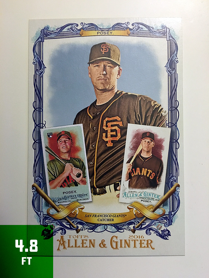
In case you didn't happen to notice, I skipped my usual full-release review of Topps Series I earlier this spring. I'd like to say it was planned but, honestly, I just never found the time for it. After a few more releases came before I got around to it, I decided to try out a new format, which you'll see here. I'm sacrificing timeliness for brevity, with the added benefit of avoiding rash judgments.


HOME RUN - All-around success. Asking for more would be greedy.

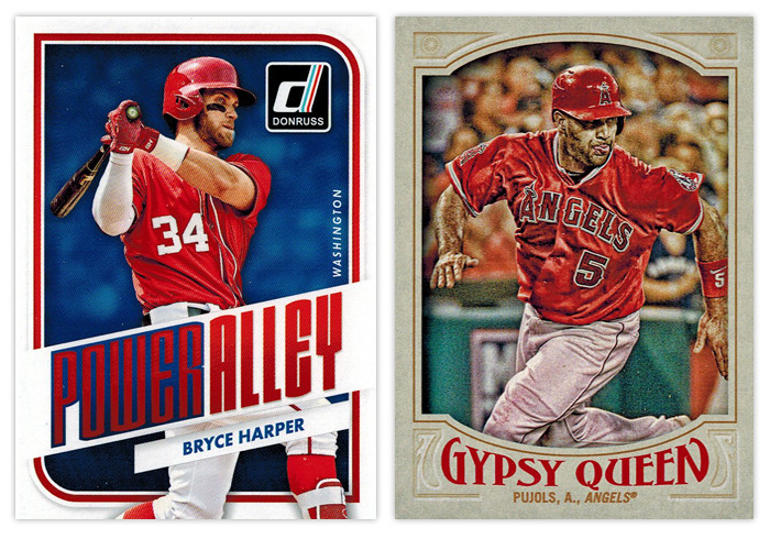
Donruss Power Alley: I was pretty impressed with this design as soon as Panini released the preview images. This is probably the best argument to be made for them to just relaunch the Donruss brand as Panini's flagship instead of all the zombie Donruss stuff they usually do with retched results. It's modern without being too modern, well-balanced and interesting with just enough interesting stuff going on.

Gypsy Queen base design: This is by far the best Gypsy Design the hobby has seen. Topps was finally able to hit that sweet spot between clean and ornate that fits the GQ brand perfectly. The wordmark has the right amount of personality without being over-the-top. The border color is neutral yet has just enough of a hue to not look boring or garish. And my favorite detail is probably the faux embossing for the elements in the corners. I can't think of a single element here that I'd change. Good job, Topps.


TRIPLE - Didn't quite get all of it but standing on third is a pretty good spot to be.

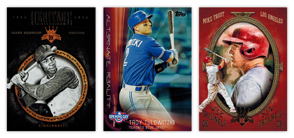
Gypsy Queen Power Alley: I'm curious what my perception of this would be if I wasn't so enthralled with the Donruss Power Alley design. Obviously the feel of GQ is quite a bit different, but it's still a pretty good design. The color scheme of blue, red and gold is really appealing on the lighter border and helps add some nice contrast to all the elements, especially the home run number total front and center. The wood grain on the bats is another nice detail. The only knock I have is the style of the blue flourishes along the top and bottom of the photo frame. They look a little too '70s-mellow-mushroom for my tastes.

Topps 100 Years at Wrigley Field: The design here benefits from having all the iconic features of Wrigley to drawn upon —red brick, ivy, Wrigley marquee. I like how all of these elements are creeping up from the bottom of the card, just like the ivy creeps up the outfield walls. My only suggestion here would be to maybe have the player name in white running just over the marquee graphic to avoid the dreaded foil-on-dark-background gambit.


DOUBLE - On target for a solid knock. 

Diamond Kings Expressionists: The design here benefits from its simplicity. Playing off the whole expressionism angle, the animated player images are all paint-rendered with the gold, green and red swaths repeating on every card. This is a rare example of them not overcrowding the card with unneeded elements.

Diamond King Aficionado: The best combination of portrait and action shot I've seen in a while. The canvas-colored strips at the top and bottom do a good job of setting the smaller action shot and adding just the right amount of depth. The oil paint look would make a bigger impact here if it was used a little more sparingly in the rest of the Diamond King set.


SINGLE - Success... but just barely.

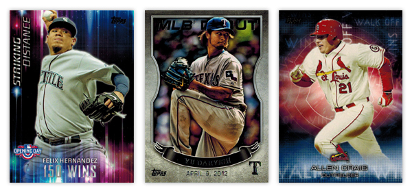
Opening Day Striking Distance: Even though they don't really have anything to do with the theme of the set, the colorful aura and light beams make for interesting design elements. The "150 WINS" text is a little hard to make out in spots. It also seems like they could move the Opening Day logo down to the actual corner and have the name/goal left aligned next to it since the format of everything else is asymmetrical.

Topps MLB Debut: These came in bronze, silver and gold variations but I honestly can't tell which foil is on the Darvish card here. I probably would have moved this up to the "double" level but the photographs are all especially dark, like their HDR action missed the brightness step in Photoshop. The banner also looks  little hokey when paired with the background texture. Compositionally, it's pretty solid, though.

Topps Walk Off Wins: Kinda like the Striking Distance cards, these have some nice, colorful but irrelevant graphics. I do appreciate that they're team-color based, but there's no real connection to the theme. It would be nice if "Walk Off Wins" appeared in full somewhere on the design. As is, the full line either runs off the edge or it's obscured by something.


Diamond Kinds Heritage Collection: The ornamented circle frame is a nicely rendered element. I like the added depth of having the player cutout overlap it in spots. Another instance of less is more with the background, though, again, the foil on black has some issues as you can see from the scan. The team location at the bottom of circle looks nice in that same gold as the frame. Unfortunately, the player name and position flanking the DK logo towards the tops looks funky since the two lines have such varying lengths on the Frank Robinson here.

Opening Day Alternate Reality: It's very reminiscent of the Striking Distance design. Honestly, they could easily flip the designs for each set and it wouldn't make a difference either way. The "Alternate Reality" text is a little too cliché sci-fi for my tastes. The composition is a little better than its sibling though the elements aren't as nice.

Diamond Kings DK Originals: Give Panini credit for some nicely deployed irony here. This is the Diamond King set's answer to the Donruss Diamond Kings subset. And they named it "Originals" lol. Whatever you say, Panini. It has the same portrait/smaller action cutout set up you'll see in the Donruss version, though executed better here. Making the whole thing full color is a nice distinction. I'm not a fan of the text treatment up top or the "DK Originals" stamped on the bottom. Switching the image order from the Aficionado design is good move to help differentiate them a bit.


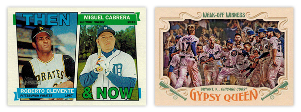
Heritage Then & Now: With the constraints of the 1967 base design, this is about as good of a solution as you could ask for. The little details like having the flags split the photos and then wrap around are well done.

Gypsy Queen Walk-Off Winners: Wait, this again? I will say the photo choices here are a lot better than the regular Topps WOW cards. But the horizontal layout means there's less room the image itself since they have to allow for all the typical GQ flourishes to circle in from the borders. My biggest gripes are how the text is handled for both. The "Walk-Off Winners" text up top looks a little to groovy for the rest of the design. And the way Gypsy Queen wordmark arches down along the top really bothers me with the player/team name running above it on a straight baseline. That's a gnarly negative space.


WALK - Mostly good but left a little power in the bat.

Topps base: I'm a fan of the basic look and layout here but it's littered with things I'd change. The "smoke" on the edges, the fake shininess, cut off logos. Has anybody noticed how the colors on the diagonal bars are different? Look at the Eickhoff card. The one on top matches the red from the Phillies logo but the bottom one is on its way to purple. And why is blue the predominant color for the Phillies cards instead of red? Or why are the Pirates cards mostly red with just a smidgen of yellow and zero black? There are too many little things like that for me to be complete sold.

Bowman base: If you saw my previous post, you know exactly where I think the Bowman design can be improved. To sum it up, make the border solid and get rid of all the shiny textures and this would really round the bases.


REACHED ON ERROR - Somehow standing on first despite your best efforts to make an out.

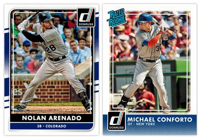
Donruss base: I don't know why Panini is still doing what they're doing with Donruss. Take a few different elements from different Donruss designs of the past, throw lock yourself in a cell with a laptop and see if you can earn your parole (or something). As an evolution from the 2015 design, it's actually an improvement. But they seemed to have incorporated one Topps' least popular design elements into the Frankenstein design here, for some reason. Somehow, though, I don't hate it. Objectively, it's not a bad design per sé. I just can't endorse the way it came to exist.

Donruss Rated Rookie: Hello, halftone gradient. Not so nice to see you again. Having it run across the bottom unencumbered like that is not a good decision. It's teetering on obnoxious. The only saving grace for the rest of the design is the absence of anything else. Just a solid white border and plain white text with the iconic Rated Rookie logo in the corner. So congrats for knowing how to not make things worse (for this design at least).


GROUND OUT - A trip to the plate with nothing to show for it.

Bowman Prospects: While this is almost completely interchangeable with the Bowman base design, it takes a few extra dings here. The issues with border and texture still appear. Without the player name running vertically, it loses some of the dynamism that Bowman has. Also, the team logo sitting in the circle, there's a little too much negative space on the left border that throws things off balance.

Bowman Sophomore Standouts: All the leftover diagonals converge here into...nothing really. The text is boring and too similar for anything to standout. The absence of a primary element other than the player image drags this to snoozeville.

Bowman International Ink: These were doomed once they decided to feature players wearing jerseys over dress shirts in front of the busiest backdrop ever. The team and Bowman logos would be better off if they switched places, letting the team logo be a little bigger. All the fades and shines could stand be toned down as well. The design isn't beyond salvaging but it's probably a more effort than it looks like they were willing to put in.


INFIELD FLY - Took a big cut but ended up not making a positive difference.

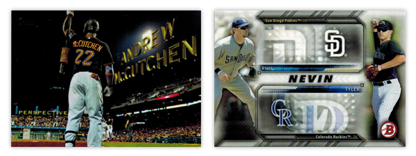
Topps Perspectives: I know I'm in the minority here but I'm not a fan of this insert. And it's all because it's completely based off the opening credits of a 14-year old movie. It seems like Topps was attempting to inject some Stadium Club-ness into the flagship set here but it just comes across as a little limp.

Bowman Family Tree: I've never been a fan of when Topps designs insert sets around the auto or relic parallels included. This is a pretty egregious example. All of that wasted space next to the logos just so they can accommodate the autographs. While, the autographed cards are pretty cool, there's no reason to saddle the non-auto versions with such a design obstacle.


STRIKEOUT - Walk back to the dugout in shame.

Donruss Diamond Kings: Why are the "paintings" gray? Why couldn't they edit out the background noise like the NetSuite logo? Why is the player name/team location so prominent? This whole thing screams minimal effort and thought. I can't think of a single positive to mention.

Topps Pressed Into Service: With such a novel concept for an insert, it's a shame the execution is so poorly done. You'd think they would use a picture of the players' pitching, no? The ball stitching is pretty cheesy in the background and I'm not sure why there's a little blip of the photograph fading around the cutout. The swooshes look pretty dated as well. My overall sense is this was a design they've had sitting in the cabinet for a few years now and finally got around to using it to clear out space.


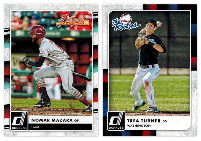
Donruss The Prospects & Donruss The Rookies: Ooh boy. Of all the elements for Panini to pick from the Donruss carcasses, I think the tubes from the 1988 set is very, very far down the list of desirability. Mix in the grungy white texture and it's a match made in hell.