Showing posts with label adam jones. Show all posts

Wednesday, September 12, 2018

2018 Clubhouse: Baltimore Orioles

Things are looking bleak for Orioles collectors in a post-Manny world. I hope this isn't salt in that wound.

#11. Dylan Bundy

#12. Adam Jones

#13. Manny Machado

#14. Trey Mancini

#15. Jonathan Schoop

Honestly, I'm not sure I could replace the departed Machado and Schoop with anybody particularly noteworthy. I suppose Mark Trumbo still has a little bit of star power left (compared to the rest of the Orioles' roster at least).


For some reason I had Mancini and Schoop as the autograph subjects. I should probably have bumped Schoop for Adam Jones since he's actually beloved in Baltimore despite his decline.


He looks pretty good on a purple parallel, too.

Wednesday, August 29, 2018

2018 Spirit: AL East

I may be a little late getting it onto the blog here, but unveiling the 2018 Spirit base design division-by-division. First up is the AL East:

#205: Adam Jones, Baltimore Orioles

  #55: Andrew Benintendi, Boston Red Sox


#52: Aaron Judge, New York Yankees 

#20: Kevin Kiermaier, Tampa Bay Rays

#112: Russell Martin, Toronto Blue Jays

Taking a look at the design, it's once again borderless with full bleed photos. Since I've never done parallels for the Spirit base sets, I feel like the lack of borders is completely normal and cool and acceptable. All the player/team info is on a diagonal banner with a "fold" separating space for the team logo and text. If I'm being honest, it's pretty reminiscent of the 2013 base design. This time around, it's a little cleaner and less busy, mostly due to the lack of foil and font selection. I brought back the 'accolades' line for applicable players like Judge there. Personally, I think it's a cool way to easily show the real standout players from the previous year.

I also did backs for all but I'm just gonna show one example in this post for space's sake.


The angles and colors are here as well. The stat line is pretty basic stuff but with a few more "modern" inclusions like OPS+ and WAR (which is the Baseball Reference variety here). Benny here only has a couple of seasons under his belt so there's a small bit of text added in there. For longer tenured players, the stat box fills all the white space but I refrain from squeezing full career numbers on there because it's 2018 and the internet exists.

Gonna plow through the other divisions here since they're already all made up and ready to post. If I do any inserts this year, they will be very sporadic (especially since this is my first 2018 post and it's basically September). Once again, the pace catches up with me and kinda derails my big plans I have at the beginning of each year. So I'm gonna set my sights low for the rest of the year so I can not come up as short as normal. Stick around if ya want.

Tuesday, August 29, 2017

2017 PENNANT BOX BREAK - PACK 9

278. Carlos González

27. Zach Britton


147. Adam Jones

145. Kyle Schwarber

116. Jason Grilli

138. Seung-hwan Oh

204. Kevin Pillar

15. Aaron Sanchez

51. Dee Gordon

TB5. Jose Quintana - Throwbacks


This is the AL East pack apparently. I really like the Carlos González photo. It fills the frame perfectly, keeping all his limbs unsevered and even getting the ball in frame. The only thing that could make it better is if the Wrigley ivy behind him wasn’t all brown.

Saturday, April 29, 2017

2017 SPIRIT BOX BREAK - PACK 19

90. Jedd Gyorko

260. Cory Spangenberg

276. John Lackey

225. Joe Mauer

183. Hanley Ramirez

126. Ben Gamel

197. Adam Jones

180. Raisel Iglesias

282. Braden Shipley (RC)

G269. Matt Moore

TL118. Brandon Belt - Team Leader (SFG - HRs)

It still feels weird to call Brandon Belt the Giants’ team leader in homers AND all-star but they’re both 100% accurate. Granted, 17 HRs being the team high is kind of sad...

Monday, September 15, 2014

2014 Spirit Base: 301-310

Let's start unpacking Series 2 (better late than never...)

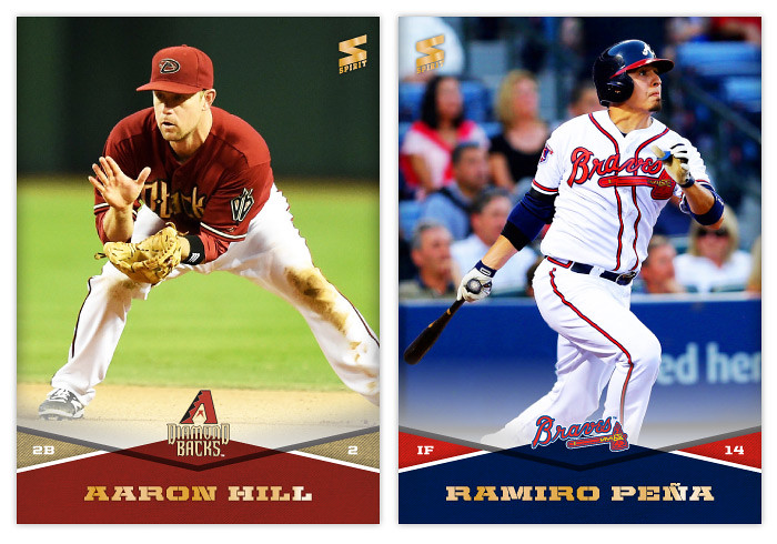
#301 - Aaron Hill
I like that he's mimicking the shape of the Diamondbacks' logo here.

#302 - Ramiro Pena
I had to look him up on Baseball-Refernce.com to check his position. Turns out he's not a relief pitcher like his name would indicate. Go figure.


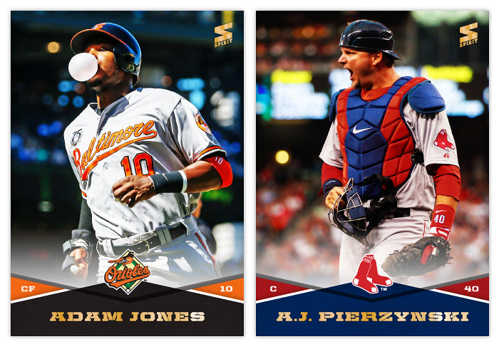
#303 - Adam Jones
#304 - A.J. Pierzynski

The alpha and omega of MLB A.J.'s. On the left we have the most likable one with a fun, friendly photo. On the right, the most hate-able one with an appropriately dickish photo. Pretty proud of my work on this pair.


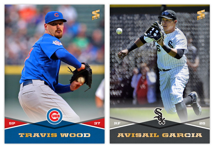
#305 - Travis Wood
I've noticed the blues really looking funky lately.

#306 - Avisail Garcia
I'm really glad the ball was able to make it in-frame here.


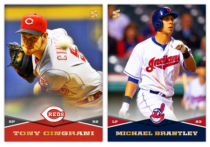
#307 - Tony Cingrani
His last name is kinda fun to say. Try it at home.

#308 - Michael Brantley
Brantley's probably the breakthrough player of this season. I hope he keeps playing at this level for many seasons to come.


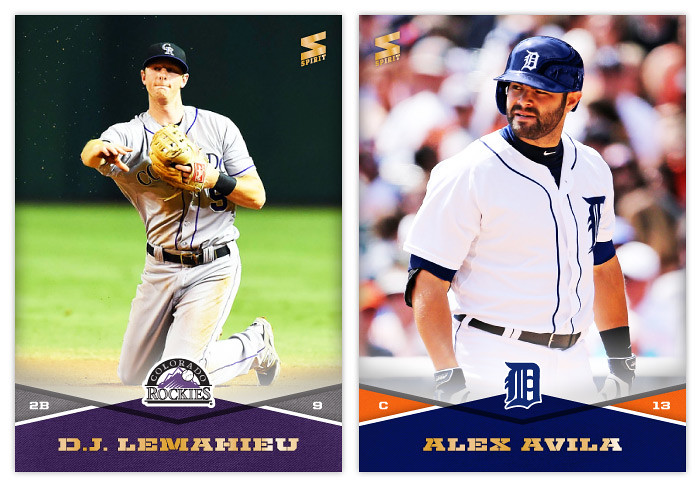
#309 - D.J. LeMahieu
I'll never get tired of hearing jokes about D.J. LeMahieu "spinning at the club" or whatever.

#310 - Alex Avila
What a classic cardboard pose here.

Sunday, July 27, 2014

2014 Clubhouse All-Stars


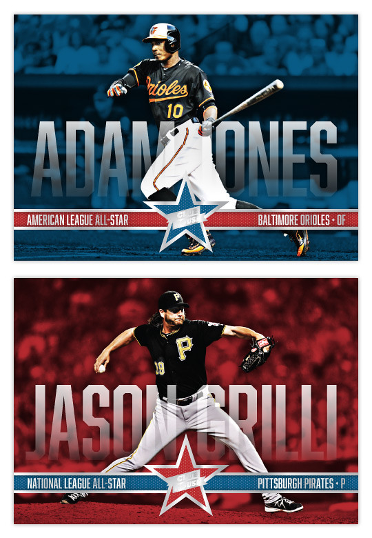
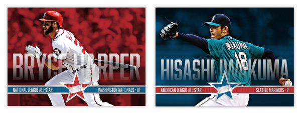
Just in time for the All-Star break..... aww, crap. Well, here's the 2014 Clubhouse All-Stars design anyway. I decided to go horizontal this year to match the 2014 Clubhouse base set. I also wanted to mimic one of the big features from that so I ran the player names really big across the width of the card. To make sure they didn't impose too much, there's a little bit of transparency to them as well as a soft fade. Hopefully they're still readable even if you don't see every edge of every character. The letter height varies depending on the length of the player names. That's why Iwakuma's aren't nearly as tall as Harper's below.

Along the bottom is a strip of info: league, team and position. The color of the bar alternates with the background and star color.


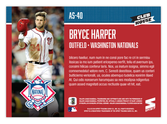
On the back, background color is solid so the text is plenty easy to read (other than it being jibberish here.) There's a vertical player photo on the left with the AL/NL logo on the bottom. I packed last year's design with too much info on the back that I'm sure would be nearly impossible to read. This year, it's all cleaner and clearer.

Wednesday, May 15, 2013

REVIEW: 2013 Bowman


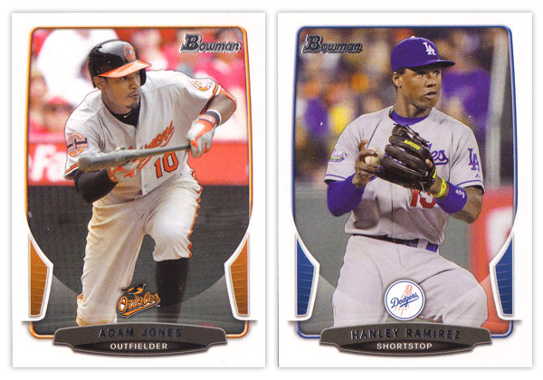
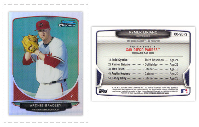
The biggest takeaway from the 2012 Bowman design was how it was a big departure from what Bowman had been putting out for many years past. As we review the 2013 version, it looks like that big year-to-year jump was merely aberration and not a new gameplan heading forward. Just like the 2012 version, this year we have white borders, not-quite rectangular frames in team colors, silver foil names, subtle drop shadows around the players, team logos centered above the name block. Honestly, you could be looking at last year's cards while reading that description and it would be 100% accurate. About the only distinguishing features here are the little tabs folding in on the left and right sides and the soft white overlay to finish out that curve. If we didn't have 2012 to compare this to, I'd really like the base design here. But as a follow up, it looks more like a rehash and suffers a bit.


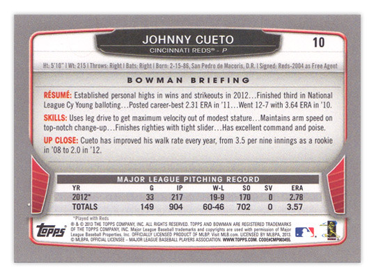
For the backside, the similarities are even more....similar. The layout is identical to 2012 with a little tinkering to fit this year's look. The colored tabs on the bottom and the black nameplate are pretty much where those embellishments are made. I mentioned a couple things on last year's review that I thought were easy improvements to make. I suggested that the last section of the Bowman Briefing be changed from EVOLUTION to UP CLOSE (like it is/was on the prospect cards.) I doubt that any eyeballs at Topps saw my recommendation but somehow it was magically changed for this year. My other suggestion, however, seems to have gone without notice. The card numbers are still in the upper right corner, which means if you store these upright in a cardboard box, the numbers won't be visible. So once I again, I propose this amendment to the Baseball Card Constitution: horizontal backs have to be numbered in the upper left corner to help for storage box sorting.


Now on to what is basically Bowman's reason to exist: prospect cards. For 2012, I preferred the veteran design to the prospect design but I'm flipping it around for this year. The prospect design is a lot easier to distinguish here thanks to the solid team-color wedges above the name. There are some subtle shape differences to the frame and nameplates that also help them stick out. The team logos are removed to help save space for the autographs (I assume.) That means the team names are found below the player name and the position is moved to the right color wedge. 


Like every other Topps release, there are plenty of parallels again. Gold, blue, purple, orange, silver ice, etc., etc. The international cards are a little different this year. The flags have some texture to them so they aren't as glaringly obvious as prior years. Also, for American-born players, they have the flag of their home state up here instead of the Stars & Stripes. I'm all for anything that helps distinguish them from previous years. 


The Top 100 Prospects cards are actually pretty nice. They have a smooth, cool finish to them with some silver, black and blue/red colors around the border. There appears to be a die-cut version as well but, as I've mentioned before, I'm not a big fan of random-shaped die-cuts. I do like how the numbers are nice and big to help drive home the fact that there is a list they're referencing. And keeping with the blue, we have Bowman reprints with blue refractor borders. I'm so tired of reprints that I can't even bother to say any more about them.


Finally, we've come to what's probably the worst development so far this collecting season. Topps has decided to introduce minis into the Bowman line. Their reasoning is obviously... who knows, but here they are. They're an odd size, they're chrome, they're refractory, they're prospect-ory. I wish somebody with power at Topps could exercise some willpower and stop spreading things across every release like this. It's really getting old.

Overall, I'd feel better about the 2013 release if it all weren't so simliar to 2012. The base and prospect designs look like comps that didn't get picked up last year or were just saved away for a future release. I understand keeping some things consistent but this comes across as a little too lazy.

Base cards: 7/10
Parallels: 6.5/10
Prospects: 8/10
Inserts: 6/10
Minis:4/10
OVERALL: 6.3/10

Monday, April 22, 2013

REVIEW: 2013 Topps Opening Day

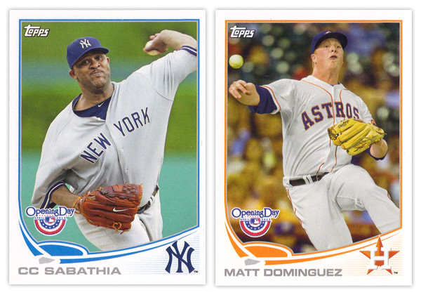
It may be a few weeks into the season but I'm just not getting around to reviewing some cards again. Opening Day is Topps' lowest-end release geared towards getting younger collectors excited for the start of the new MLB season. I'm gonna pass over the base design since it's the same as the flagship series with only the silver foil subtracted and the MLB Opening Day logo added (plus some nice derp-face.) So let's move onto some of the inserts.


The blue-border inserts are a little different this year. Topps must have decided that the Emerald Sparkle from Series 1 was so nice they should try it in blue. I really like this decision as the blue they chose is really vibrant and pretty. Plus, it keeps us from getting them mixed up with the Walmart exclusive blue-bordered parallels. The Ballpark Fun insert features a lot of smiling and/or pie-covered faces which is best-suited for a release like this. We have a swirly team-color section at the bottom with a familiar mowed-grass pattern. Two complaints about this design: I've seen this free cursive font a lot of places so it kind of bugs me that Topps couldn't find a more refined alternative; secondly, the white grunge-feather border seems really unnecessary since the rest of the elements are decidedly clean (minus the pie face.) They've also updated the 3-D Opening Day Stars insert. Returning are the round edges and lenticular surface, but the rest of the design has been refreshed. I think it's an improvement from last year's design with more room for the photo and fewer unnecessary flourishes.


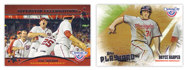
Next we have the Superstar Celebrations cards, which were included in last year's set. These are basically team-wide mobbings of players following what I presume to be walk-off hits. Design-wise, they're pretty standard with red bars across the top and bottom with some silver foil to add some sparkle. Topps decided to keep the fun elements to the photographs and play the rest pretty standard with works I suppose. Compare that to the Play Hard inserts which feature guys in the middle of some 'gritty' baseball moments such as sliding home, stealing bases or laying out to make a catch. The edges have been grunge-feathered which helps with the theme and stays away from a standard design.

I know the target for this set is a lot different than the rest of Topps releases and not all collectors even bother with it, but I usually enjoy spending $10 to take a look at something different like this. Design-wise, Opening Day seems to have a better rate of non-misses than even Topps' flagship. Everything is from decent-to-good and decidedly non-stuffy. In other words, it's fun.

Base cards: 4/5
Blue Parallels: 5/5
Ballpark Fun: 3/5
Opening Day Stars: 4/5
Superstar Celebrations: 3/5
Play Hard: 3.5/5
OVERALL: 3.75/5