Showing posts with label insert. Show all posts
Sunday, October 16, 2016
2016 Spirit Deluxe Portraits
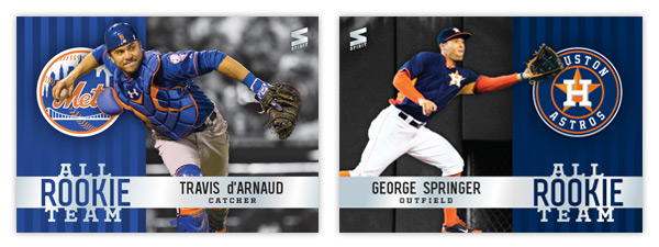
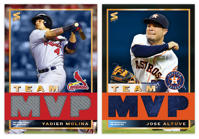
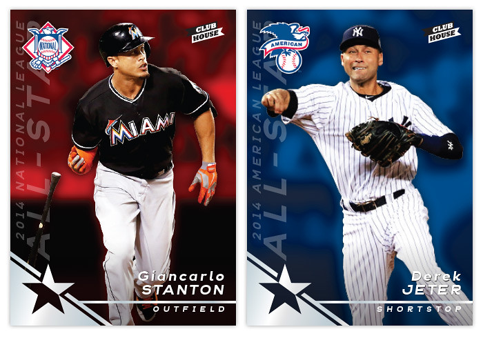
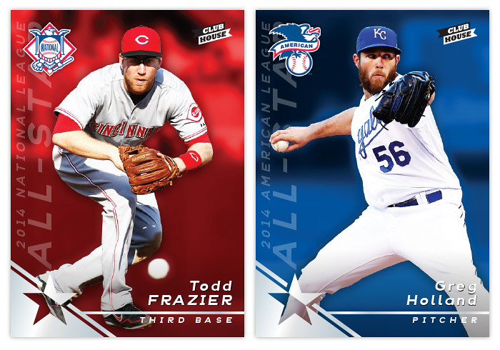
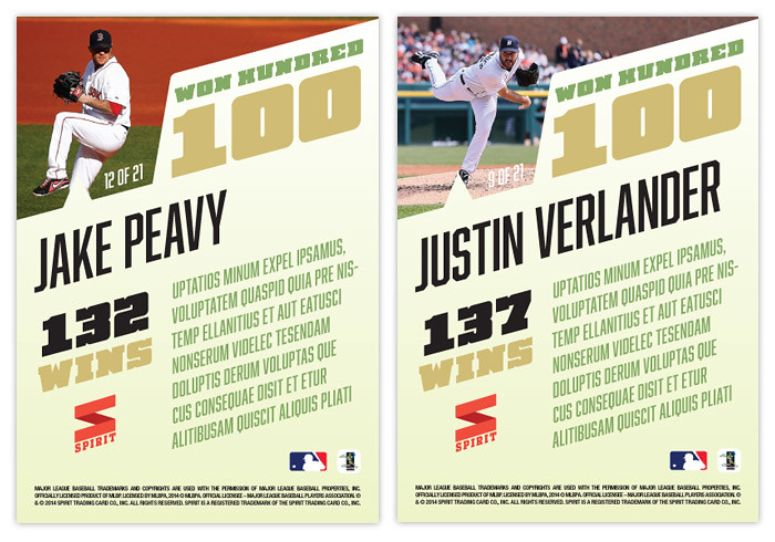
Well, the postseason is upon us and my interest in the 2016 collecting year is dwindling. I've started looking ahead to 2017 and already have base design in the works. I'll be trying something new when it comes time to roll out the 2017 Spirit releases. Hopefully I'll plan it well enough to not fall on my face like I've done in the past. All of this is to preface the fact that this will probably be the final 2016 Spirit design post. I may have a remix post or two following the World Series, but I'm calling it quits on "new" designs for 2016. And since the Deluxe line has received the least attention this year, I figured it was only right to at least offer up one "insert" design.
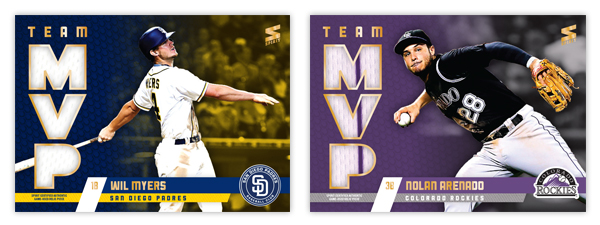
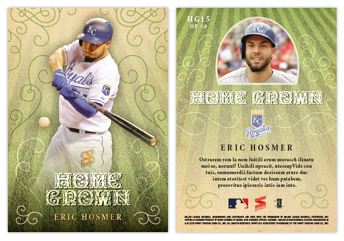
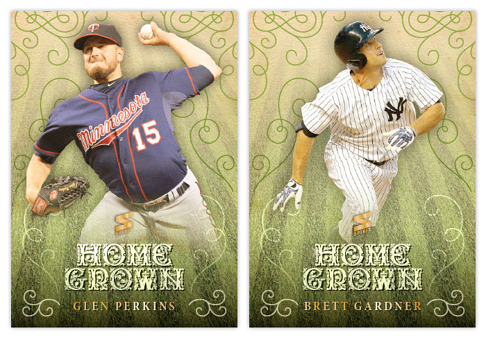
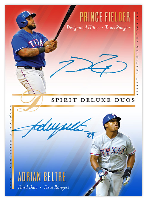
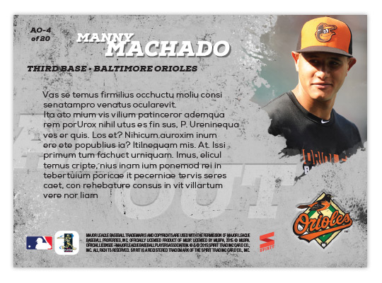
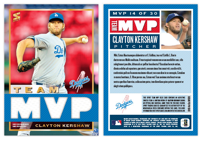
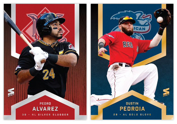
If you've been reading this blog long enough, you may remember the Deluxe Portraits design from four years ago. The concept there was just a zoomed in portrait of a guy, cut out and placed on top of the team-colored texture and nothing more. I also had die-cut variations there but I've since come to loathe extreme die-cuts. For 2016, I decided to make them more Studio-esque—a bit more refined and interesting. Incorporating the color fade from the 2016 Deluxe base design, the portraits are less stark and the overall card is less "in-your-face" than before. The only embellishments are the player name and a baseline stamped in silver foil along with the Deluxe "D" logo in the corner.
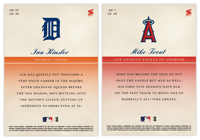
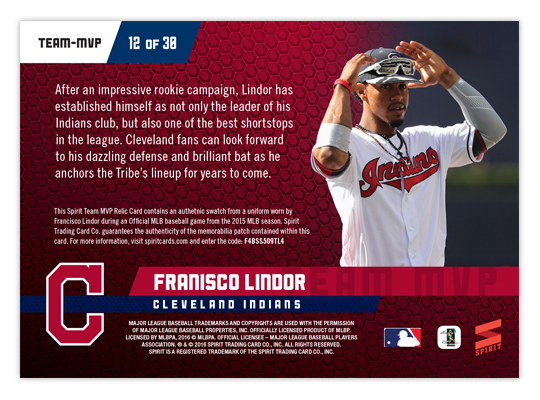
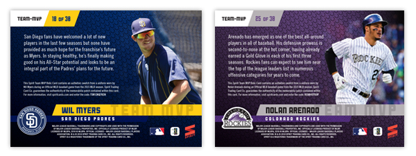
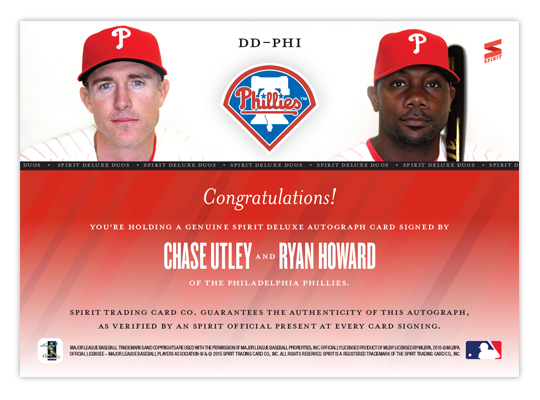
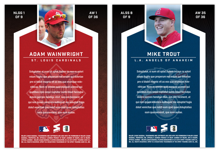
The backs are even more simple than the front. Just a logo, player and team name and a few brief lines filling you in on the player's impact. Sometimes less is more.
And with that, the 2016 Spirit Trading Cards year comes to a close. Reflecting on the year of this blog, I realize that the gaps in posts can be explained by my disinterest in actually writing about the cards. That's partly due to the fact I'm not a writer. There are only so many ways I can describe what you can just as easily see by looking at the cards themselves. So looking ahead to 2017, I anticipate a lot less of me describing what's on the cards themselves and perhaps more of me explaining my decisions. Or I might just shut up and let the designs speak for themselves. Either way, I hope I post more often.
Thursday, August 18, 2016
2016 Spirit Team MVP
One of the first inserts I created was the 2012 Spirit Team MVP set, featuring the best player from every club that included a relic swatch in every single card. Here's the 2016 version which follows the footsteps of the original entry 4 years ago. Design-wise, this is an extension of the 2016 Spirit base design, much like the 2012 version mirrored the base set as well.
The team color bars come in from opposite sides to house the player and team names with the logo tucked in the corner. Big block MVP letters on the left are filled with the relic swatch, leaving a big chunk of card real estate for the player image. The background fades from a tech-y looking texture to some background stadium action, both parts washed in a gradient from one team color to the other.
On the back, the elements shift a little bit as the logo moves from the right side to the left and the MVP letters take a hike to make room for a brief write up. The player photos are a little more candid/casual instead of action shots like the front.
I really like the balance of these cards, which are probably the best looking of all four Team MVP designs over the years. Let's see if I have any other ideas for the MVP-relic box next year.
Labels:
2016 spirit,
arenado,
francisco lindor,
insert,
relic,
team mvp,
wil myers
Thursday, December 31, 2015
2015 Deluxe First Rate Rookies
The 2015 rookie class may go down as one of the strongest in MLB history. This post is probably a bit of a precursor to the 2016 Spirit All-Rookie Team or whatever. Since a player's worth/value in the hobby is probably no higher than their prospect and rookie years, seems like a good time to throw some rookie autos into a high-end product. Even at 15-deep, this is a pretty solid checklist:
1. Kris Bryant
2. Carlos Correa
3. Matt Duffy
4. Miguel Sano
5. Kyle Schwarber
6. Noah Syndergaard
7. Francisco Lindor
8. Jung Ho Kang
9. Joc Pederson
10. Robert Osuna
11. Stephen Piscotty
12. Addison Russell
13. Chris Heston
14. Andrew Heaney
15. Odubel Herrera
The design is pretty similar to the Dynamic Duos and the Deluxe base, using elements of team colors with a bit of a beam pattern, minimal text/ornaments and similar typefaces. There's a soft white fade for legible signatures along with some of the standard gold foil for the name and logo.
The back has minimal design elements. Along the top color bar, player portrait fades in from the right with the "First Rate Rookies" logotype and card number on the left. Below is the name/position/team combo from the front as well as a full-color team logo. The rest of the space is filled with the standard authenticity language and the rest of the fine print.
Wednesday, September 16, 2015
2015 Spirit Home Grown
With all the player movement this season, I thought a good insert concept would be to focus on some guys who have risen all the way to the majors with the same team that drafted and developed them. Some people refer to them as "home grown" so that's the name I picked. 50 cards here featuring such players that have at least 5 MLB seasons in the ledger.
Playing off the "grown" part of the title, the design features a grassy background image fading into a subtle paper texture. The title is in an ornate typeface that looks similar to an immaculately tended hedge garden. There are also some green-ish vine-line flourishes adorning the edges of the card. A player cutout overlaps all the elements before softly fading to make room for the the text at the bottom. The cardboard here is uncoated in keeping with the earthy, organic feel of the concept. It also makes a great contrast for the foil-stamped player name and Spirit logo.
The motif carries over to the backs with the grass fade reversed to top-to-bottom. A small player portrait rest in the middle along the top, flanked by the "Home Grown" text and the team logo below. A brief write-up closes things out.
With the checklist here numbering 50, you'd get some of the less-marquee names like Perkins and Gardner here along with heavy hitters like McCutchen and Kershaw and Trout, so something for everyone.
Labels:
2015 spirit,
brett gardner,
glen perkins,
Hosmer,
insert
Monday, July 20, 2015
2015 Deluxe Duos
I've had all the base cards posted for each of the 4 Spirit releases but I was still lacking an insert design for the Deluxe set. I decided to resurrect the Deluxe Duos autograph cards after their absence in 2014. Turns out that when you design 900 individual cards in a summer, it cuts into your ability to create inserts for other releases.
Like previous Deluxe Duos designs, this one features a pair of teammates sharing the same card while featuring autographs of both players. This is the first time the orientation has been vertical. I left more room for player images than usual since sometimes they get squeezed into a corner with maybe just their faces peeking out. Since these would be "on-card" autographs, it's up to the players themselves to decide how much of their signature should overlap their pictures. Design elements from the Deluxe base cards are present, with the team color fades and the same fonts for player name, team and position.
Some nice portraits anchor the design on the back with the team logo making an appearance. I like the simplicity of the back here. Ditch the senseless writeup and stick with some nice photos and lots of empty space. It makes things a little more elegant, befitting a release called "Deluxe."
Labels:
2015,
auto,
beltre,
deluxe,
insert,
prince fielder,
ryan howard,
spirit,
utley
Friday, July 3, 2015
2015 Clubhouse All Out
After the clean and tidy Incumbents design, I decided to go 180° with this All Out insert. The checklist here features players that go "all out" on the field, whether with the glove on the basepaths. You could fairly call this the Clubhouse version of Topps' Opening Day Play Hard insert. Personally, I think "All Out" is a much better name. And design-wise, I think I have them beat as well.
After cutting out these great action photos, I added a little glowing fuzz to them so they'd look a little "otherworldly" or so. The background is kind of a grungy gray stone thing to help the team color splash/explosion things stand out a bit more. It was a lot fun adding all the color. The names are in gold foil to help differentiate them from the "All Out" logo.
The motif is applied to the back of the card minus the color splashes. They had to be sacrificed so you could read all the jibberish nice and easily. I also made space for the team logo in the bottom right corner.
Monday, June 29, 2015
2015 Pennant Incumbents
ARI - Daniel Hudson (Miguel Montero)
ATL - Freddie Freeman (Tim Hudson)
BAL - Adam Jones (Nick Markakis)
BOS - David Ortiz
CHC - Starlin Castro (Alfonso Soriano)
CHW - John Danks (Paul Konerko)
CIN - Brandon Phillips
CLE - Michael Brantley (Asdrubal Cabrera)
COL - Troy Tulowitzki (Todd Helton)
DET - Justin Verlander
HOU - Jason Castro (Wesley Wright)
KCR - Alex Gordon
LAA - Jered Weaver
LAD - Andre Ethier
MIA - Giancarlo Stanton (Ricky Nolasco)
MIL - Ryan Braun
MIN - (Joe Mauer) Justin Morneau
NYM - David Wright
NYY - Alex Rodriguez (Derek Jeter)
OAK - Coco Crisp (Daric Barton)
PHI - Chase Utley (Jimmy Rollins)
PIT - Andrew McCutchen
SDP - Will Venable (Chase Headley)
SFG - Matt Cain
SEA - Felix Hernandez
STL - Yadier Molina
TBR - Evan Longoria (Ben Zobrist)
TEX - Elvis Andrus (Ian Kinsler)
TOR - Jose Bautista (Adam Lind)
WAS - Ryan Zimmerman
It's a lot stronger this time around with only maybe Daniel Hudson, John Danks and Will Venable as the real downers.
Design-wise, it's very reminiscent of the inaugural version: posed player portrait cutouts, solid team-color backgrounds. This year, though, I've incorporated the 2015 Pennant base design a bit with the frame edge corners. I added pinstripes to the background for a little more interest as well as some starts to bring in a little of that "elected official" campaign look. Being a "retro" set, the colors are a little skewed and there's some grain added to the images.
The backs are pretty straight-forward. They're the standard black & white for Pennant cards with a little write-up and team logo. The cleaner, the better.
Labels:
2015,
alex gordon,
insert,
matt cain,
pennant,
retro,
Tulowitzki
Tuesday, April 28, 2015
2015 Spirit All-Rookie Team
Last year I decided to copy Topps and made my own all-rookie squad. So here I am pulling another page outta Topps' playbook and recycling the same idea again with just a new design. But really, though, I think it's a sound decision to have an insert devoted to the previous year's rookies. Keeping with the whole "team" format can prove to be difficult, though, as you'll see from the checklist below.
1B: Jose Abreu
2B: Kolten Wong
SS: Danny Santana
3B: Nick Castellanos
OF: Billy Hamilton
OF: George Springer
OF: Ender Inciarte
C: Travis d’Arnaud
LHP: Roenis Elias
RHP: Jacob deGrom
RP: Dellin Betances
M: Matt Williams
There a no-brainers like Abreu and Hamilton, but sometimes there just isn't a stand out in one particular position. OR you have the inverse with way too many guys competing for one spot. The left-handed and right-handed pitcher situation up there is a perfect example. Last year's best newcomers on the mound were almost all righties. That means a southpaw like Roenis Elias makes the checklist while guys like Masahiro Tanaka, Marcus Stroman and Matt Shoemaker don't. Maybe I'll rectify that next year. Anyway, let's look at the design.
We're going horizontal again. There seems to be more room for the action shots this year with a sliver of the background staying on the card instead of them being complete cutouts. There are big team logos again just a layer behind the players with a subtle stripe motif behind them. A big silver foil band stretches across the bottom with the 'ALL ROOKIE TEAM' "logo" revealing some of the stripes from below. Player names & positions are in black on the foil bar so hopefully they're readable in most light.
Oh yeah, here's the autograph parallel version. Same design but with a white fade coming from beneath and the certification text below the bar.
The back mimics the front but with the bar moving to the top and turning white. The only issue with this choice would be finding photos with enough open space up top as to not have the 'ALL ROOKIE TEAM' thing overlap a guy's dome. I lucked out with Hamilton here.
Overall I think these fit in with the rest of the 2015 Spirit designs thus far. Colorful without being too ornate and utilizing negative space in some capacity. I'd like to say that's on purpose but it's probably just a happy accident.
Labels:
2015 spirit,
all-rookie,
auto,
billy hamilton,
d'arnaud,
george springer,
insert,
rookie
Tuesday, April 21, 2015
2015 Spirit Team MVP
Time for the return of the Spirit Team MVP insert. This is the third iteration and just like the previous two, the basic design for these cards contain relic swatches.
The big 'MVP' letters runs across the bottom, cut out from a team-color bar to reveal the jersey swatch below. There are some gold foil embellishments with the player name and a frame around the edges. I managed to leave a lot more space for the player photos with this layout and having them stretch to the edges of the cards helps keep things from getting to claustrophobic. The team logos are also a bit more prominent than the previous design.
The backs are bright with team colors and white borders for each info compartment. I also included the relic codes where you could (hypothetically) enter the code online and see the actual jersey the featured swatch was pulled from.
Just for fun, lets look at the rest of the checklist:
MVP1: Mike Trout (Angels)
MVP2: Jose Altuve (Astros)
MVP3: Josh Reddick (A's)
MVP4: Jose Bautista (Blue Jays)
MVP5: Freddie Freeman (Braves)
MVP6: Carlos Gomez (Brewers)
MVP7: Yadier Molina (Cardinals)
MVP8: Anthony Rizzo (Cubs)
MVP9: Paul Goldschmidt (Diamondbacks)
MVP10: Clayton Kershaw (Dodgers)
MVP11: Madison Bumgarner (Giants)
MVP12: Corey Kluber (Indians)
MVP13: Felix Hernandex (Mariners)
MVP14: Giancarlo Stanton (Marlins)
MVP15: Matt Harvey (Mets)
MVP16: Jordan Zimmermann (Nationals)
MVP17: Chris Davis (Orioles)
MVP18: Andrew Cashner (Padres)
MVP19: Chase Utley (Phillies)
MVP20: Andrew McCutchen (Pirates)
MVP21: Adrian Beltre (Rangers)
MVP22: Evan Longoria (Rays)
MVP23: David Ortiz (Red Sox)
MVP24: Johnny Cueto (Reds)
MVP25: Troy Tulowitzki (Rockies)
MVP26: Eric Hosmer (Royals)
MVP27: Miguel Cabrera (Tigers)
MVP28: Joe Mauer (Twins)
MVP29: Chris Sale (White Sox)
MVP30: Jacoby Ellsbury (Yankees)
Boy, the A's slot was brutally hard to fill. Same with the Twins, though Mauer just keeps it by default on account of him still being around.
Labels:
2015 spirit,
Altuve,
insert,
kershaw,
relic,
team mvp,
yadier molina
Sunday, April 5, 2015
2015 Clubhouse All-Stars
Just in time to start the 2015 MLB season, let's take a look at the first 2015 Clubhouse insert, highlighting the players who made the 2014 All-Star teams. I've been doing this insert each year since I started the blog because it's always a great encapsulation of the standout players of the league. This year, it gives me a legitimate reason to feature a Derek Jeter since (so far) I've refrained from putting retired players into any Spirit product.
The cards are split by league once again with red to designate NL guys and blue for the AL. The bottom left corner as a foil star design which is a good anchor for the player name/position to the right along with the "2014 National/American League All-Star" text along the left edge. In the upper left corner is the respective league logo. The foil here is used strictly as a design embellishment and not as a crutch, with the names being an easy-to-read white on top of the color background. I've noticed I tend to lean towards centered, symmetric designs so I'm happy going asymmetrical here.
The back has room for a nice portrait-type image up top along with space for the team logo and a brief write-up. Since the all-star squads seem to be expanding each year, this insert set has a big checklist that would lend itself to being a "one-per-pack" insert which is perfect for a low-end product like Clubhouse.
Now that the season kicks into full-gear tonight and tomorrow, get ready for more designs coming with more regularity. Good luck to everybody's favorite teams and let's 'play ball'!
Labels:
2015,
all-star,
Clubhouse,
giancarlo stanton,
greg holland,
insert,
jeter,
todd frazier
Sunday, July 27, 2014
2014 Clubhouse All-Stars
Just in time for the All-Star break..... aww, crap. Well, here's the 2014 Clubhouse All-Stars design anyway. I decided to go horizontal this year to match the 2014 Clubhouse base set. I also wanted to mimic one of the big features from that so I ran the player names really big across the width of the card. To make sure they didn't impose too much, there's a little bit of transparency to them as well as a soft fade. Hopefully they're still readable even if you don't see every edge of every character. The letter height varies depending on the length of the player names. That's why Iwakuma's aren't nearly as tall as Harper's below.
Along the bottom is a strip of info: league, team and position. The color of the bar alternates with the background and star color.
On the back, background color is solid so the text is plenty easy to read (other than it being jibberish here.) There's a vertical player photo on the left with the AL/NL logo on the bottom. I packed last year's design with too much info on the back that I'm sure would be nearly impossible to read. This year, it's all cleaner and clearer.
Labels:
2014,
adam jones,
all-star,
bryce harper,
Clubhouse,
concept,
grilli,
insert,
iwakuma
Monday, April 21, 2014
Won Hundred
After I published my previous post, I noticed it was entry number 99. Which meant the following post would be my 100th of the blog. So instead of passing the milestone with another 2014 Spirit Base entry (which I'm sure you're all tired of by now), I decided to commemorate it with some relevant content. After searching for a subject that revolved around the number 100, I saw the list of active pitchers with 100 career wins was right around the 20-player mark, which is right in the sweet spot for insert if you ask me. Then once I came up with the punny name, it was a no-brainer.
Even though pitcher wins as a stat is losing its relevance, it's still a nice sign of a pitcher's longevity and effectiveness to be able to stick around the league long enough to pile up Ws. And taking a look at the checklist, you'll see a mix of top-of-line aces as well as some guys that probably don't get their due as effective starting pitchers.
1. Tim Hudson
2. CC Sabathia
3. Mark Buehrle
4. Bartolo Colon
5. A.J. Burnett
6. Cliff Lee
7. John Lackey
8. Bronson Arroyo
9. Justin Verlander
10. Josh Beckett
11. Dan Haren
12. Kyle Lohse
13. Jake Peavy
14. Jered Weaver
15. Aaron Harang
16. Felix Hernandez
17. Zack Greinke
18. Ervin Santana
19. Jon Lester
20. Adam Wainwright
21. James Shields
For the front of the design, the big elements are 100 stacked above a big W, which works as a frame for the player cutout. The title 'Won Hundred' is wedged between them but since the players make it pretty unreadable, I have it tiled in the upper left corner. There's a circle in the bottom right corner for the team logo. Below that is the player name stamped in gold foil. Keeping with the '100' theme, each card is serial numbered to 100, stamped vertically in the left corner.
On the backside, there's an action photo filling the exaggerated W frame with the full 'Won Hundred' title and 100 unobscured to the right. With the name at an angle below, there's a brief write-up on the right along with a big bold wins total on the left.
Overall, the design is simple but with enough little details to keep it interested. I like the subdued color-palette as well as the asymmetry on both sides.
Thanks for taking the time to read any of the 100 posts I've made in the last 2+ years. Hopefully somewhere along the line I've done something to inspire you and whomever else may be out there in the card collecting/designing world. Let's see how the next 100 posts go.
Monday, February 24, 2014
2014 Spirit All-Rookie Team
The 2013 rookie crop was one of the strongest in recent years. Here's an insert to feature the most accomplished player from each position. I know this basically sounds like Topps' Rookie Cup Team but I figured it'd make more sense to turn it into an insert set instead of padding the Series 1 base set. Before I go over the design, here's the checklist I put together:
1: Matt Adams (1B)
2: Jedd Gyorko (2B)
3: Jose Iglesias (SS)
4: Nolan Arenado (3B)
5: Yasiel Puig (OF)
6: Wil Myers (OF)
7: Khris Davis (OF)
8: Evan Gattis (C)
9: Tony Cingrani (LHP)
10: Jose Fernandez (RHP)
11: Danny Farquhar (RP)
12: Walt Weiss (M)
Some of the names are no-brainers but the rest are a good chance to shine a light on some players that might not get all the attention they deserve yet. Really, though, there are a lot of guys that deserve consideration that just couldn't overtake the guys that made the cut. Also, I threw in a manager spot just because you never know who's gonna be taking the reins for the first time. With so many former players becoming skippers, there's probably a good chance there'll be someone out there who collects them. Now onto the design.
The front continues the geometric motif that's been present in all the 2014 Spirit designs so far. The two team-color bars coming in from opposite edges house all of the player information as well as the set name. Behind the player cutout is a team-color fabric with shaded polygons to add some depth. The team logo fills whatever negative space is left from the cutout. On the back, the criss-cross tabs are enlarged and reoriented to house the player photo and team cap logo. Then there's a brief write-up in the remaining negative space.
Also, since rookie/young player autos are so highly sought-after, I figured it'd be a good place to through some ink into the mix. The design is the same with only the addition of another polygon made big and white for the player to sign. Fernandez's signature isn't as wide as most but hopefully the other guys would spread out to fill the space a bit more.
Wednesday, February 19, 2014
2014 Spirit Award Winners
After hitting the halfway mark of the base set project, let's take a break and check in with some Series 1 inserts. For the third year in a row, the inaugural insert design is the Award Winners set. This year brings some familiar motifs along with some changes. We're still alternating between gold and silver foil for the Silver Slugger and Gold Glove winners, though I decided to subdue the blinginess a bit. Now there are just a few strips of foil instead of a huge shiny background.
The NL cards feature red again and the AL guys are blue. With this system, you can easily distinguish which award each player won just by glancing at the foil color and background. Just to be safe, I added another visual cue with the Gold Glovers having a leather background and the Sluggers a wooden bat. And to make things even more clear cut, the NL and AL logos are screened on upper fabric swatch thing.
The back of the card has the same elements from the front repeated, other than the foil of course. They actually look pretty similar to the 2012 ones I did, though the overall composition fits this design better.
Labels:
2014,
award winners,
concept,
design,
insert,
pedro alvarez,
pedroia,
trout,
wainwright
Tuesday, July 9, 2013
2013 Spirit Team MVPs
Just like with Award Winners, every year will see a return of the Spirit Team MVP insert. To me, it's a no-brainer. A 30-card set with every team represented by their best player. Why Topps hasn't embraced this idea is beyond me. Maybe since it was Donruss' thing they want to keep their distance.
Let's start off with the checklist.
MVP1: Mike Trout (Angels)
MVP2: Jose Altuve (Astros)
MVP3: Yoennis Cespedes (A's)
MVP4: Jose Bautista (Blue Jays)
MVP5: Brian McCann (Braves)
MVP6: Ryan Braun (Brewers)
MVP7: Yadier Molina (Cardinals)
MVP8: Starlin Castro (Cubs)
MVP9: Paul Goldschmidt (Diamondbacks)
MVP10: Clayton Kershaw (Dodgers)
MVP11: Buster Posey (Giants)
MVP12: Asdrubal Cabrera (Indians)
MVP13: Felix Hernandex (Mariners)
MVP14: Giancarlo Stanton (Marlins)
MVP15: David Wright (Mets)
MVP16: Bryce Harper (Nationals)
MVP17: Chris Davis (Orioles)
MVP18: Chase Headley (Padres)
MVP19: Cliff Lee (Phillies)
MVP20: Andrew McCutchen (Pirates)
MVP21: Adrian Beltre (Rangers)
MVP22: Evan Longoria (Rays)
MVP23: David Ortiz (Red Sox)
MVP24: Joey Votto (Reds)
MVP25: Troy Tulowitzki (Rockies)
MVP26: Billy Butler (Royals)
MVP27: Miguel Cabrera (Tigers)
MVP28: Joe Mauer (Twins)
MVP29: Chris Sale (White Sox)
MVP30: Derek Jeter (Yankees)
Some of these selections were tough. The Braves have a handful of guys that are good but none that really rise above the rest. I went with McCann because he's been there the longest. Castro has had a down year so Anthony Rizzo could possibly replace him. The Rays' pick could've been David Price or even Ben Zobrist. Carlos Gonzalez has a good case for the Rockies since Tulo is always hurt. The Royals guy could easily be Alex Gordon or James Shields. And since Jeter has been out all year, it would probably make sense to put Cano in there, too.
Anyway, onto the design.
Like last year, the biggest feature here is the MVP relic windows. I figured the easiest way to differentiate from 2012 would be to make them vertical instead of horizontal. So the M-V-P letters are stacked on the right side leaving a vertical window for a player photo. To add some depth, I had part of the guys overlap into the team color section. Below is a the secondary team color section to house the player name along with the cap logo. The square-ish space for the logo helps balance things along with keeping it from looking to symmetrical (which I have a habit of doing.) There's some silver foil along the relic windows and all the text, minus the "Spirit Certified Game-Used Relic" small print below the P.
The elements make a 90° turn for the back side while the secondary bar moves to the top. Below a horizontal player photo is a brief bit of text. To the left is a block of copy about the relic authentication along with a code to enter online for more info about this particular swatch. And I'm looking out for everyone with having the numbers in the upper right corner so they're easy to see when stored in a cardboard box.
Friday, June 21, 2013
Keepin' It Clean
One of my personal favorite designs from Spirit in 2012 was the Clubhouse Moonshots insert. Homerun hitters, die-cut, big ol' moon. What's not to love? This time around, I kept the subject the same but changed the name to Clean-Up Crew. The die-cut is also back again though in a much different shape.
The arrows are a play on the 'up' part of 'clean-up' and helped me get the design rolling. The one on the right leaves a nice tidy space for the team logo or a memorabilia swatch. I wanted to make sure all arrows pointed up so the upper left corner was the natural choice for the other die-cut location. Having some part of the player cut into the arrow keeps things from getting stale.
As the arrows take care of the latter half of the insert name, the bright neon green/yellow color on the bottom handles the 'clean' half. Something about the color makes me think of a super-intense household cleaner that would almost scrub the skin off your finger. I imagine the ink would be almost plastic-like on the finished product.
On the back side, we have the reverse die-cut shape to deal with but luckily plenty of space is left for another big player portrait. The neon is turned down a bit with black being the most prominent color. Below a brief write-up is the 2012 stat line with categories relevant to clean-up hitters (HR, RBI, total bases, slugging % and OPS.)
All in all, the bright colors, special shape and big batters seem to fit right in with the Clubhouse line.
Labels:
2013,
clean-up,
Clubhouse,
concept,
die-cut,
freddie freeman,
granderson,
homerun,
insert,
relic,
ryan howard
Subscribe to:
Comments (Atom)


