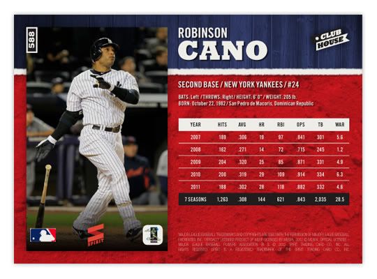
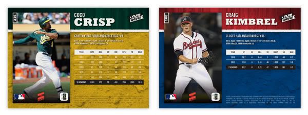
Voting for the 2016 All-Star is in full swing with early results pouring in. To nobody's surprise, there are lots of Cubs towards the top of tally on the NL side. Conversely, the Royals are either in first or second at every position on the AL ballot, despite some of those names being Omar Infante and Kendrys Morales. (Good job, Royals fans.) Luckily the squads will end up numbering 30+ so hopefully there won't be many snubs for next year's Clubhouse All-Stars set. But first, lets look at 2016.
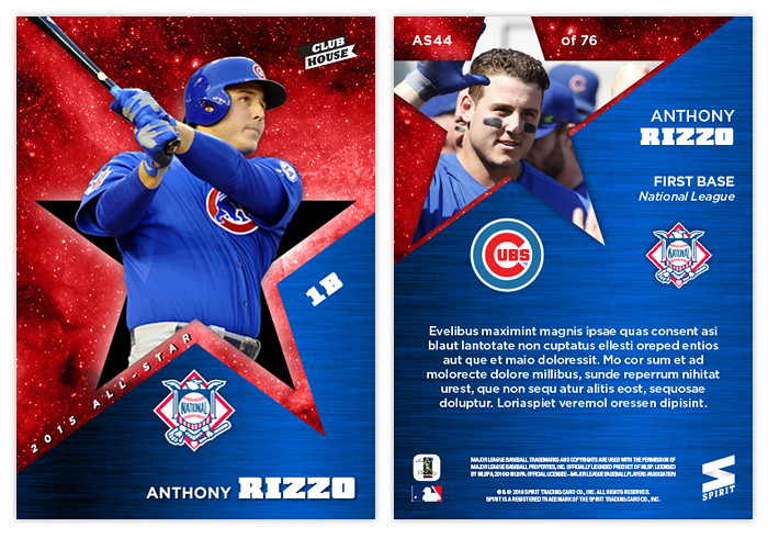
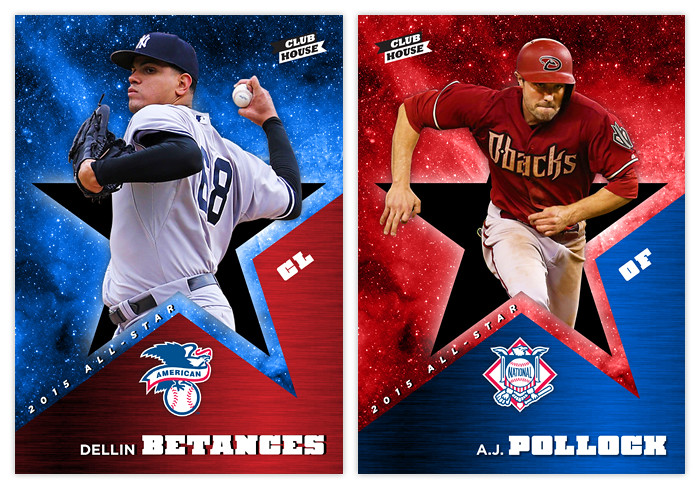
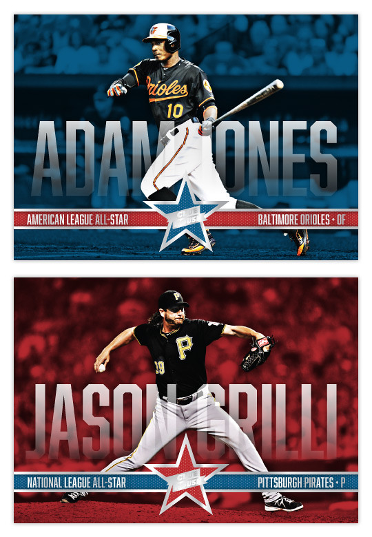
I decided to keep the red/blue divide a little more ambiguous this year instead of overtly assigning one color or the other to a particular squad. Blue outer space/red metal on one and red outer space/blue metal on the other. Incorporating the star shape into the design elements was a good way for me to call back to the 2016 Clubhouse base design. Plus, having the players busting out of the shapes is kinda fun and fits the Clubhouse brand.
The back incorporates the same elements with some slight rearranging. Adding the team logos and a small (jibberish) write-up finishes things off.
Design On Deck
Showing posts with label Clubhouse. Show all posts
Wednesday, June 8, 2016
Sunday, March 13, 2016
2016 Clubhouse
I seem to be going every-other-year with the orientation of the Clubhouse set. Last year, they were vertical. So I guess it's time for horizontal again.
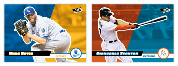
Once again, the design is filled with bold colors and simplicity, with the card cut in half by diagonal color boxes. The player cutout is surrounded by a white outline to keep them offset from the background. Diagonal bars come in from opposite sides for the player name and position with a team logo in a circle in the bottom right corner. It helps tie Clubhouse to the main Spirit base set without being such a overt copy. These simple elements keep the design from feeling overdone or cluttered while also keeping with the "fun" feel this low-end product strives for.
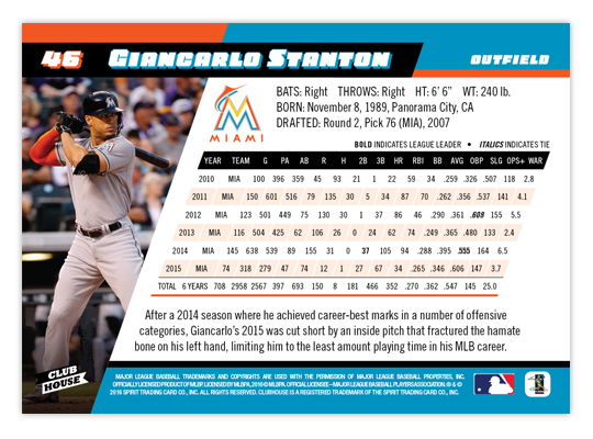
The back has plenty room for career stats while still following the elements and look of the front. Even the stat box is able to keep the angled format. If not for having to cut out every player, I'd consider doing a card for each of the 30 MLB teams just because the designing was so fun for me. To me, it strikes a good balance of modern and fun, without being too ornate like some designs are these days.
We still have the Pennant and Deluxe designs to finish/post and then I'll probably start on some new inserts for all four Spirit sets.
Labels:
2016,
arrieta,
Clubhouse,
giancarlo stanton,
wade davis
Friday, July 3, 2015
2015 Clubhouse All Out
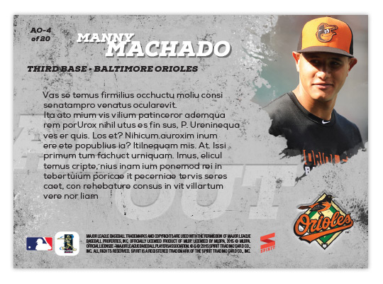
After the clean and tidy Incumbents design, I decided to go 180° with this All Out insert. The checklist here features players that go "all out" on the field, whether with the glove on the basepaths. You could fairly call this the Clubhouse version of Topps' Opening Day Play Hard insert. Personally, I think "All Out" is a much better name. And design-wise, I think I have them beat as well.
After cutting out these great action photos, I added a little glowing fuzz to them so they'd look a little "otherworldly" or so. The background is kind of a grungy gray stone thing to help the team color splash/explosion things stand out a bit more. It was a lot fun adding all the color. The names are in gold foil to help differentiate them from the "All Out" logo.
The motif is applied to the back of the card minus the color splashes. They had to be sacrificed so you could read all the jibberish nice and easily. I also made space for the team logo in the bottom right corner.
Sunday, April 5, 2015
2015 Clubhouse All-Stars
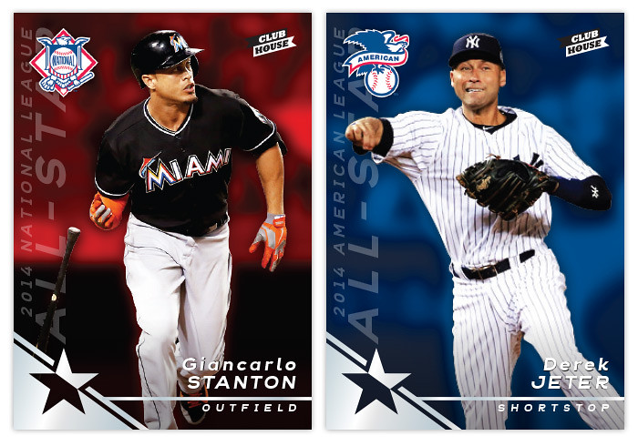
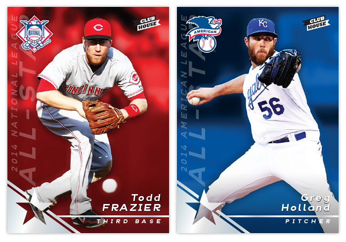
Just in time to start the 2015 MLB season, let's take a look at the first 2015 Clubhouse insert, highlighting the players who made the 2014 All-Star teams. I've been doing this insert each year since I started the blog because it's always a great encapsulation of the standout players of the league. This year, it gives me a legitimate reason to feature a Derek Jeter since (so far) I've refrained from putting retired players into any Spirit product.
The cards are split by league once again with red to designate NL guys and blue for the AL. The bottom left corner as a foil star design which is a good anchor for the player name/position to the right along with the "2014 National/American League All-Star" text along the left edge. In the upper left corner is the respective league logo. The foil here is used strictly as a design embellishment and not as a crutch, with the names being an easy-to-read white on top of the color background. I've noticed I tend to lean towards centered, symmetric designs so I'm happy going asymmetrical here.
The back has room for a nice portrait-type image up top along with space for the team logo and a brief write-up. Since the all-star squads seem to be expanding each year, this insert set has a big checklist that would lend itself to being a "one-per-pack" insert which is perfect for a low-end product like Clubhouse.
Now that the season kicks into full-gear tonight and tomorrow, get ready for more designs coming with more regularity. Good luck to everybody's favorite teams and let's 'play ball'!
Labels:
2015,
all-star,
Clubhouse,
giancarlo stanton,
greg holland,
insert,
jeter,
todd frazier
Thursday, March 5, 2015
2015 Clubhouse
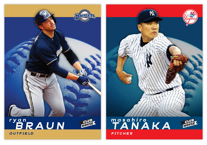
Time to check in with Spirit's "low-end" set, Clubhouse. This is traditionally a bright and colorful design and this year is no different.
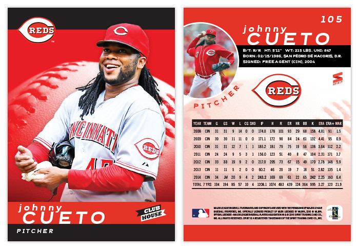
I seem to be alternating between horizontal and vertical each year so I guess we're back upright following the 2014 design. The front of the card has solid team-color stripes along the top and bottom with team-colored baseball close-up in the center. The players are cut out and overlapping the stripe at the top which also is an anchor for the team logo. The last names are big and spaced out with the player first name running off-center above it.
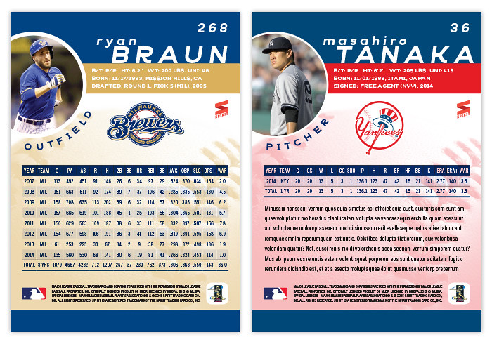
On the back, the color stripes return to house the player name and vitals. There's a circle bleeding over from the edge for an additional player photo with the position following that curve below. Right in the middle is an even bigger team logo with a pretty full stat box below. Underneath that middle section is a screened-back version of the baseball from the front. For some of the younger players, there's plenty of room below the stats for a few lines of more information.
Unlike last year, I decided to keep these parallel-free so hopefully they'll be more inserts to fill out the packs. I already have the annual All-Star design done and ready to write once I get around to it, so it looks like I'm well ahead of last year's pace.
I seem to be alternating between horizontal and vertical each year so I guess we're back upright following the 2014 design. The front of the card has solid team-color stripes along the top and bottom with team-colored baseball close-up in the center. The players are cut out and overlapping the stripe at the top which also is an anchor for the team logo. The last names are big and spaced out with the player first name running off-center above it.
On the back, the color stripes return to house the player name and vitals. There's a circle bleeding over from the edge for an additional player photo with the position following that curve below. Right in the middle is an even bigger team logo with a pretty full stat box below. Underneath that middle section is a screened-back version of the baseball from the front. For some of the younger players, there's plenty of room below the stats for a few lines of more information.
Unlike last year, I decided to keep these parallel-free so hopefully they'll be more inserts to fill out the packs. I already have the annual All-Star design done and ready to write once I get around to it, so it looks like I'm well ahead of last year's pace.
Sunday, July 27, 2014
2014 Clubhouse All-Stars
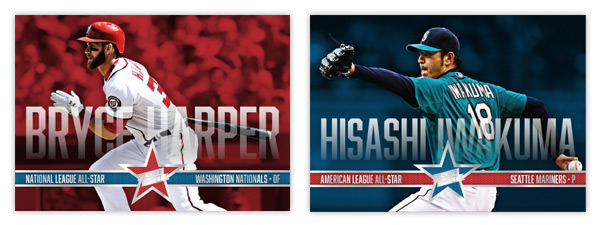
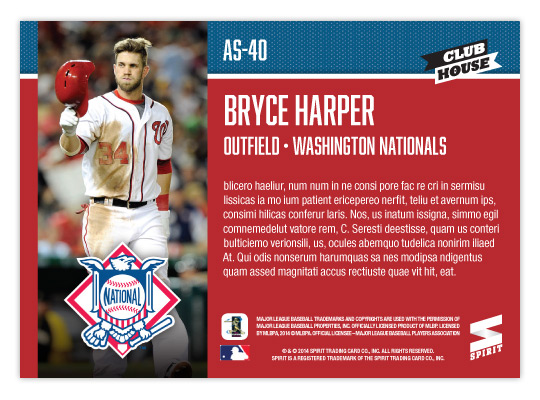
Just in time for the All-Star break..... aww, crap. Well, here's the 2014 Clubhouse All-Stars design anyway. I decided to go horizontal this year to match the 2014 Clubhouse base set. I also wanted to mimic one of the big features from that so I ran the player names really big across the width of the card. To make sure they didn't impose too much, there's a little bit of transparency to them as well as a soft fade. Hopefully they're still readable even if you don't see every edge of every character. The letter height varies depending on the length of the player names. That's why Iwakuma's aren't nearly as tall as Harper's below.
Along the bottom is a strip of info: league, team and position. The color of the bar alternates with the background and star color.
On the back, background color is solid so the text is plenty easy to read (other than it being jibberish here.) There's a vertical player photo on the left with the AL/NL logo on the bottom. I packed last year's design with too much info on the back that I'm sure would be nearly impossible to read. This year, it's all cleaner and clearer.
Labels:
2014,
adam jones,
all-star,
bryce harper,
Clubhouse,
concept,
grilli,
insert,
iwakuma
Wednesday, May 21, 2014
2014 Clubhouse
Here's a look at the 2014 design for Spirit's low-end product, Clubhouse. Having lived with the 2013 design for a year now, I decided to shift the
tone back a little more toward "fun" this year. There are definitely
some similarities between 2014 and the initial 2012 design.
Obviously there's the horizontal format but also the bold names and the
bold colors. This is bringing the set back to what I originally had in
mind.
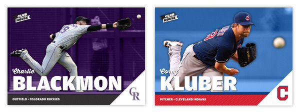
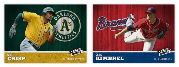
With the horizontal format we'll see more dynamic action shots, different from those on the vertical Spirit base design. There's a full-color action cut-out on top of a team-color shaded background. Just above the secondary color bar with the player position/team name is a big, bold last name. Tucked just above that is the player's first name in a nice script font. In the bottom right corner is a white triangle leaving just enough room for the team cap logo.
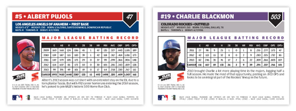
On the back are a couple of color boxes for all the pertinent player bio information. Next to a small portrait is a stat block with the player's five most-recent seasons along with their career totals, leaving room for a few sentences about them. As you can see from the numbering in the upper right, the set is a lot bigger than most non-flagship releases. A 600-card, no-foil low-end set would definitely fill a hole in the current baseball card landscape.
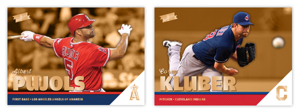
I'm adding a single parallel to the set, Clubhouse Gold seen here. Just like the original Topps Gold parallels, these are strictly the same cards but with gold foil embellishing a few areas. I also made the background color gold, too, to help set them off in case the foil gets overlooked.
With the horizontal format we'll see more dynamic action shots, different from those on the vertical Spirit base design. There's a full-color action cut-out on top of a team-color shaded background. Just above the secondary color bar with the player position/team name is a big, bold last name. Tucked just above that is the player's first name in a nice script font. In the bottom right corner is a white triangle leaving just enough room for the team cap logo.
On the back are a couple of color boxes for all the pertinent player bio information. Next to a small portrait is a stat block with the player's five most-recent seasons along with their career totals, leaving room for a few sentences about them. As you can see from the numbering in the upper right, the set is a lot bigger than most non-flagship releases. A 600-card, no-foil low-end set would definitely fill a hole in the current baseball card landscape.
I'm adding a single parallel to the set, Clubhouse Gold seen here. Just like the original Topps Gold parallels, these are strictly the same cards but with gold foil embellishing a few areas. I also made the background color gold, too, to help set them off in case the foil gets overlooked.
Thursday, August 29, 2013
2013 Clubhouse Mitt Masters
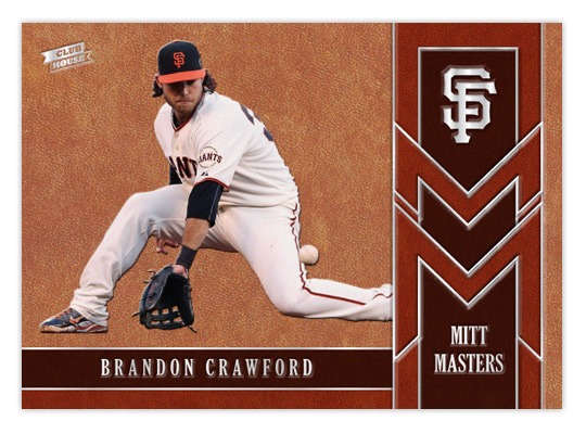
After tackling the heavy hitters of the league, let's shine a little light on some guys that flash the leather. The Mitt Masters insert features some of the league's best fielders that might not put up the offensive numbers to garner a lot of attention. Being a Giants fan, I'm keenly aware of Brandon Crawford's glovework at short. The rest of the baseball world, however, I'm not so sure. The card is almost top-to-bottom leather, or in this case cardboard with a leather texture. By adding some thickness to the stock, we're able to give all the elements a visual and tactile embossed appearance. Gloves come in all shades of leather so we' have 3 tones represented here.
The raised surfaces of all the leather spots makes way for some stamp silver foil to be pressed down. In person, these cards would be a pleasure to hold, running your fingertips across all the bumps of the images and valleys of the foil. The big cap logo in the upper right corner really stands out to my eyes.
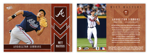
The back may have a level surface but the full color photo on the left and the richness of the leather pattern keep things from getting dull. It's a little hard to make out here but the card number (MMxx) is found inside a mitt silhouette with an embossed look, along with the Mitt Masters logo subtly pressed below the text.
I don't know how feasible it would be, but if these cards were produced it would be nice if they could somehow be infused with a leather scent. I guess that would probably make it easy for pack searchers to sniff them out, though. I think the combination of the embossing and the leather texture along with this hypothetical odor would fit in perfectly with the Clubhouse target market.
The raised surfaces of all the leather spots makes way for some stamp silver foil to be pressed down. In person, these cards would be a pleasure to hold, running your fingertips across all the bumps of the images and valleys of the foil. The big cap logo in the upper right corner really stands out to my eyes.
The back may have a level surface but the full color photo on the left and the richness of the leather pattern keep things from getting dull. It's a little hard to make out here but the card number (MMxx) is found inside a mitt silhouette with an embossed look, along with the Mitt Masters logo subtly pressed below the text.
I don't know how feasible it would be, but if these cards were produced it would be nice if they could somehow be infused with a leather scent. I guess that would probably make it easy for pack searchers to sniff them out, though. I think the combination of the embossing and the leather texture along with this hypothetical odor would fit in perfectly with the Clubhouse target market.
Labels:
2013,
andrelton,
brandon crawford,
Clubhouse,
concept,
defense,
emboss,
fielding,
glove,
leather
Friday, June 21, 2013
Keepin' It Clean
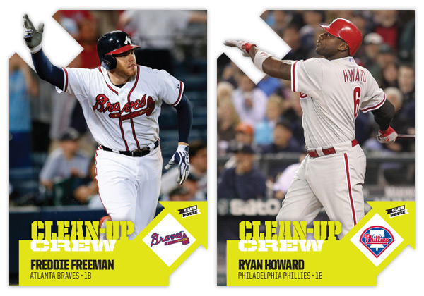
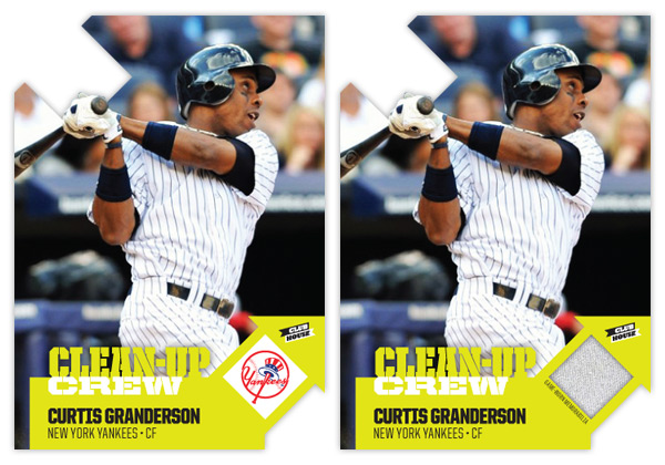
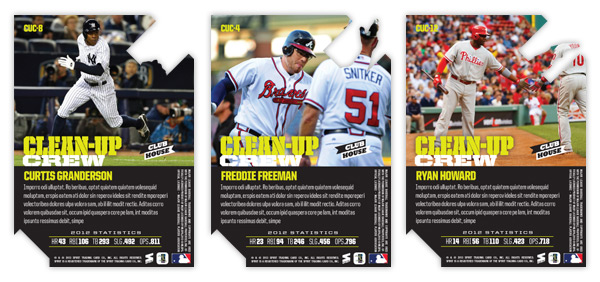
One of my personal favorite designs from Spirit in 2012 was the Clubhouse Moonshots insert. Homerun hitters, die-cut, big ol' moon. What's not to love? This time around, I kept the subject the same but changed the name to Clean-Up Crew. The die-cut is also back again though in a much different shape.
The arrows are a play on the 'up' part of 'clean-up' and helped me get the design rolling. The one on the right leaves a nice tidy space for the team logo or a memorabilia swatch. I wanted to make sure all arrows pointed up so the upper left corner was the natural choice for the other die-cut location. Having some part of the player cut into the arrow keeps things from getting stale.
As the arrows take care of the latter half of the insert name, the bright neon green/yellow color on the bottom handles the 'clean' half. Something about the color makes me think of a super-intense household cleaner that would almost scrub the skin off your finger. I imagine the ink would be almost plastic-like on the finished product.
On the back side, we have the reverse die-cut shape to deal with but luckily plenty of space is left for another big player portrait. The neon is turned down a bit with black being the most prominent color. Below a brief write-up is the 2012 stat line with categories relevant to clean-up hitters (HR, RBI, total bases, slugging % and OPS.)
All in all, the bright colors, special shape and big batters seem to fit right in with the Clubhouse line.
Labels:
2013,
clean-up,
Clubhouse,
concept,
die-cut,
freddie freeman,
granderson,
homerun,
insert,
relic,
ryan howard
Thursday, May 9, 2013
2013 Clubhouse All-Stars
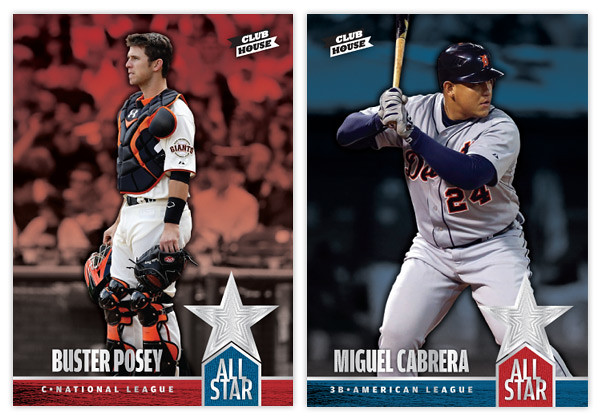
The MLB All-Star ballots went live a week or so ago so I thought it would be a good time for the 2013 installment of Clubhouse's All-Star insert. This is a 74-card set that features all the players named to the 2012 all-star rosters, whether voted in by fans, selected by managers or named as injury replacements. The design kind of follows the Clubhouse base set but with a few embellishments. The most prominent one is the shiny silver concentric star cluster in the bottom right corner. That foil is also present in the ALL-STAR title along with the player name and position/league. The red and blue motifs respective to each league is consistent with last year's version along with the annual Spirit Award Winners designs. Instead of the mowed field background from the base design, I simply kept the isolated players full-color and had the blurry background fade into their league color.
For the back side, a player portrait fills the negative space from the star shape in the upper left corner while the concentric stars fill the color underneath. The NL and AL logos are in the upper right corner with the league's all-star roster listed below with the starters and reserves designated. It's kind of a de facto half-checklist. On the left, below the player name/position/team is a brief write-up (lorem ipsum here since I was feeling too lazy to write.)
Again, I don't understand why Topps doesn't make an All-Star insert instead of relegating it to the Update set where it's basically the same base card with the ASG logo slapped on. Explain to me how at 70+ card insert with the best players (from all 30 teams) doesn't trump another nebulously-themed insert with yet more retired legends (Yankees)? Blargh.
Labels:
2013,
AL,
all-star,
Buster Posey,
Clubhouse,
concept,
design,
insert,
miguel cabrera,
NL
Sunday, March 3, 2013
2013 Clubhouse
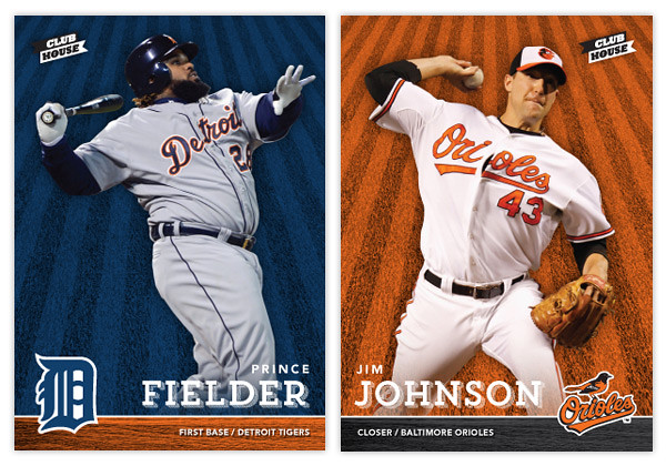
With spring training and the World Baseball Classic in full swing, my mind is definitely focused on baseball again, which hopefully means more frequent design posts. It'll be interesting to see if I have any fresh ideas after a year or if I'll fall into the same patterns like Topps does on occasion. Anyway, here's a look at the 2013 Clubhouse series. This is meant to be the low-end, Topps Opening-Day-esque product in the Spirit line. Like last year's design, it's a bright and colorful, no-frills design.
The front of the cards feature an action shot cutout of the player on top of a team-colored background with an outfield grass pattern. On the bottom is a bar with the secondary team color and a wood pattern. With the player's last name big, their first name and position/team are found above and below. I always find it important to include team/position on base designs, especially for a product marketed towards those learning the game. Alternating corners from card to card, the team's primary logo is the final element of the front design.
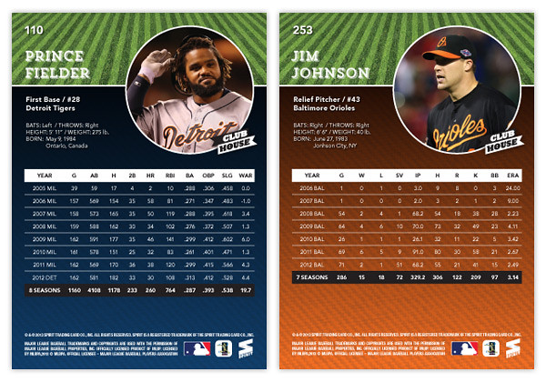
For the back, we've got a full-color player photo to the right and the player name/bio on the left. The grass pattern from the front makes it way to the back, this time in its natural green state. The bottom portion sees a big block of team color with a big chunk of career stats on top.
Keep an eye out for a few Clubhouse inserts coming up. I'll probably do another All-Stars design but hopefully I'll find some inspiration for some new and different insert ideas.
Labels:
2013,
base,
Clubhouse,
concept,
jim johnson,
kids,
low-end,
prince fielder,
pujols
Monday, June 11, 2012
Don't Skip Class
The 2012 edition of the MLB Draft happened a week or so ago so I've kinda had it on the brain for a bit. Baseball's draft is really unique when compared to the NFL and NBA versions. Most of guys are complete strangers before getting drafted, unlike the top college football and basketball players who get national attention for a season or two along with the copious amounts of coverage leading up to the draft. And unlike the Cam Newtons and Kevin Durants, the top picks aren't expected to lead their teams the following season. The timeframe for these players to start contributing is stretched much further, so by the time a guy reveals himself to be a bust or not, fans have moved on. Basically, it'll take years before anybody has any clue whether or not a particular class is strong.
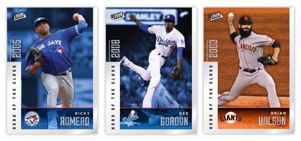
I took a little trip back to the draft results from the past dozen years or so and decided to do a draft-focused set to pick out the best picks and see how they stack up from year to year. Clubhouse Head Of the Class. This is a 100-card insert set that spans 10 drafts, from 2000 to 2009. That's a pretty good cut-off as far as singling out the 10 best players from a draft. Outside of Harper and Chris Sale, I'm not sure anyone from 2010 has made a mark in the big leagues yet.
The first thing I did was compile the checklist. It's pretty interesting to see the stacked 2005 draft (8 of the top 12) compared to bottom-heavy drafts like 2000 and 2001. Some years were a little thinner than others but I think I did a good job find 100 guys that deserved to be featured.
Looking at the design, we have a silver foil border that goes around approximately 2/3 of the card edge. The left side is a bit thicker and has the "HEAD OF THE CLASS" text in black running over it. Above that is the draft year in silver foil as well. This is one of the few asymmetrical inserts I've done, so it was nice to change that up a bit. We've got the team color backgrounds behind the player cutouts along with an info bar at the bottom with the player name and team logo.
On the back, the silver border has been turned the team color and the background is solid black. We have a small player portrait on the right with the card number and player position/team below. The top spells out which year the player was drafted along with the top 10 picks from that respective draft. The picks are listed in order but obviously skips ahead to the pertinent draft slot. The player depicted on the card has his name and draft slot bigger, bolder and italicized. Beneath that is a brief write-up about what makes them one of the 10 best from their draft.
This was a fun insert just to figure out the players to include and to take a look back at drafts of the past. The fun part is, I'm sure that even 2 or 3 years from now, these checklists could look drastically different as some late-bloomers or Renaissance men start to emerge in the league. As a Giants fan, though, I sure hope the #10 pick from 2006 could stay included in the future.
I took a little trip back to the draft results from the past dozen years or so and decided to do a draft-focused set to pick out the best picks and see how they stack up from year to year. Clubhouse Head Of the Class. This is a 100-card insert set that spans 10 drafts, from 2000 to 2009. That's a pretty good cut-off as far as singling out the 10 best players from a draft. Outside of Harper and Chris Sale, I'm not sure anyone from 2010 has made a mark in the big leagues yet.
The first thing I did was compile the checklist. It's pretty interesting to see the stacked 2005 draft (8 of the top 12) compared to bottom-heavy drafts like 2000 and 2001. Some years were a little thinner than others but I think I did a good job find 100 guys that deserved to be featured.
Looking at the design, we have a silver foil border that goes around approximately 2/3 of the card edge. The left side is a bit thicker and has the "HEAD OF THE CLASS" text in black running over it. Above that is the draft year in silver foil as well. This is one of the few asymmetrical inserts I've done, so it was nice to change that up a bit. We've got the team color backgrounds behind the player cutouts along with an info bar at the bottom with the player name and team logo.
On the back, the silver border has been turned the team color and the background is solid black. We have a small player portrait on the right with the card number and player position/team below. The top spells out which year the player was drafted along with the top 10 picks from that respective draft. The picks are listed in order but obviously skips ahead to the pertinent draft slot. The player depicted on the card has his name and draft slot bigger, bolder and italicized. Beneath that is a brief write-up about what makes them one of the 10 best from their draft.
This was a fun insert just to figure out the players to include and to take a look back at drafts of the past. The fun part is, I'm sure that even 2 or 3 years from now, these checklists could look drastically different as some late-bloomers or Renaissance men start to emerge in the league. As a Giants fan, though, I sure hope the #10 pick from 2006 could stay included in the future.
Labels:
2012,
brian wilson,
checklist,
class,
Clubhouse,
concept,
dee gordon,
draft,
foil,
insert,
ricky romero,
strasburg
Tuesday, April 17, 2012
1-2 Punch
The last post focused on heavy hitters so now it's time for mound masters (sounds like a great name for another inserts somewhere down the line.) The hook for this one is spotlighting teams with 2 pretty good or even great pitchers at the front of their rotation. It was a lot harder than I thought it would be to put together the checklist. For quite a few teams, the drop off from number 1 to 2 is pretty big. That's why guys like Kershaw and Sabathia are absent here. On the other end of the spectrum, you've got a couple of teams with deeeeeeep rotations that end up leaving off a some great pitchers, Cole Hamels and Madison Bumgarner* in particular.
* I reeeeally hope Timmy gets back to normal or his inclusion over MadBum will look particularly egregious.
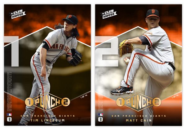
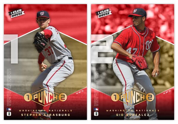
Basically we've got player cutouts on top of a gold diamond (mimicking the 1-2 Punch logo shape) on top of a team-color saturated photo. The big 1 and 2 on the side look really cool with the cards stacked next to each other.
The design here is a little more 'sophisticated' than a couple of the other Clubhouse inserts, but I think it's nice to appeal to some different tastes with a low-end set. We have some gold foil here on the 1-2 Punch logo along with the player & team names. I included the fineprint (copyright, MLB and MLBPA logos) on both sides so the number 2 guy doesn't get dumped on. I figure player collectors would probably appreciate having a full side of their guy on a 2-player card.
Here's the 14-card/28-player checklist I came up with. See any blatant snubs?
GIANTS: Lincecum, Cain
PHILLIES: Roy Halladay, Cliff Lee
TIGERS: Justin Verlander, Doug Fister
RAYS: James Shields, David Price
BREWERS: Gallardo, Greinke
RED SOX: Josh Beckett, Jon Lester
DBACKS: Ian Kennedy, Daniel Hudson
ANGELS: Jered Weaver, Dan Haren
BRAVES: Tim Hudson, Tommy Hanson
REDS: Mat Latos, Johnny Cueto
CARDINALS: Adam Wainwright, Jaime Garcia
MARLINS: Josh Johnson, Mark Buerhle
RANGERS: Yu Darvish, Derek Holland
NATIONALS: Strasburg, Gonzalez
Labels:
2012,
Clubhouse,
concept,
design,
gio gonzalez,
greinke,
insert,
Lincecum,
matt cain,
pitchers,
strasburg,
yovani
Sunday, April 1, 2012
To the Moon and back
Oh, hi there. It's nice to be back. I sure was gone a looooong time, huh? Well, the vacation was had and spring has sprung. I figured it was time to poke my head out and say 'hello.' Opening Day is a few short days away so let's get this thing back on the rails.
In thinking for another insert idea for Clubhouse, I figured I'd go with something simple like 'guys who hit a bunch of homeruns.' That seemed easy enough. But then came the hard part of coming up with a name & concept. I passed over stuff like 'Home Run Kings' since they have been in recent products and thought that the Clubhouse brand could use something a little more fun. So I started thinking of different slang terms for homers. Unfortunately, most were either semi-perverted (dingers, dongs, goin' deep) or had also been used elsewhere (going yard, touch'em all.) So I was back at square one.
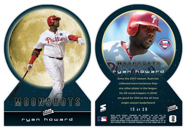
But during my research, I kept coming back to the term 'moonshot,' thinking it really lends itself to something fun and interesting design-wise. Even though Ultra ran an insert in 2003 with the same basic premise, I figured I could update and improve upon it.
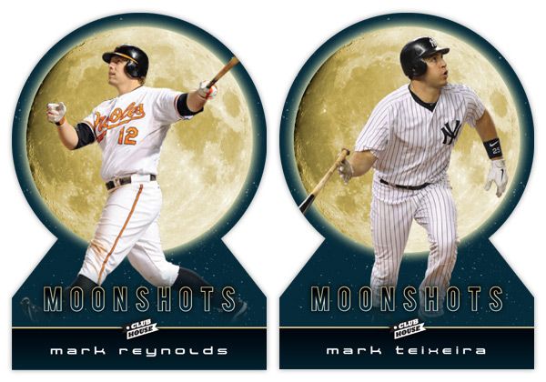
Looking at these cards, the first thing that pops out is either the UGE moon image or the absence of edges on the top. Yep, these are my first die-cuts. Over the years, I've come to the conclusion that die-cuts can be really cool but I always prefer the ones with at least 2 true corners. They need to be able to sit level in a sleeve or toploader, which usually means the bottom corners. I have a feeling that if some other card companies tried to die-cut this, they'd jump for the completely round die-cut and obliviously annoy collectors.
With the full moon image taking up a lot of real estate, it makes a nice backdrop to the player images. The photos here are of the batters directly following their 'moonshot' swings. With the Howard and Reynolds cards, they're stoicly staring down their long balls (or fly outs) while Teixeira is starting his trot towards first. The dark blue color complements the gold moon while adding a little bit of subtlety you wouldn't get from black. The names are below in a 'space' font to extend the lunar motif going on here.
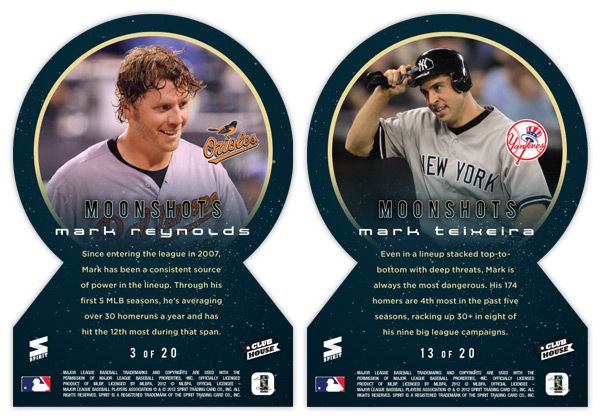
On the back side, the symmetry of the die-cut really helps keep things clean. Instead of the moon, we get a circular close-up of the players, which fades out towards the bottom to make room for the text. I also found space for the team logos somewhere within the photo frame (these all happen to be in about the same spot but that was just a happy accident with these particular photos.) The checklist totals 20 though I didn't really put it together completely. I thought it would be nice to include some guys like Reynolds here who have better numbers in the HR category while not really nearing the leaderboards elsewhere. Adam Dunn would be another candidate but would probably need to get off to a good start in 2012 to justify a spot here. Anyway, 17 of the 20 spots are still open.
Alright, thanks for checking in with me again after the long lay off. I promise the posts will keep coming semi-regularly like they used to. See ya soon!
Labels:
2012,
Clubhouse,
concept,
design,
die-cut,
homerun,
insert,
mark reynolds,
moonshots,
ryan howard,
teixeira,
welcome
Saturday, February 25, 2012
Summer Standouts
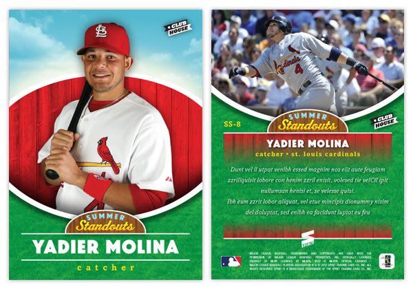
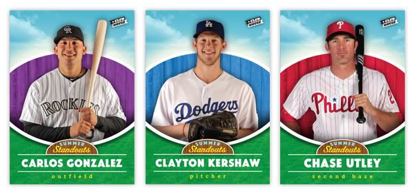
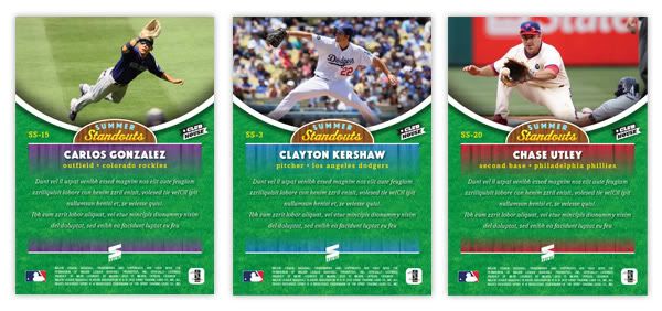
Time to switch gears a bit and introduce another insert for the Clubhouse set. This one is called Summer Standouts. Every team is represented here but by a player who may not necessarily be the #1 player on their squad.
As you can tell from the design, we're really playing up the 'kid-friendly' angle here. We've got a bright, sunny sky and a nice patch of grass framing the top and bottom. The player photos here are the standard stand-and-smile shots from the team photo days at the start of the season. These are very friendly and just give a nice, welcoming feel to the cards. The team-color fence from the base design also made its way over here, though its space has been reduced to make room for the other elements. The player name is in a big, chunky sans-serif with their position in all lowercase beneath.
On the backside, the grass patch has extended upward a bit and the player photos are action shots during day games to keep that sunny feeling going. Player name, position and team are laid over the fences, which fade out for a brief write-up.
Pretty simple insert set. No foil or diecuts or sparkliness. Checklist is below. This may not look like the most appealing set to most collectors since there won't be anybody like Jeter or Braun, but there are still some pretty popular guys from stacked teams.
SS1 - Wandy Rodriguez (HOU)
SS2 - Torii Hunter (LAA)
SS3 - Clayton Kershaw (LAD)
SS4 - Matt Cain (SF)
SS5 - Mark Teixeira (NYY)
SS6 - Alex Avila (DET)
SS7 - Yadier Molina (STL)
SS8 - J.P. Arencibia (TOR)
SS9 - Brian McCann (ATL)
SS10 - Franklin Gutierrez (SEA)
SS11 - Justin Morneau (MIN)
SS12 - Kevin Youkilis (BOS)
SS13 - Jay Bruce (CIN)
SS14 - Jayson Werth (WAS)
SS15 - Carlos Gonzalez (COL)
SS16 - David Price (TB)
SS17 - Daniel Hudson (ARZ)
SS18 - Michael Young (TEX)
SS19 - Billy Butler (KC)
SS20 - Chase Utley (PHI)
SS21 - Logan Morrison (MIA)
SS22 - Rickie Weeks (MIL)
SS23 - Darwin Barney (CHC)
SS24 - Neil Walker (PIT)
SS25 - Gordon Beckham (CWS)
SS26 - Daniel Murphy (NYM)
SS27 - J.J. Hardy (BAL)
SS28 - Coco Crisp (OAK)
SS29 - Asdrubal Cabrera (CLE)
SS30 - Clayton Richard (SD)
Saturday, February 4, 2012
Clubhouse All-Stars
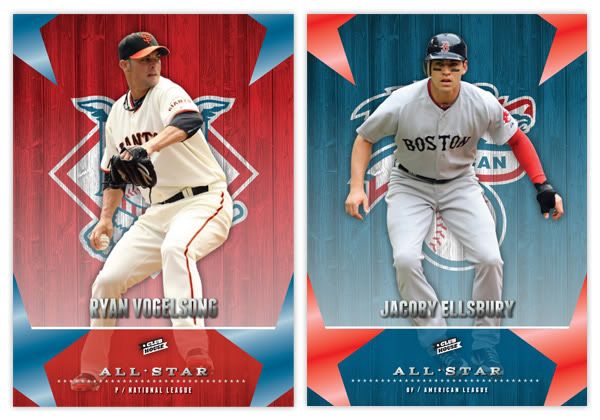
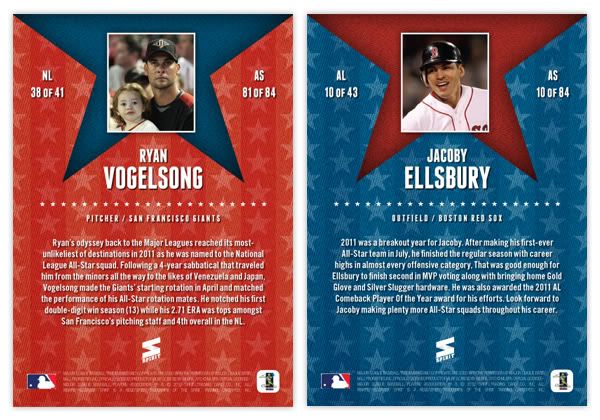
The first insert for the Clubhouse set is kind of a no-brainer. As early as 1958, all-star cards were showing up in the flagship base set. Back then it was maybe a couple dozen, usually just the starters. But with the bloated rosters of today's All-Star Game, there's just no room for an 80+ card subset. For an insert set, however, that sounds just about right. The 2011 MLB all-star squads were 41 (NL) and 43 (AL) players deep, making an 84-card set. That means you'll get the superstars like Pujols, Jeter and Halladay but also guys like Ryan Vogelsong up there.
The design carries the wooden fence motif from the Clubhouse base card, but with the NL and AL logos instead of team logos. The colors are blue and white with each league alternating the dominant hue. We have player cutouts once again, but what really sets these apart from the base design (other than the vertical layout) is the shininess. In addition to the player name and 'all-star' in silver foil, the 4 stars shooting off the edges of each corner have a solid, colorful sheen to them as well (think 2011 Topps Town.)
For the back, we have a player portrait and name centered at the top and a brief write-up of their all-star season below. The background has the alternating red and blue as well with another explosion of stars. The numbering is similar to the Spirit Award Winners inserts, with a _of_ for each league and _of_ for the whole set.
There's nothing wrong with shininess if done in moderation. Finding these inserts between the no-frills base will be a great charge for those busting wax. I'd like for them to not be a 1-per pack thing since that kind of chips away the 'specialness.' I know any time I pull a Topps Town or Hometown Heroes card, it feels like getting Tootsie Roll in your Halloween bag. It's better than those orange and black taffies, but not as exciting as a Snickers or Reese's Cup.
Friday, January 27, 2012
Welcome to the Clubhouse
First off, I want to welcome all of you new readers out there. I'm sure a lot of you came here thanks to Robert over at $30 a Week Habit, so thanks again to Robert. I really enjoy your blog and marvel at your restraint to stay within your budget. You are much stronger than I.
Now onto the card design. I was looking to create a 'low-end' set for Spirit, along the lines of Collector's Choice from the 90s or Topps Total from the early 00s. I think having a product come in at $1 a pack is important to keep growing new collectors in their youth. I know we have Opening Day but I don't like the idea of a product being tied to a single day early in the season, especially since Topps Series I is still somewhat fresh at that point. The Clubhouse set would hit the shelves right around Memorial Weekend, which, to me, always signifies the start of summer.
The base set consists of 810 cards total: 25-man roster + manager + team checklist x 30. The front of the card features the player cut out and placed in front of an old wooden fence in team colors with the team logo 'painted' on. At the bottom is the player name, position and team name placed on top of a team color dirt patch. The two sections are separated by a white chalk line and the Clubhouse logo. I think this is a pretty good 'kid-targeted' design with the solid colors and player cut out. It has a bit of a 'Sandlot' feel to it.
The back of the card features the same team color sections but with the proportions flipped. A full-frame picture of the player is found on the left with the stats & info on the right. The stat lines only cover 5 seasons and a small selection of statistical categories. They're a blend of traditional and sabermetric stats, whichever floats your boat. The card numbers in the upper left hand corner, rotated 90° counterclockwise. This makes them easier for sorting when stored vertically in /ct boxes and also keeps from covering up too much of the photo.
The production is pretty no-frills, with no foil stamping, crazy shiny patterns, parallels or any other gimmicks. Just full-color printing on a coated card stock with a semi-glossy coating. There will be a few inserts coming up later and maybe even something like a relic or die-cut. This would be a simple, fun, colorful release for set-builders on a budget or kids spending their lemonade money or whatever kids do to earn money during summer break.
Subscribe to:
Posts (Atom)