Showing posts with label minis. Show all posts
Wednesday, May 15, 2013
REVIEW: 2013 Bowman
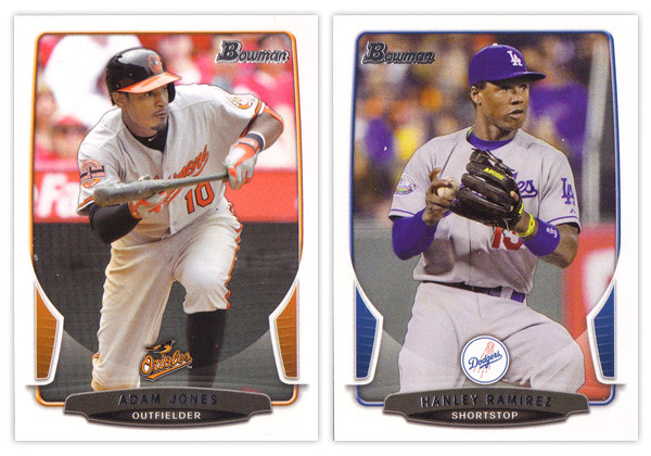
The biggest takeaway from the 2012 Bowman design was how it was a big departure from what Bowman had been putting out for many years past. As we review the 2013 version, it looks like that big year-to-year jump was merely aberration and not a new gameplan heading forward. Just like the 2012 version, this year we have white borders, not-quite rectangular frames in team colors, silver foil names, subtle drop shadows around the players, team logos centered above the name block. Honestly, you could be looking at last year's cards while reading that description and it would be 100% accurate. About the only distinguishing features here are the little tabs folding in on the left and right sides and the soft white overlay to finish out that curve. If we didn't have 2012 to compare this to, I'd really like the base design here. But as a follow up, it looks more like a rehash and suffers a bit.
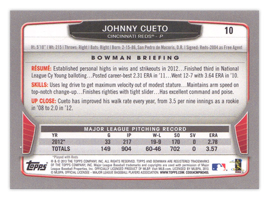
For the backside, the similarities are even more....similar. The layout is identical to 2012 with a little tinkering to fit this year's look. The colored tabs on the bottom and the black nameplate are pretty much where those embellishments are made. I mentioned a couple things on last year's review that I thought were easy improvements to make. I suggested that the last section of the Bowman Briefing be changed from EVOLUTION to UP CLOSE (like it is/was on the prospect cards.) I doubt that any eyeballs at Topps saw my recommendation but somehow it was magically changed for this year. My other suggestion, however, seems to have gone without notice. The card numbers are still in the upper right corner, which means if you store these upright in a cardboard box, the numbers won't be visible. So once I again, I propose this amendment to the Baseball Card Constitution: horizontal backs have to be numbered in the upper left corner to help for storage box sorting.
Now on to what is basically Bowman's reason to exist: prospect cards. For 2012, I preferred the veteran design to the prospect design but I'm flipping it around for this year. The prospect design is a lot easier to distinguish here thanks to the solid team-color wedges above the name. There are some subtle shape differences to the frame and nameplates that also help them stick out. The team logos are removed to help save space for the autographs (I assume.) That means the team names are found below the player name and the position is moved to the right color wedge.
Like every other Topps release, there are plenty of parallels again. Gold, blue, purple, orange, silver ice, etc., etc. The international cards are a little different this year. The flags have some texture to them so they aren't as glaringly obvious as prior years. Also, for American-born players, they have the flag of their home state up here instead of the Stars & Stripes. I'm all for anything that helps distinguish them from previous years.
The Top 100 Prospects cards are actually pretty nice. They have a smooth, cool finish to them with some silver, black and blue/red colors around the border. There appears to be a die-cut version as well but, as I've mentioned before, I'm not a big fan of random-shaped die-cuts. I do like how the numbers are nice and big to help drive home the fact that there is a list they're referencing. And keeping with the blue, we have Bowman reprints with blue refractor borders. I'm so tired of reprints that I can't even bother to say any more about them.
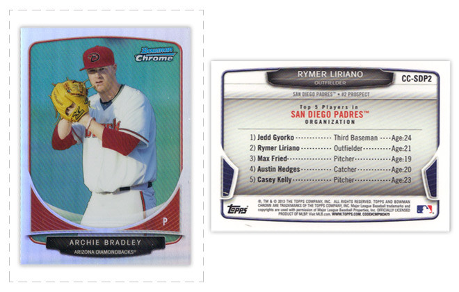
Finally, we've come to what's probably the worst development so far this collecting season. Topps has decided to introduce minis into the Bowman line. Their reasoning is obviously... who knows, but here they are. They're an odd size, they're chrome, they're refractory, they're prospect-ory. I wish somebody with power at Topps could exercise some willpower and stop spreading things across every release like this. It's really getting old.
Overall, I'd feel better about the 2013 release if it all weren't so simliar to 2012. The base and prospect designs look like comps that didn't get picked up last year or were just saved away for a future release. I understand keeping some things consistent but this comes across as a little too lazy.
Base cards: 7/10
Parallels: 6.5/10
Prospects: 8/10
Inserts: 6/10
Minis:4/10
OVERALL: 6.3/10
Monday, August 13, 2012
Gint-A-Cuffs IV: Packs 13-18
Following my last post, my running total starting out here is +125
PACK 13
WTB4 Willis Tower +3
305 Wilin Rosario SP +2
68 Rickie Weeks
138 Josh Willingham
155 Edinson Volquez
236 Scott Rolen
297 Justin Morneau
Mini261 Michael Taylor
PACK TOTAL: +5
RUNNING TOTAL: +130
PACK 14
WTB7 Chrysler Building +3
120 Mariano Rivera (NYY) -1
317 Jason Heyward SP +2
48 Jordan Walden
107 C.J. Wilson
186 Jemile Weeks
260 Alex Liddi
Mini148 Carlos Gonzalez
PACK TOTAL: +4
RUNNING TOTAL: +134
PACK 15
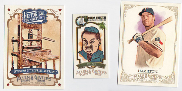
HTP7 Printing Press +3
ML20 Sun Tzu +3
328 Josh Hamilton SP (FP) +4
32 Ben Zobrist
53 Hisashi Iwakuma
64 Mat Latos
183 Darwin Barney
242 Alfonso Soriano
PACK TOTAL: +10
RUNNING TOTAL: +144
A new mini insert here, the World's Greatest Military Leaders. Not a lot to say about it.
PACK 16
WIN58 Rickey Henderson +2
AGR-AP Albert Pujols Relic +10
132 Daniel Hudson
159 Devin Mesoraco
257 Dan Uggla
284 Pedro Alvarez
Mini135 Michael Morse
PACK TOTAL: +12
RUNNING TOTAL: +156
Hit time! Even though he's not one of my personal favorites, I feel like Albert's a pretty good relic to pull if I'm just gonna be getting a regular old player relic. Too bad that doesn't net me any extra points.
PACK 17
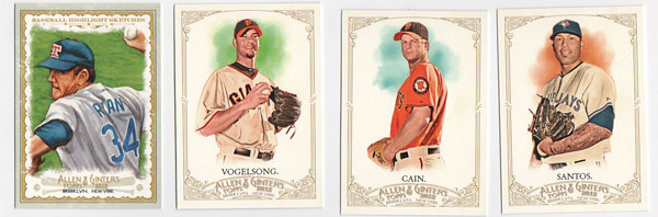
BH11 Nolan Ryan +3
152 Ryan Vogelsong (Giants) +1
281 Matt Cain (Giants) +1
322 Sergio Santos SP +2
31 Jackie Robinson
60 Reggie Jackson
116 Brandon Beachy
55Mini Colin Montgomerie
PACK TOTAL: +7
RUNNING TOTAL: +163
Cool, pocket aces. Throw in the Nolan Ryan and that's a set. Again, I love the color those orange Giants jerseys bring to this set design.
PACK 18
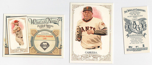
WIN8 Cliff Lee +2
158 Melky Cabrera (Giants) +1
Mini288 Alex Rodriguez A&G (NYY) +1
14 Nick Markakis
88 Stan Musial
137 George Brett
139 Tim Hudson
263 Jason Motte
PACK TOTAL: +4
RUNNING TOTAL: +167
I hope I'm right on the scoring of the A-Rod A&G Back. +2 for A&G -1 NYY = +1???
Heading into the last stretch with one hit to come, I hope +167 is a respectable total. I guess we'll see....
PACK 13
WTB4 Willis Tower +3
305 Wilin Rosario SP +2
68 Rickie Weeks
138 Josh Willingham
155 Edinson Volquez
236 Scott Rolen
297 Justin Morneau
Mini261 Michael Taylor
PACK TOTAL: +5
RUNNING TOTAL: +130
PACK 14
WTB7 Chrysler Building +3
120 Mariano Rivera (NYY) -1
317 Jason Heyward SP +2
48 Jordan Walden
107 C.J. Wilson
186 Jemile Weeks
260 Alex Liddi
Mini148 Carlos Gonzalez
PACK TOTAL: +4
RUNNING TOTAL: +134
PACK 15
HTP7 Printing Press +3
ML20 Sun Tzu +3
328 Josh Hamilton SP (FP) +4
32 Ben Zobrist
53 Hisashi Iwakuma
64 Mat Latos
183 Darwin Barney
242 Alfonso Soriano
PACK TOTAL: +10
RUNNING TOTAL: +144
A new mini insert here, the World's Greatest Military Leaders. Not a lot to say about it.
PACK 16
WIN58 Rickey Henderson +2
AGR-AP Albert Pujols Relic +10
132 Daniel Hudson
159 Devin Mesoraco
257 Dan Uggla
284 Pedro Alvarez
Mini135 Michael Morse
PACK TOTAL: +12
RUNNING TOTAL: +156
Hit time! Even though he's not one of my personal favorites, I feel like Albert's a pretty good relic to pull if I'm just gonna be getting a regular old player relic. Too bad that doesn't net me any extra points.
PACK 17
BH11 Nolan Ryan +3
152 Ryan Vogelsong (Giants) +1
281 Matt Cain (Giants) +1
322 Sergio Santos SP +2
31 Jackie Robinson
60 Reggie Jackson
116 Brandon Beachy
55Mini Colin Montgomerie
PACK TOTAL: +7
RUNNING TOTAL: +163
Cool, pocket aces. Throw in the Nolan Ryan and that's a set. Again, I love the color those orange Giants jerseys bring to this set design.
PACK 18
WIN8 Cliff Lee +2
158 Melky Cabrera (Giants) +1
Mini288 Alex Rodriguez A&G (NYY) +1
14 Nick Markakis
88 Stan Musial
137 George Brett
139 Tim Hudson
263 Jason Motte
PACK TOTAL: +4
RUNNING TOTAL: +167
I hope I'm right on the scoring of the A-Rod A&G Back. +2 for A&G -1 NYY = +1???
Heading into the last stretch with one hit to come, I hope +167 is a respectable total. I guess we'll see....
Labels:
2012,
Allen Ginter,
Gint-a-cuffs,
minis,
relic,
review
Friday, April 20, 2012
REVIEW - 2012 Gypsy Queen
Welcome to my second product review here. I skipped Heritage* since the design is the same as 1963 and there were only a few inserts to mess with. That means Gypsy Queen is next up on the docket.
*For the record, I really dig the 1963 design so I think Heritage is a winner this year. My only gripes are peripherally design-related (Rookie Stars variations? No thanks.)
So far, I've only opened a blaster and a rack pack, so I don't have an example of everything in-hand, but I've seen enough pics online to have a good understanding of the designs.
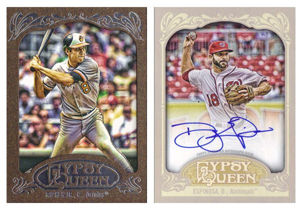
Starting with the base design, it's definitely more ornate than last year. They've added some of the flourishes from last year's inserts onto the base here. All of the info has been moved to the bottom. The Gypsy Queen 'logo' is bigger but somehow blends in a little more. That's probably due to the gold neutrals on gray. There may be a little less real estate for photos, but the shots seem to be closer and more intimate, so that's an upgrade in my eyes. Comparing this year's to last year's really makes the 2011 design look pretty drab and dull. Off to a good start with the base set.
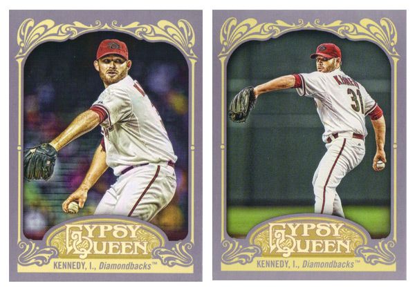
Unfortunately, the SPs this year are photo variations instead of just high-numbers at the end of the set. Right now, the problem is you only know you have an SP if you happen to pull two of the same card number but different images, like I did up there with Ian Kennedy. I'm sure eventually it'll be common knowledge which is standard and which is short-printed, but it's kind of annoying at the moment. Not only that, there are now 50 less players with a card than there should be.
A couple of parallels here are the Framed Paper. There are also a blue version and a retail-only brown version, like the Ripken here. Also a black 1/1 version for some reason. It's up in the air whether these are any nicer than last year's copper/bronze and green. There are also a lot of on-card autos which look really nice on this card stock and design. The white fade on these is the least noticeable on any auto card I've seen lately.
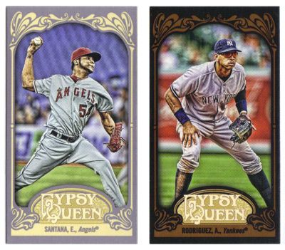
Minis this year come in regular (gray), black, green, and sepia. The black look really nice with the leather brown flourishes. The sepias also work better than the 2011 version.
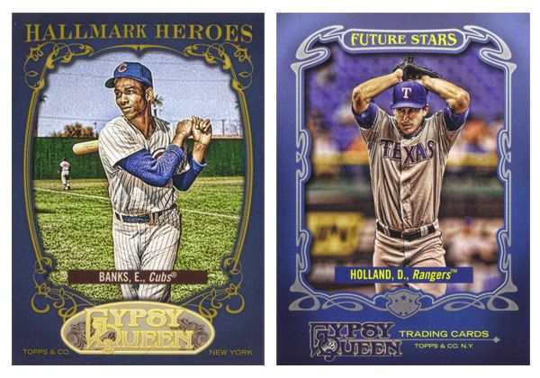
The Hallmark Heroes insert features all-time greats while Future Stars returns with up-and-coming players with bright futures. Both have blue borders, which is kind of a strange choice. Also, the logo situation on both bugs me. For the Hallmark Heroes, that shade of gold on the logo is way too light compared to the darker gold around the photo frame and the text on top. And on the Future Stars cards, not having the GQ logo centered at the bottom is really distracting since everything else is symmetrical but that.
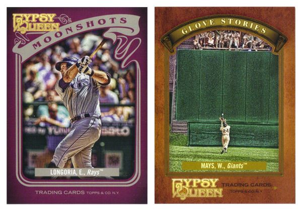
The homerun insert this year is called Moonshots. (Hey, that sounds familiar...) The purple border is surprising and works pretty well. I like the asymmetry, especially compared to the centered-ness of every single other card in GQ. The Glove Stories design is really plain and boring. There's just not a lot going on with the photo frame, especially compared to every single other card in GQ. Maybe its the fact that leather color is too similar to the gold used for that frame. Something closer to the gold on the GQ logo here would work a little better. And what's with the cropping on this image of Mays? Why they felt it necessary to show the outfield wall and keep him so small is beyond me.
The last insert is Sliding Stars, which is kind of like this year's Sticky Fingers in that it focuses on a part of the game that doesn't get a lot of attention on cards. Also, they're both the only horizontal design in both their respective sets. This is a pretty cool design that leaves a lot of space for some great photography. The elements that do enter into the frame don't impose too much, so there isn't much obstruction on display.
Last year, we saw the Gypsy Queen inserts. This time around, they've featured the Gypsy Kings, a mythical baseball squad. Again, they have auto variations, though I don't really get why they have fictional characters sign autographs. Oh well. It's a fun little bit of A&G without going overboard.
Rounding out the set are the hits like the Indian Head Penny and Relics that do a really nice job of adjusting the base design to incorporate the memorbilia. There are also the framed mini Relics and Autos that are exactly the same design as their full-size counterparts, only smaller.
All in all, the 2012 version of Gypsy Queen isn't all that different from the 2011 version. They seemed to have made some improvements here and there without really downgrading anything, so I'd consider that a success. It definitely feels less like a rehash of A&G like I was thinking last year.
Base cards: 4/5
Parallels: 4/5
Photography: 4/5
Hallmark Heroes: 3/5
Future Stars: 3.5/5
Moonshots: 4/5
Glove Stories: 2/5
Sliding Stars: 4.5/5
Gypsy Kings: 4/5
Indian Head Penny & Relic: 4/5
Minis: 4/5
OVERALL: 3.73/5
Labels:
2012,
a-rod,
derek holland,
epsinosa,
ernie banks,
Evan Longoria,
gq,
gypsy queen,
ian kennedy,
minis,
review,
ripken,
santana,
weeks,
willie mays
Sunday, February 5, 2012
REVIEW - Topps Series 1
I'm sure you've all been nearly Topps-ed to death in the blogosphere this week, but hopefully you still have some patience left for my first of (hopefully) many product reviews. I'll try to keep my review strictly design-related but we'll see how it goes.
Let's start with the base card. First off, I was really big fan of the 2011 design. Topps did a good job of making it look classy yet contemporary. They didn't over think things and didn't have anything 'trendy' that'll we'll be giggling about 10 years from now. As for the 2012 design, I think it's a step back. The amorphous blob in the corner screams late 90's, as does the font choice, Bank Gothic. I've seen quite a few other complaining about the readability of the last name in foil on black and I agree, it's hard to make out in scans and low light.
I like that they team logos are included but they should definitely be moved to the right corner of the card. As it is now, the left corner is really crowded while the right is empty, leaving the card to be imbalanced overall. Also, it's always nice to see the player position on the front.
I do give Topps credit for the photo quality throughout Series 1. There seems to be a lot more fielding shots than normal, with tighter crops for better use of the card real estate. The Arencibia and Revere ones above are a couple of my favorites so far.
The back of the base set is successfully simple. The round curve thing fits well into the top with the name and team/position section. I like that the numbers are big and just sitting inside the black box, nice and readable. The stats are always concise and thorough, though it seems like someone made some goofs and/or bad decisions. I'm sure a lot of you have noticed that doubles show up as 3B instead of 2B on some cards. That's just something that got overlooked in the proofing process. But substituting W for BB when it comes to walks, I think that was intentional. And dumb. Either way, I hope they fix it for Series 2. It's really embarrassing.
Now on to the gold 'rush,' and by rush I mean 'overkill.' It looks like they consolidated the gold and Diamond Anniversary parallels from last year into a single "Golden Moments" parallel (which happens to be the name of a completely different insert set for some inexplicable reason.) I like that golds are actually shiny instead of just a dull gold border like they've been doing. There's a warmth to the set that's inviting. As for the Golden Greats insert, these are just....I don't know. When they released the comps a few months ago, I assumed that the gold medallion things would be actual gold foil. Instead, it's just a big yellow gradient-filled circle. The layout's actually not bad with the home-plate frame and the standard 'old-timey-ness' Topps loves. But the fake gold medallion is just too much to overlook, especially when they went to the trouble of foil-stamping the text directly to the left of it. Also, why they needed to make a 75-card set featuring only 15 players is beyond me.
The Gold Standard insert set has a decent concept behind it but the execution falls a little short. The design is a little off balance with the empty space below the medallion. The '3000 HITS' on the card above are just a little too faint. Darken that up a little more and you'd have a winner. For the Classic Walk-Offs, if the bottom right photo was full-color for the non-auto cards, it would really help balance out the design. Everything else works fine and that's the only problem spot. Not terribly exciting but it gets the job done.
The Golden Moments card here is a relic version I was lucky enough to pull in from my box break (if it didn't happen to be a Giant, I'd be kinda bummed.) I like the design idea but there are a few things that bug me. First, the home plate shape (which usually houses the team logo) needs to be moved over to the right a bit. There's no reason it for it to not be centered between the player cutout and the Golden Moments bar. The other issue is the white fade along the bottom. I know the reason it's like this is for the signature on the Autograph variations, but I don't understand why it has to be on the non-auto version. It's not like they just pull the random non-auto prints out and hand them over for guys to sign. The auto variations always include that 'TOPPS CERTIFIED AUTO' text, so there's definitely at least one design distinction there. To me, it just comes across as laziness.
This year's version of the player-comparison insert is called Timeless Talents. I like these better than the Diamond Duos of last year. First off, the design is better since it fits in as both traditional and contemporary. That means it's a little boring but it'll do. But where it really beats last year is the player thread. This is obviously a retired legend on the left and the current player with the similar game on the right. These combinations were found in the Diamond Duos set too, but there were also combos made of current teammates or current players from different teams. Hopefully if they bust this set out again for Series 2, they don't start mixing up those up again.
Inside the retail blasters this year are 2 different kinds of manufacture relics. The first is a Retired Number Patch which is basically their number embroidered in a block font onto some kind of fabric. These aren't as visually exciting as the old manufactured logo patches from last year, but I think they fit the space better and it's nice having a consistent shape from card to card. The other one is a Historical Stitches card which is basically the player's last name stitched onto a heavy flannel. This is supposed to replicate the old names being stitched into player jerseys from the past, which isn't something I knew about. These are pretty cool though a little drab with such a big 'swatch.' Still, these are both pretty cool to go along with the Retired Rings and Coin cards that I don't have any scans of. I give Topps credit for being innovative here. We all bitch about the plain colored jersey swatches and how they aren't really 'special' any more since they're all basically the same year to year. I think they've done a good job replicated the old 'feel' of getting a memorabilia card by introduce these new, specialized items into the hobby. I just hope they're able to keep coming up with new things in the future.
Next is the Gold Futures set, which is basically just a way for them to make another Eric Hosmer card. My Hosmer fatigue is picking up speed early this season. As for the design, I've heard others say this looks like an Upper Deck card. Some meant it as a compliment, others as an insult. I'm somewhere in the middle on that. I will say, this is Topps best effort at making a design that can work just as well for a relic and non-relic version. The relics have the space in the middle where the team logo is cut-out for the swatch. I think maybe a gold border would be nicer than the black border here, but that's a small quibble. But the block box where the name is has to go. Unreadable.
Finishing up the inserts is the '87 Mini set. These seem to be a big hit with everyone and rightfully so. I'm sure most of it is nostalgia for when most of us were kids in the middle of the junk wax era, but there's just something about this old cardboard and that wood border. I thought that coming off of last year's Heritage set, the whole wood thing would seem old hat by now, but there's something different here that makes this set really shine. It could be the cartoony font, team logo in that white circle, but I'm guessing a lot of it is the photography and the card size. They're just so darn cute, ya know? And look at that card back. How could you not love that card back?
Okay, finally time reel in this tome. Overall, this is pretty much the same thing Topps does year in, year out. This isn't the major suckfest that some are saying, but there are some things that could definitely be better.
Base cards: 3/5
Parallels: 3.5/5
Photography: 4.5/5
Golden Greats: 2.5/5
Gold Standard: 3.5/5
Classic Walkoffs: 3.5/5
Golden Moments: 3/5
Timeless Talents: 3.5/5
Retired Number Patch: 4/5
Historical Stitches: 4/5
Golden Futures: 4/5
'87 Minis: 4.5/5
OVERALL: 3.625/5
Let's start with the base card. First off, I was really big fan of the 2011 design. Topps did a good job of making it look classy yet contemporary. They didn't over think things and didn't have anything 'trendy' that'll we'll be giggling about 10 years from now. As for the 2012 design, I think it's a step back. The amorphous blob in the corner screams late 90's, as does the font choice, Bank Gothic. I've seen quite a few other complaining about the readability of the last name in foil on black and I agree, it's hard to make out in scans and low light.
I like that they team logos are included but they should definitely be moved to the right corner of the card. As it is now, the left corner is really crowded while the right is empty, leaving the card to be imbalanced overall. Also, it's always nice to see the player position on the front.
I do give Topps credit for the photo quality throughout Series 1. There seems to be a lot more fielding shots than normal, with tighter crops for better use of the card real estate. The Arencibia and Revere ones above are a couple of my favorites so far.
The back of the base set is successfully simple. The round curve thing fits well into the top with the name and team/position section. I like that the numbers are big and just sitting inside the black box, nice and readable. The stats are always concise and thorough, though it seems like someone made some goofs and/or bad decisions. I'm sure a lot of you have noticed that doubles show up as 3B instead of 2B on some cards. That's just something that got overlooked in the proofing process. But substituting W for BB when it comes to walks, I think that was intentional. And dumb. Either way, I hope they fix it for Series 2. It's really embarrassing.
Now on to the gold 'rush,' and by rush I mean 'overkill.' It looks like they consolidated the gold and Diamond Anniversary parallels from last year into a single "Golden Moments" parallel (which happens to be the name of a completely different insert set for some inexplicable reason.) I like that golds are actually shiny instead of just a dull gold border like they've been doing. There's a warmth to the set that's inviting. As for the Golden Greats insert, these are just....I don't know. When they released the comps a few months ago, I assumed that the gold medallion things would be actual gold foil. Instead, it's just a big yellow gradient-filled circle. The layout's actually not bad with the home-plate frame and the standard 'old-timey-ness' Topps loves. But the fake gold medallion is just too much to overlook, especially when they went to the trouble of foil-stamping the text directly to the left of it. Also, why they needed to make a 75-card set featuring only 15 players is beyond me.
The Gold Standard insert set has a decent concept behind it but the execution falls a little short. The design is a little off balance with the empty space below the medallion. The '3000 HITS' on the card above are just a little too faint. Darken that up a little more and you'd have a winner. For the Classic Walk-Offs, if the bottom right photo was full-color for the non-auto cards, it would really help balance out the design. Everything else works fine and that's the only problem spot. Not terribly exciting but it gets the job done.
The Golden Moments card here is a relic version I was lucky enough to pull in from my box break (if it didn't happen to be a Giant, I'd be kinda bummed.) I like the design idea but there are a few things that bug me. First, the home plate shape (which usually houses the team logo) needs to be moved over to the right a bit. There's no reason it for it to not be centered between the player cutout and the Golden Moments bar. The other issue is the white fade along the bottom. I know the reason it's like this is for the signature on the Autograph variations, but I don't understand why it has to be on the non-auto version. It's not like they just pull the random non-auto prints out and hand them over for guys to sign. The auto variations always include that 'TOPPS CERTIFIED AUTO' text, so there's definitely at least one design distinction there. To me, it just comes across as laziness.
This year's version of the player-comparison insert is called Timeless Talents. I like these better than the Diamond Duos of last year. First off, the design is better since it fits in as both traditional and contemporary. That means it's a little boring but it'll do. But where it really beats last year is the player thread. This is obviously a retired legend on the left and the current player with the similar game on the right. These combinations were found in the Diamond Duos set too, but there were also combos made of current teammates or current players from different teams. Hopefully if they bust this set out again for Series 2, they don't start mixing up those up again.
Inside the retail blasters this year are 2 different kinds of manufacture relics. The first is a Retired Number Patch which is basically their number embroidered in a block font onto some kind of fabric. These aren't as visually exciting as the old manufactured logo patches from last year, but I think they fit the space better and it's nice having a consistent shape from card to card. The other one is a Historical Stitches card which is basically the player's last name stitched onto a heavy flannel. This is supposed to replicate the old names being stitched into player jerseys from the past, which isn't something I knew about. These are pretty cool though a little drab with such a big 'swatch.' Still, these are both pretty cool to go along with the Retired Rings and Coin cards that I don't have any scans of. I give Topps credit for being innovative here. We all bitch about the plain colored jersey swatches and how they aren't really 'special' any more since they're all basically the same year to year. I think they've done a good job replicated the old 'feel' of getting a memorabilia card by introduce these new, specialized items into the hobby. I just hope they're able to keep coming up with new things in the future.
Next is the Gold Futures set, which is basically just a way for them to make another Eric Hosmer card. My Hosmer fatigue is picking up speed early this season. As for the design, I've heard others say this looks like an Upper Deck card. Some meant it as a compliment, others as an insult. I'm somewhere in the middle on that. I will say, this is Topps best effort at making a design that can work just as well for a relic and non-relic version. The relics have the space in the middle where the team logo is cut-out for the swatch. I think maybe a gold border would be nicer than the black border here, but that's a small quibble. But the block box where the name is has to go. Unreadable.
Finishing up the inserts is the '87 Mini set. These seem to be a big hit with everyone and rightfully so. I'm sure most of it is nostalgia for when most of us were kids in the middle of the junk wax era, but there's just something about this old cardboard and that wood border. I thought that coming off of last year's Heritage set, the whole wood thing would seem old hat by now, but there's something different here that makes this set really shine. It could be the cartoony font, team logo in that white circle, but I'm guessing a lot of it is the photography and the card size. They're just so darn cute, ya know? And look at that card back. How could you not love that card back?
Okay, finally time reel in this tome. Overall, this is pretty much the same thing Topps does year in, year out. This isn't the major suckfest that some are saying, but there are some things that could definitely be better.
Base cards: 3/5
Parallels: 3.5/5
Photography: 4.5/5
Golden Greats: 2.5/5
Gold Standard: 3.5/5
Classic Walkoffs: 3.5/5
Golden Moments: 3/5
Timeless Talents: 3.5/5
Retired Number Patch: 4/5
Historical Stitches: 4/5
Golden Futures: 4/5
'87 Minis: 4.5/5
OVERALL: 3.625/5
Subscribe to:
Posts (Atom)