Showing posts with label Cano. Show all posts

Thursday, November 1, 2018

2018 Clubhouse: Seattle Mariners


121. Robinson Canó

122. Nelson Cruz

123. James Paxton

124. Kyle Seager

125. Jean Segura


With his monster year, Mitch Haniger deserves a spot on here, along with maybe Edwin Díaz. Obviously the checklist was made before Canó's PED suspension. Drop him and Seager to make room for the pair.

Segura was the "lesser" auto with Canó being the headliner. Again, next year may be a different story. It'll be interesting to see how his hobby presence changes going forward.


Here he is all sparkly at least.

Thursday, December 7, 2017

2017 PENNANT BOX BREAK - PACK 23


57. Jace Peterson


183. Jordan Zimmermann

121. Kyle Hendricks

215. Robinson Cano

281. Nate Karns

154. Patrick Corbin

31. Clayton Kershaw

165. C.J. Cron

164. Mike Moustakas

TB6. Matt Harvey - Throwbacks

One more pack and then I'm done with 2017.

Friday, September 19, 2014

2014 Spirit Base: 381-390


#381 - Domonic Brown
Dom's starting to look like a bit of a one-season wonder, huh?

#382 - Gerrit Cole
Cole's numbers are a little bit down from last season but he's still a promising pitcher for the Pirates.


#383 - Peter Bourjos
He'd have a great wrestling name: Gorgeous Peter Bourjos

#384 - Seth Smith
Smith's been the Padres best position player by far this season. Good pick up for them.


#385 - Ryan Vogelsong
He might not be back to 2011 or 2012 levels but I'm glad to see he didn't go the full-Lincecum this year.

#386 - Robinson Cano
Cano's power numbers are down but he's still doing well in Seattle. I'm sure its the difference between SafeCo and Yankee Stadium


#387 - Alex Cobb
Looks like he's the Rays ace now that Price has left town.

#388 - Prince Fielder
Let's hope Prince is able to regain his Brewers-era game in 2015. If not, it'll make this trade sting that much more considering I p.c. Ian Kinsler.


#389 - Jose Reyes
I'm glad he can still smile after these last couple seasons.

#390 - Drew Storen
"How's it feel to clinch the NL East again, Drew?"

Saturday, December 22, 2012

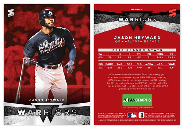
WARriors...Come out and pla-ay...


First off, and admission: I've never actually seen The Warriors movie but have heard it referenced so many times I don't really feel the need.

One of the big topics of discussion this off-season has been the whole Cabrera vs. Trout debate which is really a microcosm of the bigger "old school/new school"divide. One side relies on gut feelings and eye tests, the other on statistics and analysis. Personally, I fall somewhere in the middle, probably leaning more towards the sabermetric side. I feel I'm still in the process of rewiring myself. It's hard to unlearn being impressed by a .300+ average or 20+ wins since those numbers where instilled in me at an early age to be benchmarks of success. I still have to pause and process my thoughts when I see .320 referred to as bad (in the case of on-base percentage.) Hopefully in time I'll grow accustomed to whatever new numbers become the dividing line for bad/average/good.

A few months ago I did a Triple Crown Contenders insert design. As the MVP debate proceeded and I found myself siding with the Trout lobby, I kept feeling these waves of embarrassment that I had posted such a thing. Even though the influences for the idea were previous Triple Crown sets and the fact that such 'contenders' are pretty popular collecting subjects, I felt like I was propagating the "old school" agenda that I no longer identify with. So I decided it would be good to show the other side of debate.

I'm going to assume that you all know about WAR and are as sick of all the "WAR: what is it good for?" references as I am. I know that sabermetrics goes way beyond this singular stat but it really is the best entry point to thinking differently about statistics. So obviously, this set is about WAR.

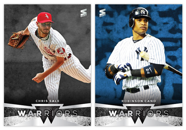
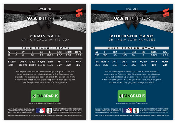
It features 20 players: the top-10 position players and top-10 pitchers according to WAR totals. I think the WARRIORS name is kind of clever since so many find WAR proponents to be frail, nerdy little fellows. Also, when "old schooler" refer to intangibles like "gritty" and gutsy" it drives sabermetricians nuts so this kind of pisses in both sides' Cheerios.


The front design features a full-color player cut-out over a grungy, color-soaked background. At the bottom we have a little abstract W shape in the center with some grungy angular bars shooting out behind and around. There are a couple of silver foil shapes along with the WARRIORS text and the player name.


On the back side, the WARRIORS shape moves to the top and the background is set in a solid team color. The player's 2012 stats are split into 2 lines below. These are the advanced stat lines from Fangraphs and I've included their logo below since they'd probably have to be in on this. There are 3 different versions of WAR so I thought it would be necessary to single out one source and Fangraphs was my first choice.

Hopefully not too many of you out there are grinding your teeth while reading through this.

Friday, January 27, 2012

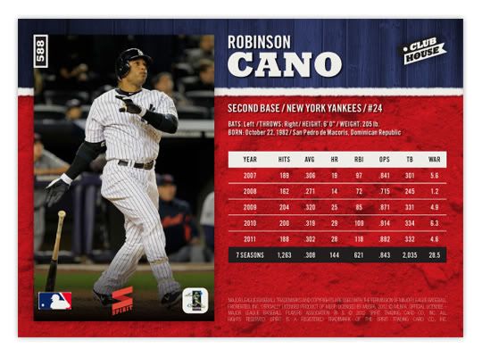
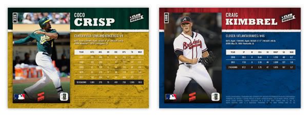
Welcome to the Clubhouse


First off, I want to welcome all of you new readers out there. I'm sure a lot of you came here thanks to Robert over at $30 a Week Habit, so thanks again to Robert. I really enjoy your blog and marvel at your restraint to stay within your budget. You are much stronger than I.

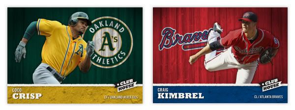
Now onto the card design. I was looking to create a 'low-end' set for Spirit, along the lines of Collector's Choice from the 90s or Topps Total from the early 00s. I think having a product come in at $1 a pack is important to keep growing new collectors in their youth. I know we have Opening Day but I don't like the idea of a product being tied to a single day early in the season, especially since Topps Series I is still somewhat fresh at that point. The Clubhouse set would hit the shelves right around Memorial Weekend, which, to me, always signifies the start of summer.


The base set consists of 810 cards total: 25-man roster + manager + team checklist x 30. The front of the card features the player cut out and placed in front of an old wooden fence in team colors with the team logo 'painted' on. At the bottom is the player name, position and team name placed on top of a team color dirt patch. The two sections are separated by a white chalk line and the Clubhouse logo. I think this is a pretty good 'kid-targeted' design with the solid colors and player cut out. It has a bit of a 'Sandlot' feel to it.


The back of the card features the same team color sections but with the proportions flipped. A full-frame picture of the player is found on the left with the stats & info on the right. The stat lines only cover 5 seasons and a small selection of statistical categories. They're a blend of traditional and sabermetric stats, whichever floats your boat. The card numbers in the upper left hand corner, rotated 90° counterclockwise. This makes them easier for sorting when stored vertically in /ct boxes and also keeps from covering up too much of the photo.


The production is pretty no-frills, with no foil stamping, crazy shiny patterns, parallels or any other gimmicks. Just full-color printing on a coated card stock with a semi-glossy coating. There will be a few inserts coming up later and maybe even something like a relic or die-cut. This would be a simple, fun, colorful release for set-builders on a budget or kids spending their lemonade money or whatever kids do to earn money during summer break.