Showing posts with label aroldis chapman. Show all posts

Sunday, October 5, 2014

2014 Spirit Base: 571-580

And here we finally are. Each team's final card of series 2.

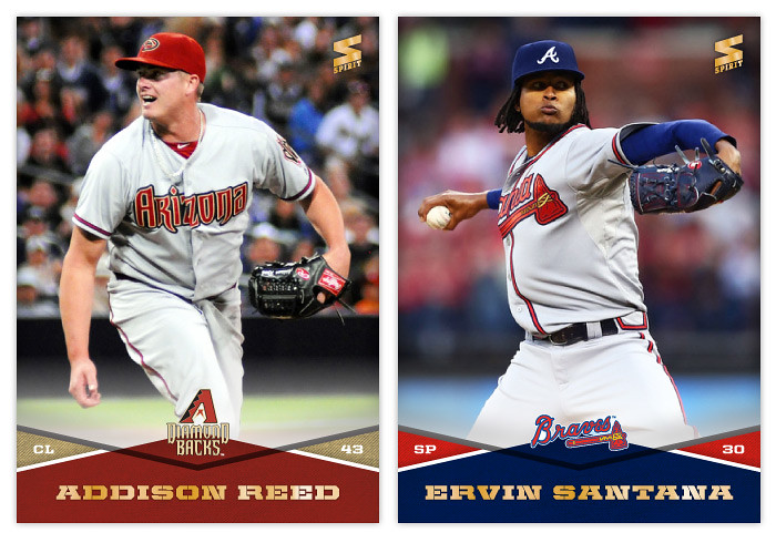
#571 - Addison Reed
Do we have any Diamondbacks fans that read the blog? I hear a lot of outside criticism of how the team is put together and run but I've never really heard a fan's perspective.

#572 - Ervin Santana
I wonder if the Royals would've won the division had they re-signed Santana and had him in their rotation all year. But if that would've happened, the world would've been deprived of that Wild Card game and the first two ALDS games and I think we're all better off having things happen like they did.
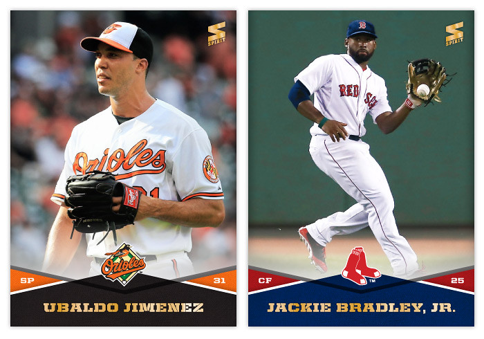

#573 - Ubaldo Jimenez
What an enigma. He keeps seesawing between a dominant pitcher and a burning can of garbage. At least he made this awesome commercial possible.

#574 - Jackie Bradley, Jr.
The colors are off on this photo. I tried my best but between the green monster and the grandstand lighting, this isn't the nicest card in the set.


#575 - Justin Ruggiano
I have to say, Ruggiano is quite a photogenic guy.

#576 - Moises Sierra
That's a pretty good bat flip from a guy with some impressive namesakes.
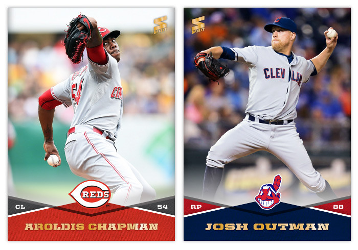

#577 - Aroldis Chapman
I'm glad to see he rebounded after that line drive. This is a pretty cool shot with that underneath angle, too.

#578 - Josh Outman
Probably the best baseball superhero name since Batman.
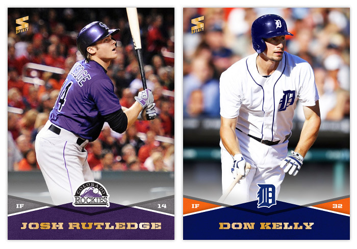

#579 - Josh Rutledge
Being Tulo's backup, Rutledge should have plenty of chances to show his skills at short and the plate. He still has some work to do.

#580 - Don Kelly
I don't know what it is about Don Kelly but the Tigers seem incapable of parting ways with him. He's been on the team since 2009 despite never posting an OPS+ above 82 in all six seasons.

Monday, September 17, 2012

2013 Pennant

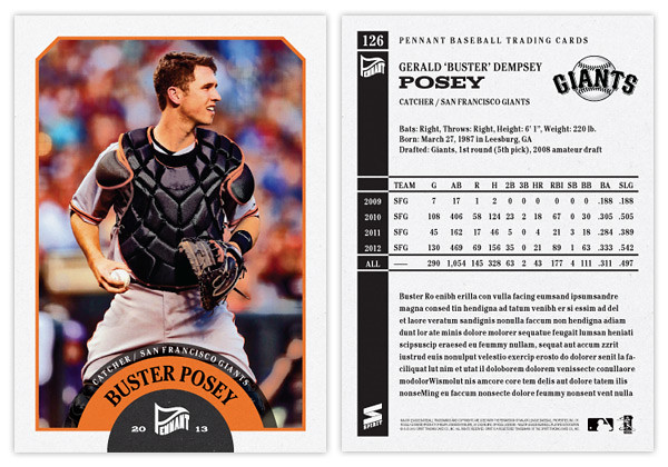
Even though there are a handful of amazing pennant/wild card races still going, apparently it's already time to look ahead to 2013 releases. Instead of starting with the Spirit 'flagship' again, I thought the Pennant line would be a good introduction to 2013.
The design is a lot simpler than what I did for last year's version. Since these designs are revisiting specific releases from the past like Heritage or Goudey or 206 do, I thought I'd turn the clock ahead a little bit, closer to something around the '60s or so. We start with an off-white border with beveled edges at the top and a team-color stroke around the frame. At the bottom, there's a half-circle team-color tab to house the Pennant logo. Then extending from that tab is another team-color tab creeping into the picture. The player name (typeset in Cheltenham Condensed Bold) arches around the tab. Moving further, there's a smaller team-color tab multiplied over the photo and housing the team name and player position. The photos have a little bit of grain and aged added to them but nothing too drastic. Altogether, it kind of resembles bunting you'd see on opening day or during the playoffs.

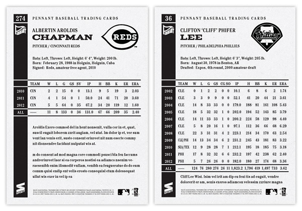
The back side of the card is one-color black and packed with a lot more information than the previous year. We have the player name and background info at the top with room for a black & white team logo. Below, we have the complete career statistics. For those whose careers don't fill the entire space, we have room for a few lines of highlights and/or other information.

I may be a tad impartial, but I think this design has the potential to be timeless. Replace the Pennant logo with a Topps logo, print the name in silver foil and you could have the 2014 Topps flagship design. Or remove the border and airbrush the photos, you could have Upper Deck's next baseball offering. It's definitely and upgrade from what I did for the 2012 version of Pennant. Here's to hoping the rest of my 2013 designs can make the same claim.