Showing posts with label andrelton. Show all posts

Monday, October 8, 2018

2018 Clubhouse: Los Angeles Angels


61. Zack Cozart

62. Ian Kinsler

63. Shohei Ohtani (RC)

64. Andrelton Simmons

65. Mike Trout

Cozart and Kinsler are kinda iffy here but I thought they'd be good since they were new offseason acquisitions. I'd probably swap  Cozart out for Justin Upton if doing it at this point.

Mike Trout and Cozart are the auto subjects here. I figured adding Ohtani into the mix with Trout would be totally unfair


Here's the purple Ohtani as a consolation.

Monday, November 6, 2017

2017 PENNANT BOX BREAK - PACK 15


211. Matt Carpenter


78. Brandon Drury


72. Mark Melancon

296. Noah Syndergaard

186. Evan Longoria

162. Andrelton Simmons

157. Andrew McCutchen

14. Travis d’Arnaud

89. Alcides Escobar

FF10. Raisel Iglesias - Future Favorites


Not a lot to say about this pack. We're getting closer to the end here, folks.

Friday, April 28, 2017

2017 SPIRIT BOX BREAK - PACK 18

189. Jake Marisnick

86. Hector Neris

150. Joe Kelly

248. Eddie Rosario

26. Juan Lagares

97. Andrelton Simmons

231. Trea Turner

285. Nick Castellanos

253. Gabriel Ynoa (RC)

G266. Jose De Leon (RC)

OTR2. Mookie Betts - On the Rise (AUTO)


Hit #2 here and it’s a good one. After Mookie’s breakout 2016, he’s quickly climbing the ranks of hobby favorites. Elsewhere in the pack, the De Leon gold is one I debated on replacing since he got traded to the Rays. But since Logan Forsythe has already made an appearance here, I figured it’d make most sense just to keep them with their “original” teams. That means any more trades in the next week or so will not be reflected in the rest of the box break.

Friday, February 20, 2015

2015 Spirit Award Winners


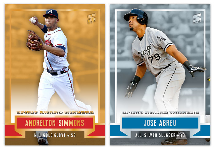
Well I guess baseball is officially back now that pitchers and catchers are starting to report to camp. I guess the Design On Deck equivalent to that is the unveiling of the Award Winners insert design. It's traditionally the first insert I tackle each season. Once again, it there are four segments: NL Gold Glove, AL Gold Glove, NL Silver Sluggers, AL Silver Sluggers. In the past they've been very shiny with an overwhelming amount of silver and gold foil. Last season they were a little more subdued and I followed that sensibility again this time around. Oh yeah, the both NL segments feature red while the AL ones use blue. Again.


The Gold Gloves feature a fielding shot cutout over a gold-ish background. The foil has been pared down to just borders around the design elements along with the player name and "Spirit Award Winners" text. The Silver Sluggers are the same only with silver instead and a batting shot, naturally. I thought the banner motif worked well for the subject matter and helped keep things clean but not too dull. I like that you can make out the background of the photos instead of just having the players cut out and removed from the context of a stadium. You'll probably be seeing more of that from the rest of this year's Spirit designs.


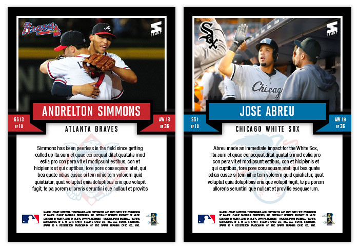
On the back, the banner design reappears but is paired with black and white instead of the shininess. The top half is reserved for a sizable photo plus team logo in the corner. Below, there's room for a brief write-up set on top of a watermarked league logo.

Four years in I think the 2016 version will have to change things up a bit. Perhaps I can add stuff like MVPs and Rookies of the Year?

Thursday, August 29, 2013

2013 Clubhouse Mitt Masters

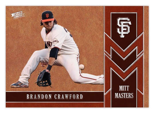
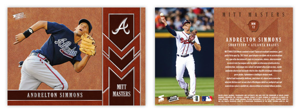
After tackling the heavy hitters of the league, let's shine a little light on some guys that flash the leather. The Mitt Masters insert features some of the league's best fielders that might not put up the offensive numbers to garner a lot of attention. Being a Giants fan, I'm keenly aware of Brandon Crawford's glovework at short. The rest of the baseball world, however, I'm not so sure. The card is almost top-to-bottom leather, or in this case cardboard with a leather texture. By adding some thickness to the stock, we're able to give all the elements a visual and tactile embossed appearance. Gloves come in all shades of leather so we' have 3 tones represented here.

The raised surfaces of all the leather spots makes way for some stamp silver foil to be pressed down. In person, these cards would be a pleasure to hold, running your fingertips across all the bumps of the images and valleys of the foil. The big cap logo in the upper right corner really stands out to my eyes.


The back may have a level surface but the full color photo on the left and the richness of the leather pattern keep things from getting dull. It's a little hard to make out here but the card number (MMxx) is found inside a mitt silhouette with an embossed look, along with the Mitt Masters logo subtly pressed below the text.

I don't know how feasible it would be, but if these cards were produced it would be nice if they could somehow be infused with a leather scent. I guess that would probably make it easy for pack searchers to sniff them out, though. I think the combination of the embossing and the leather texture along with this hypothetical odor would fit in perfectly with the Clubhouse target market.