Showing posts with label alex gordon. Show all posts

Sunday, December 3, 2017

2017 PENNANT BOX BREAK - PACK 21

127. A.J. Pollock


120. J.T. Realmuto


86. Manny Machado

7. Jay Bruce

77. David Freese

37. Alex Gordon

267. Cody Allen

79. Ian Kennedy

56. Brandon Belt

DT11. Max Scherzer - Dream Team


Lots of orange and yellow in this pack. Not much else to really say. 

Thursday, April 13, 2017

2017 SPIRIT BOX BREAK - PACK 5

286. Derek Dietrich

56. Troy Tulowitzki

55. Alex Gordon

292. Kyle Seager

222. Homer Bailey

235. Steven Wright

100. Hunter Strickland

2. Dellin Betances

300. Jharel Cotton (RC)

G121. Jordan Lyles

TL95. Zach Davies - Team Leader (MIL ERA)

This is a pretty solid pack player-wise, with the Davies insert and Lyles parallel the “lesser” names. I should probably note that the entire checklist was randomized as well as the pack collation. I’m sure with actual, physical cards, the collation and checklists are affected by the printing setup. I’m just kinda winging it here. If the base cards look a little paltry, I try to make up for it with the parallel and insert. In this case, since the base here is filled with stars and semi-stars, I figured it was a decent place to unload an underwhelming insert. (No offense, Zach Davies fans.)

Monday, June 29, 2015

2015 Pennant Incumbents


I felt like it was time to resurrect this insert after I failed to make any for the 2014 Pennant set. There's been a lot of turnover in the MLB rosters since 2013 so it won't be quite a complete rehash. Here's a look at the 2015 checklist versus 2013's:

ARI - Daniel Hudson (Miguel Montero)
ATL - Freddie Freeman (Tim Hudson)
BAL - Adam Jones (Nick Markakis)
BOS - David Ortiz
CHC - Starlin Castro (Alfonso Soriano)
CHW - John Danks (Paul Konerko)
CIN - Brandon Phillips
CLE - Michael Brantley (Asdrubal Cabrera)
COL - Troy Tulowitzki (Todd Helton)
DET - Justin Verlander
HOU - Jason Castro (Wesley Wright)
KCR - Alex Gordon
LAA - Jered Weaver
LAD - Andre Ethier
MIA - Giancarlo Stanton (Ricky Nolasco)
MIL - Ryan Braun
MIN - (Joe Mauer) Justin Morneau
NYM - David Wright
NYY - Alex Rodriguez (Derek Jeter)
OAK - Coco Crisp (Daric Barton)
PHI - Chase Utley (Jimmy Rollins)
PIT - Andrew McCutchen
SDP - Will Venable (Chase Headley)
SFG - Matt Cain
SEA - Felix Hernandez
STL - Yadier Molina
TBR - Evan Longoria (Ben Zobrist)
TEX - Elvis Andrus (Ian Kinsler)
TOR - Jose Bautista (Adam Lind)
WAS - Ryan Zimmerman

It's a lot stronger this time around with only maybe Daniel Hudson, John Danks and Will Venable as the real downers. 


Design-wise, it's very reminiscent of the inaugural version: posed player portrait cutouts, solid team-color backgrounds. This year, though, I've incorporated the 2015 Pennant base design a bit with the frame edge corners. I added pinstripes to the background for a little more interest as well as some starts to bring in a little of that "elected official" campaign look. Being a "retro" set, the colors are a little skewed and there's some grain added to the images.


The backs are pretty straight-forward. They're the standard black & white for Pennant cards with a little write-up and team logo. The cleaner, the better.

Monday, February 16, 2015

2015 Spirit Base


Now that the frenzy over the 2015 Topps release has subsided a bit, it's time for my formal unveiling of the 2015 Spirit base design. If you follow me on Instagram, you've already seen a card for each of the 30 teams. I'll post them here again as well as a general overview of the design.


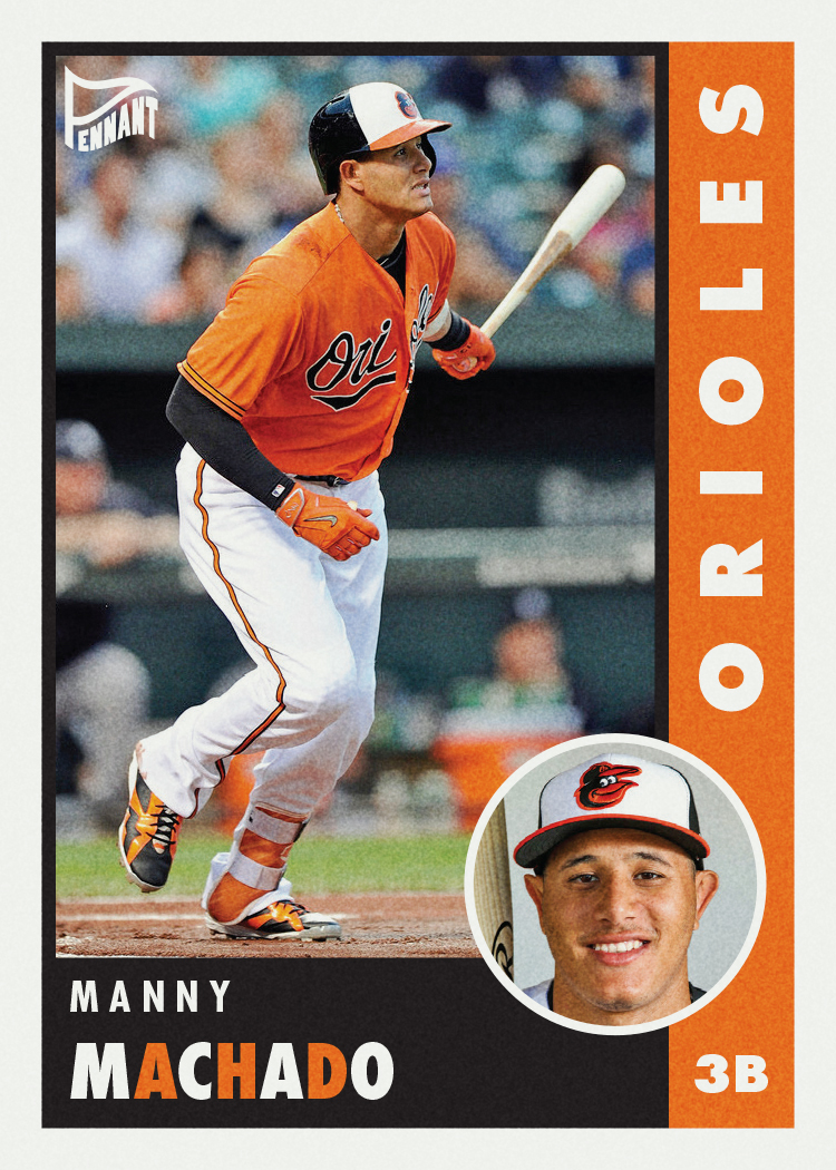
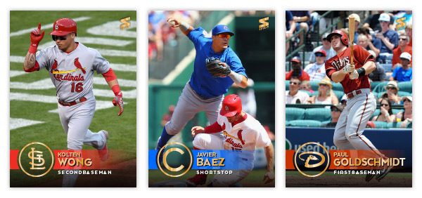
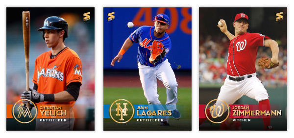
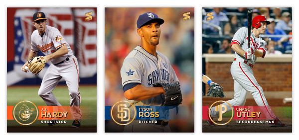
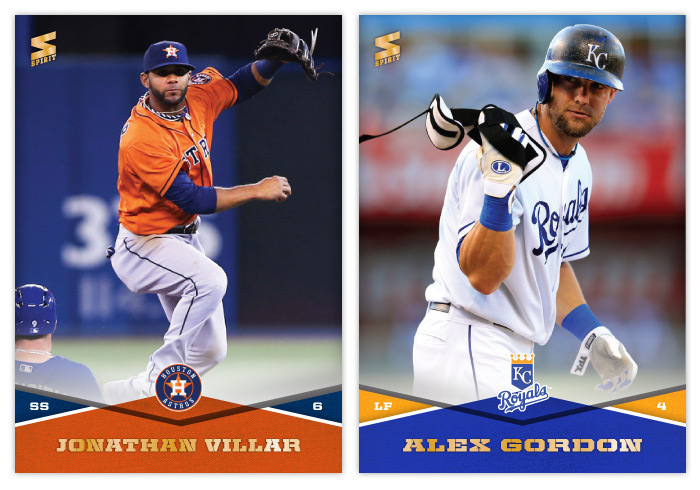
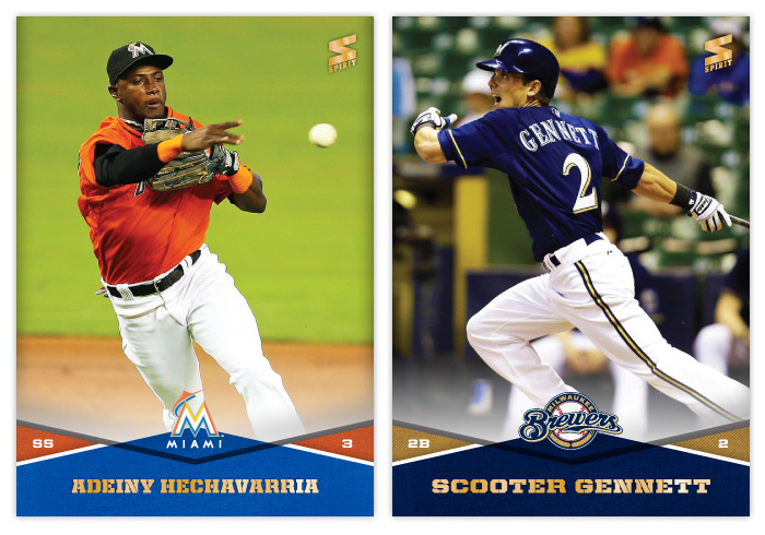
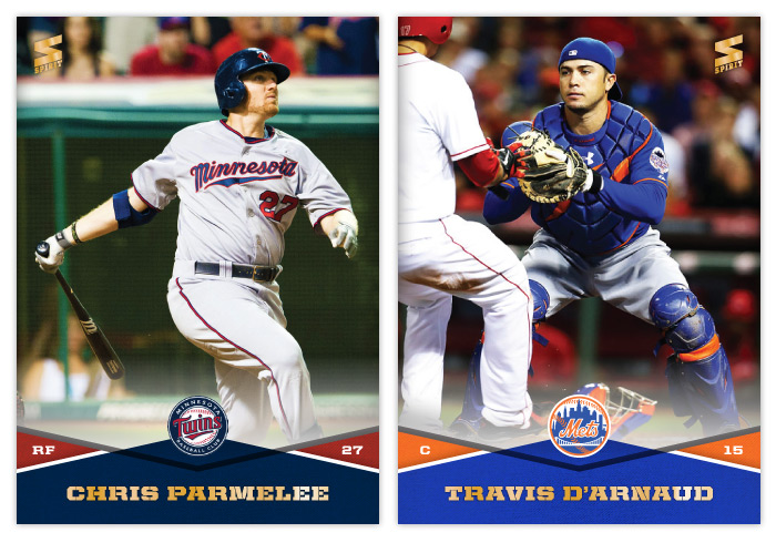
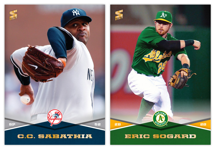
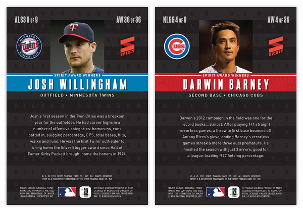
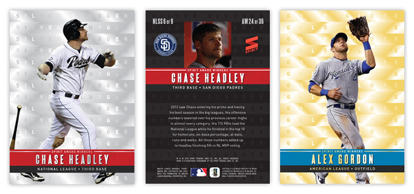
Once again, the cards are borderless with photos bleeding to the edge. I decided to change it up a bit this year and went with simple team hat logos stamped in gold foil instead of the traditional full-color primary logos. Having the photograph show through behind the circle is a nice way to keep things from getting claustrophobic. The team color bar stretches from the left edge across the logo and starts fading out as it moves across the card to the right. I made these cards before the Topps set came out and everyone (myself included) went gaga over the non-foiled names. Fortunately, I think there's enough color contrast here that they'd still be pretty readable in-hand. The positions listed below in white are definitely readable since I added a bit of a dark gradient coming up from the bottom to keep the backgrounds from being too light and unreadable. I also decided to add my own little 'rookie card' designation here on the Castillo card. Not too different from Topps' huh?

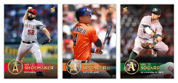
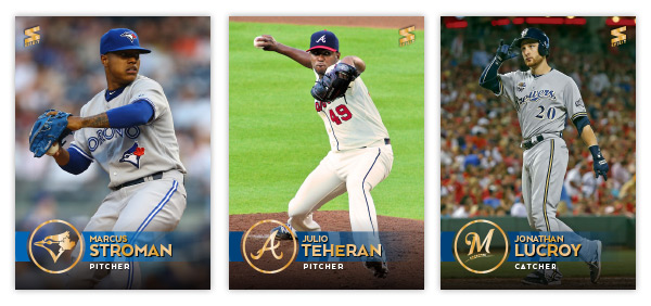
Here's a rundown of the remaining 27 teams:

As much as I liked making 900 base cards last year, I figured paring it down to 30 here would be adventurous enough.


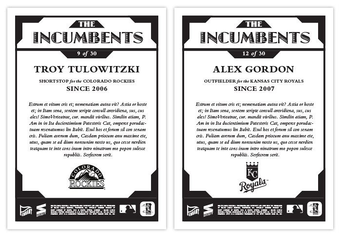
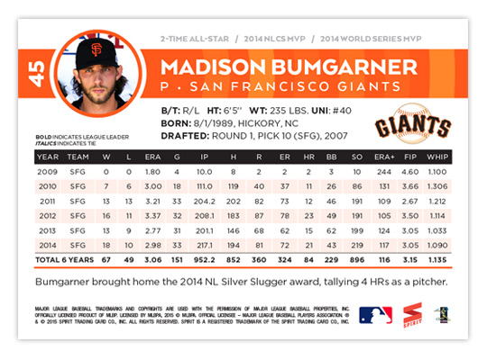
I'm really excited about the card backs. The design elements from the front move over seamlessly with a player mugshot in place for the hat logo. The color bar doesn't fade out here and stays as a nice bold contrast to all the white. Between the bar and the stat box is just enough room for the bio and the primary team logo. The stat box itself is really readable with a hint of color separating each year. I love the card numbers just to the left of the photo. They're bold and readable and having them rotated 90° makes it unbelievable easy to scan through as the sit in those cardboard boxes.


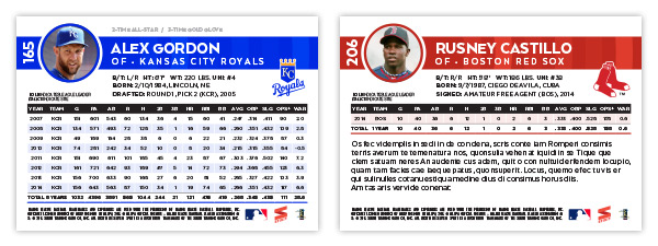
Another cool thing on the back is an accolades line just above the color bar. It's easier to read on Bumgarner's up there but you can see it on the Gordon card as well. Depending on what the player has accomplished, there's room for a few noteworthy details like number of all-star appearances, Gold Gloves or, I dunno, World Series MVPs. They're subtle enough that it doesn't stick out like a sore thumb if a guy doesn't have anything listed, like the rookie Castillo.

I'm geared up for the 2015 season and the extra time I'll have with new designs instead of devoting hours and hours on some poorly-thought-out 900 base card project. In fact, I already have two inserts designed and queued up for posting. Hopefully this summer will be a lot more active for the ol' blog. I hope you keep checking in. Thanks.

Sunday, January 26, 2014

2014 Spirit Base Series 1: 101-110


#101 - Jonathan Villar
On MLB: The Show 13, I played a franchise as the Astros for a few years and got really frustrated by Villar. He kept teetering on the edge of potential but could never really make an impact, even on a crappy team with lots of playing time. We'll see if he can do better in real life.

#102 - Alex Gordon
Anytime I can use a semi-close up of something "unusual" happening, I'm gonna. I'm already struggling to keep things from getting stale and redundant. So here's a goofy shot of Gordon tossing his plate armor off.


#103 - Garrett Richards
This image would be perfect for a Panini release. Shouldn't be too hard to airbrush the sleeve and cap logos off.

#104 - Adrian Gonzalez
I always thought Gonzalez was kind of bland and mild-mannered. But going through the photo options, there seems to be a lot of images where he's pointing or gesticulating or something. I guess it's the Dodger Way.


#105 - Adeiny Hechavarria
I'm starting to realize I should have switched the blue and orange colors for the Marlins template. There's basically zero blue represented on their uniforms and it really clashes with the design.

#106 - Scooter Gennett
SCOOTER!


#107 - Chris Parmelee
The Twins roster is filled with guys of which I have absolutely no knowledge. Sorry, Twins fans.

#108 - Travis d'Arnaud
Too bad this name font doesn't have any lowercase characters for the stencil style. It's really bugging me to see that capital D there.


#109 - C.C. Sabathia
Sabahtia's pretzel limbs are just too weird not to share with the world. Cropping his lower body probably adds to the confusion as well. Awesome.

#110 - Eric Sogard
Is this Sogard? Or Orel Hershiser wearing a crappy disguise out on the diamond?

Wednesday, November 28, 2012

2013 Spirit Award Winners


Hello to all out there in blogland. As you can tell things have slowed down a bit here with the off season in full swing. Baseball has been so far from my mind that I even overlooked my one year blogiversary. Oh well. I've got a few things planned for upcoming posts but don't expect the pace to really pick up until late January or so. In the meantime, here's a look at the 2013 edition of the Award Winners insert set.

For those that remember, I did this set last year with a similar set up: 9 AL Silver Sluggers, 9 NL Silver Sluggers, 9 AL Gold Gloves and 9 NL Gold Gloves for a total of 36-cards. The main distinguishing factor is the Silver Sluggers are bright and shiny silver and the Gold Gloves are bright and shiny gold. Horizontal stacks of each color are found in the background with the respective award names lined inside. These would have a kind of x-fractor feel with a smooth surface but the light refracting in different ways to make out the letters and such. The next layer features a player cutout (sluggers slugging and glovers gloving) with a colored band in the foreground to house the name and award info. Again, the AL guys have a blue bar with red found on the NL ones.

On the back side, we have the same horizontal stacks but this time screen back in black. To the left and right of the player portrait is their team logo and the Spirit logo. The colored bar has moved towards the top and houses the player name, team and position. A brief write-up of their respective award-winning seasons finishes out the design.

After two years, I'm not sure if this insert set will make its way into the 2014 product or if a break is in order. If it does make an appearance, I'll probably need to make sure the design take a 180-degree turn as this year's design plays kind of a like a sequel to the 2012 look. There's something to be said for subtle changes and evolutions of a standby insert, though. I suppose I have a year to figure that one out.