Showing posts with label sabathia. Show all posts
Sunday, January 26, 2014
2014 Spirit Base Series 1: 101-110
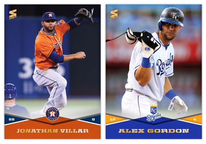
#101 - Jonathan Villar
On MLB: The Show 13, I played a franchise as the Astros for a few years and got really frustrated by Villar. He kept teetering on the edge of potential but could never really make an impact, even on a crappy team with lots of playing time. We'll see if he can do better in real life.
#102 - Alex Gordon
Anytime I can use a semi-close up of something "unusual" happening, I'm gonna. I'm already struggling to keep things from getting stale and redundant. So here's a goofy shot of Gordon tossing his plate armor off.
#103 - Garrett Richards
This image would be perfect for a Panini release. Shouldn't be too hard to airbrush the sleeve and cap logos off.
#104 - Adrian Gonzalez
I always thought Gonzalez was kind of bland and mild-mannered. But going through the photo options, there seems to be a lot of images where he's pointing or gesticulating or something. I guess it's the Dodger Way.
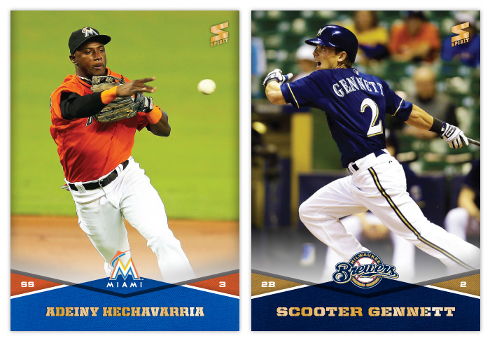
#105 - Adeiny Hechavarria
I'm starting to realize I should have switched the blue and orange colors for the Marlins template. There's basically zero blue represented on their uniforms and it really clashes with the design.
#106 - Scooter Gennett
SCOOTER!
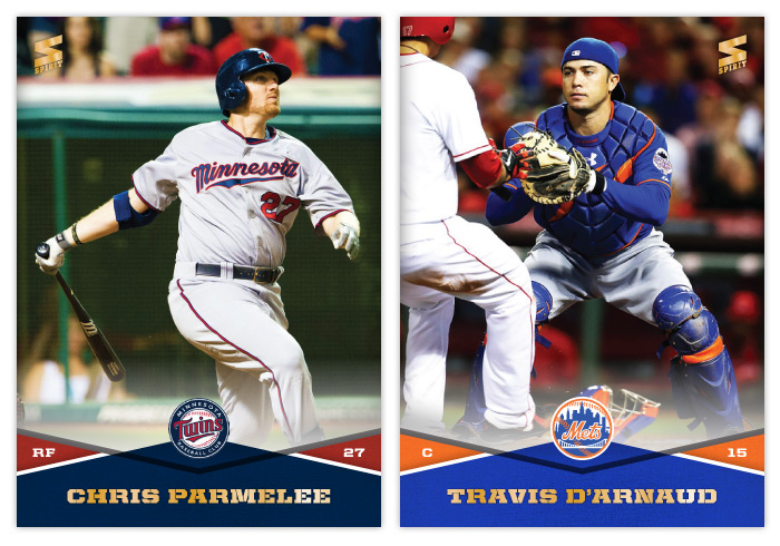
#107 - Chris Parmelee
The Twins roster is filled with guys of which I have absolutely no knowledge. Sorry, Twins fans.
#108 - Travis d'Arnaud
Too bad this name font doesn't have any lowercase characters for the stencil style. It's really bugging me to see that capital D there.
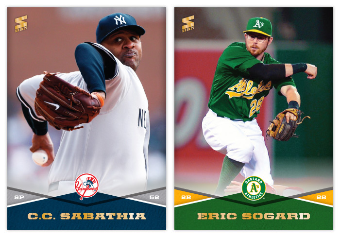
#109 - C.C. Sabathia
Sabahtia's pretzel limbs are just too weird not to share with the world. Cropping his lower body probably adds to the confusion as well. Awesome.
#110 - Eric Sogard
Is this Sogard? Or Orel Hershiser wearing a crappy disguise out on the diamond?
Labels:
2014,
adeiny,
Adrian Gonzalez,
alex gordon,
base,
concept,
d'arnaud,
design,
garrett richards,
parmelee,
sabathia,
scooter,
sogard,
sprit,
villar
Monday, April 22, 2013
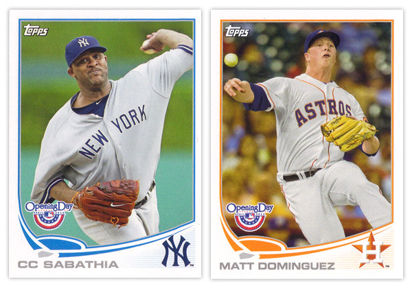
REVIEW: 2013 Topps Opening Day
It may be a few weeks into the season but I'm just not getting around to reviewing some cards again. Opening Day is Topps' lowest-end release geared towards getting younger collectors excited for the start of the new MLB season. I'm gonna pass over the base design since it's the same as the flagship series with only the silver foil subtracted and the MLB Opening Day logo added (plus some nice derp-face.) So let's move onto some of the inserts.
The blue-border inserts are a little different this year. Topps must have decided that the Emerald Sparkle from Series 1 was so nice they should try it in blue. I really like this decision as the blue they chose is really vibrant and pretty. Plus, it keeps us from getting them mixed up with the Walmart exclusive blue-bordered parallels. The Ballpark Fun insert features a lot of smiling and/or pie-covered faces which is best-suited for a release like this. We have a swirly team-color section at the bottom with a familiar mowed-grass pattern. Two complaints about this design: I've seen this free cursive font a lot of places so it kind of bugs me that Topps couldn't find a more refined alternative; secondly, the white grunge-feather border seems really unnecessary since the rest of the elements are decidedly clean (minus the pie face.) They've also updated the 3-D Opening Day Stars insert. Returning are the round edges and lenticular surface, but the rest of the design has been refreshed. I think it's an improvement from last year's design with more room for the photo and fewer unnecessary flourishes.
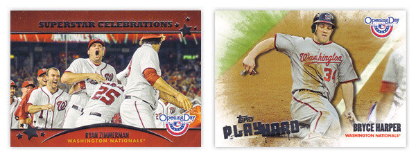
Next we have the Superstar Celebrations cards, which were included in last year's set. These are basically team-wide mobbings of players following what I presume to be walk-off hits. Design-wise, they're pretty standard with red bars across the top and bottom with some silver foil to add some sparkle. Topps decided to keep the fun elements to the photographs and play the rest pretty standard with works I suppose. Compare that to the Play Hard inserts which feature guys in the middle of some 'gritty' baseball moments such as sliding home, stealing bases or laying out to make a catch. The edges have been grunge-feathered which helps with the theme and stays away from a standard design.
I know the target for this set is a lot different than the rest of Topps releases and not all collectors even bother with it, but I usually enjoy spending $10 to take a look at something different like this. Design-wise, Opening Day seems to have a better rate of non-misses than even Topps' flagship. Everything is from decent-to-good and decidedly non-stuffy. In other words, it's fun.
Base cards: 4/5
Blue Parallels: 5/5
Ballpark Fun: 3/5
Blue Parallels: 5/5
Ballpark Fun: 3/5
Opening Day Stars: 4/5
Superstar Celebrations: 3/5
Play Hard: 3.5/5
OVERALL: 3.75/5
OVERALL: 3.75/5
Labels:
2013,
adam jones,
bryce harper,
fun,
jesus montero,
matt dominguez,
mauer,
opening day,
review,
ryan zimmerman,
sabathia,
Topps
Monday, February 20, 2012
Members Only
Time for another merit-based insert set for Spirit. This one focuses on the top 10 performing players over the last 5 seasons in 6 different statistical categories: hits, home runs, RBIs, wins, saves and ERA. These 6 subsets make up the 60-card "Members Only" insert set. Each 'Club' has its own logo displaying their respective statistic.
The look of this set is like a old, secret book passed down generation after generation to the incoming members. Each logo looks embossed into the canvas books cover while gold leaf pops off the edges. We have a team color swatch at the bottom to house the player name & team in gold foil. On the right side is the gold foil 'club' logo with the player's respective total below.
On the back side you'll find the color swatch moved to the top along with the player name/position/team flanked on either side by the card number and team logo. Below is leaderboard for each club which also serves as a checklist of sorts. On each individual player's card, their name and leaderboard position are highlighted.
After I finished with this design, I realized it looks a bit like the first Upper Deck SP set from 1993 and Panini had a baby.
Labels:
2012,
club,
ichiro,
insert,
members only,
panini,
ryan howard,
sabathia,
SP,
spirit,
stats,
upper deck
Subscribe to:
Posts (Atom)