Showing posts with label deluxe. Show all posts

Sunday, October 16, 2016

2016 Spirit Deluxe Portraits


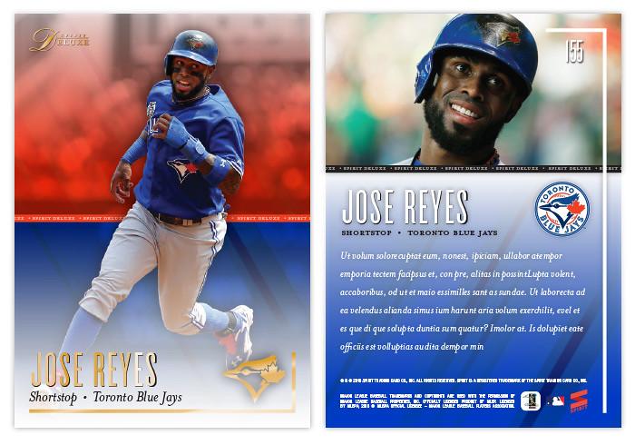
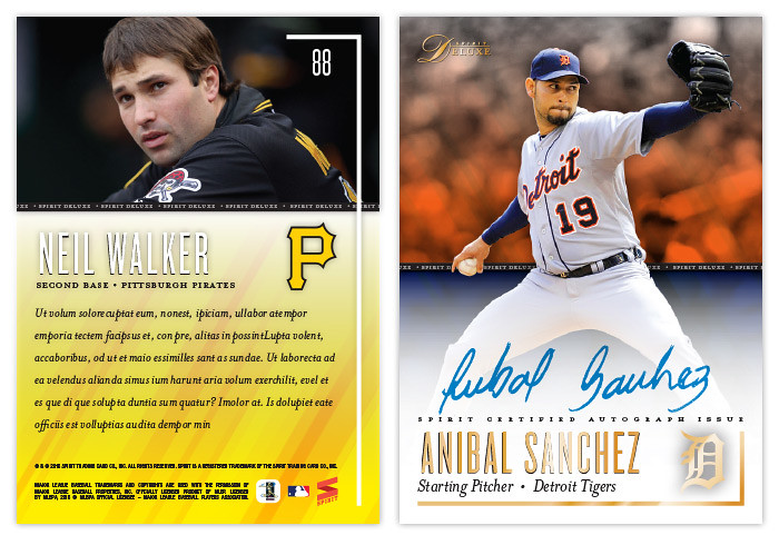
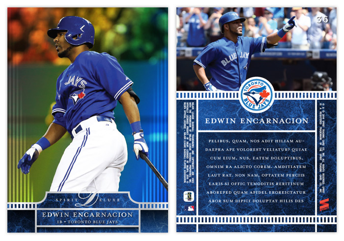
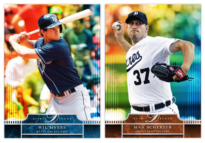
Well, the postseason is upon us and my interest in the 2016 collecting year is dwindling. I've started looking ahead to 2017 and already have base design in the works. I'll be trying something new when it comes time to roll out the 2017 Spirit releases. Hopefully I'll plan it well enough to not fall on my face like I've done in the past. All of this is to preface the fact that this will probably be the final 2016 Spirit design post. I may have a remix post or two following the World Series, but I'm calling it quits on "new" designs for 2016. And since the Deluxe line has received the least attention this year, I figured it was only right to at least offer up one "insert" design.


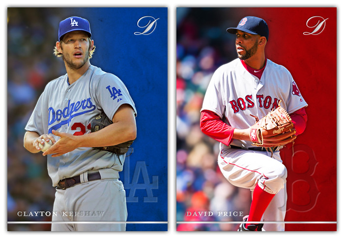
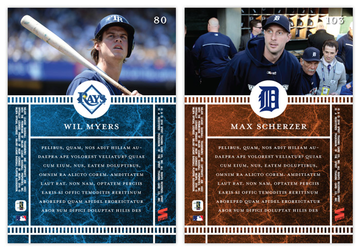
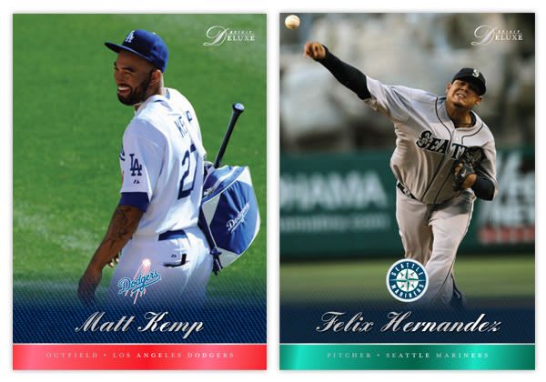
If you've been reading this blog long enough, you may remember the Deluxe Portraits design from four years ago. The concept there was just a zoomed in portrait of a guy, cut out and placed on top of the team-colored texture and nothing more. I also had die-cut variations there but I've since come to loathe extreme die-cuts. For 2016, I decided to make them more Studio-esque—a bit more refined and interesting. Incorporating the color fade from the 2016 Deluxe base design, the portraits are less stark and the overall card is less "in-your-face" than before. The only embellishments are the player name and a baseline stamped in silver foil along with the Deluxe "D" logo in the corner.


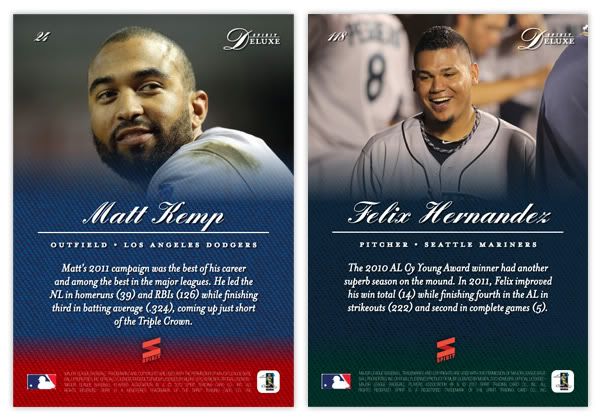
The backs are even more simple than the front. Just a logo, player and team name and a few brief lines filling you in on the player's impact. Sometimes less is more.

And with that, the 2016 Spirit Trading Cards year comes to a close. Reflecting on the year of this blog, I realize that the gaps in posts can be explained by my disinterest in actually writing about the cards. That's partly due to the fact I'm not a writer. There are only so many ways I can describe what you can just as easily see by looking at the cards themselves. So looking ahead to 2017, I anticipate a lot less of me describing what's on the cards themselves and perhaps more of me explaining my decisions. Or I might just shut up and let the designs speak for themselves. Either way, I hope I post more often.

Monday, April 25, 2016

2016 Spirit Deluxe


The flagship, "low-end" and retro base designs have been in the books for a while now, so it's time to finish up the Spirit quartet with Deluxe, the "high-end" set.


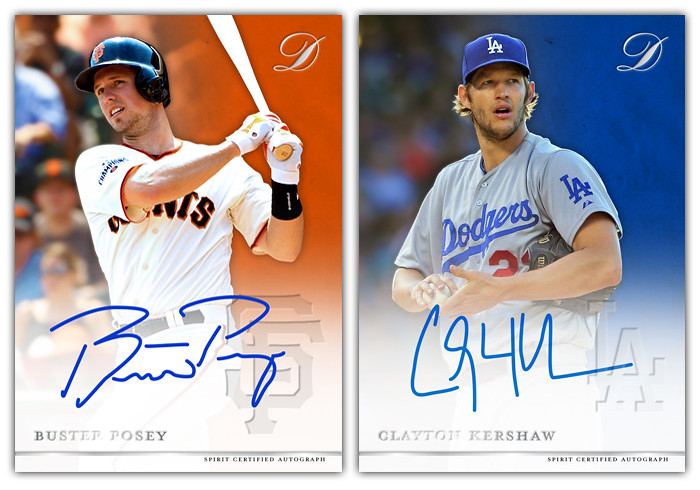
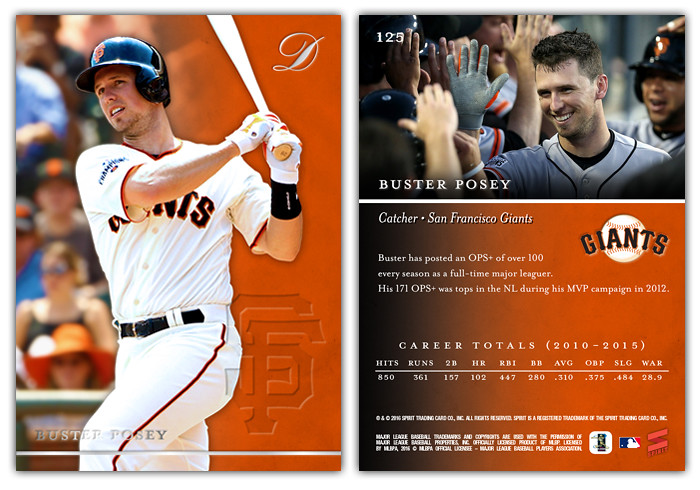
I tried to keep the elements to a minimum and keep the cards from getting too busy. The player names are along the bottom left, stamped in silver foil. Additionally, there's a silver line below and the Deluxe "D" in the upper right corner, all three elements stamped with a bit of an embossed effect. The look is mimicked by the team cap logo in the bottom right corner, though the embossing there is strictly a design effect and not physically embossed. You can see why in the autograph parallels below.


With the white feather coming up from below to help ensure the autographs are visible, the fake embossed look for the logo is a necessity so the players don't have any issues when actually signing.


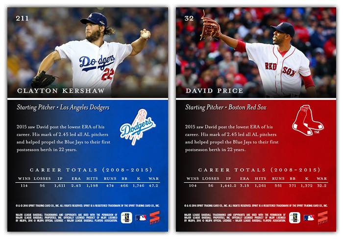
The backs probably look pretty similar to previous years of Deluxe cards with a good sized photo up top with the rest of space devoted for stats/write-up/other info. Here we have full-size team logos as well as a single stat line encompassing the players's whole career. Also, I actually took the time to do the "write-up" instead of using lorem ipsum text like I usually do, so enjoy more of my meandering writing if you'd like.

The next design post will probably be the Clubhouse All-Stars insert I've done every year but I may do a "review" post with an exciting new format! (Mostly because I've been reeeeeally bad at keeping up with reviewing the 2016 releases from Topps and Panini thus far.)

Thursday, December 31, 2015

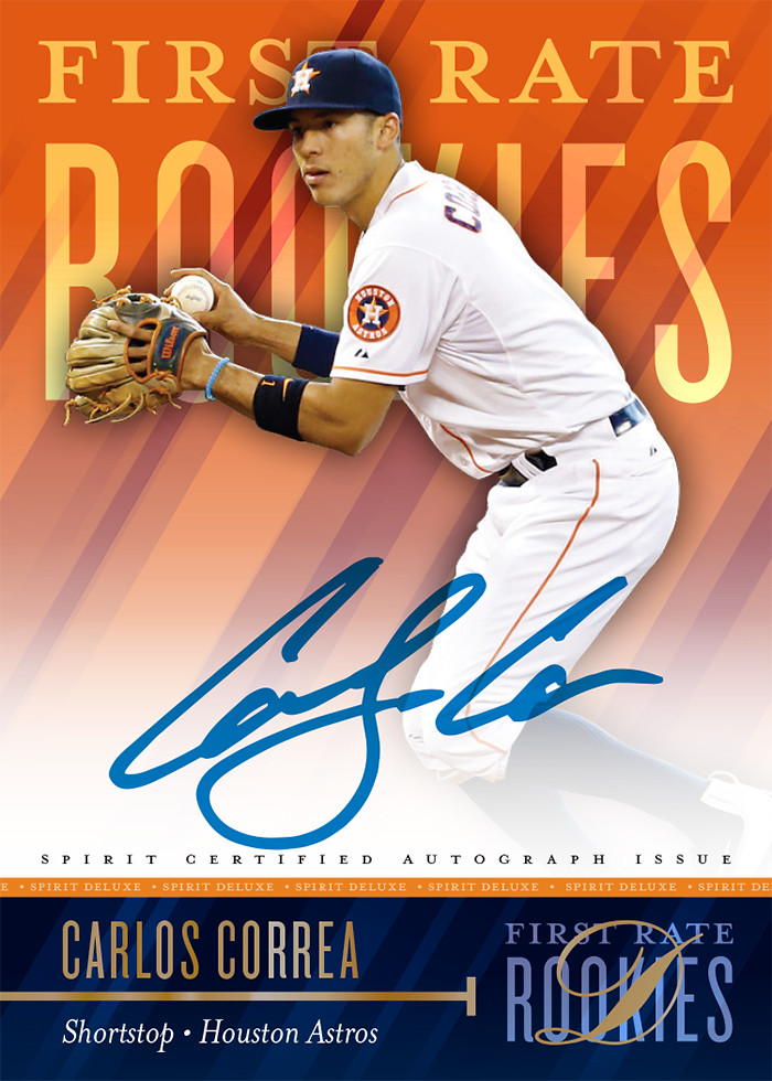
2015 Deluxe First Rate Rookies


The 2015 rookie class may go down as one of the strongest in MLB history. This post is probably a bit of a precursor to the 2016 Spirit All-Rookie Team or whatever. Since a player's worth/value in the hobby is probably no higher than their prospect and rookie years, seems like a good time to throw some rookie autos into a high-end product. Even at 15-deep, this is a pretty solid checklist:

1. Kris Bryant
2. Carlos Correa
3. Matt Duffy
4. Miguel Sano
5. Kyle Schwarber
6. Noah Syndergaard
7. Francisco Lindor
8. Jung Ho Kang
9. Joc Pederson
10. Robert Osuna
11. Stephen Piscotty
12. Addison Russell
13. Chris Heston
14. Andrew Heaney
15. Odubel Herrera


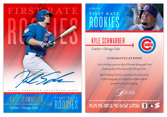
The design is pretty similar to the Dynamic Duos and the Deluxe base, using elements of team colors with a bit of a beam pattern, minimal text/ornaments and similar typefaces. There's a soft white fade for legible signatures along with some of the standard gold foil for the name and logo.


The back has minimal design elements. Along the top color bar, player portrait fades in from the right with the "First Rate Rookies" logotype and card number on the left. Below is the name/position/team combo from the front as well as a full-color team logo. The rest of the space is filled with the standard authenticity language and the rest of the fine print.

Monday, July 20, 2015

2015 Deluxe Duos


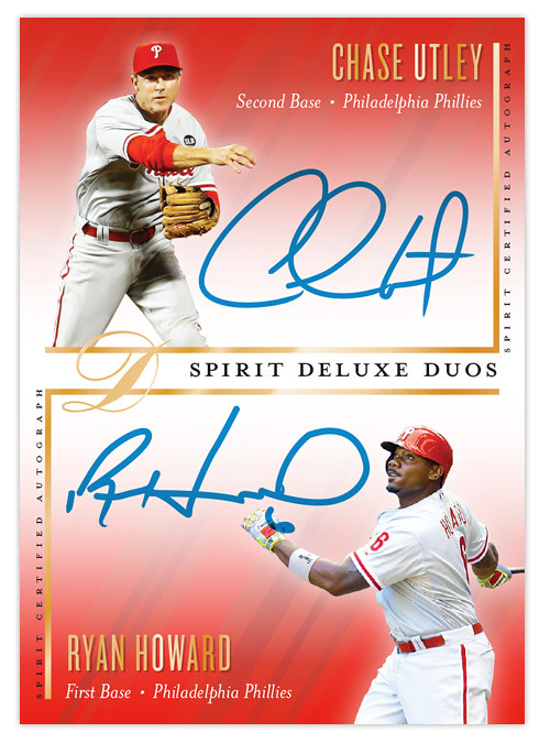
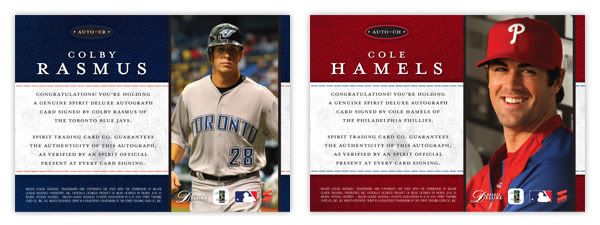
I've had all the base cards posted for each of the 4 Spirit releases but I was still lacking an insert design for the Deluxe set. I decided to resurrect the Deluxe Duos autograph cards after their absence in 2014. Turns out that when you design 900 individual cards in a summer, it cuts into your ability to create inserts for other releases.


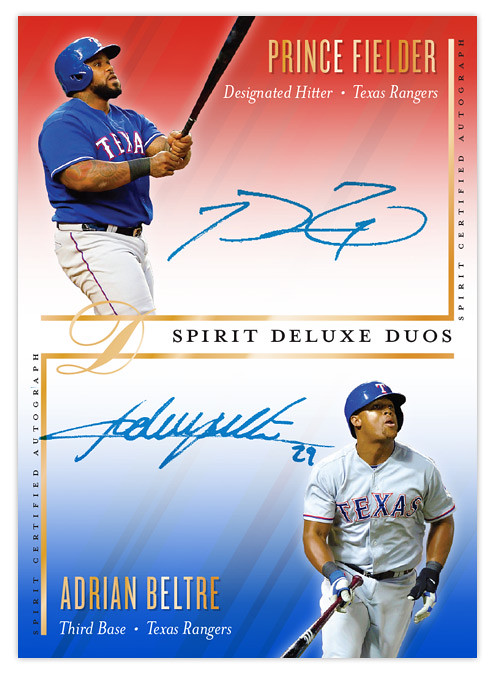
Like previous Deluxe Duos designs, this one features a pair of teammates sharing the same card while featuring autographs of both players. This is the first time the orientation has been vertical. I left more room for player images than usual since sometimes they get squeezed into a corner with maybe just their faces peeking out. Since these would be "on-card" autographs, it's up to the players themselves to decide how much of their signature should overlap their pictures. Design elements from the Deluxe base cards are present, with the team color fades and the same fonts for player name, team and position.

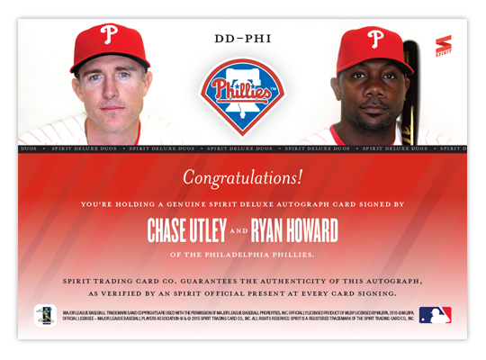
Some nice portraits anchor the design on the back with the team logo making an appearance. I like the simplicity of the back here. Ditch the senseless writeup and stick with some nice photos and lots of empty space. It makes things a little more elegant, befitting a release called "Deluxe."
Monday, May 25, 2015

2015 Spirit Deluxe


The base set for the final Deluxe product of 2015 has arrived. We've done the flagship, the low-end and the retro releases. Here's a look a the "high-end" set, Deluxe.


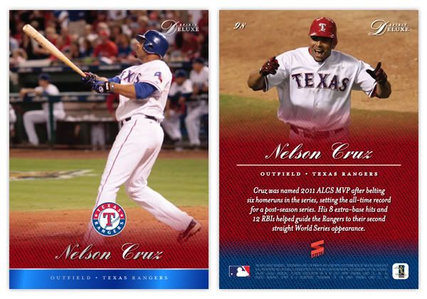
I decided to go more with a simplistic design instead of the ornate, cluttered stuff that usually passes for "high-end." The cards are cut into 2 team-colored halves with a full-color player cutout jumping off from the background. Player names and team hat logos are in gold foil along the bottom along with a solid stripe making its way around the partial edge.


The back is split but not 50-50 like front, leaving a little room up top for a more intimate photo and space for the player write-up on top of a colorful background below. Also, being a high-end set, there are autographs to be had. There will be insert autos as well but I wanted to start out here with just the base parallel auto. The bottom color half fades to white a little more drastically to make room for the ink but that's the only design difference for the base autos.

More designs to come for the Deluxe set as well as the other Spirit releases.

Thursday, March 20, 2014

2014 Spirit Deluxe


Time to slow things down a bit on the Spirit base front since we're approaching the end of Series 1 and the season hasn't even started yet. Here's this year's "high-end" release, Spirit Deluxe.


The front features a full-bleed photo again, though this year the background is a shimmery, refractor-y, prismatic thing. I'm not sure I can replicate it digitally but I think this gives you an idea. It's a lot more prominent on the day game photos. At the bottom is a team-colored marble block with lots of silver foil accents. The thin rails on the left and right extend up into the photo space before softly fading out. It reminds me of a spotlight receding into the darkness of night.


On the back, the team-colored marble takes up about 2/3 of the bottom, leaving room for a brief write-up and some fine print along with the player name. The rail element from the front reappears, this time anchoring the bottom as well as separating the photo from the text block. The team logo sits inside a white circle centered where the 2 sections converge.


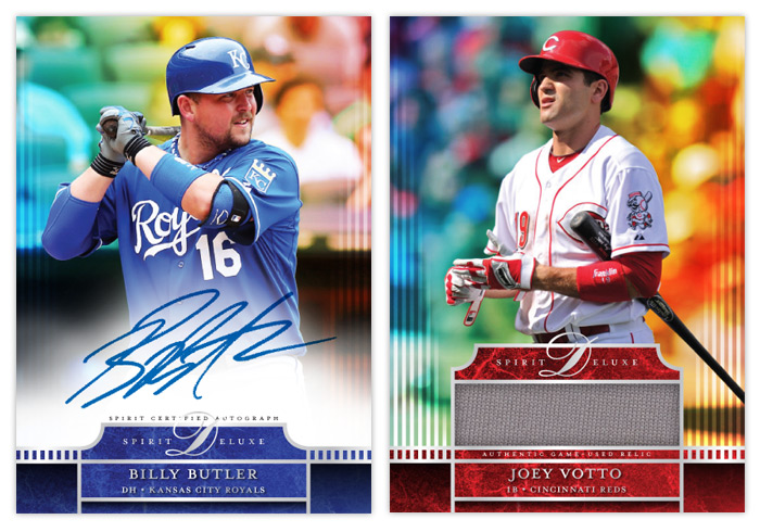
Here's a look at the standard auto and relic variations. The auto has a white glow for the player to sign. It covers up the light rails a bit but it's functionally necessary.

I think this is a nice evolution from the 2012 and 2013 versions. They aren't drastically different but hopefully you'll be able to distinguish from year to year. I just want to keep the full bleed, glossy thing going so there's consistency.

Thanks for checking this out.

Tuesday, May 28, 2013

2013 Spirit Deluxe Duos


With Deluxe being Spirit's "high-end" product, I figured the dual-autograph Deluxe Duos would be a good place to start with 2013's inserts. These wouldn't be as prevalent as the auto and relic parallels from the base set, maybe about a 1:20 hit.


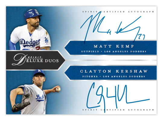
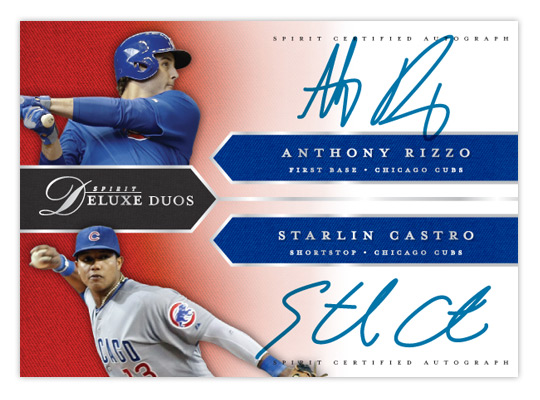
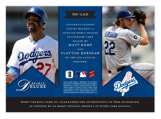
Like last year's version, the design is right in step with the base cards. We have the pointed tabs shooting in from the edges, filled with a team-color twill texture. All of the text (minus the certification small-print) is in shiny silver foil to jump off the glossy finish. It's bisected horizontally with each half of the duo on the top or bottom. A small cutout of the players sits in the left corners on top of another team-color twill texture that fades to white moving to the right, leaving room for the player signatures.


On the back, the tabs are inverted and filled with some bigger action shots. The team-color twill makes an appearance again as a background for the small print and authentication copy. The team logo also finds its way into the mix.

While not every club may have a duo on the level of Kemp/Kershaw here, most would have at least one player of note get excited about. Especially at the SRP of $10-$15 a pack.

Thursday, May 2, 2013

2013 Spirit Deluxe


Directly on the heels of the low-end offering from Spirit comes the singular high-end release. It's kind of a cross between Stadium Club and something like Tribute, only with out the avalanche of randomly numbered parallels.


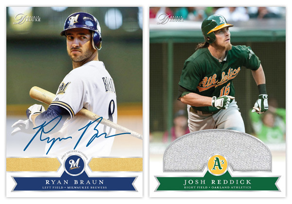
Like last year we have full-bleed photos on a glossy stock with silver foil accents. The team logo sits in the center, flanked by three team-color swatches. The subtle knit texture from last year makes another appearance. Beneath it all is a soft white fade leading from the bottom edge to keep things from getting too harsh.


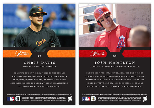
For the back we have the player photo taking up most of the top half with a solid black background below. The team-color polygons from the front make an appearance here to tie together both sides. Underneath the name, position and team is a brief write-up of the player's 2012 season.


Being a high-end set, we also have an autograph and relic variation. The auto just has the white fade up a little further from below. For the relic, I figured it would be nice to have a nice big swatch for such a set. The semi-circle allows for a bigger patch without intruding too much into the photo.

I'm not a big fan of the idea of spending so much for a box of something like Tribute or Triple Threads to where all that matters is the autos or relics as the base cards barely register any notice. The Deluxe set would have a sizable base set with the hits coming like every few packs or something. A standard pack would have 6 base cards with and come with either a pair of inserts or a hit, with relics being about twice as common as autos. I think that would place the price somewhere around $10-$15 a pack, which is still a lot but not ridiculous. To me, that's about as high as I'd like to go on "high-end."

Monday, July 9, 2012

Spirit Deluxe Duos


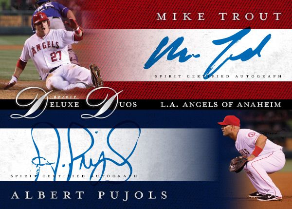
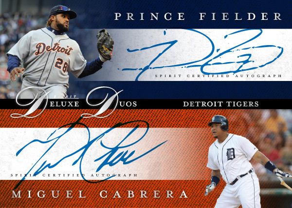
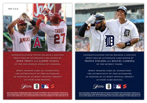
No, not Diamond Duos or Dueling Duos. Deluxe Duos. Two guys on the same team that are among the MLB elite. It may not be the most original concept, but I bet there are lots of people that'd be very excited to pull a Mike Trout/Albert Pujols dual auto. Every good turn deserves another or something like that.


These carry the same hallmarks as the other Spirit Deluxe cards so far. Team color textured backgrounds, sophisticated fonts, silver foil, dynamic fade photos. Hopefully the consistency isn't too boring.


The back features a candid shot of the two featured players together. I really like the Fielder/Cabrera photo. It's nice to see teammates interact with each other like little leaguers do. And for these cards, it keeps the front side from looking like arbitrary pairings of guys who just happen to wear the same uniform.

Some of the other duos in the series would probably be Harper/Strasburg, Kemp/Kershaw, Lincecum/Posey, Halladay/Lee, Pedroia/Ellsbury, Mauer/Morneau.

Monday, May 7, 2012

Spirit Deluxe Portraits


Trying to come up with 'new' or 'innovative' ideas for cards isn't as easy as I thought it was going to be. Even though there are plenty of complaints to levy at Topps for some of their product choices, they actually do quite a few things that are pretty successful and cool. At this point, most of their missteps come from constructing releases and not so much the actual cards themselves. People like autographs and minis and parallels and short prints and die-cuts and memorabilia and just about every other 'gimmick' out there to varying degrees. But all in all, these are basic elements that go into constructing a set.

This blog has basically been me just rearranging some or all of these elements into what I think would be fun to manufacture. If there were another licensee out there releasing product in 2012, these are things I could see fitting into the marketplace, acting as either a supplement or an alternative to Topps.

That brings us to the cards in this post. I was looking for another 'insert' or whatever you'd like to call it for the Deluxe set. I didn't feel like doing one of those triple swatch, nickname cutout sticker autos that you find in Triple Threads. Even though Deluxe is Spirit's 'high-end' product, it's probably more in tune with something like Finest (which is definitely the very top of my own personal price range.) I see that Topps plans on having some die-cuts in Finest this year, but hopefully this doesn't come across as copy-catting.

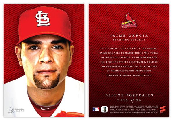
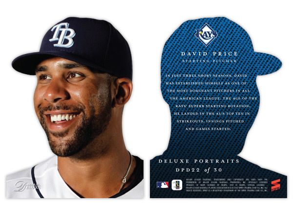
So for the Deluxe Portraits insert, there are 3 different versions you could get your hands on. The first would be the standard Deluxe Portraits insert base, seen here with Jaime Garcia. The design features a tightly cropped portrait with the Deluxe-familiar team-color cloth background. The only other thing adorning the front of the card is the Spirit Deluxe logo in silver foil. Somehow, these seem to come across as more personal and intimate without the player name cluttering the front. The back continues the team-color cloth with a brief write-up.


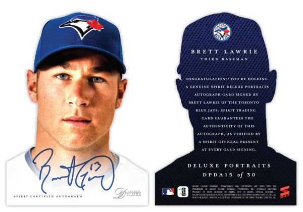
The second version is the die-cut parallel, here with David Price. The design is basically the same except the obvious die cut edges around the player. And finishing off the trio is the die-cut auto version, seen at the top with Brett Lawrie.

Even though parallels can sometimes be redundant and annoying, I feel like this insert captures the best aspects of paralleling a design. Each version offers something different other than just a different color border or refraction. The whole 'cut-out head' thing may seem a little hokey for a 'high-end' set, but I think it's fun. And if you ask me, fun is definitely something we could all use more of in card design these days.

Friday, March 2, 2012

Spirit Deluxe Relic Autos


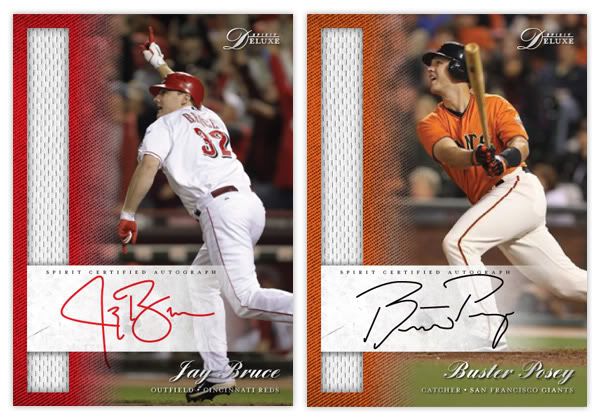
Expanding on the Deluxe Autos from a few posts back, here is another auto set but with the introduction of a relic swatch. These have a lot of the same elements from the other Deluxe cards. The team color texture fading into the photograph, silver foil, same typefaces. The vertical jersey swatch along the left side is the distinguishing factor of the set. Admittedly, it would be cool of the jersey swatch matched the team color texture but I think the white stands out in a good way. Of course pinstripes with the appropriate teams would be nice to see as well.

On the back, we have a more casual player photo along with the team colors and logos. Curious to see if anybody notices anything special/different about the Posey photo on the back, though it may be hard to see with the white text box over it. The basic composition is similar to front but with those few changes to keep them distinguishable. Each card is serial-numbered to 199.

Thursday, February 23, 2012

Spirit Deluxe Autos

Following the Members Only post, I looked back and tallied up all the cards I've done so far and realized I've really loaded up the Spirit flagship and neglected Clubhouse and Deluxe. That brings us to the first inserts from the Deluxe set, Deluxe Autos.

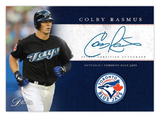
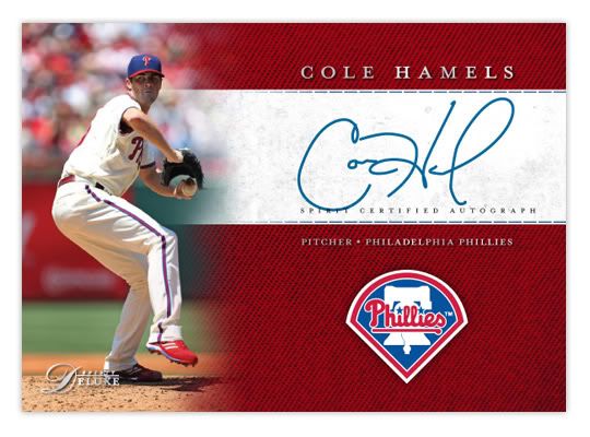
The design on these is very simple but goes along with the Deluxe base. We've got the team-color knit fading into the player photograph. The horizontal orientation lends itself to a bigger autograph, with the team logo below. The player name is in a nice silver foil-stamped serif font above with position/team below the signature, which would be on-card and not stickers.

On the back is more of the team-color swatch along with a more intimate player photo. These would be considered the 'base' autos for the set with future inserts being dual autos or auto/relic combos. The 30 cards in the set would be made up of one player from each team.

Thursday, February 9, 2012

2012 Spirit Deluxe


So first I did the flagship with a few inserts. Then it was the low-end with an insert. I guess now it's time for some high-end stuff. Topps and Panini have done a good job scouring the thesaurus, locking up every suitable synonym for "best" or "expensive," but luckily they seem to have overlooked "deluxe." So I'm gonna claim that now while I have the chance.


 I'm gonna start off with the base card design here. Much like Marquee, the full-bleed photography takes center stage here, though the bottom of the card is ceded for some color. We've continued the colored knit texture that's shown up on a few other Spirit designs. Here, it softly fades into the photograph with the team logo just above. Below the logo is the player name in an elegant script font and stamped with silver foil. The bottom edge of the card is a shiny stripe of the alternate team color and the player position/team stamped in silver foil.


On the back side, the player photo takes up most of the top half with a soft fade into the team color knit. This time, the alternate team color shows up at the bottom in the knit texture instead of a solid block. Player name and position/team are found in the middle with a brief player write-up found below.


I'd say the major characteristics of the Deluxe set are the team colors, soft fade, great photography, and sophisticated typography in a simple design. These elements will continue onto upcoming inserts (auto, relic.)

Trying to keep the Spirit line from getting bogged down into too many different-but-the-same sets like Topps has done, I'll start bouncing back and forth by introducing new inserts for each of the sets. I'm still looking for some innovative ideas to keep from just redesigning what's already out there, so if you have any, feel free to share.