Showing posts with label remix. Show all posts
Thursday, April 28, 2016
THIS IS THE REMIX: 2016 Bowman
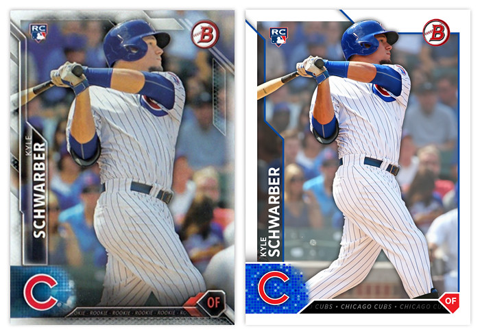
I thought I'd take the occasion of 2016 Bowman hitting the shelves to post a remix I did a few months ago. My overall impression of Topps' design is mostly positive. I like the angular elements and appreciate that everything is (mostly) readable The biggest issue I have is just the overall busy-ness, with all the shines and fades and bevels. The lack of a solid border was the first thing I changed while keeping a few of the overlaps along the top. Next, I changed the name so both the first and last are aligned on the left and just made the tab a solid transparent tab. The Bowman and RC logos are in the same spot. I decided to make the shape holding the player position into an actual home plate instead of just the "sorta" home plate they used. The little tab thing between that and the logo has the team name repeating over and over like a ticker, like the original design. (The Schwarber here says "ROOKIE" over and over.) Then I added the drop shadow to the player cutout and faded the background image a bit to help the player stand out.
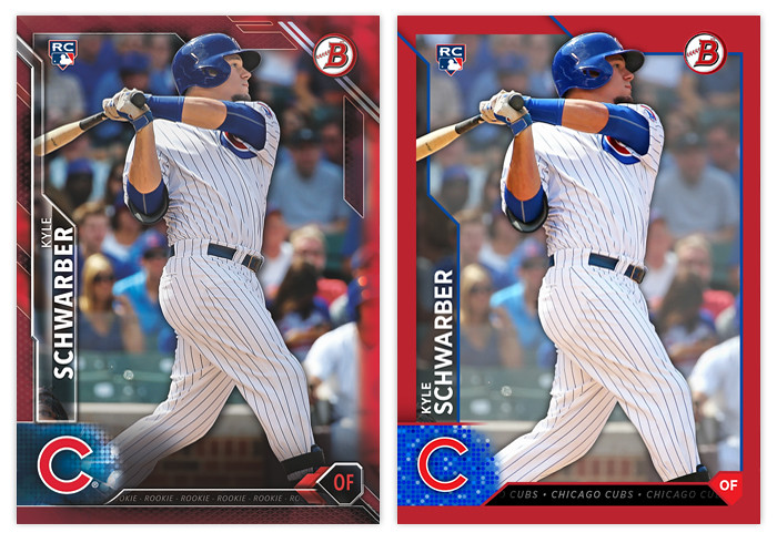
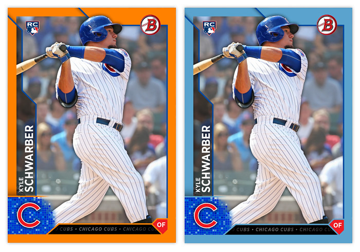
You can see here how the solid border looks with the parallels in comparison to the Topps' design. It's definitely easier to spot on your initial view. The fade on the borderless right side of the card in the original really bugs me. The solid border fixes that. I did a few more below though I don't know if these are included in 2016.
The changes aren't too drastic but they definitely fit my own personal style more than all the over-texturing that Topps is so smitten with currently. In my mind, they're about 5-7 years behind design trends with all of the beveling and whatnot. The remix would definitely age a lot better down the line than the original design.
Sunday, January 3, 2016
THIS IS THE REMIX: 1992 Topps
First off, Happy New Year to everybody. 2016 is here so I hope everyone is looking forward to the Giants' World Series win this fall as much as I am. The other 29 fanbases around the league had your chance last season. For you non-Royals fans, 2017 is just a year away. I already have the 2016 Spirit base design completed. I'm just waiting a little bit to start posting them in case one of the players I picked gets traded. (I've already had to scrub my Shelby Miller/Braves selection.) I'll be posting them on Instagram like last year leading up to a full post here, so look forward to that. In the meantime, I plan on posting a "remix" or two, starting off here with 1992 Topps.
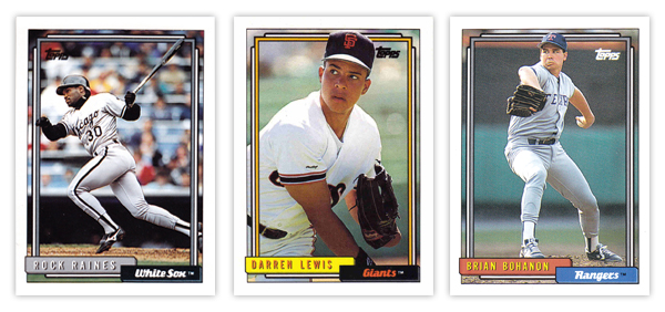
The most noteworthy thing about Topps' 1992 release is the use of a coated card stock for the first time in a Topps' flagship release. On top of the smoother surface, the entire card was just brighter than ever before. The design itself was a continuation of the 1991 set with the color and info along the bottom of the card and some extra frames inset from the borders. There's not a lot of exciting stuff going on here, basically just colored boxes with text. For better or worse, I stuck with this strategy for the remix while just making some slight adjustments.
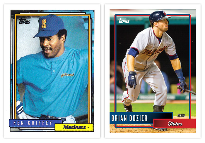
On the original design, the boxes had some hatching added to the bottom and left edges to help add a sense of depth. It's a minor detail that does what it's supposed to. The boxes themselves are mostly team-colored though there are a few random exceptions like the yellow used for the Giants here. The inset frames are also kinda team-colored along with an additional white line on the outside. Topps was able to use these frames to add a little bit of excitement as they had some periodic overlapping where the photographs called for it. Something as simple as having the player's hat or glove or bat cross over that line really adds depth and interest.
Instead of any kind of branding, the team name is simply spelled out in a cursive typeface on the smaller box with the player name in an all-caps sans-serif font in the bigger box. Again, these colors are seem to correspond with the team colors most of the time but not always.
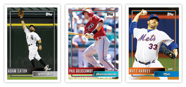
Looking at the remix, the basic feel is very similar with just each area tweaked ever so slightly. The shading of the boxes is gone and instead each ones fades from one team color to a slightly darker version. There's a solid stroke around each with the respective team color. Those strokes then connect with the new inset frames that extend from the boxes. You can see on the original how there was a thick black outline around each frame. Those added a lot of unnecessary heft that imposes on the photograph. I decided to stick with just two simple lines that interact with each other instead of overpowering the borders. The added distance between them and outside white border also keeps things from being as congested. The players still overlap the frames when appropriate.
The text treatments are the same but with different typefaces, though all are in white to keep them legible. (I'm still not sure why the 1992 Bohanon up there has his name in yellow since the Rangers haven't had yellow happening in their branding ever.) I did make the addition of the player position in the negative space between the right edge of the name box and the right frame just above the team box. It can be black or white, depending on the particular image below it on each card.
Like all the other remixes I've done, the feel is intact while the elements have just been tweaked/updated to reflect either more modern design elements or correct (perceived) design errors.
What set(s) should I do next? Surely there are a few designs from the last 30+ years that are just a few little adjustments away from being good. Let me know what you think could use a 'remix.'
Labels:
1992 Topps,
adam eaton,
Brian Bohanon,
Brian Dozier,
Darren Lewis,
goldschmidt,
griffey,
matt harvey,
remix,
Rock Raines
Wednesday, January 14, 2015
THIS IS THE REMIX: 1989 Donruss
Oh, hi there. Long time no blog. Just to bring you up to speed, I'm going to make my first 2015 Spirit post some time in February. But if you don't wanna wait until then to see the 2015 design, I'm in the midst of posting a card a day on my Instagram. Once all 30 teams are up, I'll do a standard post here discussing the designs and whatnot. In the mean, I thought I'd revive the long-dormant feature known as "THIS IS THE REMIX."
1989 was right when baseball cards entered my universe. Up to that point I had acquired a few random cards from either my dad buying me packs or cousins tossing me some of their duplicates. Just stuff stacked along with my Batman trading cards. But the summer 1989 is when I started paying attention to baseball. I would look for wax at every convenient store I entered, saving up quarters and dimes to buy a pack whenever I could. There was a gas station three blocks from my house I could ride my bike to whenever I had 54 cents burning a hole in my pocket. They usually had a box of both Topps and Donruss there amongst the candy. I seemed to favor Donruss. They were more colorful than '89 Topps and they came with a freaking puzzle. How could I resist?
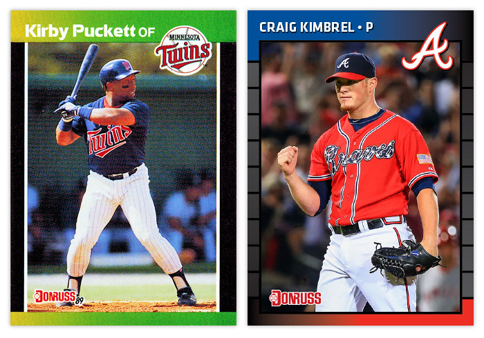
I'm not really sure if there's a consensus regarding the '89 Donruss design. Obviously it's not a masterpiece but I don't seem to recall it garnering hate like so many other designs of that period. My guess is the color strips are kind of endearing. That and the fact that it's not cluttered with unnecessary design elements like little baseballs, Super Mario tubes or paint splatters. All in all it's a pretty simple design, but there's still room for improvement.
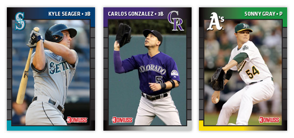
The basic build is the same but with just a few minor tweaks. We still have gradient color bars sweeping horizontally from edge to edge. My first decision was obvious – change the colors to team colors. Call me crazy but if you're gonna have the colors vary from card to card, might as well make them fit the player and their uniform. As I continued to tinker, I thought about having the top and bottom bars go opposite directions, i.e. the Braves would go red to blue on top and blue to red on bottom. It wasn't horrible but it just didn't quite work. Then I had the notion to fade each bar to black instead of the opposite team color. Perfect. It put the team colors on opposite corners and kept the whole gradient motif without affecting readability.
After having the black in the corners, I played with the tiled line edges. I made sure to lighten them up so they're visible no matter the ink saturation. On a lot of '89 Donruss cards, the edges just look solid black. Making them fade from black to a light gray would help with that and it really tied into everything else at that point.
I decided to go with team cap logos instead of their primaries. The thought behind that is to try keeping the logo from getting too big. Look at that big, boxy Braves logo from 1989. That thing takes up a lot more space than the A does. And since the logos do dip down into the photo a bit, I thought it would be best to have the option to flip the design to accommodate any particular photograph. For instance, the Mariners logo would cover up the helmet bill on Kyle Seager's card if I had gone with the normal orientation.
The final change was the picking a new typeface. After going through several, I landed on Klavika. It's definitely more modern looking than the previous font but still has some of that same "square but not really" flavor to it. I made the names all caps and just added a bullet after, followed by the player position. It really bugs me how the position is a different typeface and smaller on the '89 cards. Problem solved.
Overall I think this has been one of the smoothest remixes I've done. That probably has a lot to do with the starting point. I've always chalked my '89 Donruss fondness up to nostalgia but I'm starting think it was just a secret little gem in need of a polish.
Labels:
1989 Donruss,
assenmacher,
cargo,
Kimbrel,
kirby puckett,
lemke,
magrance,
remix,
seager,
sonny gray
Wednesday, October 31, 2012
THIS IS THE REMIX: 1986 Topps
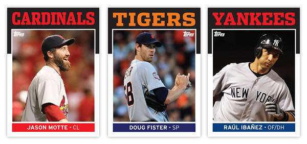
As per Rod's request, here's my stab at remixing the 1986 Topps design. And since this is my first chance to brag a bit about the Giants' World Series victory, I figured I'd feature some of the standout players from the 4 teams that made it to the LCSs this season.
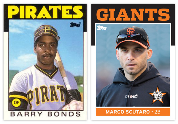
Let's take a look at the original 1986 design. This is probably one of the most iconic sets for collectors of my era so I hope I'm not treading on sacred ground here. The most prominent feature is the big, funky team name over the black border. The big team name in team color is really effective but my goodness, that font... Those As and Es are from another planet. That quirkiness is probably a reason why some love this design while it's likely the reason some might hate it. No matter which side of the fence you reside, it's way past its prime here in 2012.
The rest of the design is refreshingly simple. The black border extends down the edges just a little bit more before giving way to the white border around the rest of the photo. At the bottom, the player name is set in all caps and loosely spaced to fill up the horizontal real estate. The last element is the player position tucked inside a colored circle tucked into the bottom left corner of the photo.
Now let's take a look at the updates. First up is the font up top. I went with Dispatch Black once again since it comes in a variety of widths. That flexibility helps when you have team names of varying length. The Cardinals is the condensed width while the other 3 are the standard width. It has enough personality to help it balance between boring and obnoxious. It hits the sweet spot right in the middle.
Next up is the player name found at the bottom. I wanted to add a little more color to the design so I made a rectangle at the bottom of the photo to house the player name. There's also room in there for the player position so it isn't hanging out by itself in the corner like before. There are also some minor tweaks to the border widths to help with the centering issues that plague the 1986 set.
This is probably the most subtle of my remixes so far but that's partly due to the success and simplicity of the original design. The biggest change is definitely the font up top, the most iconic feature of almost any card design from the 80s. So what's up next?
Wednesday, July 18, 2012
THIS IS THE REMIX: 1981 Topps
As per Johnny's request on the last Remix post, installment number 2 is 1981 Topps.
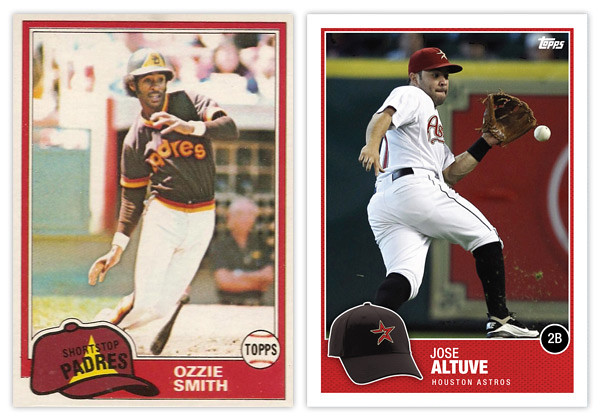
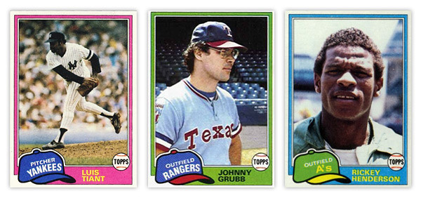
From what I've seen online, the 1981 Topps set is held in somewhat high regard. If I were to wager a guess as to why that's so after 30 years later, I'd say it's probably that floppy old hat. Personally, I think it's a little hokey but I can understand why others find it so endearing. My biggest issue is probably the team name runs arched right at the bottom while the position is on a straight diagonal right on top of it, leaving that negative space above it like it weighs a ton.
I'll give Topps credit for having the hats in the appropriate team colors even though sometimes they really clash with the border color. The Johnny Grubb above is a perfect example.
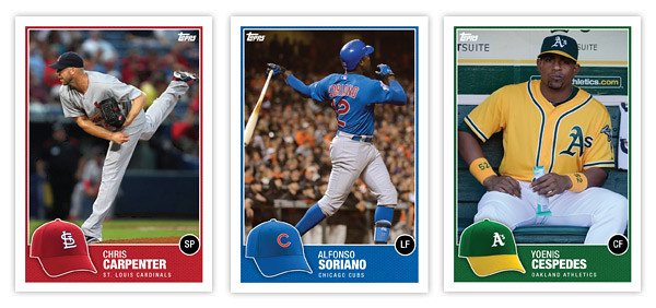
So my first order of business was bringing the hat concept into the 21st century. Instead of cartoony drawings, we have actual photographs of the actual hats. With all the alternate hats that teams wear these days, there might an issue of the logo hat being different than what the player is wearing on the photo (Altuve, Carpenter) but that doesn't really bother me. Just a reflection of current uniform trends.
Since the hat is now the official team hat, I had to find a place for the position. Some have mentioned how the Topps logo inside the baseball was kind of an odd logo treatment on the original. And since Topps' logo is different now and has a lot more flexibility, I figure that was a perfect home for the position markers. The circle is just a black circle since having a ball AND a hat is kind of overkill.
The names are in white on a team-color border so they're nice and legible. I tucked the team name smaller beneath just in case someone new to the game doesn't quite have the team logos down. All in all, the composition is pretty similar with just a few tweaks and updates made to freshen up the design, so good remix.
Be sure and let me know what other sets are begging to be remixed.
Thursday, July 5, 2012
THIS IS THE REMIX: '91 Score
Trying out a new feature here on the old design blog. I'll take a look at a previous card design and do a little remixin' to try and freshen them up a bit for today. This will be a cross between what I normally do and customs that other guys out there do.
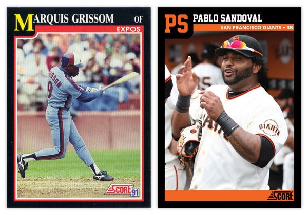
First up is '91 Score. I've always thought this was a vastly underrated design, especially compared to some other designs from 1991. It has a bit of understated dignity to its benefit.
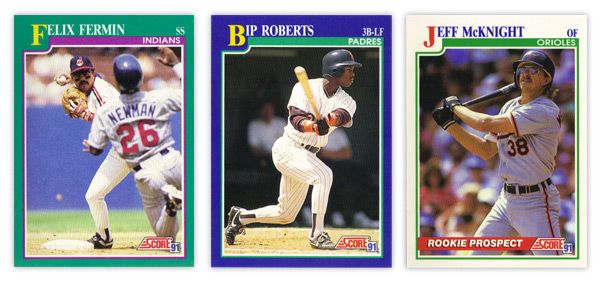
There aren't a lot of elements to the design, so its simplicity is big virtue. The solid color borders add some personality, though I'm not sure the color combinations are the prettiest. That teal & purple combo on Felix Fermin's card just doesn't sit right. In the upper left corner, the first letter in the first name is big and yellow, pushing the colored border down into the frame a bit. This kind of reminds me of playing cards, like a big K or Q in the corner for a king or queen card. It's definitely one of the most prominent and successful features. The rest of the name is spelled out in white at the top, along with team name and player position inside a secondary color bar. There were also some 'Rookie Prospect' cards in the set with white borders and a "ROOKIE PROSPECT" flash across a red streak towards the bottom. Paired with the green inset border, these cards look a little Christmas for a summer sport such as baseball.
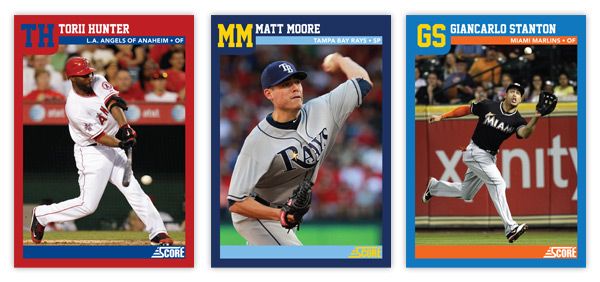
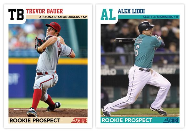
For the remix, I pretty much tweaked every element ever so slightly. The colored borders now reflect the featured player's team, as does the inset stripe. I also removed the strokes around the frame to help clean up the clutter. And instead of having the first letter in the first name biggified, we now have a monogram of the first and last name. This helps with the spacing of the initials and little frame bump. The position has moved from the corner down into the inset bar along with the full team name (city/state and name.) That helps to accommodate some of the longer player names. The one thing that's an addition and not just a tweak is the secondary inset bar I added at the bottom. I though this just helped to balance the top of the card out. Plus...
it makes for a great little spot for the 'ROOKIE PROSPECT' notation to rest, along with the Score logo.
Overall, I think I kept with the tone and feel of the original set but made some minor adjustments to enhance the design a bit. The introduction of the team colors spruces it up along with some different font choices. Hopefully these Remix posts will be sprinkled in alongside some of my original Spirit designs.
What are some sets you think could use a 'remix?'
Labels:
bauer,
design,
giancarlo stanton,
liddi,
Matt Moore,
Pablo Sandoval,
remix,
score,
torii hunter
Subscribe to:
Posts (Atom)