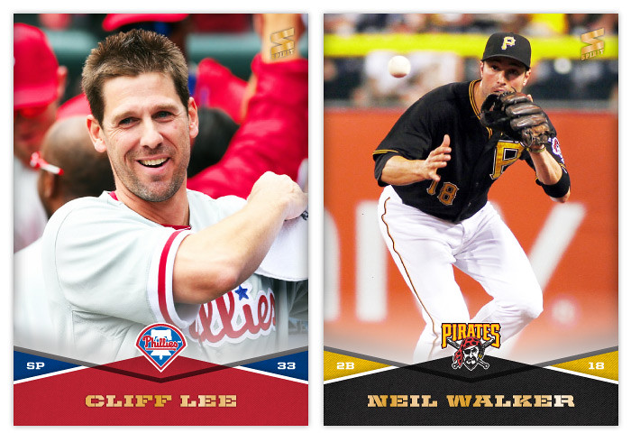
Showing posts with label cliff lee. Show all posts
Wednesday, September 17, 2014
2014 Spirit Base: 351-360
#351 - Cliff Lee
Cliff better put a hat on. It's always sunny there.
#352 - Neil Walker
Walker's having the finest season of his career so far.
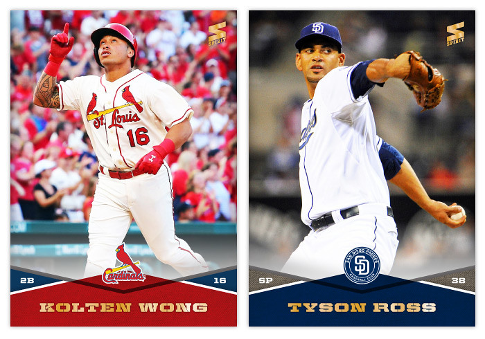
#353 - Kolten Wong
Looks like he's finally up to the majors for good.
#354 - Tyson Ross
Probably the biggest bright spot for the Padres this year.
#355 - Brandon Belt
What a strange season for Belt. He started off like gangbusters, then naturally cooled off, then broke his thumb in May. After he finally returned in July, he dealt with a stiff back for a few weeks before getting hit during batting practice. Since then he's been out with a concussion. Then just a couple of days ago he was finally activated, though he's yet to see any playing time. I had such high hopes for his 2014 season after that hot start. Now I just hope he's able to stay healthy and contribute in some way.
#356 - Hisashi Iwakuma
Though not quite as revelatory as last year, Iwakuma's been good again this season. Lo and behold, the Mariners have a chance to make the playoffs.
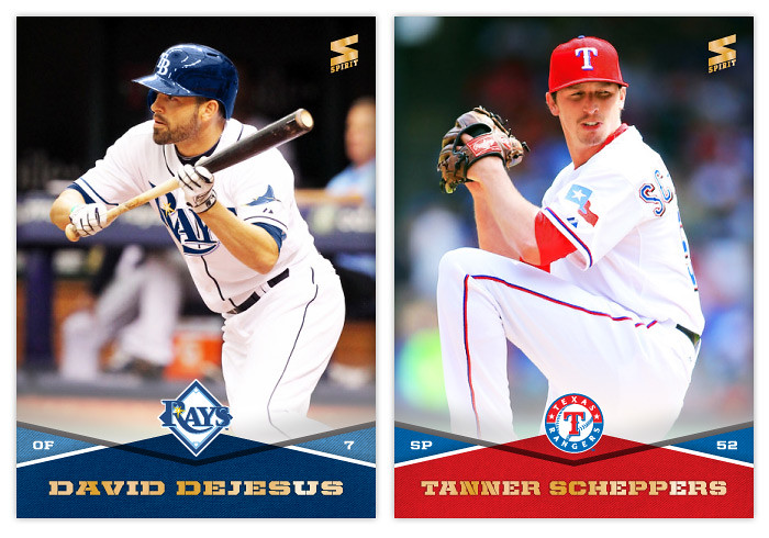
#357 - David DeJesus
I've been looking for a good bunt image to throw in here but I think DeJesus is the first I've actually used.
#358 - Tanner Scheppers
Probably the unlikeliest of Opening Day starters. And after spending the post-April season mostly on the DL, the Rangers have already announced he'll be a bullpen guy in 2015.
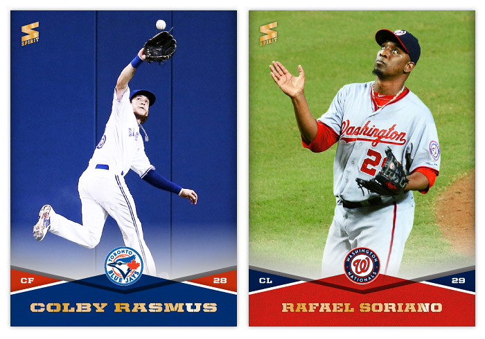
#359 - Colby Rasmus
I have a hard time finding good defensive shots of outfielders that show them actually catching the ball. I had no choice but to use this one of Rasmus here.
#360 - Rafael Soriano
This was probably the least obnoxious clap photo he has out there.
Labels:
2014,
base,
brandon belt,
cliff lee,
david dejesus,
iwakuma,
kolten wong,
neil walker,
rafael soriano,
rasmus,
scheppers,
spirit,
tyson ross
Monday, September 17, 2012
2013 Pennant
Even though there are a handful of amazing pennant/wild card races still going, apparently it's already time to look ahead to 2013 releases. Instead of starting with the Spirit 'flagship' again, I thought the Pennant line would be a good introduction to 2013.
The design is a lot simpler than what I did for last year's version. Since these designs are revisiting specific releases from the past like Heritage or Goudey or 206 do, I thought I'd turn the clock ahead a little bit, closer to something around the '60s or so. We start with an off-white border with beveled edges at the top and a team-color stroke around the frame. At the bottom, there's a half-circle team-color tab to house the Pennant logo. Then extending from that tab is another team-color tab creeping into the picture. The player name (typeset in Cheltenham Condensed Bold) arches around the tab. Moving further, there's a smaller team-color tab multiplied over the photo and housing the team name and player position. The photos have a little bit of grain and aged added to them but nothing too drastic. Altogether, it kind of resembles bunting you'd see on opening day or during the playoffs.
The back side of the card is one-color black and packed with a lot more information than the previous year. We have the player name and background info at the top with room for a black & white team logo. Below, we have the complete career statistics. For those whose careers don't fill the entire space, we have room for a few lines of highlights and/or other information.
I may be a tad impartial, but I think this design has the potential to be timeless. Replace the Pennant logo with a Topps logo, print the name in silver foil and you could have the 2014 Topps flagship design. Or remove the border and airbrush the photos, you could have Upper Deck's next baseball offering. It's definitely and upgrade from what I did for the 2012 version of Pennant. Here's to hoping the rest of my 2013 designs can make the same claim.
Labels:
2013,
aroldis chapman,
Buster Posey,
cliff lee,
pennant,
retro
Subscribe to:
Comments (Atom)


