Trying to come up with 'new' or 'innovative' ideas for cards isn't as easy as I thought it was going to be. Even though there are plenty of complaints to levy at Topps for some of their product choices, they actually do quite a few things that are pretty successful and cool. At this point, most of their missteps come from constructing releases and not so much the actual cards themselves. People like autographs and minis and parallels and short prints and die-cuts and memorabilia and just about every other 'gimmick' out there to varying degrees. But all in all, these are basic elements that go into constructing a set.
This blog has basically been me just rearranging some or all of these elements into what I think would be fun to manufacture. If there were another licensee out there releasing product in 2012, these are things I could see fitting into the marketplace, acting as either a supplement or an alternative to Topps.
That brings us to the cards in this post. I was looking for another 'insert' or whatever you'd like to call it for the Deluxe set. I didn't feel like doing one of those triple swatch, nickname cutout sticker autos that you find in Triple Threads. Even though Deluxe is Spirit's 'high-end' product, it's probably more in tune with something like Finest (which is definitely the very top of my own personal price range.) I see that Topps plans on having some die-cuts in Finest this year, but hopefully this doesn't come across as copy-catting.

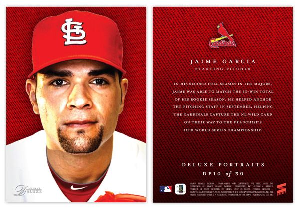
So for the Deluxe Portraits insert, there are 3 different versions you could get your hands on. The first would be the standard Deluxe Portraits insert base, seen here with Jaime Garcia. The design features a tightly cropped portrait with the Deluxe-familiar team-color cloth background. The only other thing adorning the front of the card is the Spirit Deluxe logo in silver foil. Somehow, these seem to come across as more personal and intimate without the player name cluttering the front. The back continues the team-color cloth with a brief write-up.
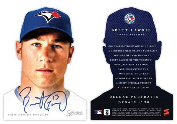
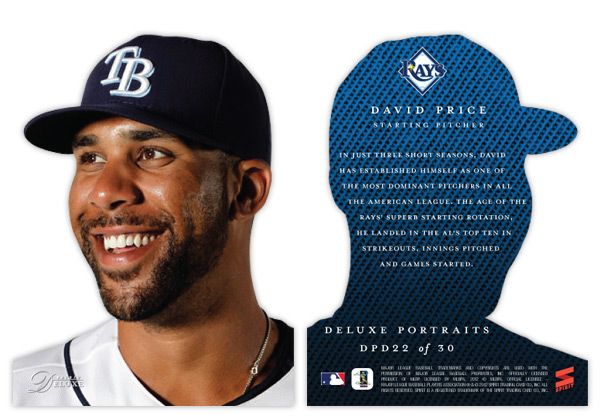
The second version is the die-cut parallel, here with David Price. The design is basically the same except the obvious die cut edges around the player. And finishing off the trio is the die-cut auto version, seen at the top with Brett Lawrie.
Even though parallels can sometimes be redundant and annoying, I feel like this insert captures the best aspects of paralleling a design. Each version offers something different other than just a different color border or refraction. The whole 'cut-out head' thing may seem a little hokey for a 'high-end' set, but I think it's fun. And if you ask me, fun is definitely something we could all use more of in card design these days.