Showing posts with label review. Show all posts

Thursday, June 2, 2016

Around the Horn Review: 2016 Early Releases


In case you didn't happen to notice, I skipped my usual full-release review of Topps Series I earlier this spring. I'd like to say it was planned but, honestly, I just never found the time for it. After a few more releases came before I got around to it, I decided to try out a new format, which you'll see here. I'm sacrificing timeliness for brevity, with the added benefit of avoiding rash judgments.

HOME RUN - All-around success. Asking for more would be greedy.

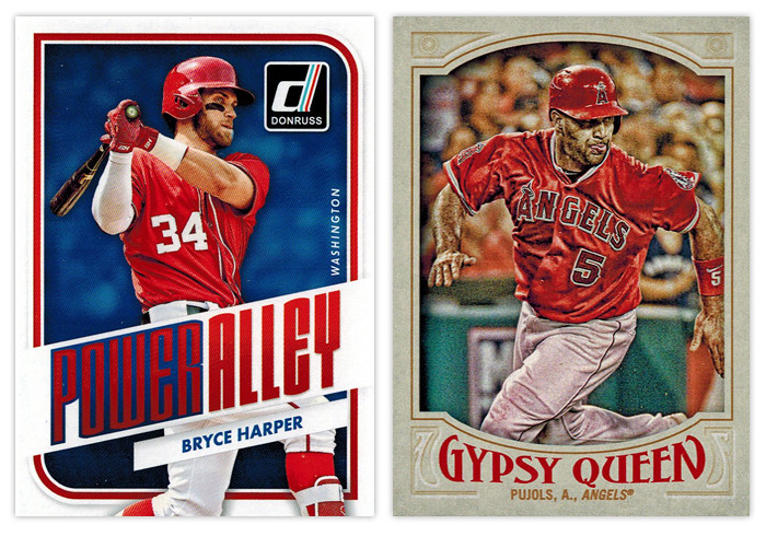
Donruss Power Alley: I was pretty impressed with this design as soon as Panini released the preview images. This is probably the best argument to be made for them to just relaunch the Donruss brand as Panini's flagship instead of all the zombie Donruss stuff they usually do with retched results. It's modern without being too modern, well-balanced and interesting with just enough interesting stuff going on.

Gypsy Queen base design: This is by far the best Gypsy Design the hobby has seen. Topps was finally able to hit that sweet spot between clean and ornate that fits the GQ brand perfectly. The wordmark has the right amount of personality without being over-the-top. The border color is neutral yet has just enough of a hue to not look boring or garish. And my favorite detail is probably the faux embossing for the elements in the corners. I can't think of a single element here that I'd change. Good job, Topps.


TRIPLE - Didn't quite get all of it but standing on third is a pretty good spot to be.

Gypsy Queen Power Alley: I'm curious what my perception of this would be if I wasn't so enthralled with the Donruss Power Alley design. Obviously the feel of GQ is quite a bit different, but it's still a pretty good design. The color scheme of blue, red and gold is really appealing on the lighter border and helps add some nice contrast to all the elements, especially the home run number total front and center. The wood grain on the bats is another nice detail. The only knock I have is the style of the blue flourishes along the top and bottom of the photo frame. They look a little too '70s-mellow-mushroom for my tastes.

Topps 100 Years at Wrigley Field: The design here benefits from having all the iconic features of Wrigley to drawn upon —red brick, ivy, Wrigley marquee. I like how all of these elements are creeping up from the bottom of the card, just like the ivy creeps up the outfield walls. My only suggestion here would be to maybe have the player name in white running just over the marquee graphic to avoid the dreaded foil-on-dark-background gambit.


DOUBLE - On target for a solid knock. 

Diamond Kings Expressionists: The design here benefits from its simplicity. Playing off the whole expressionism angle, the animated player images are all paint-rendered with the gold, green and red swaths repeating on every card. This is a rare example of them not overcrowding the card with unneeded elements.

Diamond King Aficionado: The best combination of portrait and action shot I've seen in a while. The canvas-colored strips at the top and bottom do a good job of setting the smaller action shot and adding just the right amount of depth. The oil paint look would make a bigger impact here if it was used a little more sparingly in the rest of the Diamond King set.
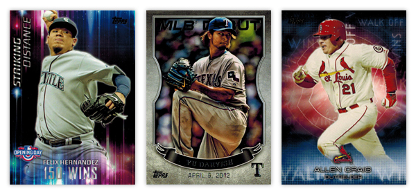

SINGLE - Success... but just barely.

Opening Day Striking Distance: Even though they don't really have anything to do with the theme of the set, the colorful aura and light beams make for interesting design elements. The "150 WINS" text is a little hard to make out in spots. It also seems like they could move the Opening Day logo down to the actual corner and have the name/goal left aligned next to it since the format of everything else is asymmetrical.

Topps MLB Debut: These came in bronze, silver and gold variations but I honestly can't tell which foil is on the Darvish card here. I probably would have moved this up to the "double" level but the photographs are all especially dark, like their HDR action missed the brightness step in Photoshop. The banner also looks  little hokey when paired with the background texture. Compositionally, it's pretty solid, though.

Topps Walk Off Wins: Kinda like the Striking Distance cards, these have some nice, colorful but irrelevant graphics. I do appreciate that they're team-color based, but there's no real connection to the theme. It would be nice if "Walk Off Wins" appeared in full somewhere on the design. As is, the full line either runs off the edge or it's obscured by something.
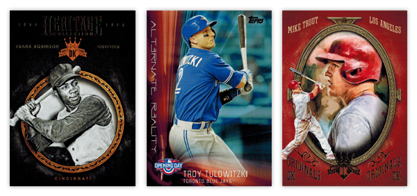

Diamond Kinds Heritage Collection: The ornamented circle frame is a nicely rendered element. I like the added depth of having the player cutout overlap it in spots. Another instance of less is more with the background, though, again, the foil on black has some issues as you can see from the scan. The team location at the bottom of circle looks nice in that same gold as the frame. Unfortunately, the player name and position flanking the DK logo towards the tops looks funky since the two lines have such varying lengths on the Frank Robinson here.

Opening Day Alternate Reality: It's very reminiscent of the Striking Distance design. Honestly, they could easily flip the designs for each set and it wouldn't make a difference either way. The "Alternate Reality" text is a little too cliché sci-fi for my tastes. The composition is a little better than its sibling though the elements aren't as nice.

Diamond Kings DK Originals: Give Panini credit for some nicely deployed irony here. This is the Diamond King set's answer to the Donruss Diamond Kings subset. And they named it "Originals" lol. Whatever you say, Panini. It has the same portrait/smaller action cutout set up you'll see in the Donruss version, though executed better here. Making the whole thing full color is a nice distinction. I'm not a fan of the text treatment up top or the "DK Originals" stamped on the bottom. Switching the image order from the Aficionado design is good move to help differentiate them a bit.
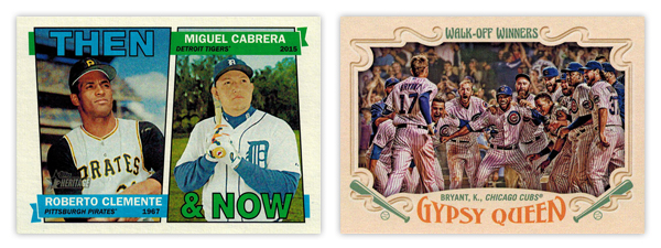

Heritage Then & Now: With the constraints of the 1967 base design, this is about as good of a solution as you could ask for. The little details like having the flags split the photos and then wrap around are well done.

Gypsy Queen Walk-Off Winners: Wait, this again? I will say the photo choices here are a lot better than the regular Topps WOW cards. But the horizontal layout means there's less room the image itself since they have to allow for all the typical GQ flourishes to circle in from the borders. My biggest gripes are how the text is handled for both. The "Walk-Off Winners" text up top looks a little to groovy for the rest of the design. And the way Gypsy Queen wordmark arches down along the top really bothers me with the player/team name running above it on a straight baseline. That's a gnarly negative space.


WALK - Mostly good but left a little power in the bat.

Topps base: I'm a fan of the basic look and layout here but it's littered with things I'd change. The "smoke" on the edges, the fake shininess, cut off logos. Has anybody noticed how the colors on the diagonal bars are different? Look at the Eickhoff card. The one on top matches the red from the Phillies logo but the bottom one is on its way to purple. And why is blue the predominant color for the Phillies cards instead of red? Or why are the Pirates cards mostly red with just a smidgen of yellow and zero black? There are too many little things like that for me to be complete sold.

Bowman base: If you saw my previous post, you know exactly where I think the Bowman design can be improved. To sum it up, make the border solid and get rid of all the shiny textures and this would really round the bases.
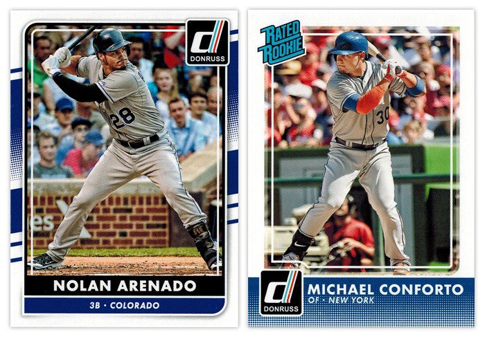

REACHED ON ERROR - Somehow standing on first despite your best efforts to make an out.

Donruss base: I don't know why Panini is still doing what they're doing with Donruss. Take a few different elements from different Donruss designs of the past, throw lock yourself in a cell with a laptop and see if you can earn your parole (or something). As an evolution from the 2015 design, it's actually an improvement. But they seemed to have incorporated one Topps' least popular design elements into the Frankenstein design here, for some reason. Somehow, though, I don't hate it. Objectively, it's not a bad design per sé. I just can't endorse the way it came to exist.

Donruss Rated Rookie: Hello, halftone gradient. Not so nice to see you again. Having it run across the bottom unencumbered like that is not a good decision. It's teetering on obnoxious. The only saving grace for the rest of the design is the absence of anything else. Just a solid white border and plain white text with the iconic Rated Rookie logo in the corner. So congrats for knowing how to not make things worse (for this design at least).


GROUND OUT - A trip to the plate with nothing to show for it.

Bowman Prospects: While this is almost completely interchangeable with the Bowman base design, it takes a few extra dings here. The issues with border and texture still appear. Without the player name running vertically, it loses some of the dynamism that Bowman has. Also, the team logo sitting in the circle, there's a little too much negative space on the left border that throws things off balance.

Bowman Sophomore Standouts: All the leftover diagonals converge here into...nothing really. The text is boring and too similar for anything to standout. The absence of a primary element other than the player image drags this to snoozeville.

Bowman International Ink: These were doomed once they decided to feature players wearing jerseys over dress shirts in front of the busiest backdrop ever. The team and Bowman logos would be better off if they switched places, letting the team logo be a little bigger. All the fades and shines could stand be toned down as well. The design isn't beyond salvaging but it's probably a more effort than it looks like they were willing to put in.
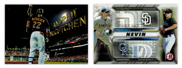

INFIELD FLY - Took a big cut but ended up not making a positive difference.

Topps Perspectives: I know I'm in the minority here but I'm not a fan of this insert. And it's all because it's completely based off the opening credits of a 14-year old movie. It seems like Topps was attempting to inject some Stadium Club-ness into the flagship set here but it just comes across as a little limp.

Bowman Family Tree: I've never been a fan of when Topps designs insert sets around the auto or relic parallels included. This is a pretty egregious example. All of that wasted space next to the logos just so they can accommodate the autographs. While, the autographed cards are pretty cool, there's no reason to saddle the non-auto versions with such a design obstacle.


STRIKEOUT - Walk back to the dugout in shame.

Donruss Diamond Kings: Why are the "paintings" gray? Why couldn't they edit out the background noise like the NetSuite logo? Why is the player name/team location so prominent? This whole thing screams minimal effort and thought. I can't think of a single positive to mention.

Topps Pressed Into Service: With such a novel concept for an insert, it's a shame the execution is so poorly done. You'd think they would use a picture of the players' pitching, no? The ball stitching is pretty cheesy in the background and I'm not sure why there's a little blip of the photograph fading around the cutout. The swooshes look pretty dated as well. My overall sense is this was a design they've had sitting in the cabinet for a few years now and finally got around to using it to clear out space.
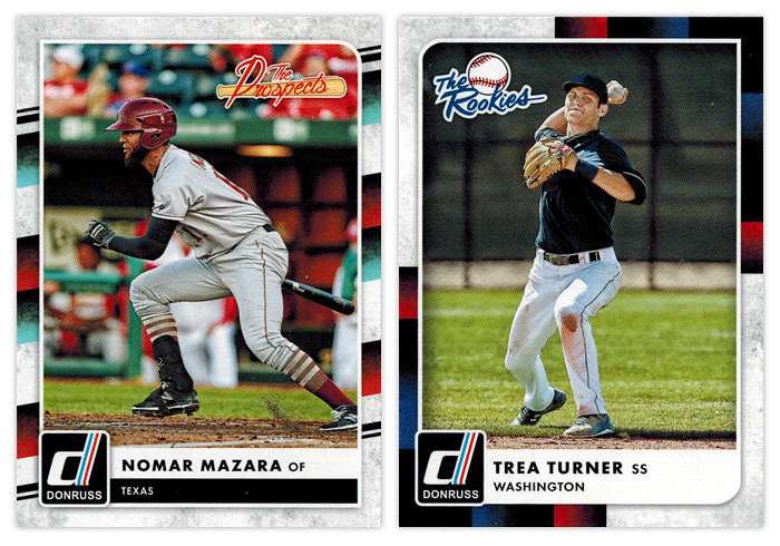

Donruss The Prospects & Donruss The Rookies: Ooh boy. Of all the elements for Panini to pick from the Donruss carcasses, I think the tubes from the 1988 set is very, very far down the list of desirability. Mix in the grungy white texture and it's a match made in hell.

Sunday, August 23, 2015

2015 Gint-a-cuffs (Part 2 of 3)

A third of the way through my Gint-a-cuffs box, I'm sitting at 51 points and 2 hits remaining. Let's jump right into part 2.


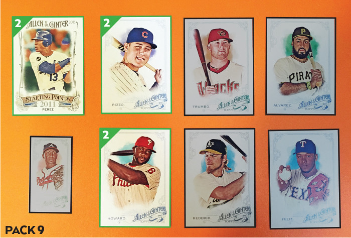
#25 - Mark Trumbo
#131 - Josh Reddick
#162 - Anthony Rizzo (FP) +2
#245 - Ryan Howard (FP) +2
#263 - Pedro Alvarez
#340 - Neftali Perez
SP-37 Salvador Perez (Starting Points) +2
MINI 236 - Julio Teheran

PACK TOTAL: 6
RUNNING TOTAL: 57

Thanks to a couple of guys on the Favorite Players list, this is actually a pretty decent pack.


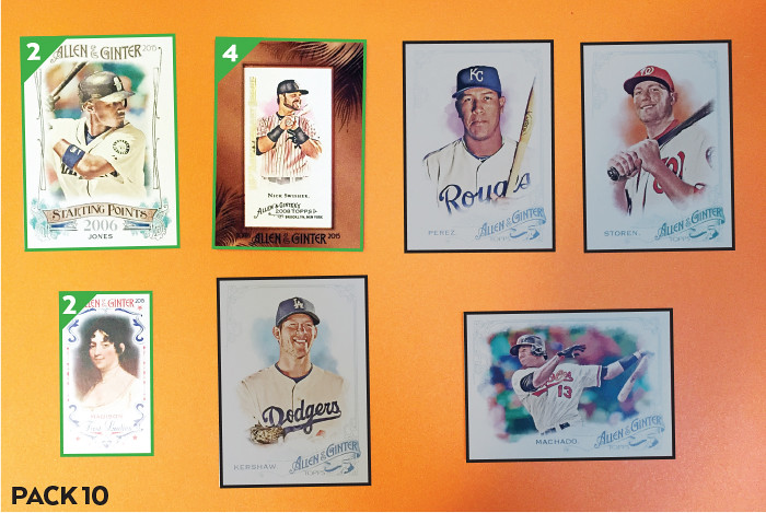
#103 - Salvador Perez
#179 - Manny Machado
#266 - Drew Storen
#339 - Clayton Kershaw
SP-8 Adam Jones (Starting Points) +2
Mini A&G Buyback - Nick Swisher +4
MINI FIRST-4 Dolley Madison (First Ladies) +2

PACK TOTAL: 8
RUNNING TOTAL: 65

These 10th Anniversary Buybacks are weird. I guess they're "added value" even though this framed mini version meant one less card in the pack for me. I can't imagine there being too many opportunities for me to get rid of this random Nick Swisher quasi-hit with artificial scarcity, unless Chris Olds stumbles across this particular post. Oh well.


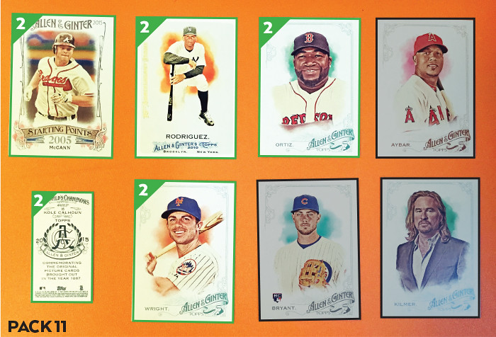
#65 - David Ortiz (FP) +2
#85 - Kris Bryant
#203 - David Wright +2
#206 - Erick Aybar
#328 - Val Kilmer
SP-58 Brian McCann (Starting Points) +2
Full-Size A&G Buyback - Alex Rodriguez +2
MINI 95 - Kole Calhoun (A&G Back) +2

PACK TOTAL: 10
RUNNING TOTAL: 75

Now this 10th Anniversary Buyback is definitely more intriguing. I've kind of come out the other side with A-Rod. I think it's hilarious that he's doing well again this season after he was such a magnet for hate the last few years. I'm not really a fan of his per se but I definitely welcome the baseball gods trolling everybody. If only there wasn't the Yankee penalty attached to this card. Add in the Favorite Players and the A&G back and this is probably the best pack of the box so far. Not to mention that the Kris Bryant rookie card doesn't even score any points.


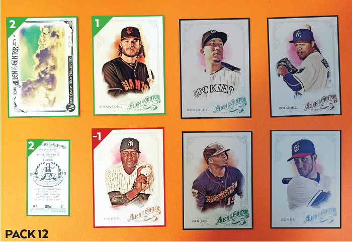
#53 - Brandon Crawford (FT) +1
#78 - Carlos Gonzalez
#99 - Yan Gomes
#138 - Michael Pineda (YANKEES) -1
#189 - Kennys Vargas
#224 - Edinson Volquez
WAS-3 Ether (What Once Was Believed) +2
MINI 143 - Mike Zunino (A&G Back) +2

PACK TOTAL: 4
RUNNING TOTAL: 79

I wish I could have put money on Brandon Crawford winning a Silver Slugger before a Gold Glove. The odds would probably have been like 110:1 or something. I could have made a fortune at the end of this season.


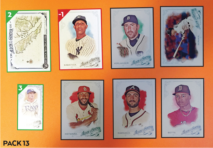
#2 - Nick Markakis
#15 - Justin Verlander
#70 - Kyle Seager
#241 - CC Sabathia (YANKEES) -1
#274 - Mookie Betts
#330 - Jason Heyward
WAS-9 California Island (What Once Was Believed) +2
MINI 292 - Grant Balfour (Black-Bordered) +3

PACK TOTAL: 4
RUNNING TOTAL: 83

I don't get why the black-bordered minis are so non-black-bordered. The little intricate ornamentation they added is unique to these parallels, so it's not like they were just following suit with their base design. They'd really look nice if they stood out a little bit more.


#239 - Zach Britton
#242 - James McCann
#252 - Mike Trout (FP) +2
#295 - Joe Nathan
MM-13 Cyclops (Menagerie of the Mind) +2
FMR-MH Matt Holliday (Framed Mini Relic) +8
MINI 85 - Kris Bryant

PACK TOTAL: 12
RUNNING TOTAL: 95

Hit #2 of the box. Whaddaya know, it's one of my least-liked players from one of my least-liked teams. I'm pretty sure Cardinals fans aren't even all that crazy about Matt Holliday. And again, the best card of the pack just happens to earn me zero points.


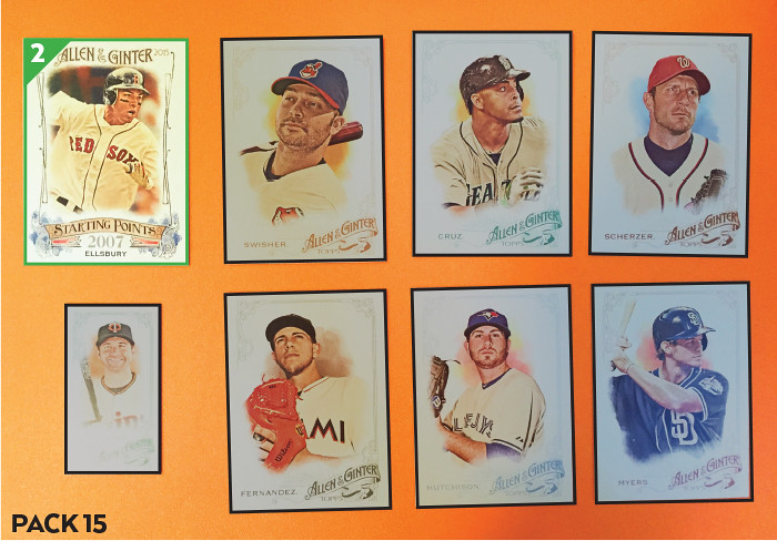
#12 Nelson Cruz
#29 Nick Swisher
#42 Max Scherzer
#181 Drew Hutchison
#208 Jose Fernandez
#289 Wil Myers
SP-57 Jacoby Ellsbury (Starting Points) +2
MINI 156 - Brian Dozier

PACK TOTAL: 2
RUNNING TOTAL: 97

Silver lining to this dud of a pack is the lack of Yankees, even though Ellsbury is, in fact, a Yankee.


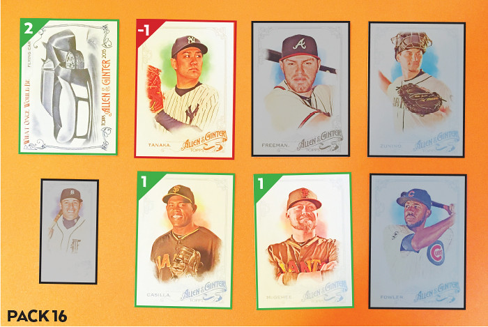
#74 - Casey McGehee (FT) +1
#116 - Freddie Freeman
#143 - Mike Zunino
#145 - Santiago Casilla (FT) +1
#271 - Dexter Fowler
#350 - Masahiro Tanaka (YANKEES) -1
WOULD-1 Flying Car (What Once Would Be) +2
MINI 196 - Ian Kinsler

PACK TOTAL: 3

RUNNING TOTAL: 100

I know Topps has to make checklists and produce the cards waaaay in advance of release but this is a really great example of the flaw in the current system. Here we have a set that doesn't hit shelves until late July. Casey McGehee was designated for assignment May 24. His replacement, Matt Duffy, has since been one of the best thirdbasemen in the National League and is a serious contender for Rookie of the Year. Duffy, who was part of the Giants' postseason roster last year, has yet to have an MLB card produced. Meanwhile, Topps did manage to make room on the checklist for Gary Brown, who used to be considered one of the Giants' top prospects. Brown's inclusion in this year's Allen & Ginter set is even more egregious, considering he was DFA'd by the Giants before the season even began. To make matters worse, he's been picked up and DFA'd by two other teams since then.

So here I am as a Giants fan with cards of 2 players who essentially made zero contribution to the Giants' 2015 season. Meanwhile, our all-star caliber rookie thirdbaseman will be surfacing for the first time in Topps' Update series, which is just a minor step above Opening Day when it comes to enthusiasm in the hobby. Again, I know why this all happened but am just pointing out that in no way should this happen.

And as that rant ends, so does Part 2 of my Gint-a-cuffs box. I'm sitting at an even 100, on pace for 150 points with one hit remaining. 

Tuesday, August 18, 2015

2015 Gint-a-cuffs (Part 1 of 3)

August has thankfully arrived and given me some content to post via the annual Gint-a-cuffs contest. This is my fourth consecutive year to compete; I have a pretty good winning percentage in the danged thing that surely isn't sustainable (foreshadowing...)

This is part 1 of 3 of my box of 2015 Topps Allen & Ginter

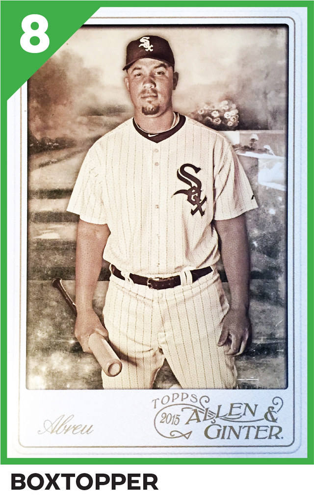
Jose Abreu Oversize Boxloader +8

RUNNING TOTAL: 8

I've gotten a lot of Abreu cards this year, though of course it's a year too late. I still don't understand why Topps has two different versions of these oversized boxtoppers. There's the standard base design just blown-up and then this completely different design. Like a lot of choices they make, it just seems pointless to me.


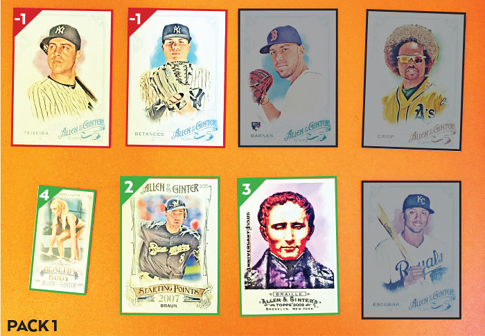
#48 - Coco Crisp
#68 - Matt Barnes
#111 - Dellin Betances (YANKEES) -1
#135 - Mark Teixeira (YANKEES) -1
#331 - Alcides Escobar
SP-56 Ryan Braun (Starting Points) +2
Full-Size A&G Buyback - Louis Braille +3
MINI BODY-8 Barbell Lifts (A Healthy Body) +4

PACK TOTAL: 7
RUNNING TOTAL: 15

The 'Starting Points' insert is this year's super-expansive filler. It's pretty ugly. It looks like one of the runner-up designs for the base card that just didn't get used. Having to cram the insert title in there really crowds everything. If the photos were cutout like the basecards instead of just feathered on the edges, that would alleviate some of the claustrophobia. But really, it's all kind of uninspired. You could plug any number of concepts into this design and they'd fit just as well as the 'starting point' concept.


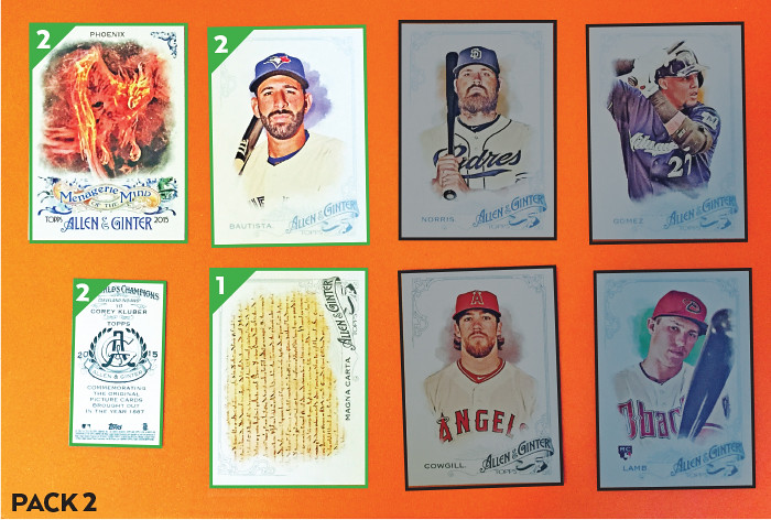
#166 - Carlos Gomez
#207 - Derek Norris
#216 - Jake Lamb
#248 - Jose Bautista (FP) +2
#297 - Magna Carta +1
#335 - Collin Cowgill
MM-4 Phoenix (Menagerie of the Mind) +2
MINI 117 - Corey Kluber (A&G Back) +2

PACK TOTAL: 7
RUNNING TOTAL: 22

I actually like the base design this year. The asymmetry is nice without throwing things off balance. The Allen & Ginter logo is a little big but it looks nice still. I'm not crazy about the shifting border colors, though it's feasible they have something to do with the Ginter Code so I'll let it slide. The players are cropped a lot tighter this year. Not sure if it's better or worse but I appreciate that it's a break from the norm. It'll help differentiate 2015 from other sets years from now I imagine.


#49 - Hisashi Iwakuma
#50 - Francisco Rodriguez
#83 - Matt Harvey
#127 - Nick Castellanos
#191 - John Lackey
#313 -  Jhonny Peralta
WAS-1 Flat Earth (What Once Was Believed) +2
MINI MBT3 - James J. Hill (Magnates, Barons, Tycoons) +2

PACK TOTAL: 4
RUNNING TOTAL: 26

The full-size insert here is "What Once Was Believed" which features formerly accepted truths that have since been proven false. Don't confuse them with the "What Once Would Be" inserts, though. We'll take a look at those coming up... 


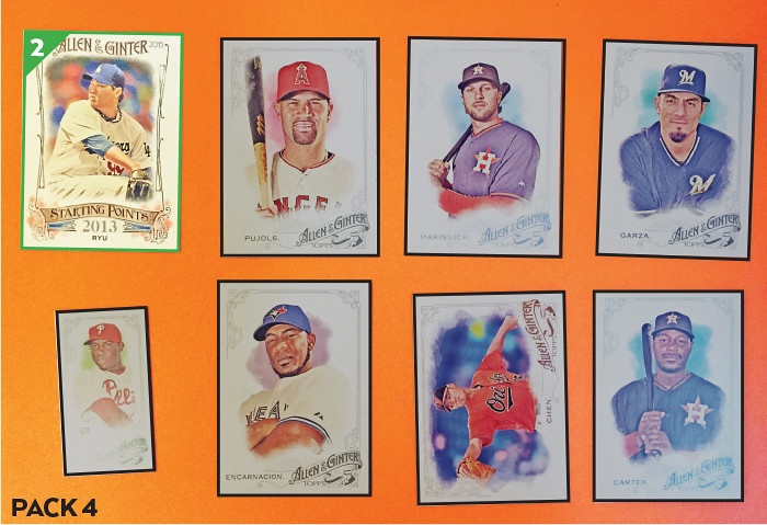
#51 - Matt Garza
#52 - Jake Marisnick
#121 - Wei-Yin Chen
#183 - Edwin Encarnacion
#198 - Albert Pujols
#305 - Chris Carter
SP-42 Hyun-Jin Ryu (Starting Points) +2
MINI 27 - Maikel Franco

PACK TOTAL: 2
RUNNING TOTAL: 28

Every time I pull a Dodger card, I get sad and start adding up the negative points until I realize that it's just the hated Yankees we're penalized for. But then I get sad again because now I'm stuck with another gross Dodgers card. 


#44 - Sal Vulcano
#72 - Joe Panik (FT-Giants) +1
#110 - Victor Martinez
#153 - Brandon Moss
#199 - Zack Greinke
#311 - Michael Brantley
SP-90 Prince Fielder (Starting Points) +2
MINI 69 - Christian Bethancourt

PACK TOTAL: 3
RUNNING TOTAL: 31

I'm slowly accumulating points here. Thank goodness there are a ton of Giants on the checklist. I'm glad I was able to accumulate some nice Joe Panik cards before he got called up and turned into such a solid player.


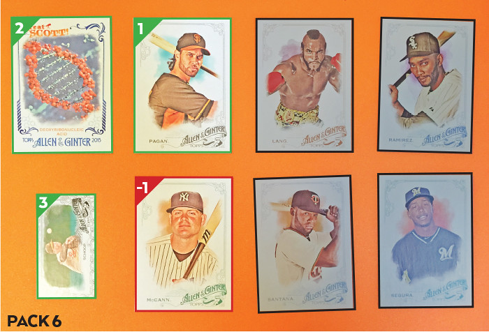
#102 - James “Clubber” Lang
#114 - Brian McCann (YANKEES) -1
#126 - Alexei Ramirez
#160 - Danny Santana
#243 - Jean Segura
#343 - Angel Pagan (FT) +1
GS-6 Deoxyribonucleic Acid (Great Scott!) +2
MINI 259 - Jonathan Schoop (Black-Bordered) +3

PACK TOTAL: 5
RUNNING TOTAL: 36

The "Great Scott!" cards feature scientific breakthroughs that have occurred through history. Some people have been clamoring for more DNA cards for a while so maybe this will appease them? This will not appease them.


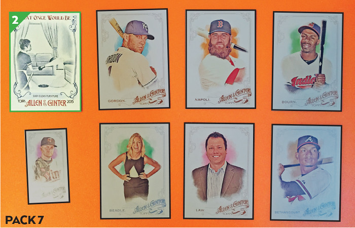
#69 - Christian Bethancourt
#92 - Michelle Beadle
#190 - Michael Bourn
#230 - Keith Law
#254 - Alex Gordon
#338 - Mike Napoli
WOULD-7 Easy-Clean Furniture (What Once Would Be) +2
MINI 272 - Glen Perkins

PACK TOTAL: 2
RUNNING TOTAL: 38

And here is the "What Once Would Be" insert. These are all black & white drawings of stuff that was predicted to happen in the future but never came to be. I guess these are supposed to be sister inserts but I feel like they just get in the way and are needlessly confusing. And worse than that, the "What Once Would Be" cards are just boring to look at.


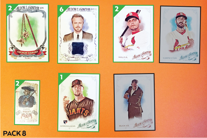
#17 - Yadier Molina (FP) +2
#112 - Buck 65
#172 - Matt Carpenter
#317 - Hunter Strickland (FT) +1
AA-9 Flail (Ancient Armory) +2
MINI HBF-10 Henry Every (Hoist the Black Flag) +2
FSRA-APA Aaron Paul (Full-Size Relic) +6

PACK TOTAL: 13
RUNNING TOTAL: 51

Here we have the first hit. It's a non-baseball one of some guy from some show I didn't watch. I mean, I guess Aaron Paul would be one of the better non-athlete hits to get. Perhaps if it was memorabilia from Bojack Horseman I'd be a little more excited. Overall, though, a very welcomed pack to end part 1. I'm currently on pace to come nowhere close to last year's wining score. Let's hope that changes... (spoiler alert, it won't...)

Monday, February 9, 2015

REVIEW: 2015 Topps Series 1


This offseason seemed longer than most for some reason. I imagine it was even longer for you non-Giants fans out there (sorry.) Personally, I blame my dwindling interest in the NFL and the distraction it usually provided us baseball-starved fans. Perhaps it was due to the anticipation of the 2015 Topps release. Well it's finally February and the curtains have been raised. Hopefully you're all not already tired of all the 2015 Topps talk and pictures. Even if you are, I need to get my review on the books...

The early consensus is that the 2015 design is a homerun and I'm not here to say any nays. Last year's design was so ugly that Topps didn't have a very high bar to clear. Lucky for them (and us), they decided to break (a bit) from the modern traditions they've set in the past half-decade. The most obvious change is the absence of the sterile white borders. They've decided to integrate each team's colors into the design, which I'm sure you faithful readers have noticed is pretty standard for most Spirit designs. When the previews for the set came out last fall, I kinda rolled my eyes at the grunginess of the background but seeing it in-person, it's less noticeable, which is a plus. All the little lines and dots and stuff kind of just multiply into each other to make a colorful background for all the player info.

The second obvious break from the usual is the absence of foil. The only foil on these cards is the Topps logo. All these years of us collectors/bloggers bitching about how hard it is to read foil type on a non-white background have finally paid off. I'm guessing that the busy backgrounds also helped usher that change but go ahead and take credit, y'all. Team logos are easy to make out in the corners above the ripple-prints and the player position dot is perfectly executed as well.

The horizontal cards look just as good as the vertical ones. There's more open space on the bottom for the squiggly tech-y lines so if those aren't your cup of tea then I guess that may be a detriment.


In addition to the usual stat leaders cards Topps has been doing for a while, they brought back team cards for 2015. You may have noticed that the checklist goes to 350(351) this year but with 30 team cards spread across Series 1 and two, that means there are just 5 more players per series than usual. Still, a bigger checklist means fewer duplicates – in theory.


For as much praise as the front design has received, the card backs are just as popular. There's even more continuity between the sides than normal for flagship. The colorful grunge is there as well as the ripple/print behind the logos. The big, easy-to-read numbers are nice, though I wish they were on the left side so they'd be towards the top of when you place the cards in monster boxes. I guess having the logo on the left helps keep the player and team names left-aligned.

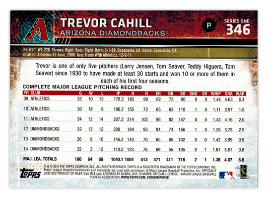
The other complaint for the backs is the spacing of the write-ups and stat boxes. As Night Owl mentioned, the line-spacing, or "leading," of the paragraph text is too loose. The last line comes waaay to close to the "COMPLETE MAJOR LEAGUE PITCHING RECORD" header above the stat box. There's actually more space between lines two and three than there is between line 3 and the header. It's not something everybody would notice or pay attention to, but as a designer it drives me insane. My irritation is compounded when you see how much space there is between each year or stats in the stat box as well. Really, the write-up should be the same width as the stat box, which would probably reduce the 3 lines to 2 lines and avoid the whole crowding issue. Sorry if this is getting really dry to read about. I just have to get it out of my system since I have to deal with these kind of issues on a daily basis at my real-life job.


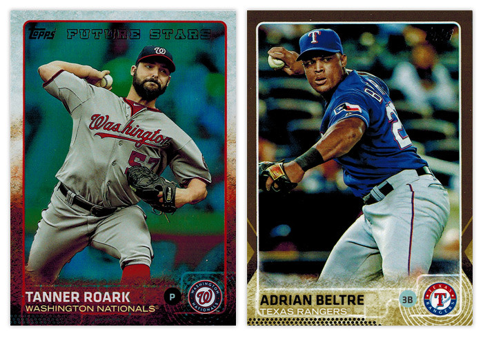
Now that I have that out of my system, let's move onto the parallels. For the first time in forever, Topps decided to make fewer parallels than the year before. There are still, like, a half-dozen or so but they seem to have tidied things up and trimmed some of the fat like the retail-only green and yellows from 2014. Also absent are the red, and blue borders from Target and Walmart, respectively. Most of what you'll be seeing are the non-numbered foils (Roark, above) and the /2015 golds (Beltre.) The scans above are very representative of how they look in-hand but the foils are, basically, a shiny foil background inside the border and behind the player. Essentially they're non-chrome refractors. The golds are big step-up from the usual Topps golds. The borders are actually shimmery gold and not just a flat gold-ish color like years past. The player name is also gold foil but they've lightened up the background at the bottom so it's easy to read no matter how the light hits it. I've only busted retail so far so I don't have any of the black, pink or snow camo to review but the black (/65) and pink (/50) seem to follow the same look as the gold but with their respective colors. The snow camo (/99) just have a light camo look to them without the shininess. There's also the clear (/10) and framed (/20) versions but I'll never have one in-hand so they barely exist to me.


Next to parallels, the other two things Topps flagship is know for are SP photo variations and sparkles. The sparkles are just as hard to find as ever so the only thing I have to say about them is ignore the fronts and check the codes in the fine print on the back. If the last three digits are 903, you have a sparkle. Congrats. The photo variations are a lot easier to spot. Somehow, I managed to pull this George Springer (right) and the Yu Darvish variations in the small bit of retail buying I've done. Chances are, if the photo is really cool and doesn't look like a "standard" action photo, it's a variation. Here's a guide if you want to double-check at home. For the Springer here it's also detectable if you notice the absence of the FUTURE STARS foil at the top and the Rookie Cup at the bottom. (This is also a good time to point out how better they handled the Future Stars designation this year than last. Much less intrusive and it fits the rest of the design very well.)


Moving onto the inserts, here are two that I'm a bit iffy on. The Free Agent 40 design is kinda nice though I'm not really sold on the concept. There are only 15 subjects in Series 1 so it I guess it's premature to pinpoint the flaws just yet. Part of me thinks they should have gone with green instead of blue since free agency's all about cash these days. The Archetypes design looks like a mid-90s Skybox card. Concept-wise, I'm guessing it's supposed to feature players that "break the mold"  but if this is an insert they stretch across Series 2 and Update, they'll be watering down that distinction a bit I'm afraid.


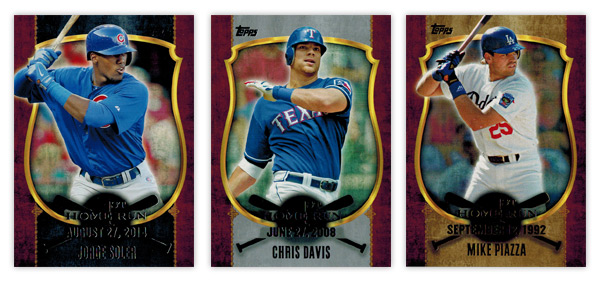
Next up is the First Home Run insert. Design-wise, this looks like a holdover from 2013 or something. These are and look every bit retail-only. The thing that bugs me the most is that all three items of text are basically the same size. There needs to be some sort of hierarchy so you know where to look first. My vote would be for the date to arc from bat to bat at a smaller point size and maybe make the "1st Home Run" text larger. That and doing away with the fuzzy black circle that renders most of it unreadable. You'll also notice three different colorways above — blackish/bluish, silver and gold. I'm guessing one comes from the rack packs, one from blasters and the other from the hanger boxes. I didn't pay attention to which was which, not that it matters. I do like the concept, though. It's a justifiable idea that lets Topps put a wide variety of players into packs, whether it's rookies like Soler or older guys like Victor Martinez or Chris Davis. I'm not even bothered by the inclusion of retired guys.


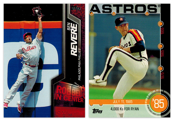
Here's probably my favorite insert design of Series 1. From the photography to the design, these Robbed cards are, ironically, home runs. The shapes on the right are dynamic and fit the great action shots very well. And the "Robbed In..." graphic in the bottom right corner is executed flawlessly, including the detail of it reflecting where in the outfield each guy plays. Throw in the fact that it's colored by team and I have zero complaints. As for the Baseball History insert, I can't say I'm a fan. The biggest problem I have is that it totally sounds like an insert destined for Heritage, not flagship. There are 15 baseball moments that happened within a few days of 15 other general historical moments. For example, the 4,000 Ks for Ryan card here pairs with a card for the 1985 Live Aid concert. I guess that's kinda cool but it just seems so out of place here since Topps has a release every year that caters to concepts exactly like these. I guess since Heritage focuses on a specific year it might not be a perfect fit but there's definitely some static there when I try to associate this with Series 1. Honestly, though, I think the design is what irks me the most. Too many dots, too many restricting lines. And the big text across the top looks too much like an homage to 1971 Topps. If it's intentional, it makes zero sense. If it's unintentional, that's a pretty big oversight. The design looks like a starting point, not a finished idea.


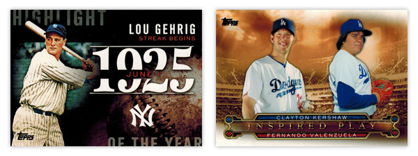
Here's another disparate pair of inserts. The Highlight of the Year insert is a great idea and good design but comes up a little short on being perfect. Instead of a 30-card checklist, it would've been even better to have a card with the biggest storyline for each of the past, say, 75 years — 25 each for Series 1, 2 and update. They could sprinkle them around so the it wouldn't just be 25 consecutive years in each series. It would be a great opportunity to fill in the gaps of some of the forgotten stories of baseball instead of just rehashing things that get beaten to death (Gehrig's streak.) I don't really have any big issues with the design. I guess the year may be a little big but I suppose it's fitting for the concept. On the other end of the spectrum is the same tired idea, this year named "Inspired Play." You may remember its previous aliases: Legendary Lineage, Timeless Talents, Diamond Duos. Basically it's current team player on one side, former team player on the other. Usually they play the same position. It's not that I hate the concept, I'm just tired of it. I will say that they do look good this year. They're not all boxed up like they've been in past so I guess it's a step in the right direction.


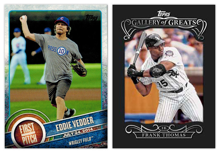
Let's finish things up on a positive note. The First Pitch cards have been getting a lot of good coverage and rightfully so. Unlike the with the Baseball History cards I mentioned above, I welcome Topps bringing over some of the DNA from one of their other sets (Allen & Ginter) into the flagship release here. Mostly because there's an actual link to baseball. Featuring celebrities whom throw out the ceremonial first pitch is a great way to a little extra ink for the hobby. There's enough of a link to the base design to help connect things should a non-collector become interested. I'd really like to see these return in Series 2 with a wider range of teams represented. (3 Dodgers? Really?)  The Gallery of Great card on the right is a hobby-only thing so, again, I don't have one in-hand. But from what I've seen, they're a bit different than the preview image up there. Inside the black paper frame, the background behind the player is rainbow foil-y, kinda like the non-chrome refactors above. Again, Topps has made a slight variation from a previous year's insert. From what I can tell they're pretty basic but not gaudy so that's a plus in my book.

Overall, this is a pretty good showing for Topps. The base design sets the tone for a solid year with only minor quibbles on the design. The inserts, like every year, are hit or miss but the misses aren't nearly as bad as they've been in the past. But the general feeling Series 1 gives me is definitely positive. I hope it's a sign of things to come and not just an anomaly. If they can continue delivering nice designs while tidying up some of the flaws, I'll continue to give them good marks.

TLDR REVIEW

WHAT I LIKE:
• Base design is a break from routine; colorful, tidy without being boring
• Parallels pared down, more than just different colored borders
• Card backs match the fronts perfectly
• 350-card checklist
• "Future Stars" designation less obnoxious
• "Robbed" insert one of the best
• "Highlight of the Year" idea solid, with improvement
• "First Pitch" bridges baseball and non-baseball
• Absence of weirdly-shaped die cuts

WHAT I DON'T LIKE:
• Write-ups on back need tightened up
• Sparkles again
• "1st Home Run" design looks like holdover from the past
• "Archetypes" too Skybox-esque for 2015
• "Baseball History" design and concept
• "Highlight of the Year" execution
• Current/Retired player insert resurrected ("Inspired Play")

Thursday, February 6, 2014

REVIEW: 2014 Topps Series 1


Pitchers and catchers haven't reported yet but we can pretty much say baseball season has arrived as the first release of the year has made its way onto the shelves. Thanks to my wife bringing home a blaster for me the other night, I finally have some to scan and digest. Let's take a look at the 2014 Topps Series 1 design offerings.

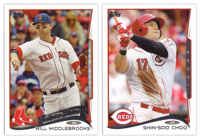
I've mentioned it before but I'll reiterate that I'm not a fan of the base design. The white borders are back. Even though I know it's only so Topps can go parallel-crazy like they always do, I don't have a problem with the white borders. When you move onto to basically every other design element, that's where the problems start to pop up. The biggest offender here is the foil wave at the bottom. Outside of Nike, swooshes need to leave the visual landscape. They've been overused for the last 5-10 years.

Even worse than the wave's existence is its execution. The tapering of the curves on each end are unbalanced. Plus the angles themselves are all wonky. Look at the Middlebrooks card above. His name is so long that it overlaps the foil wave since they didn't allow enough room for it to run across unfettered. Then squeezed between the name and the swoosh is a little oval to house the player position. I think it's nice that they included the position again this year but it looks sooo cramped between these two elements. Behind the foil wave is a team-color wave that's an extension of the photo border around the rest of card. It's a nice way to add some more color to the design but I think it could stand to stick out a bit more. On top of that is the team logo.

Another thing you'll notice on the Middlebrooks card is the return of the Future Stars designation. Others have chronicled its history from the 80s through 90s and I'm not that enthusiastic about seeing it back. For some reason, Topps has found it necessary to have a theme running across its flagship release for the past 3 or 4 years. This year they're really shoving the whole rookie/young player angle everywhere as you'll see in the inserts. I can't decide which irks me more: how stale it is or how much it's an obvious case of pandering. Anyway, as far as the Future Stars logo thing, I guess it's not too bad. It fits in with the rest of the design, though it's odd how the tail of the start actually indicates it's falling.

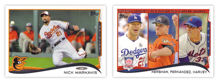
The element that seems to biggest target of most people's ire is the team name tab along the right side of the card. At first, I was like everyone else and hated it. But after seeing these cards more, I think it's actually a nice element. It's just completely out of place here with the rest of the card design and a little redundant. I think if they were to go back to the drawing board on this design, the tab would be the one thing I'd suggest they keep and work into the rest of the design.


You can see on the horizontal cards that the tab doesn't encroach on the rest of the design as much and doesn't stick out in the same awkward way. There's also more space along the bottom for the player name with the wave stretched out more. It's a better overall shape, too.


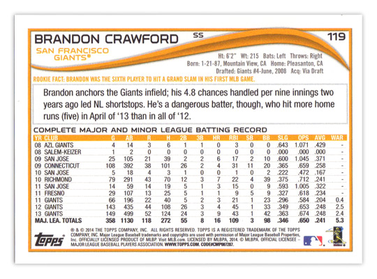
Taking a look at the back of the base cards, the format's basically the same as the last couple years have been. The card number in the upper right corner looks a little small and the player position looks like they forgot where to put it until the very last moments before going on press. About the only other things of note are the addition of WAR to the stat line (yay!) and the "Rookie Fact" tidbit (boo!).


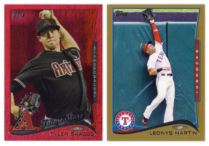
There are plenty of parallels as usual. The sparkly color for this year is red. I guess since there are so many MLB teams with red in the color schemes they'll turn out okay. The red just seems a little dull to me. Gold cards are also back because of course. Not pictured are the standard red, blue and purples from Target, Walmart and Toys 'R' Us, mostly because there's only one of those three stores in town, but also because I'm sure you all know what they look like anyway.


The newest parallel wrinkle is the addition of two new retail-only colors. The lime green actually isn't as bad as I thought it'd be when I first saw them online but the yellow is as Fleer-tastic as you would imagine. Really not a pleasant couple of colors to feature so prominently on cards.


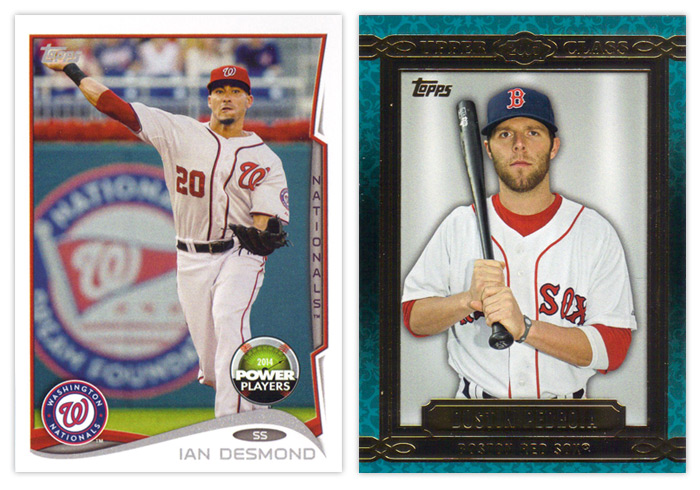
Now onto the inserts, though the Power Players cards are about half insert, half parallel. As you can see, the design is the same as the standard base cards, only the foil is just gray ink and there's a Power Players beach ball about to crest the hill. This is Topps' online component for the year. Without really knowing how the whole setup works yet, I will give them credit for at least making these somewhat collectible this year. Even after the code is redeemed, they'll still be desirable depending on the player depicted. They're less ubiquitous than the old Topps Town and Topps Attax code cards from years past, so that's another plus. The first true insert there on the right is Upper Class. This is probably the weakest insert so far this year. My first beef is with the name. I know they're nowhere near what they used to be but it seems foolish to plant even the tiniest clue to one of your competitor brands' names on your cards. I honestly have to stop myself from saying Upper Deck every time. I'm also not a fan of the design itself. The flourishes in the background are too pronounced, the colors range from teal to gray to brown without any sort of reasoning and the solid gray background is just way too plain. It makes the whole thing look rather generic. I guess the design is supposed to recall framed portraits lining a decorative wall but the drab backgrounds remove any ounce of 'class' that the rest of the design may impart. And as far as the checklist goes, pretty much every player ever is eligible to be included. Again, there's no rhyme or reason behind including anyone in particular. It's not something like the top 3 rookies from each class for the past 10 years or something like that. It's really a random crap shoot.


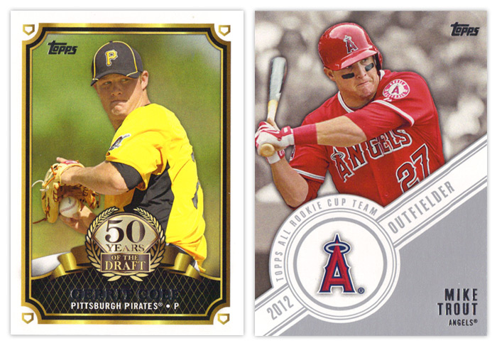
The 50 Years of the Draft insert is actually a pretty nice design. The frames are solid without being overdone, the logo part is well balanced and not too gawdy and the overall composition is nice. My only thoughts would be to make the fake gold on it actual gold foil and for the home plates in the corners to maybe be rotated so the points are all facing the corners instead of all being upright. The Topps All Rookie Cup Team design is also pretty solid but has one glaring issue. The angle of the banner should really be reduced so there's not as much wasted space above the player name. It would allow for more of the photo to be shown and not crowd the guy as much.


2012 Series 1 had a poorly conceived insert set called Golden Greats that featured multiple cards of the same handful of legends. Topps realized how bad an idea this was and stretched out the Series 2 checklist to feature 25 other guys a single time. I wonder if they'll follow the same script for Series 2 with the Future Is Now inserts here. They have multiple cards for 13 different players here, which happen to be some of the hobby's most desirable players. Funny how that happens. Design-wise, these look very similar to a Topps football Prolific Playmakers insert. You have the overlapping curves, the player cutouts over a dulled background. It's a nice looking design so I can't blame them for overusing it. I guess they've made enough alterations that the difference is noticeable. I do think they could do without the fake lens flare, though.


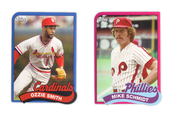
Making my blood boil are these 1989 Die-cut Minis. The 1989 Topps set was the first complete set I ever got so I'm already very protective. Somehow, Topps thought it was a good idea to cut off the margins and shrink these babies down. As I'm sure you can notice, the big issue with that is the fact that the name banner has a little notch at the bottom that hangs over the photo frame. Not only is that a problem for safely securing these while keeping the notches intact, it's just flat out ugly since the die isn't going to match up perfectly to the printing every time. That's also apparent on the bottom right corner as well. I've mentioned it before but I really hate die-cuts that don't have at least one standard corner and this is a perfect example of why. Then you add in the fact that they messed around with all the colors and the border thickness and these keep breaking my heart. Topps, please stop reusing old designs on anything other than Heritage. Please.


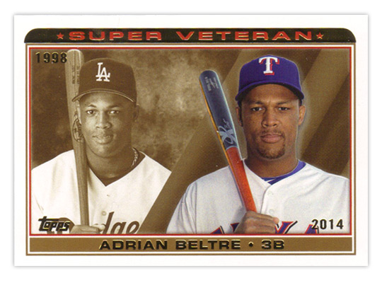
The last insert I have is the Super Veteran collection. Even though they look like a mature version of something from the 90s, I thin this is a nice simple design. Seeing how a player's looks have progressed from their rookie season to now is a kinda fun. The sepia background is nicely employed against a full-color current photo. I really have no complaints for this one.

Well that about wraps it up. I know there are more things out there than what I happened to pull in my couple retail purchases, but you can check last year's review if you wanna see my thoughts on the camo and pink parallels. I guess I'll boil this review down to what I like and what I don't like.

TLDR REVIEW

WHAT I LIKE:
• Horizontal design works less bad
• Addition of WAR stat
• Power Players cards are worth keeping
• 50 Years of the Draft design
• Topps All Rookie Cup Team design is good with a subtle change
• Future Is Now design
• Super Veteran design and execution

WHAT I DON'T LIKE:
• The Wave
• Player position egg
• Not holding free agents over until Series 2
• Green and yellow parallels (or most of them, really)
• Everything about the Upper Class insert
• Future Is Now concept
• Everything about the 89 Diecut Minis
• The gimmick of rookie/young player focus