Showing posts with label votto. Show all posts

Sunday, September 16, 2018

2018 Clubhouse: Cincinnati Reds


31. Adam Duvall

32. Billy Hamilton

33. Scott Schebler

34. Eugenio Suárez

35. Joey Votto


Other than being absent one Scooter, this works out pretty well. That Suárez pic is pretty sweet in particular.

Joey Votto just had to be one of the Reds' signers since he's by far their best/most collectable player. Schebler is pretty under the radar but I figured Votto would make up for that.


I'm excited for this parallel. I know the Allen & Ginter wood minis are a bit hit so I figured a full-size parallel would be even better. These are all 1/1s, so they'd be pretty damn hard to pull and I imagine you'd be pretty psyched to find one.

Wednesday, October 4, 2017

PENNANT BOX BREAK - PACK 13

16. Tony Watson 


65. Joey Votto 

174. Marcus Stroman 

26. Justin Upton 

142. Dellin Betances 

54. Carlos Martinez 

247. David Robertson 

76. Joe Ross 

135. Brian Dozier 

DT4. Kris Bryant - Dream Team


Alright, let's finish up this box break. A little late on the release here considering three of these guys aren’t on the same teams now. I’m glad this Brian Dozier card is finally seeing the light of day, though. That’s such an awesome photo.

Monday, August 14, 2017

2017 PENNANT BOX BREAK - PACK 8

177. Brad Miller


282. Jose Quintana

191. Jose Bautista

188. Dallas Keuchel

84. Jason Kipnis

19. Felix Hernandez

46. Starling Marte

68. Zach Davies

290. Alex Bregman

TI7. Joey Votto - The Incumbents


Pretty colorful pack here. I know Quintana isn’t with the White Sox anymore but in theory this product would have been released well before the trade deadline. I actually put the checklist together back in June sometime. Luckily Joey Votto is still with the Reds and, therefore, their longest-tenured player, so the Incumbents card can stay.

Wednesday, February 17, 2016

2016 Spirit Base


With pitchers and catchers reporting today, what better time to unveil the look for the 2016 Spirit flagship set. Just like last year, I've designed a card for every team. You can see a roundup of them all below but to get a better look, you can check them out on my Instagram page. Without further ado, let's breakdown this year's design.


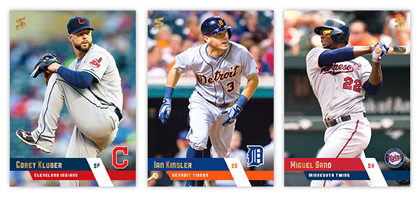
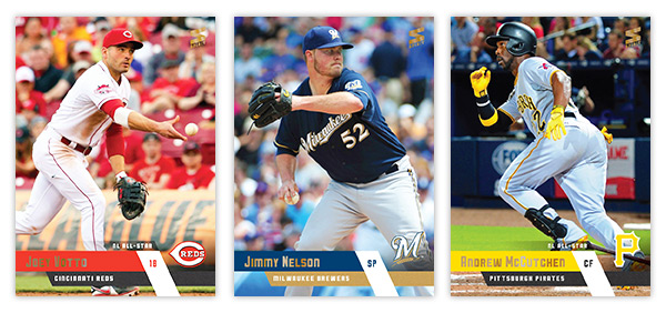
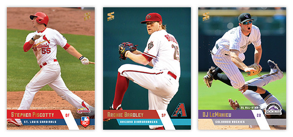
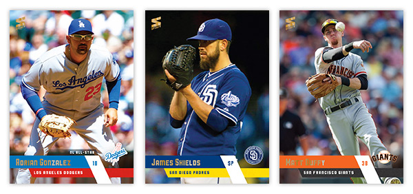
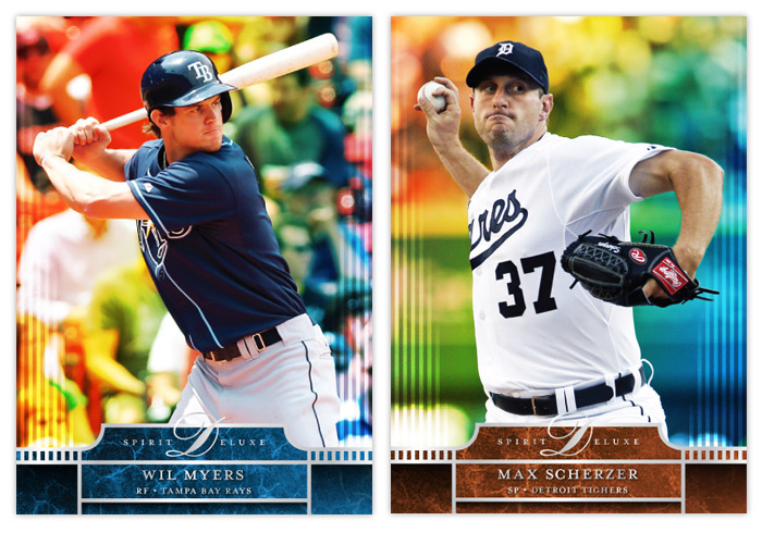
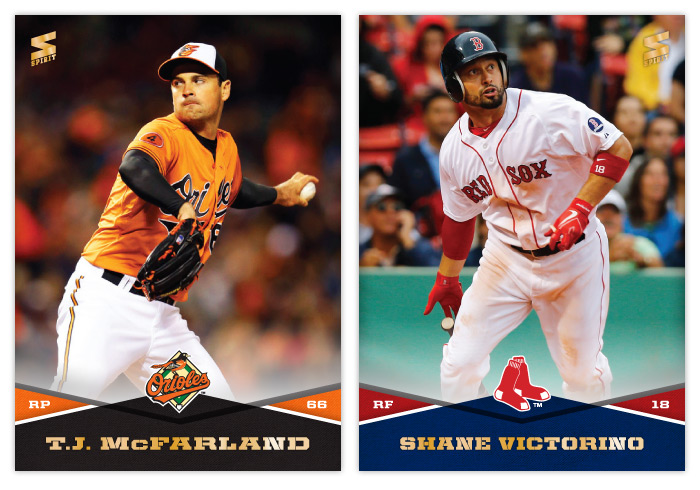
For the fifth straight year, the flagship set is borderless. (Just wanted to point that out since Topps seems to be getting a lot of credit for going borderless in 2016...) These diagonal bars in team colors coming from the edges converge to add a little bit of dynamism that you don't get from just plain old rectangles. I guess diagonals are all the rage in 2016. The team logos are back to full-color after I went with gold foil last year. The last element is a small accolades strip extending just above the bars. For any award-winning or all-star player, there's a designation to help them stand out a bit from the rest of the league. You can really tell below even at these small sizes.


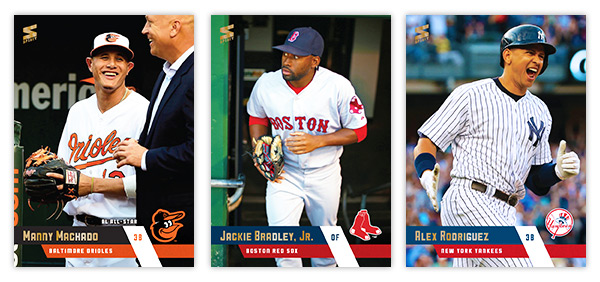
Though he's kinda cut off, I had to go with the Cal pic for Machado's card. And that A-Rod photo is so trolltastic I love it.


The Donaldson photo seemed like a good emblem of his 2015 season.


Solid trio of cards here. I like how you can see Kinsler's bat in the bottom left corner, peeking out.


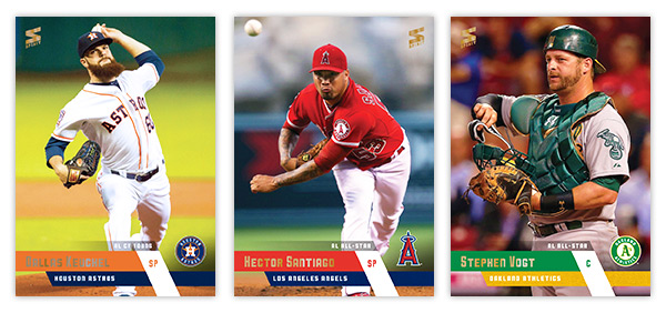
Check out the flow on Keuchel's beard there. Also, I was just barely able to get the ball in frame on the Santiago card without the whole thing getting imbalanced. Just barely.


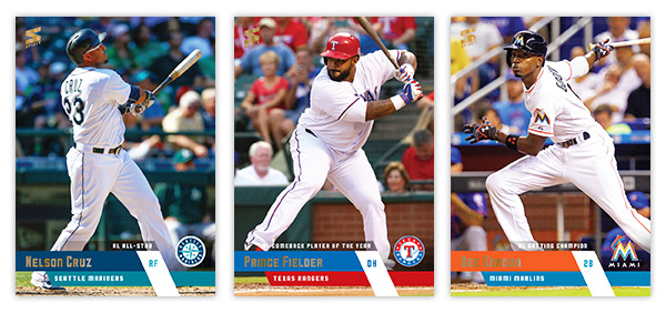
All three batting cards featuring different parts of the swing. God I love Nelly's fly ball pose.


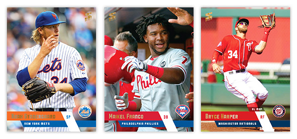
Good balance of photos here. A candid on-field, a candid dugout and a statue-esque action shot.


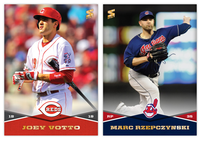
The look of concern on Joey Walks face is something you'll probably be seeing a lot of this season.


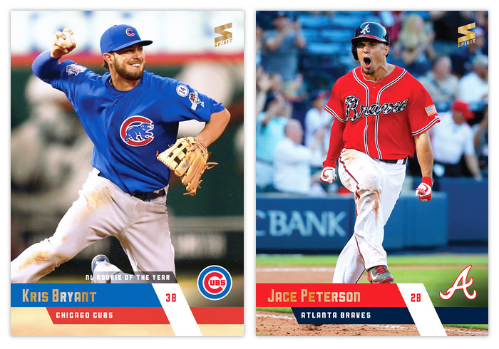
Piscotty gets the RC logo in the bottom right corner. It's a little tight but fits. I decided to go with red and teal for the Diamondbacks even though they don't actually feature it much in their new identity. Anything to add some unique colors to the set.


Glad the Padres added yellow to their team colors. The sand was always so drab. Maybe next year they'll add brown in there as well.


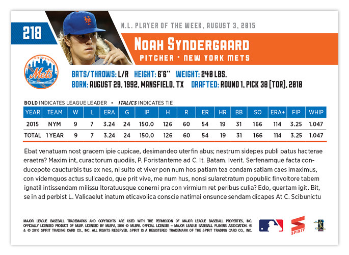
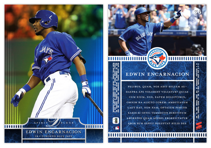
The back are a progression from the 2015 design, updated with the 2016 design elements. Everything fits pretty coherently. For veterans with years and years of service, the stat box will get a little crowded but that's always been the case with any base design. I think my favorite part is how the logo fits perfectly below the card number and to the left of the vitals, filling the negative space from the diagonal photo.

Well this is the fifth Spirit base set I've designed. If I find the time I may do a retrospective post comparing them all across the years. Maybe even a poll for everyone to vote for their favorites. Stay tuned for that....

Thursday, March 20, 2014

2014 Spirit Deluxe


Time to slow things down a bit on the Spirit base front since we're approaching the end of Series 1 and the season hasn't even started yet. Here's this year's "high-end" release, Spirit Deluxe.


The front features a full-bleed photo again, though this year the background is a shimmery, refractor-y, prismatic thing. I'm not sure I can replicate it digitally but I think this gives you an idea. It's a lot more prominent on the day game photos. At the bottom is a team-colored marble block with lots of silver foil accents. The thin rails on the left and right extend up into the photo space before softly fading out. It reminds me of a spotlight receding into the darkness of night.


On the back, the team-colored marble takes up about 2/3 of the bottom, leaving room for a brief write-up and some fine print along with the player name. The rail element from the front reappears, this time anchoring the bottom as well as separating the photo from the text block. The team logo sits inside a white circle centered where the 2 sections converge.


Here's a look at the standard auto and relic variations. The auto has a white glow for the player to sign. It covers up the light rails a bit but it's functionally necessary.

I think this is a nice evolution from the 2012 and 2013 versions. They aren't drastically different but hopefully you'll be able to distinguish from year to year. I just want to keep the full bleed, glossy thing going so there's consistency.

Thanks for checking this out.

Monday, January 13, 2014

2014 Spirit Base Series 1: 61-70


#61 - Cody Ross
I really wish Cody Ross was playing for a team not in the NL West. I love rooting for him but not at the expense of the Giants.

#62 - Jason Heyward
I considered using a photo with his extra long helmet flap since it's unique but it just looked too weird. Plus, I'm sure he doesn't need to be reminded of his broken jaw.


#63 - T.J. McFarland
There weren't a ton of photos to choose from but luckily had a few that were usable. Love those orange jerseys.

#64 - Shane Victorino
If baseball cards could utilize .gif technology, I'd totally use this image instead.


#65 - Edwin Jackson
Thought this was an interesting angle for a pitcher card.

#66 - Alexei Ramirez
Those White Sox uniforms really don't add much chromatically speaking.


#67 - Joey Votto
Probably one of the nicest combinations of color, lighting, pose and player so far. Very nice looking card

#68 - Marc Rzepczynski
Thank god for copy/paste.


#69 - Tyler Chatwood
I really like when the Rockies embrace their purple-mountain majesty. It's such a unique color in the MLB now.

#70 - Victor Martinez
Maybe it's because I don't watch a lot of AL ball, but I have the hardest time remembering Victor Martinez when it comes to "good hitters." He doesn't seem to have much of a presence on cardboard either. It's really strange when you do realize how good he is.