Showing posts with label die-cut. Show all posts

Thursday, April 20, 2017

2017 SPIRIT BOX BREAK - PACK 11

239. Chris Stewart

140. Junior Guerra


287. D.J. LeMahieu


48. Danny Salazar


291. Masahiro Tanaka


116. Eugenio Suarez


139. Keon Broxton


196. Brad Hand


148. Aaron Judge (RC)


G219. Francisco Cervelli


K5. Jon Gray - Kings


Pretty good pack for Yankee collectors here. The Judge RC easily the best in the pack, though that Broxton pic is pretty cool.

Wednesday, April 12, 2017

2017 SPIRIT BOX BREAK - PACK 4

94. Adam Duvall

158. Aaron Altherr

233. Ken Giles

146. Freddy Galvis

73. Ryan Buchter

74. Erasmo Ramirez

172. Mike Zunino

288. Corey Dickerson

270. Dansby Swanson (RC)

G33. Justin Grimm

K1. Max Scherzer - Kings

The Swanson rookie card is probably the noteworthy pull here. If he pans out like he’s hyped to, I think it has potential to become “iconic.” The Scherzer here introduces the Kings insert set. It features the 20-best strikeout pitchers of 2016. I went for a “regal” pattern to match the name of the set and decided to make it a K-shaped die-cut so it’d be a bit more unique. The only cut-out is on the right side, though, to reduce the likelihood of corner dings.

Friday, June 21, 2013

Keepin' It Clean


One of my personal favorite designs from Spirit in 2012 was the Clubhouse Moonshots insert. Homerun hitters, die-cut, big ol' moon. What's not to love? This time around, I kept the subject the same but changed the name to Clean-Up Crew. The die-cut is also back again though in a much different shape.


The arrows are a play on the 'up' part of 'clean-up' and helped me get the design rolling. The one on the right leaves a nice tidy space for the team logo or a memorabilia swatch. I wanted to make sure all arrows pointed up so the upper left corner was the natural choice for the other die-cut location. Having some part of the player cut into the arrow keeps things from getting stale.

As the arrows take care of the latter half of the insert name, the bright neon green/yellow color on the bottom handles the 'clean' half. Something about the color makes me think of a super-intense household cleaner that would almost scrub the skin off your finger. I imagine the ink would be almost plastic-like on the finished product.


On the back side, we have the reverse die-cut shape to deal with but luckily plenty of space is left for another big player portrait. The neon is turned down a bit with black being the most prominent color. Below a brief write-up is the 2012 stat line with categories relevant to clean-up hitters (HR, RBI, total bases, slugging % and OPS.)

All in all, the bright colors, special shape and big batters seem to fit right in with the Clubhouse line.

Saturday, August 25, 2012

It just goes 'round and 'round


I was already working on this design when Mr. Beltre hit for the cycle last night. I figured it was probably a sign for me to finish and post it. As you can probably guess, this is an insert set featuring those active MLB players who have hit for the cycle. I checked the list and found that there are quite a few more than I remember. There are plenty of stars like Carlos Gonzalez, Jose Reyes and Pablo Sandoval, but there are also lots of guys like Kelly Johnson here or Aaron Hill, who has managed to accomplish the feat already twice this season.

The biggest design feature here is obviously the die-cut. In trying to differentiate it from the Moonshots die-cut I did a while back, I decided to change the orientation to horizontal. But since I have to go with a circle—I mean, it's for hitting the cycle—I thought adding some little slivers between the 'stages' of the cycle (single, double, triple homerun) would distinguish it a little more.

There's also lots of shininess here with the inside of the circle all shimmering along with silver foil on the names and Spirit logo.


On the back side, things get a little wonky with the non-uniform die-cut shapes. I think I figured out why they don't make a lot of non-uniform die-cuts now. But with a brief write-up of each player's cycle exploits, they should be interesting to read.

Saturday, May 19, 2012

REVIEW - 2012 Bowman

A full week after it hit shelves, 2012 Bowman finally made its way to the Walmart in my town, so this is the first chance I've had to take a look that the set.

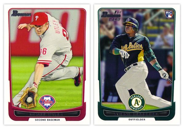
Starting off with the base card design, the first thing you'll notice is the familiar black borders are gone. I'm a little torn on this one. For the last decade or so, Topps did a great job of branding Bowman with something as simple as having a consistent black border on the base design every year. Looking at these all-white borders, I'm kind of missing that Bowman feel. But on the bright side, the black borders are notorious for showing every little imperfection along the edges, so their absence here helps rectify that.

Another change of pace is the introduction of team-specific colors into the design. In years past, the only colors to go along with the black borders were a small bit of red for veterans or green for rookies. Now you'll find blue and purple and a whole host of other colors.  The team logos return in full color after showing up in gold foil last year.

There are a few things I'm not crazy about. The names being in silver foil on top of black is just as hard to read here as the the gold on black was on the flagship design. I'm also not a big fan of all the unnecessary bevels around some of the frame elements. Those are, however, small quibbles. Something that's subtle but really helps the players shine here is the light drop shadow you'll see around the guys. It more noticeable on lighter backgrounds, like the Utley one up there, but helps to add focus to subject of the card. If it were any heavier, I'd probably be bitching about it forever, but they got it about perfect here.


The back side of the base cards continue the same feel as the front, only the border here is gray instead of white. Can't figure that one out. Only having stats from the 2011 season seems like a trade-off they had to make for the veteran cards since Bowman's primary focus is prospects. The 'RESUME' 'SKILLS' and 'EVOLUTION' things are fine, though I prefer the 'UP CLOSE' section on the backs of the prospect cards, which replaces 'EVOLUTION.' One thing they kind of messed up on is having the card number in the right corner instead of the left. BASEBALL CARD LAW: horizontal backs have to be numbered in the upper left corner to help for storage box sorting.


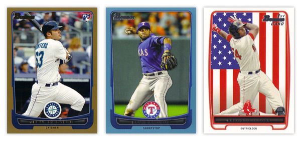
The design for the prospect "inserts" is really, really similar to the base design. In fact, it's almost problematically similar. For the 2011 set, the prospect cards had a white border to differentiate from the black bordered-base, so it didn't really matter if the designs were similar or not. This year, though, the made the designs almost identical on top of having the same colored borders. Not sure what the thinking was there unless they're really trying to test the MLB's patience with the whole Bowman prospect worship thing. Regardless, I think it was a dumb decision.

There are parts where the designs differ, though: prospect has a symmetrically convex border compared to trapezoidally-shaped base border with the little weird notches on each side; the cutout for the position on the bottom is wider and rounder for the prospect design; the base set doesn't have those weird wing things on each side of the logo. I think if the base design didn't have those notches or if the prospect set didn't have the wings, you'd have an all-around better design for one or the other. But holy hell, they shouldn't look this similar.

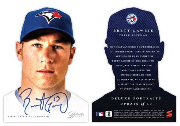
I'll give them credit regarding the autographs, though. They did away with the facsimile autos on the 'base' prospect cards, which really helps the make the actual auto cards more unique.


Just like every other Topps product, this one comes with lots of parallels. Gold, blue, red, orange, green, blue, international, blue, red ice, silver ice, Dentyne ice, blue. I think the flags on the international is kinda neat. The silver and red ice versions are basically just atomic refractors. Really, they have at least twice as many parallels as they should, if not more. But in honor of the Preakness today, I'll refrain from beating that dead horse.


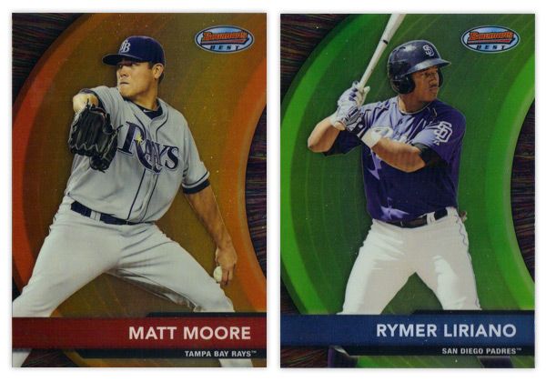
Finishing up here is this year's edition of the Bowman's Best insert. Again, they have the red version for veterans and blue for prospects. There are also die-cut versions, which have all kinds of crazy refractor parallels themselves. Design-wise, I like the different textures on the swoosh and the background. Along with the type and name bar, I appreciate the simplicity of the design.

Overall, I think there's some pretty good, modern design here even if it's not completely "Bowman."

Base cards: 4.25/5
Parallels: 3.5/5
Prospects: 4.25/5
Inserts: 4/5
OVERALL: 4/5

Monday, May 7, 2012

Spirit Deluxe Portraits


Trying to come up with 'new' or 'innovative' ideas for cards isn't as easy as I thought it was going to be. Even though there are plenty of complaints to levy at Topps for some of their product choices, they actually do quite a few things that are pretty successful and cool. At this point, most of their missteps come from constructing releases and not so much the actual cards themselves. People like autographs and minis and parallels and short prints and die-cuts and memorabilia and just about every other 'gimmick' out there to varying degrees. But all in all, these are basic elements that go into constructing a set.

This blog has basically been me just rearranging some or all of these elements into what I think would be fun to manufacture. If there were another licensee out there releasing product in 2012, these are things I could see fitting into the marketplace, acting as either a supplement or an alternative to Topps.

That brings us to the cards in this post. I was looking for another 'insert' or whatever you'd like to call it for the Deluxe set. I didn't feel like doing one of those triple swatch, nickname cutout sticker autos that you find in Triple Threads. Even though Deluxe is Spirit's 'high-end' product, it's probably more in tune with something like Finest (which is definitely the very top of my own personal price range.) I see that Topps plans on having some die-cuts in Finest this year, but hopefully this doesn't come across as copy-catting.

So for the Deluxe Portraits insert, there are 3 different versions you could get your hands on. The first would be the standard Deluxe Portraits insert base, seen here with Jaime Garcia. The design features a tightly cropped portrait with the Deluxe-familiar team-color cloth background. The only other thing adorning the front of the card is the Spirit Deluxe logo in silver foil. Somehow, these seem to come across as more personal and intimate without the player name cluttering the front. The back continues the team-color cloth with a brief write-up.


The second version is the die-cut parallel, here with David Price. The design is basically the same except the obvious die cut edges around the player. And finishing off the trio is the die-cut auto version, seen at the top with Brett Lawrie.

Even though parallels can sometimes be redundant and annoying, I feel like this insert captures the best aspects of paralleling a design. Each version offers something different other than just a different color border or refraction. The whole 'cut-out head' thing may seem a little hokey for a 'high-end' set, but I think it's fun. And if you ask me, fun is definitely something we could all use more of in card design these days.

Sunday, April 1, 2012

To the Moon and back


Oh, hi there. It's nice to be back. I sure was gone a looooong time, huh? Well, the vacation was had and spring has sprung. I figured it was time to poke my head out and say 'hello.' Opening Day is a few short days away so let's get this thing back on the rails.

In thinking for another insert idea for Clubhouse, I figured I'd go with something simple like 'guys who hit a bunch of homeruns.' That seemed easy enough. But then came the hard part of coming up with a name & concept. I passed over stuff like 'Home Run Kings' since they have been in recent products and thought that the Clubhouse brand could use something a little more fun. So I started thinking of different slang terms for homers. Unfortunately, most were either semi-perverted (dingers, dongs, goin' deep) or had also been used elsewhere (going yard, touch'em all.) So I was back at square one.

But during my research, I kept coming back to the term 'moonshot,' thinking it really lends itself to something fun and interesting design-wise. Even though Ultra ran an insert in 2003 with the same basic premise, I figured I could update and improve upon it.


Looking at these cards, the first thing that pops out is either the UGE moon image or the absence of edges on the top. Yep, these are my first die-cuts. Over the years, I've come to the conclusion that die-cuts can be really cool but I always prefer the ones with at least 2 true corners. They need to be able to sit level in a sleeve or toploader, which usually means the bottom corners. I have a feeling that if some other card companies tried to die-cut this, they'd jump for the completely round die-cut and obliviously annoy collectors.

With the full moon image taking up a lot of real estate, it makes a nice backdrop to the player images. The photos here are of the batters directly following their 'moonshot' swings. With the Howard and Reynolds cards, they're stoicly staring down their long balls (or fly outs) while Teixeira is starting his trot towards first. The dark blue color complements the gold moon while adding a little bit of subtlety you wouldn't get from black. The names are below in a 'space' font to extend the lunar motif going on here.


On the back side, the symmetry of the die-cut really helps keep things clean. Instead of the moon, we get a circular close-up of the players, which fades out towards the bottom to make room for the text. I also found space for the team logos somewhere within the photo frame (these all happen to be in about the same spot but that was just a happy accident with these particular photos.) The checklist totals 20 though I didn't really put it together completely. I thought it would be nice to include some guys like Reynolds here who have better numbers in the HR category while not really nearing the leaderboards elsewhere. Adam Dunn would be another candidate but would probably need to get off to a good start in 2012 to justify a spot here. Anyway, 17 of the 20 spots are still open.

Alright, thanks for checking in with me again after the long lay off. I promise the posts will keep coming semi-regularly like they used to. See ya soon!