First off, and admission: I've never actually seen
The Warriors movie but have heard it referenced so many times I don't really feel the need.
One of the big topics of discussion this off-season has been the whole Cabrera vs. Trout debate which is really a microcosm of the bigger "old school/new school"divide. One side relies on gut feelings and eye tests, the other on statistics and analysis. Personally, I fall somewhere in the middle, probably leaning more towards the sabermetric side. I feel I'm still in the process of rewiring myself. It's hard to unlearn being impressed by a .300+ average or 20+ wins since those numbers where instilled in me at an early age to be benchmarks of success. I still have to pause and process my thoughts when I see .320 referred to as bad (in the case of on-base percentage.) Hopefully in time I'll grow accustomed to whatever new numbers become the dividing line for bad/average/good.
A few months ago I did a
Triple Crown Contenders insert design. As the MVP debate proceeded and I found myself siding with the Trout lobby, I kept feeling these waves of embarrassment that I had posted such a thing. Even though the influences for the idea were previous Triple Crown sets and the fact that such 'contenders' are pretty popular collecting subjects, I felt like I was propagating the "old school" agenda that I no longer identify with. So I decided it would be good to show the other side of debate.
I'm going to assume that you all know about WAR and are as sick of all the "WAR: what is it good for?" references as I am. I know that sabermetrics goes way beyond this singular stat but it really is the best entry point to thinking differently about statistics. So obviously, this set is about WAR.
It features 20 players: the top-10 position players and top-10 pitchers according to WAR totals. I think the
WARRIORS name is kind of clever since so many find WAR proponents to be frail, nerdy little fellows. Also, when "old schooler" refer to intangibles like "gritty" and gutsy" it drives sabermetricians nuts so this kind of pisses in both sides' Cheerios.
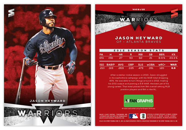
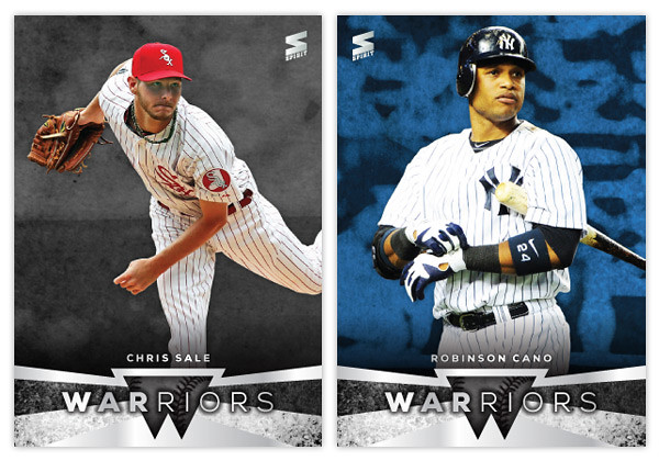
The front design features a full-color player cut-out over a grungy, color-soaked background. At the bottom we have a little abstract W shape in the center with some grungy angular bars shooting out behind and around. There are a couple of silver foil shapes along with the WARRIORS text and the player name.
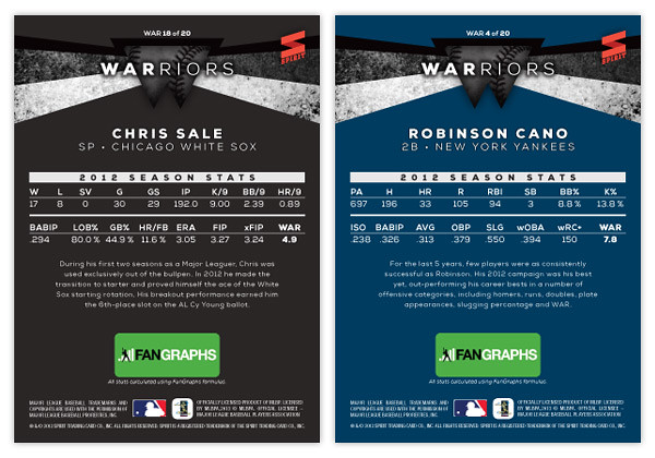
On the back side, the WARRIORS shape moves to the top and the background is set in a solid team color. The player's 2012 stats are split into 2 lines below. These are the advanced stat lines from
Fangraphs and I've included their logo below since they'd probably have to be in on this. There are 3 different versions of WAR so I thought it would be necessary to single out one source and Fangraphs was my first choice.
Hopefully not too many of you out there are grinding your teeth while reading through this.