Showing posts with label pedro alvarez. Show all posts
Sunday, September 21, 2014
2014 Spirit Base: 411-420
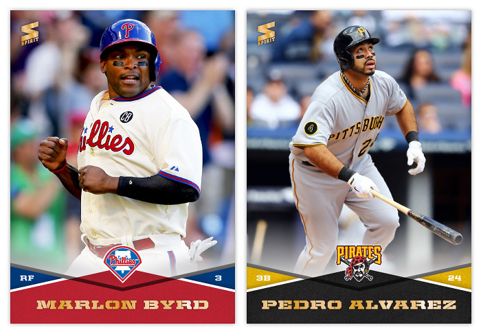
#411 - Marlon Byrd
How often do the Phillies wear these blue helmets? They look good.
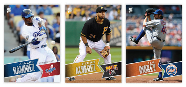
#412 - Pedro Alvarez
Pedro's having a bit of a down year after 2013's breakout season.
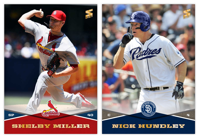
#413 - Shelby Miller
I wonder if he'll actually see any postseason action this year...
#414 - Nick Hundley
Hundley will be seeing plenty for sure with the Orioles.
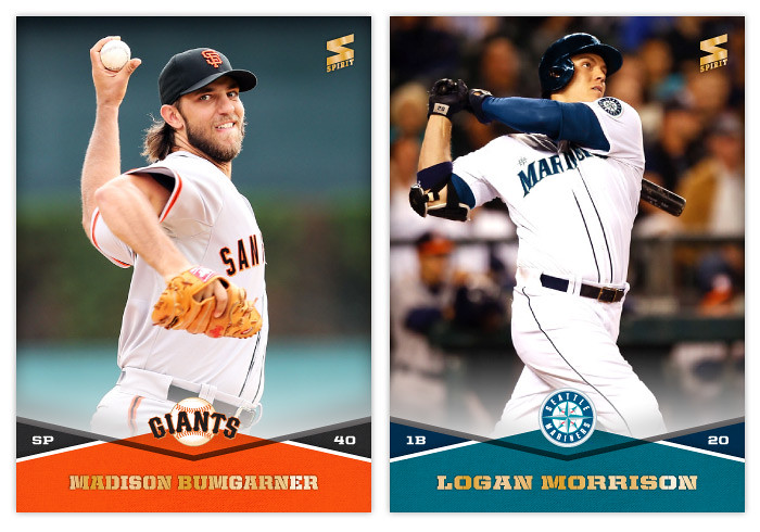
#415 - Madison Bumgarner
Had to break out the regular/non-extended version of the font for Bumgarner here. I was really tempted to go with a snot rocket photo but decided against it.
#416 - Logan Morrison
I haven't heard anything about him for a while so I guess he isn't rubbing Mariners' fans the wrong way like I thought he might.
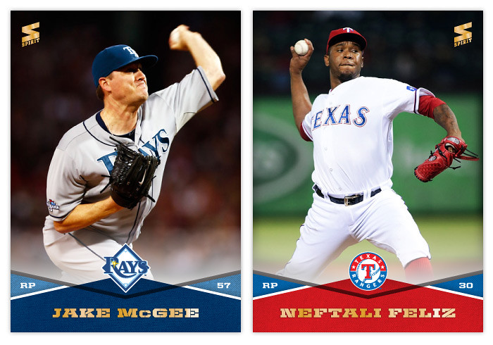
#417 - Jake McGee
It's so hard to write something about every card.
#418 - Neftali Feliz
Man, has his stock fallen since 2011. Maybe if he can stay healthy and the Rangers will keep him in the bullpen he can regain his success.
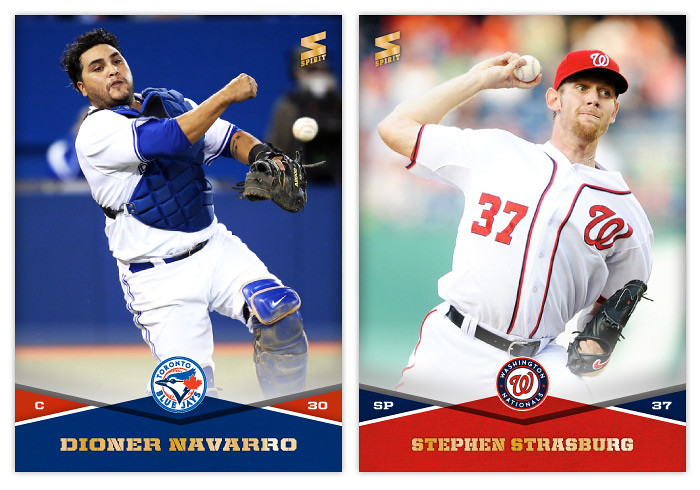
#419 - Dioner Navarro
He looks like some guy they just pulled of the street and stuck the gear on in this photo.
#420 - Stephen Strasburg
Strasburg looks kinda normal here. Good for him.
Labels:
2014,
base,
bumgarner,
dioner navarro,
jake mcgee,
logan morrison,
marlon byrd,
Neftali,
nick hundley,
pedro alvarez,
shelby miller,
spirit,
strasburg
Wednesday, February 19, 2014
2014 Spirit Award Winners
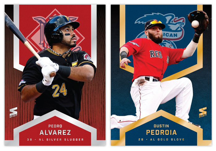
After hitting the halfway mark of the base set project, let's take a break and check in with some Series 1 inserts. For the third year in a row, the inaugural insert design is the Award Winners set. This year brings some familiar motifs along with some changes. We're still alternating between gold and silver foil for the Silver Slugger and Gold Glove winners, though I decided to subdue the blinginess a bit. Now there are just a few strips of foil instead of a huge shiny background.
The NL cards feature red again and the AL guys are blue. With this system, you can easily distinguish which award each player won just by glancing at the foil color and background. Just to be safe, I added another visual cue with the Gold Glovers having a leather background and the Sluggers a wooden bat. And to make things even more clear cut, the NL and AL logos are screened on upper fabric swatch thing.
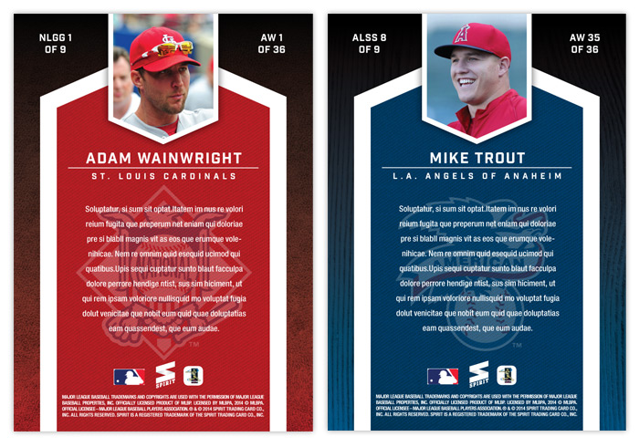
The back of the card has the same elements from the front repeated, other than the foil of course. They actually look pretty similar to the 2012 ones I did, though the overall composition fits this design better.
Labels:
2014,
award winners,
concept,
design,
insert,
pedro alvarez,
pedroia,
trout,
wainwright
Tuesday, September 25, 2012
BASE IN YR FACE: 2013 Spirit Base
Moving forward with our 2013 preview, here's the base design for the 2013 Spirit flagship. For reference sake, this is comparable to Topps Series 1 if, ya know, someone other than Topps had an MLB license.
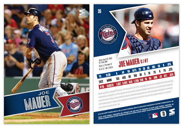
Just like last year's design, 2013 features the full-bleed, full-color photo fronts. There's also a team-color banner to house the player names. The fonts here in silver foil are Blair Medium for the first name and position and Enamel Inline for the big, bold last name. In the opposite banner is the secondary color along with the team logo. All of these elements are on a ten-degree angle that helps make the whole a little more dynamic. Also, it conveniently mimics the angle of the Spirit logo in the corner.
On the opposite side, the angled banner is enlarge and filled with a more intimate player photo with the team logo appearing once again to its left. I'm really taking advantage of this MLB license and smearing their property all over this set. Offset from the team-color background, there's a white box for player info. Instead of doing the full-career stat box, I went with the previous season and career totals. That helps keep the design consistent from card to card since there can be quite a variation from player to player. Below the stats are 5 lines for a write-up.
This year is definitely from the same family as the 2012 Spirit design, but it's more like a second or third cousin than sibling. Lots of the DNA is there but rearranged. I love how bright and colorful the backs are and also how the front design doesn't get in the way of the photo, even enhancing it.
What do you think? How does this compare to the Topps 2013 flagship design?
Just like last year's design, 2013 features the full-bleed, full-color photo fronts. There's also a team-color banner to house the player names. The fonts here in silver foil are Blair Medium for the first name and position and Enamel Inline for the big, bold last name. In the opposite banner is the secondary color along with the team logo. All of these elements are on a ten-degree angle that helps make the whole a little more dynamic. Also, it conveniently mimics the angle of the Spirit logo in the corner.
On the opposite side, the angled banner is enlarge and filled with a more intimate player photo with the team logo appearing once again to its left. I'm really taking advantage of this MLB license and smearing their property all over this set. Offset from the team-color background, there's a white box for player info. Instead of doing the full-career stat box, I went with the previous season and career totals. That helps keep the design consistent from card to card since there can be quite a variation from player to player. Below the stats are 5 lines for a write-up.
This year is definitely from the same family as the 2012 Spirit design, but it's more like a second or third cousin than sibling. Lots of the DNA is there but rearranged. I love how bright and colorful the backs are and also how the front design doesn't get in the way of the photo, even enhancing it.
What do you think? How does this compare to the Topps 2013 flagship design?
Subscribe to:
Posts (Atom)