Showing posts with label ryan howard. Show all posts
Monday, July 20, 2015
2015 Deluxe Duos
I've had all the base cards posted for each of the 4 Spirit releases but I was still lacking an insert design for the Deluxe set. I decided to resurrect the Deluxe Duos autograph cards after their absence in 2014. Turns out that when you design 900 individual cards in a summer, it cuts into your ability to create inserts for other releases.
Like previous Deluxe Duos designs, this one features a pair of teammates sharing the same card while featuring autographs of both players. This is the first time the orientation has been vertical. I left more room for player images than usual since sometimes they get squeezed into a corner with maybe just their faces peeking out. Since these would be "on-card" autographs, it's up to the players themselves to decide how much of their signature should overlap their pictures. Design elements from the Deluxe base cards are present, with the team color fades and the same fonts for player name, team and position.
Some nice portraits anchor the design on the back with the team logo making an appearance. I like the simplicity of the back here. Ditch the senseless writeup and stick with some nice photos and lots of empty space. It makes things a little more elegant, befitting a release called "Deluxe."
Labels:
2015,
auto,
beltre,
deluxe,
insert,
prince fielder,
ryan howard,
spirit,
utley
Thursday, July 10, 2014
2014 Spirit Base: 261-270
#261 - Ryan Howard
EAT FRESH!
#262 - Charlie Morton
Do not try sneaking up on Charlie Morton. He knows you're coming and he's not havin' it.
#263 - Daniel Descalso
Infielders easily have the coolest photos to choose from.
#264 - Chase Headley
Headley's trade value has taken a big dive over the past season and a half but he's probably not long for the Padres.
#265 - Javier Lopez
O.G. LOOGY.
#266 - Brad Miller
Nice to see him having a second career after his NBA days.
#267 - Ben Zobrist
As much as he's meant to the Rays, I could see them shipping him somewhere before the end of July since they're pretty much out of it this season.
#268 - Leonys Martin
I'm actually going to the Rangers' game in Arlington on Sunday. The forecast calls for 100° and sunny skies. And we got bleacher seats. Something tells me we won't be sticking around for all 9 innings.
#269 - Jose Bautista
Joey Bats is waaaaay too "active" on Twitter. And by "active" I mean "desperate." I guess it works, though.
#270 - Ian Desmond
Invisible BMX!
Labels:
2014,
base,
bautista,
brad miller,
charlie morton,
chase headley,
descalso,
ian desmond,
javier lopez,
leonys,
ryan howard,
spirit,
zobrist
Friday, June 21, 2013
Keepin' It Clean
One of my personal favorite designs from Spirit in 2012 was the Clubhouse Moonshots insert. Homerun hitters, die-cut, big ol' moon. What's not to love? This time around, I kept the subject the same but changed the name to Clean-Up Crew. The die-cut is also back again though in a much different shape.
The arrows are a play on the 'up' part of 'clean-up' and helped me get the design rolling. The one on the right leaves a nice tidy space for the team logo or a memorabilia swatch. I wanted to make sure all arrows pointed up so the upper left corner was the natural choice for the other die-cut location. Having some part of the player cut into the arrow keeps things from getting stale.
As the arrows take care of the latter half of the insert name, the bright neon green/yellow color on the bottom handles the 'clean' half. Something about the color makes me think of a super-intense household cleaner that would almost scrub the skin off your finger. I imagine the ink would be almost plastic-like on the finished product.
On the back side, we have the reverse die-cut shape to deal with but luckily plenty of space is left for another big player portrait. The neon is turned down a bit with black being the most prominent color. Below a brief write-up is the 2012 stat line with categories relevant to clean-up hitters (HR, RBI, total bases, slugging % and OPS.)
All in all, the bright colors, special shape and big batters seem to fit right in with the Clubhouse line.
Labels:
2013,
clean-up,
Clubhouse,
concept,
die-cut,
freddie freeman,
granderson,
homerun,
insert,
relic,
ryan howard
Sunday, April 1, 2012
To the Moon and back
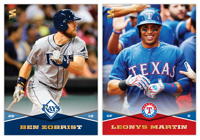
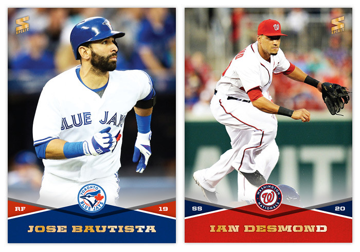
Oh, hi there. It's nice to be back. I sure was gone a looooong time, huh? Well, the vacation was had and spring has sprung. I figured it was time to poke my head out and say 'hello.' Opening Day is a few short days away so let's get this thing back on the rails.
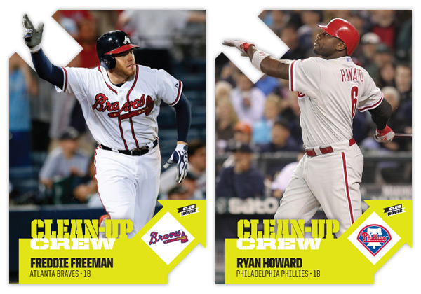
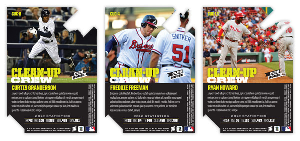
In thinking for another insert idea for Clubhouse, I figured I'd go with something simple like 'guys who hit a bunch of homeruns.' That seemed easy enough. But then came the hard part of coming up with a name & concept. I passed over stuff like 'Home Run Kings' since they have been in recent products and thought that the Clubhouse brand could use something a little more fun. So I started thinking of different slang terms for homers. Unfortunately, most were either semi-perverted (dingers, dongs, goin' deep) or had also been used elsewhere (going yard, touch'em all.) So I was back at square one.
But during my research, I kept coming back to the term 'moonshot,' thinking it really lends itself to something fun and interesting design-wise. Even though Ultra ran an insert in 2003 with the same basic premise, I figured I could update and improve upon it.
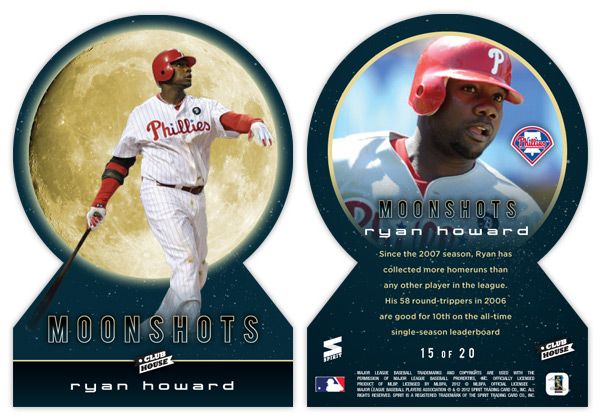
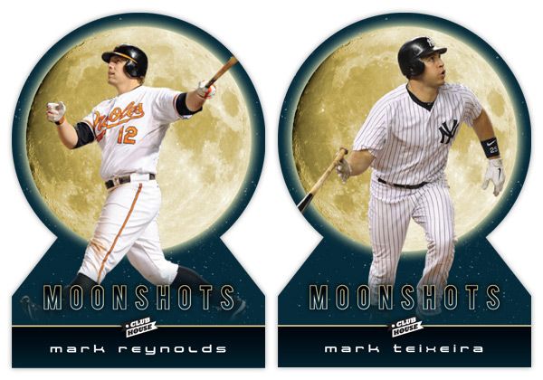
Looking at these cards, the first thing that pops out is either the UGE moon image or the absence of edges on the top. Yep, these are my first die-cuts. Over the years, I've come to the conclusion that die-cuts can be really cool but I always prefer the ones with at least 2 true corners. They need to be able to sit level in a sleeve or toploader, which usually means the bottom corners. I have a feeling that if some other card companies tried to die-cut this, they'd jump for the completely round die-cut and obliviously annoy collectors.
With the full moon image taking up a lot of real estate, it makes a nice backdrop to the player images. The photos here are of the batters directly following their 'moonshot' swings. With the Howard and Reynolds cards, they're stoicly staring down their long balls (or fly outs) while Teixeira is starting his trot towards first. The dark blue color complements the gold moon while adding a little bit of subtlety you wouldn't get from black. The names are below in a 'space' font to extend the lunar motif going on here.
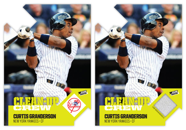
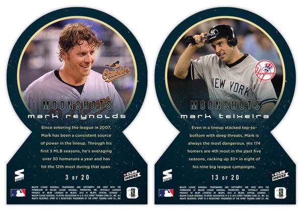
On the back side, the symmetry of the die-cut really helps keep things clean. Instead of the moon, we get a circular close-up of the players, which fades out towards the bottom to make room for the text. I also found space for the team logos somewhere within the photo frame (these all happen to be in about the same spot but that was just a happy accident with these particular photos.) The checklist totals 20 though I didn't really put it together completely. I thought it would be nice to include some guys like Reynolds here who have better numbers in the HR category while not really nearing the leaderboards elsewhere. Adam Dunn would be another candidate but would probably need to get off to a good start in 2012 to justify a spot here. Anyway, 17 of the 20 spots are still open.
Alright, thanks for checking in with me again after the long lay off. I promise the posts will keep coming semi-regularly like they used to. See ya soon!
Labels:
2012,
Clubhouse,
concept,
design,
die-cut,
homerun,
insert,
mark reynolds,
moonshots,
ryan howard,
teixeira,
welcome
Monday, February 20, 2012
Members Only
Time for another merit-based insert set for Spirit. This one focuses on the top 10 performing players over the last 5 seasons in 6 different statistical categories: hits, home runs, RBIs, wins, saves and ERA. These 6 subsets make up the 60-card "Members Only" insert set. Each 'Club' has its own logo displaying their respective statistic.
The look of this set is like a old, secret book passed down generation after generation to the incoming members. Each logo looks embossed into the canvas books cover while gold leaf pops off the edges. We have a team color swatch at the bottom to house the player name & team in gold foil. On the right side is the gold foil 'club' logo with the player's respective total below.
On the back side you'll find the color swatch moved to the top along with the player name/position/team flanked on either side by the card number and team logo. Below is leaderboard for each club which also serves as a checklist of sorts. On each individual player's card, their name and leaderboard position are highlighted.
After I finished with this design, I realized it looks a bit like the first Upper Deck SP set from 1993 and Panini had a baby.
Labels:
2012,
club,
ichiro,
insert,
members only,
panini,
ryan howard,
sabathia,
SP,
spirit,
stats,
upper deck
Subscribe to:
Comments (Atom)


