Showing posts with label inserts. Show all posts
Sunday, February 24, 2013
REVIEW: 2013 Topps Series 1
The 2013 season hasn't officially begun yet but the commemorative start happened a few weeks ago with the release of Topps Series 1. Ok, I know I'm really late on this one but better late than never. Anyway, here are my thoughts on the design-related parts of the set.
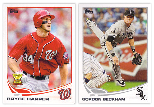
Starting off, the base card design is a nice step up from 2012's. They went with the clean white border once again, but this year it curves up past a rectangle on the bottom segment. This make the silver foil name easy to read (unlike year's past) regardless of how the light hits it. The most prominent design feature is the abstracted baseball diamond above the name. This adds the biggest pop of team color to the card but is a little whimsical for my tastes. The homeplate lingers a little to close to the name and the curves of the baselines are a little too exaggerated and unnatural. In the bottom right corner is the team cap logo. This is a good anchor for the corner even though the faded lines beneath it can be a little distracting. One thing I do miss seeing is the player position. I could easily see them finding space for this bit of info either in the white space on the left between the name and baseline or in the field shape itself.
The back of the card uses the same field and curve elements so it's a pretty good match for the front. The diamond graphic in the corner leaves room for the number which is in the correct corner again this year after being on the wrong side in 2012. The stats and player write-up look good and are easy to read. The faded lines in the bottom right corner are again unnecessary, this team creeping up into the stat box. The other item of note is the Career Chase line just below the player vitals. This is a neat little extra with some of the listings a little tongue-in-cheek but other still relevant. And I'm sure you've all heard about the whole Pete Rose thing by now. Anyway, I like the Career Chase inclusion here since it fits into the theme they have running through the whole flagship this year.
Now on to the parallels. Once again with have the standard golds serial numbered to the year (/2013) and a sparkly parallel, though this year it's green (emerald). Green has always been one of my favorite colors so I really like them. There are also the black parallels again this year along with 2 new ones: camo and pink. The camos are numbered to 99 and the pinks are to 50. Both seem to be pretty rare finds. Another thing they have in common is I guess they're supposed to be in support of something (military and breast cancer awareness). I really don't know the point of that since it's not like their inclusion somehow make a contribution to those respective causes. There's no DAV or Yellow Ribbon Fund logo on the camos and nothing about Susan G. Komen or similar entities on the pinks. In a way, I find it a little bit exploitative of Topps to do these particular parallels. And to top it off, they're actually pretty ugly to look at.
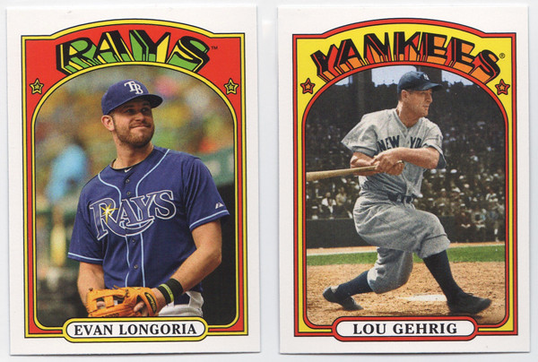
We've got more random minis this year with the 1972 design. Regardless of what you think of the 1972 design, let me say this: Topps, please stop releasing new cards with old design in anything other than Heritage. It's getting really old and you're watering down these designs. You have the Heritage line to celebrate your past so please stop injecting it into the flagship. Stop.
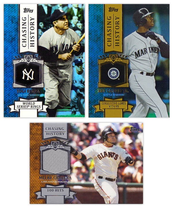
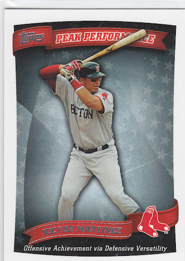
Just as last year, the inserts all follow a similar theme. The gold thing didn't have the flexibility last year that the chase seems to have this year. The big one is Chasing History, which is basically the same as last year's Golden Moments, 2011's Topps 60, and 2010's Peak Performance. The design here is a big step up from the previous efforts. They have to design these in a way they can insert the relics without changing up anything else. The holding frame for the logos kind of look like a medal hanging from a ribbon on the vertical cards. On the left is a team color knit design with an action shot on the right. It's a good balance on the horizontal cards but there seems to be too much space on the left of the vertical cards. The fonts and everything are pretty standard but do look really nice here. And in case you didn't think Topps was parallel-crazy enough already, we now have standard, non-numbered insert parallels. The Yogi card is a holofoil parallel with the team color spot on the left and the background. It's kind of shimmery like Bowman Platinum cards are. Then to top it off, there are retail-only gold parallels (Griffey). These are exactly the same but with gold foil on a gold ribbons instead of silver foil on a white ribbon.
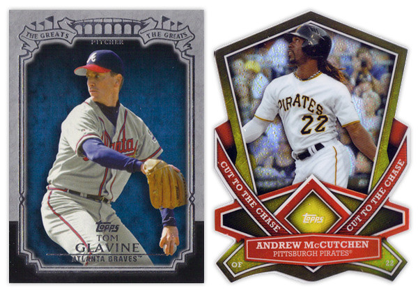
The nicest looking insert from Series 1 is The Greats. The design is actually understated with the gray and black border and some restrained foil embellishment. My only complaint would be the it seems a little top-heavy but that's a minor quibble. On the other side of that coin is the Cut to the Chase die-cut insert. These are incredibly busy with all of the weird cuts and shapes. They're also very similar to the die-cuts we've been seeing lately in the Bowman Chrome, Topps Chrome and Finest sets. I hate how not a single corner is rectangular as it makes it hard to get into holders sometimes. Bottom line, not a fan.
Chasing the Dream is this year's answer to the Gold Futures insert from last year. I like that the design featuring players of the future is decidedly more modern looking than the rest of the inserts. They're nice and colorful without any negative attributes. And finishing up is the Calling Card insert. These look to be about 4 years late in regards to design trends. I'm not really sure how the motif correlates to the subject, player trademarks or routines. The colors are pretty bland and the skinny border on the right side catches me every time. It looks like it's mis-cut.
Wrapping up, this year looks to be an improvement over 2012 across the board. The complaints have more to do with how Topps constructs a set than design decisions. There could be some tweaks here and there but for the most part it's a solid offering.
Base cards: 4/5
Photography: 4/5
Parallels: 3.5/5
'72 Minis: 3/5
Chasing History: 4.5/5
The Greats: 4.5/5
Cut to the Chase: 2.5/5
Chasing the Dream: 4.5/5
Calling Cards: 3.5/5
OVERALL: 3.7/5
Friday, November 30, 2012
2012 Post-postseason Odds & End Review Roundup Roulette
Here's my final look back at the designs produced by Topps in 2012. There aren't a whole lot to cover here since everything Topps has released since July is just a chromified version of their base design. I'm also not spending any time on the high-end releases since I don't have the money to personally accrue a wide swath for reviewing. Also because they're all basically just a place to stick a uni swatch and/or auto. But in brief, they all look nice.
This space is saved for the new inserts found in Series 2 and Update along with whatever random things happened to fall out of my Topps Chrome & Bowman Chrome blasters (so not a lot).
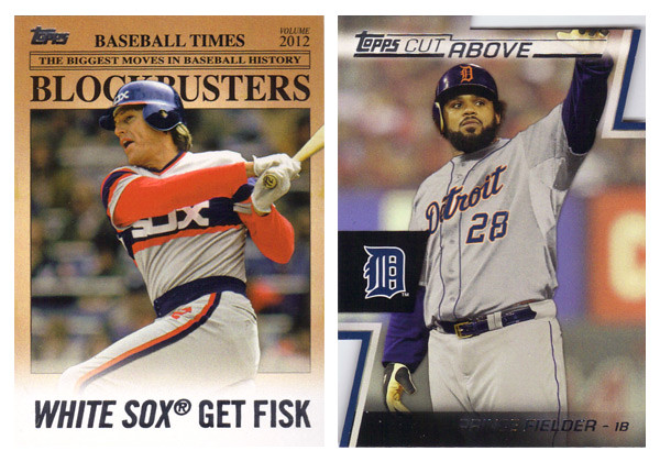
First up is the Blockbusters insert from Update. In a way it was nice to have a little reminder what Update used to be about before it was bloated with all-stars, rookie debuts and yet even more SPs and SSPs. As for the design itself, there's not really a lot to it. It mimics an old newspaper with some of the laziest headline writing. I guess its okay even though the paper color is a little too aged for color photos. My other complaints are the huge ® after the team names as well as some odd player selections. I understand there are only so many trades that happen, but when Joey Bats was traded to Toronto, it probably didn't even a garner a line in transaction box in most papers, let alone get the front-page treatment.
The Cut Above insert set is probably the best design from Topps flagship in 2012. The diagonal die cut notches in the corners are pretty cool and fit into the 'cut above' theme. They left plenty of room for a full photo and also space for a relic and/or auto that don't impede too much onto the design. It's clean and modern with all the angular elements adding some dynamics.
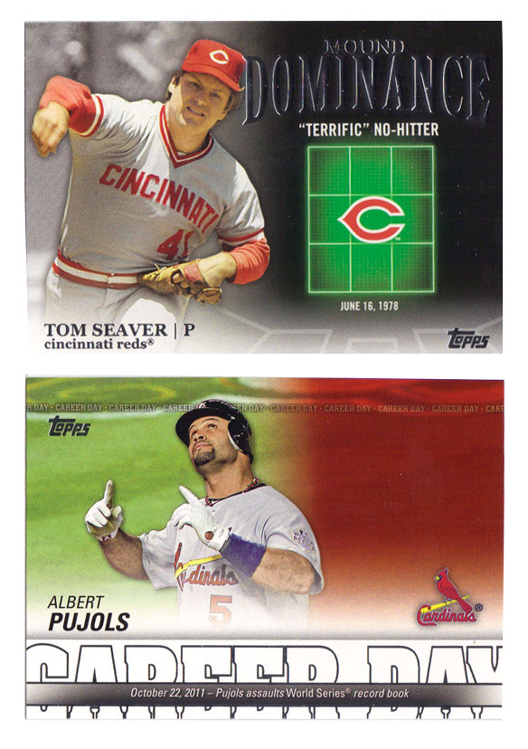
Following that up is probably the ugliest design of 2012. The Mound Dominance insert just looks cheesy as hell with the glowing green strike zone. It's like Ghostbusters meets Battleship. There's really no reason that so much of the card real estate is devoted to something like that. The Career Day design is decent with plenty of info packed into the bottom, leaving plenty of space for a nice photo. Unfortunately, they leave so much of it empty for relics and autos, making the plain jane version especially bare. I really don't understand why Topps can't change up the auto / non-auto design to accommodate each version. They still have to add the "certification" statement for autos and relics, so it's not like the design is exactly the same for each. I suppose there's possibly a reason other than laziness but I can't think of one at the moment.
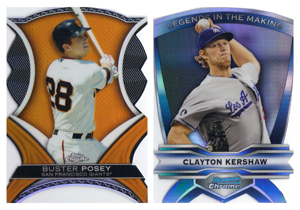
2012 was the year of the diecut apparently. Both the Chrome sets dabbled in some really weird and bizarrely shaped cards. The Dynamic Diecuts from TC are a little more colorful so I give them a slight edge though there are way too many little cutesy design elements for my tastes. I do appreciate that they have 2 actual corners on the bottom, unlike the Legends In the Making cards. These really are a bitch to get into penny sleeves.
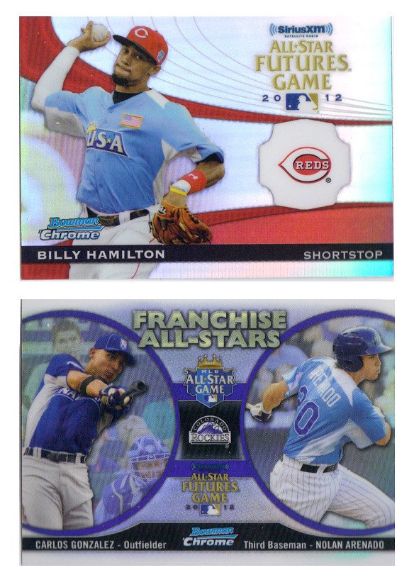
These two inserts from Bowman Chrome finished out the year on a good note. The Futures Game cards have a nice blend of elements that make them not too gaudy but also somewhat exciting. The odd holding shape for the logo should bother me more than it does but I think it actually works well here. Of course, it's there for the relic/auto version but it works well without it.
The Franchise All-Stars insert is a pretty neat idea for a set like Bowman Chrome that features both big leaguers and prospects from the minors. It's also pretty well executed here with so much information included without looking crowded. The big circle frames for the player photos is much nicer than the standard double-player designs Topps has been doing lately. The only thing that really bothers me is the font choice for the "Franchise All-Stars" text. Gill Sans Ultra Bold is used in way too many crappy movie posters. I can't get past it here.
Well that should close the book on 2012, unless my wife gets me a box of Five-Star Baseball or something. So, again, that closes the book on 2012.
This space is saved for the new inserts found in Series 2 and Update along with whatever random things happened to fall out of my Topps Chrome & Bowman Chrome blasters (so not a lot).
First up is the Blockbusters insert from Update. In a way it was nice to have a little reminder what Update used to be about before it was bloated with all-stars, rookie debuts and yet even more SPs and SSPs. As for the design itself, there's not really a lot to it. It mimics an old newspaper with some of the laziest headline writing. I guess its okay even though the paper color is a little too aged for color photos. My other complaints are the huge ® after the team names as well as some odd player selections. I understand there are only so many trades that happen, but when Joey Bats was traded to Toronto, it probably didn't even a garner a line in transaction box in most papers, let alone get the front-page treatment.
The Cut Above insert set is probably the best design from Topps flagship in 2012. The diagonal die cut notches in the corners are pretty cool and fit into the 'cut above' theme. They left plenty of room for a full photo and also space for a relic and/or auto that don't impede too much onto the design. It's clean and modern with all the angular elements adding some dynamics.
Following that up is probably the ugliest design of 2012. The Mound Dominance insert just looks cheesy as hell with the glowing green strike zone. It's like Ghostbusters meets Battleship. There's really no reason that so much of the card real estate is devoted to something like that. The Career Day design is decent with plenty of info packed into the bottom, leaving plenty of space for a nice photo. Unfortunately, they leave so much of it empty for relics and autos, making the plain jane version especially bare. I really don't understand why Topps can't change up the auto / non-auto design to accommodate each version. They still have to add the "certification" statement for autos and relics, so it's not like the design is exactly the same for each. I suppose there's possibly a reason other than laziness but I can't think of one at the moment.
2012 was the year of the diecut apparently. Both the Chrome sets dabbled in some really weird and bizarrely shaped cards. The Dynamic Diecuts from TC are a little more colorful so I give them a slight edge though there are way too many little cutesy design elements for my tastes. I do appreciate that they have 2 actual corners on the bottom, unlike the Legends In the Making cards. These really are a bitch to get into penny sleeves.
These two inserts from Bowman Chrome finished out the year on a good note. The Futures Game cards have a nice blend of elements that make them not too gaudy but also somewhat exciting. The odd holding shape for the logo should bother me more than it does but I think it actually works well here. Of course, it's there for the relic/auto version but it works well without it.
The Franchise All-Stars insert is a pretty neat idea for a set like Bowman Chrome that features both big leaguers and prospects from the minors. It's also pretty well executed here with so much information included without looking crowded. The big circle frames for the player photos is much nicer than the standard double-player designs Topps has been doing lately. The only thing that really bothers me is the font choice for the "Franchise All-Stars" text. Gill Sans Ultra Bold is used in way too many crappy movie posters. I can't get past it here.
Well that should close the book on 2012, unless my wife gets me a box of Five-Star Baseball or something. So, again, that closes the book on 2012.
Sunday, February 5, 2012
REVIEW - Topps Series 1
I'm sure you've all been nearly Topps-ed to death in the blogosphere this week, but hopefully you still have some patience left for my first of (hopefully) many product reviews. I'll try to keep my review strictly design-related but we'll see how it goes.
Let's start with the base card. First off, I was really big fan of the 2011 design. Topps did a good job of making it look classy yet contemporary. They didn't over think things and didn't have anything 'trendy' that'll we'll be giggling about 10 years from now. As for the 2012 design, I think it's a step back. The amorphous blob in the corner screams late 90's, as does the font choice, Bank Gothic. I've seen quite a few other complaining about the readability of the last name in foil on black and I agree, it's hard to make out in scans and low light.
I like that they team logos are included but they should definitely be moved to the right corner of the card. As it is now, the left corner is really crowded while the right is empty, leaving the card to be imbalanced overall. Also, it's always nice to see the player position on the front.
I do give Topps credit for the photo quality throughout Series 1. There seems to be a lot more fielding shots than normal, with tighter crops for better use of the card real estate. The Arencibia and Revere ones above are a couple of my favorites so far.
The back of the base set is successfully simple. The round curve thing fits well into the top with the name and team/position section. I like that the numbers are big and just sitting inside the black box, nice and readable. The stats are always concise and thorough, though it seems like someone made some goofs and/or bad decisions. I'm sure a lot of you have noticed that doubles show up as 3B instead of 2B on some cards. That's just something that got overlooked in the proofing process. But substituting W for BB when it comes to walks, I think that was intentional. And dumb. Either way, I hope they fix it for Series 2. It's really embarrassing.
Now on to the gold 'rush,' and by rush I mean 'overkill.' It looks like they consolidated the gold and Diamond Anniversary parallels from last year into a single "Golden Moments" parallel (which happens to be the name of a completely different insert set for some inexplicable reason.) I like that golds are actually shiny instead of just a dull gold border like they've been doing. There's a warmth to the set that's inviting. As for the Golden Greats insert, these are just....I don't know. When they released the comps a few months ago, I assumed that the gold medallion things would be actual gold foil. Instead, it's just a big yellow gradient-filled circle. The layout's actually not bad with the home-plate frame and the standard 'old-timey-ness' Topps loves. But the fake gold medallion is just too much to overlook, especially when they went to the trouble of foil-stamping the text directly to the left of it. Also, why they needed to make a 75-card set featuring only 15 players is beyond me.
The Gold Standard insert set has a decent concept behind it but the execution falls a little short. The design is a little off balance with the empty space below the medallion. The '3000 HITS' on the card above are just a little too faint. Darken that up a little more and you'd have a winner. For the Classic Walk-Offs, if the bottom right photo was full-color for the non-auto cards, it would really help balance out the design. Everything else works fine and that's the only problem spot. Not terribly exciting but it gets the job done.
The Golden Moments card here is a relic version I was lucky enough to pull in from my box break (if it didn't happen to be a Giant, I'd be kinda bummed.) I like the design idea but there are a few things that bug me. First, the home plate shape (which usually houses the team logo) needs to be moved over to the right a bit. There's no reason it for it to not be centered between the player cutout and the Golden Moments bar. The other issue is the white fade along the bottom. I know the reason it's like this is for the signature on the Autograph variations, but I don't understand why it has to be on the non-auto version. It's not like they just pull the random non-auto prints out and hand them over for guys to sign. The auto variations always include that 'TOPPS CERTIFIED AUTO' text, so there's definitely at least one design distinction there. To me, it just comes across as laziness.
This year's version of the player-comparison insert is called Timeless Talents. I like these better than the Diamond Duos of last year. First off, the design is better since it fits in as both traditional and contemporary. That means it's a little boring but it'll do. But where it really beats last year is the player thread. This is obviously a retired legend on the left and the current player with the similar game on the right. These combinations were found in the Diamond Duos set too, but there were also combos made of current teammates or current players from different teams. Hopefully if they bust this set out again for Series 2, they don't start mixing up those up again.
Inside the retail blasters this year are 2 different kinds of manufacture relics. The first is a Retired Number Patch which is basically their number embroidered in a block font onto some kind of fabric. These aren't as visually exciting as the old manufactured logo patches from last year, but I think they fit the space better and it's nice having a consistent shape from card to card. The other one is a Historical Stitches card which is basically the player's last name stitched onto a heavy flannel. This is supposed to replicate the old names being stitched into player jerseys from the past, which isn't something I knew about. These are pretty cool though a little drab with such a big 'swatch.' Still, these are both pretty cool to go along with the Retired Rings and Coin cards that I don't have any scans of. I give Topps credit for being innovative here. We all bitch about the plain colored jersey swatches and how they aren't really 'special' any more since they're all basically the same year to year. I think they've done a good job replicated the old 'feel' of getting a memorabilia card by introduce these new, specialized items into the hobby. I just hope they're able to keep coming up with new things in the future.
Next is the Gold Futures set, which is basically just a way for them to make another Eric Hosmer card. My Hosmer fatigue is picking up speed early this season. As for the design, I've heard others say this looks like an Upper Deck card. Some meant it as a compliment, others as an insult. I'm somewhere in the middle on that. I will say, this is Topps best effort at making a design that can work just as well for a relic and non-relic version. The relics have the space in the middle where the team logo is cut-out for the swatch. I think maybe a gold border would be nicer than the black border here, but that's a small quibble. But the block box where the name is has to go. Unreadable.
Finishing up the inserts is the '87 Mini set. These seem to be a big hit with everyone and rightfully so. I'm sure most of it is nostalgia for when most of us were kids in the middle of the junk wax era, but there's just something about this old cardboard and that wood border. I thought that coming off of last year's Heritage set, the whole wood thing would seem old hat by now, but there's something different here that makes this set really shine. It could be the cartoony font, team logo in that white circle, but I'm guessing a lot of it is the photography and the card size. They're just so darn cute, ya know? And look at that card back. How could you not love that card back?
Okay, finally time reel in this tome. Overall, this is pretty much the same thing Topps does year in, year out. This isn't the major suckfest that some are saying, but there are some things that could definitely be better.
Base cards: 3/5
Parallels: 3.5/5
Photography: 4.5/5
Golden Greats: 2.5/5
Gold Standard: 3.5/5
Classic Walkoffs: 3.5/5
Golden Moments: 3/5
Timeless Talents: 3.5/5
Retired Number Patch: 4/5
Historical Stitches: 4/5
Golden Futures: 4/5
'87 Minis: 4.5/5
OVERALL: 3.625/5
Let's start with the base card. First off, I was really big fan of the 2011 design. Topps did a good job of making it look classy yet contemporary. They didn't over think things and didn't have anything 'trendy' that'll we'll be giggling about 10 years from now. As for the 2012 design, I think it's a step back. The amorphous blob in the corner screams late 90's, as does the font choice, Bank Gothic. I've seen quite a few other complaining about the readability of the last name in foil on black and I agree, it's hard to make out in scans and low light.
I like that they team logos are included but they should definitely be moved to the right corner of the card. As it is now, the left corner is really crowded while the right is empty, leaving the card to be imbalanced overall. Also, it's always nice to see the player position on the front.
I do give Topps credit for the photo quality throughout Series 1. There seems to be a lot more fielding shots than normal, with tighter crops for better use of the card real estate. The Arencibia and Revere ones above are a couple of my favorites so far.
The back of the base set is successfully simple. The round curve thing fits well into the top with the name and team/position section. I like that the numbers are big and just sitting inside the black box, nice and readable. The stats are always concise and thorough, though it seems like someone made some goofs and/or bad decisions. I'm sure a lot of you have noticed that doubles show up as 3B instead of 2B on some cards. That's just something that got overlooked in the proofing process. But substituting W for BB when it comes to walks, I think that was intentional. And dumb. Either way, I hope they fix it for Series 2. It's really embarrassing.
Now on to the gold 'rush,' and by rush I mean 'overkill.' It looks like they consolidated the gold and Diamond Anniversary parallels from last year into a single "Golden Moments" parallel (which happens to be the name of a completely different insert set for some inexplicable reason.) I like that golds are actually shiny instead of just a dull gold border like they've been doing. There's a warmth to the set that's inviting. As for the Golden Greats insert, these are just....I don't know. When they released the comps a few months ago, I assumed that the gold medallion things would be actual gold foil. Instead, it's just a big yellow gradient-filled circle. The layout's actually not bad with the home-plate frame and the standard 'old-timey-ness' Topps loves. But the fake gold medallion is just too much to overlook, especially when they went to the trouble of foil-stamping the text directly to the left of it. Also, why they needed to make a 75-card set featuring only 15 players is beyond me.
The Gold Standard insert set has a decent concept behind it but the execution falls a little short. The design is a little off balance with the empty space below the medallion. The '3000 HITS' on the card above are just a little too faint. Darken that up a little more and you'd have a winner. For the Classic Walk-Offs, if the bottom right photo was full-color for the non-auto cards, it would really help balance out the design. Everything else works fine and that's the only problem spot. Not terribly exciting but it gets the job done.
The Golden Moments card here is a relic version I was lucky enough to pull in from my box break (if it didn't happen to be a Giant, I'd be kinda bummed.) I like the design idea but there are a few things that bug me. First, the home plate shape (which usually houses the team logo) needs to be moved over to the right a bit. There's no reason it for it to not be centered between the player cutout and the Golden Moments bar. The other issue is the white fade along the bottom. I know the reason it's like this is for the signature on the Autograph variations, but I don't understand why it has to be on the non-auto version. It's not like they just pull the random non-auto prints out and hand them over for guys to sign. The auto variations always include that 'TOPPS CERTIFIED AUTO' text, so there's definitely at least one design distinction there. To me, it just comes across as laziness.
This year's version of the player-comparison insert is called Timeless Talents. I like these better than the Diamond Duos of last year. First off, the design is better since it fits in as both traditional and contemporary. That means it's a little boring but it'll do. But where it really beats last year is the player thread. This is obviously a retired legend on the left and the current player with the similar game on the right. These combinations were found in the Diamond Duos set too, but there were also combos made of current teammates or current players from different teams. Hopefully if they bust this set out again for Series 2, they don't start mixing up those up again.
Inside the retail blasters this year are 2 different kinds of manufacture relics. The first is a Retired Number Patch which is basically their number embroidered in a block font onto some kind of fabric. These aren't as visually exciting as the old manufactured logo patches from last year, but I think they fit the space better and it's nice having a consistent shape from card to card. The other one is a Historical Stitches card which is basically the player's last name stitched onto a heavy flannel. This is supposed to replicate the old names being stitched into player jerseys from the past, which isn't something I knew about. These are pretty cool though a little drab with such a big 'swatch.' Still, these are both pretty cool to go along with the Retired Rings and Coin cards that I don't have any scans of. I give Topps credit for being innovative here. We all bitch about the plain colored jersey swatches and how they aren't really 'special' any more since they're all basically the same year to year. I think they've done a good job replicated the old 'feel' of getting a memorabilia card by introduce these new, specialized items into the hobby. I just hope they're able to keep coming up with new things in the future.
Next is the Gold Futures set, which is basically just a way for them to make another Eric Hosmer card. My Hosmer fatigue is picking up speed early this season. As for the design, I've heard others say this looks like an Upper Deck card. Some meant it as a compliment, others as an insult. I'm somewhere in the middle on that. I will say, this is Topps best effort at making a design that can work just as well for a relic and non-relic version. The relics have the space in the middle where the team logo is cut-out for the swatch. I think maybe a gold border would be nicer than the black border here, but that's a small quibble. But the block box where the name is has to go. Unreadable.
Finishing up the inserts is the '87 Mini set. These seem to be a big hit with everyone and rightfully so. I'm sure most of it is nostalgia for when most of us were kids in the middle of the junk wax era, but there's just something about this old cardboard and that wood border. I thought that coming off of last year's Heritage set, the whole wood thing would seem old hat by now, but there's something different here that makes this set really shine. It could be the cartoony font, team logo in that white circle, but I'm guessing a lot of it is the photography and the card size. They're just so darn cute, ya know? And look at that card back. How could you not love that card back?
Okay, finally time reel in this tome. Overall, this is pretty much the same thing Topps does year in, year out. This isn't the major suckfest that some are saying, but there are some things that could definitely be better.
Base cards: 3/5
Parallels: 3.5/5
Photography: 4.5/5
Golden Greats: 2.5/5
Gold Standard: 3.5/5
Classic Walkoffs: 3.5/5
Golden Moments: 3/5
Timeless Talents: 3.5/5
Retired Number Patch: 4/5
Historical Stitches: 4/5
Golden Futures: 4/5
'87 Minis: 4.5/5
OVERALL: 3.625/5
Subscribe to:
Posts (Atom)