I have 3 main passions in life: sports, design and music. (If I had a fourth, it would probably be fast food... I've said too much.)
Since you're reading this blog, it should be pretty obvious where the first 2 merge. Baseball card design is exciting for me. Even as a kid I would scribble out new card designs with a box of Crayola thin-tipped markers and some 3x5 index cards. The black would always go out first so I'd have to make some bold color choices after that. I assume this is how the 1990 Topps and 1991 Donruss designs were mocked up.
As for the latter, there's no better synergy of design and music than the gig poster. From their humble beginnings as xeroxed flyers on colored paper stapled to everything in sight, gig posters are now beautifully artistic receipts for those rock shows you won't be able to replay in your head once the ringing in your ears is gone. Or, more accurately, they're works of art that help to visually explain the music, if not literally then figuratively.
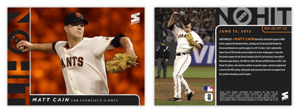
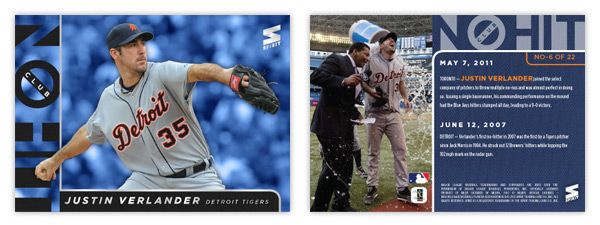
My wife got me a few gig posters for Christmas (the Avett Brothers, Superchunk and the Decemberists) and it planted an idea in my head. 'Wouldn't it be cool if I could combine all 3 of my passions into a singular product?' Just as gig posters commemorate the date of sometimes transcendental rock shows, why not give transcendental baseball performances a similar treatment?
Hence the birth the Headliners insert set. There are a couple attributes to this set that are very unique and potentially revolutionary. First of all is the artists. Within the gig poster world, there are quite a few remarkable designers.
Mikey Burton,
Aesthetic Apparatus,
A. Micah Smith,
Rob Jones and
the Heads of State are a few of the all-stars and some of my personal favorites. The idea would be to get 15 different artists on board and have each of them design an original screenprint commemorating one of 15 different notable baseball performances like Thome's 600th homerun, Jeter's 3,000th hit or Verlander and Liriano's no-hitters. Things that made 'headlines' during the 2011 MLB season.
The set would be one of the most unique in memory, with 15 different artists and their 15 different styles on 15 different designs for 15 different events while all being cohesive in concept. As popular as Dick Perez's Diamond Kings cards were in the 80s & 90s, they got pretty stale. This would inject some new life into the baseball card illustration platform.
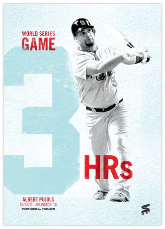
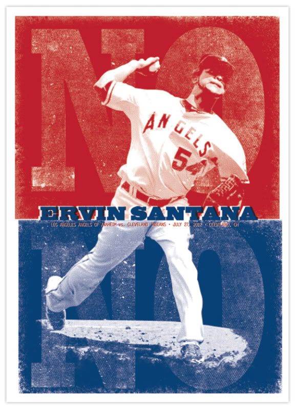
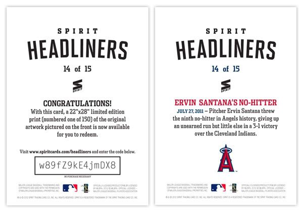
For proof of concept, I went with the two designs you see above: Pujols' 3-homerun display in Game 3 of the World Series and Ervin Santana's no-hitter. While the designs are different, they each incorporate some of the elements you'll see in a lot of gig posters. Hallmarks such as 2- or 3-color inks, intentional mis-registration (ink overlap), halftone patterns, and grainy ink coverage. While you won't find those on every gig poster, they're definitely oft-occurring characteristics that scream 'gig poster.'
What I think puts this set over the top into awesome sauce is my next idea: a redemption parallel. That's right, two of the most loathed things in current card collecting world. But hear me out. For the parallel part, it's not just the same card with 5 different colored borders and shrinking print runs. There are only 2 versions: the standard card and the redemption card.
Most people hate redemptions because it takes forever before you get the
actual card in-hand and a lot of times, it ends up being something
different than what you were supposed to get. Those are two things you
don't have to worry about with this set. The redemptions are for one of
150 screenprints of each design. Those will be delivered by each artist
before the cards can even go to print. So basically, you get the card
and redeem the code on back and get a 22x28 screenprint (/150) of the
same design, signed by the artist.
What do you think? Good idea or
great idea? Unique card designs, redemptions for full-size works of art, expanding the market for baseball card collectors. I'd love for Topps to steal this idea from me.
Well, maybe not steal. I'd be willing to trade the idea for a job with them.