In case you didn't happen to notice, I skipped my usual full-release review of Topps Series I earlier this spring. I'd like to say it was planned but, honestly, I just never found the time for it. After a few more releases came before I got around to it, I decided to try out a new format, which you'll see here. I'm sacrificing timeliness for brevity, with the added benefit of avoiding rash judgments.
HOME RUN - All-around success. Asking for more would be greedy.
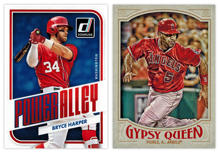
Donruss Power Alley: I was pretty impressed with this design as soon as Panini released the preview images. This is probably the best argument to be made for them to just relaunch the Donruss brand as Panini's flagship instead of all the zombie Donruss stuff they usually do with retched results. It's modern without being too modern, well-balanced and interesting with just enough interesting stuff going on.
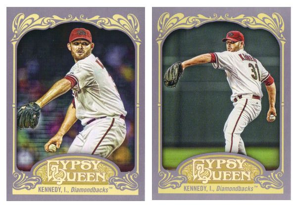
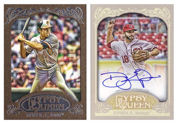
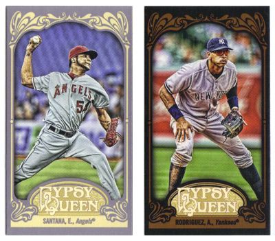
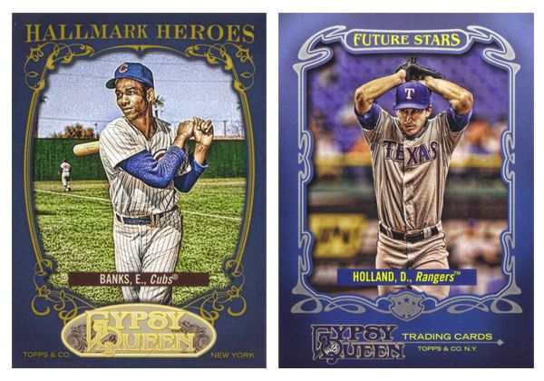
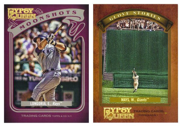
Gypsy Queen base design: This is by far the best Gypsy Design the hobby has seen. Topps was finally able to hit that sweet spot between clean and ornate that fits the GQ brand perfectly. The wordmark has the right amount of personality without being over-the-top. The border color is neutral yet has just enough of a hue to not look boring or garish. And my favorite detail is probably the faux embossing for the elements in the corners. I can't think of a single element here that I'd change. Good job, Topps.

TRIPLE - Didn't quite get all of it but standing on third is a pretty good spot to be.
Gypsy Queen Power Alley: I'm curious what my perception of this would be if I wasn't so enthralled with the Donruss Power Alley design. Obviously the feel of GQ is quite a bit different, but it's still a pretty good design. The color scheme of blue, red and gold is really appealing on the lighter border and helps add some nice contrast to all the elements, especially the home run number total front and center. The wood grain on the bats is another nice detail. The only knock I have is the style of the blue flourishes along the top and bottom of the photo frame. They look a little too '70s-mellow-mushroom for my tastes.
Topps 100 Years at Wrigley Field: The design here benefits from having all the iconic features of Wrigley to drawn upon —red brick, ivy, Wrigley marquee. I like how all of these elements are creeping up from the bottom of the card, just like the ivy creeps up the outfield walls. My only suggestion here would be to maybe have the player name in white running just over the marquee graphic to avoid the dreaded foil-on-dark-background gambit.

DOUBLE - On target for a solid knock.
Diamond Kings Expressionists: The design here benefits from its simplicity. Playing off the whole expressionism angle, the animated player images are all paint-rendered with the gold, green and red swaths repeating on every card. This is a rare example of them not overcrowding the card with unneeded elements.
Diamond King Aficionado: The best combination of portrait and action shot I've seen in a while. The canvas-colored strips at the top and bottom do a good job of setting the smaller action shot and adding just the right amount of depth. The oil paint look would make a bigger impact here if it was used a little more sparingly in the rest of the Diamond King set.
SINGLE - Success... but just barely.
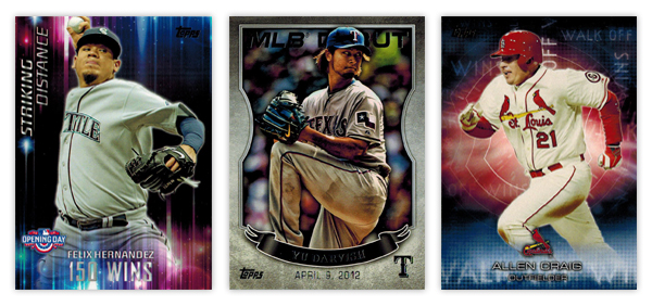
Opening Day Striking Distance: Even though they don't really have anything to do with the theme of the set, the colorful aura and light beams make for interesting design elements. The "150 WINS" text is a little hard to make out in spots. It also seems like they could move the Opening Day logo down to the actual corner and have the name/goal left aligned next to it since the format of everything else is asymmetrical.
Topps MLB Debut: These came in bronze, silver and gold variations but I honestly can't tell which foil is on the Darvish card here. I probably would have moved this up to the "double" level but the photographs are all especially dark, like their HDR action missed the brightness step in Photoshop. The banner also looks little hokey when paired with the background texture. Compositionally, it's pretty solid, though.
Topps Walk Off Wins: Kinda like the Striking Distance cards, these have some nice, colorful but irrelevant graphics. I do appreciate that they're team-color based, but there's no real connection to the theme. It would be nice if "Walk Off Wins" appeared in full somewhere on the design. As is, the full line either runs off the edge or it's obscured by something.
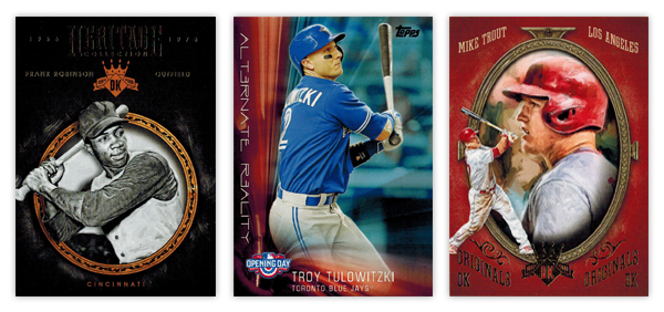
Diamond Kinds Heritage Collection: The ornamented circle frame is a nicely rendered element. I like the added depth of having the player cutout overlap it in spots. Another instance of less is more with the background, though, again, the foil on black has some issues as you can see from the scan. The team location at the bottom of circle looks nice in that same gold as the frame. Unfortunately, the player name and position flanking the DK logo towards the tops looks funky since the two lines have such varying lengths on the Frank Robinson here.
Opening Day Alternate Reality: It's very reminiscent of the Striking Distance design. Honestly, they could easily flip the designs for each set and it wouldn't make a difference either way. The "Alternate Reality" text is a little too cliché sci-fi for my tastes. The composition is a little better than its sibling though the elements aren't as nice.
Diamond Kings DK Originals: Give Panini credit for some nicely deployed irony here. This is the Diamond King set's answer to the Donruss Diamond Kings subset. And they named it "Originals" lol. Whatever you say, Panini. It has the same portrait/smaller action cutout set up you'll see in the Donruss version, though executed better here. Making the whole thing full color is a nice distinction. I'm not a fan of the text treatment up top or the "DK Originals" stamped on the bottom. Switching the image order from the Aficionado design is good move to help differentiate them a bit.
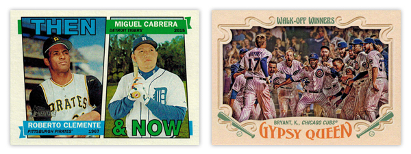
Heritage Then & Now: With the constraints of the 1967 base design, this is about as good of a solution as you could ask for. The little details like having the flags split the photos and then wrap around are well done.
Gypsy Queen Walk-Off Winners: Wait, this again? I will say the photo choices here are a lot better than the regular Topps WOW cards. But the horizontal layout means there's less room the image itself since they have to allow for all the typical GQ flourishes to circle in from the borders. My biggest gripes are how the text is handled for both. The "Walk-Off Winners" text up top looks a little to groovy for the rest of the design. And the way Gypsy Queen wordmark arches down along the top really bothers me with the player/team name running above it on a straight baseline. That's a gnarly negative space.

WALK - Mostly good but left a little power in the bat.
Topps base: I'm a fan of the basic look and layout here but it's littered with things I'd change. The "smoke" on the edges, the fake shininess, cut off logos. Has anybody noticed how the colors on the diagonal bars are different? Look at the Eickhoff card. The one on top matches the red from the Phillies logo but the bottom one is on its way to purple. And why is blue the predominant color for the Phillies cards instead of red? Or why are the Pirates cards mostly red with just a smidgen of yellow and zero black? There are too many little things like that for me to be complete sold.
Bowman base: If you saw my previous post, you know exactly where I think the Bowman design can be improved. To sum it up, make the border solid and get rid of all the shiny textures and this would really round the bases.
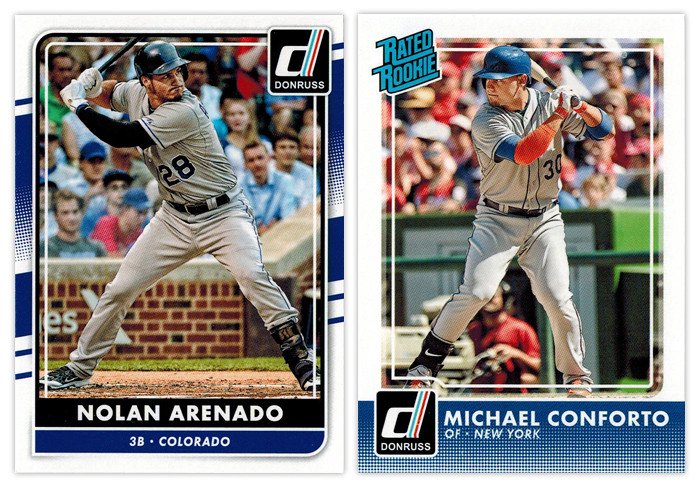
REACHED ON ERROR - Somehow standing on first despite your best efforts to make an out.
Donruss base: I don't know why Panini is still doing what they're doing with Donruss. Take a few different elements from different Donruss designs of the past, throw lock yourself in a cell with a laptop and see if you can earn your parole (or something). As an evolution from the 2015 design, it's actually an improvement. But they seemed to have incorporated one Topps' least popular design elements into the Frankenstein design here, for some reason. Somehow, though, I don't hate it. Objectively, it's not a bad design per sé. I just can't endorse the way it came to exist.
Donruss Rated Rookie: Hello, halftone gradient. Not so nice to see you again. Having it run across the bottom unencumbered like that is not a good decision. It's teetering on obnoxious. The only saving grace for the rest of the design is the absence of anything else. Just a solid white border and plain white text with the iconic Rated Rookie logo in the corner. So congrats for knowing how to not make things worse (for this design at least).

GROUND OUT - A trip to the plate with nothing to show for it.
Bowman Prospects: While this is almost completely interchangeable with the Bowman base design, it takes a few extra dings here. The issues with border and texture still appear. Without the player name running vertically, it loses some of the dynamism that Bowman has. Also, the team logo sitting in the circle, there's a little too much negative space on the left border that throws things off balance.
Bowman Sophomore Standouts: All the leftover diagonals converge here into...nothing really. The text is boring and too similar for anything to standout. The absence of a primary element other than the player image drags this to snoozeville.
Bowman International Ink: These were doomed once they decided to feature players wearing jerseys over dress shirts in front of the busiest backdrop ever. The team and Bowman logos would be better off if they switched places, letting the team logo be a little bigger. All the fades and shines could stand be toned down as well. The design isn't beyond salvaging but it's probably a more effort than it looks like they were willing to put in.
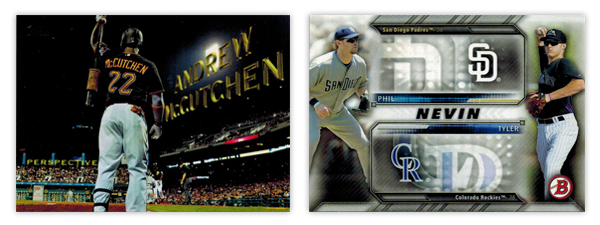
INFIELD FLY - Took a big cut but ended up not making a positive difference.
Topps Perspectives: I know I'm in the minority here but I'm not a fan of this insert. And it's all because it's completely based off the opening credits of a 14-year old movie. It seems like Topps was attempting to inject some Stadium Club-ness into the flagship set here but it just comes across as a little limp.
Bowman Family Tree: I've never been a fan of when Topps designs insert sets around the auto or relic parallels included. This is a pretty egregious example. All of that wasted space next to the logos just so they can accommodate the autographs. While, the autographed cards are pretty cool, there's no reason to saddle the non-auto versions with such a design obstacle.

STRIKEOUT - Walk back to the dugout in shame.
Donruss Diamond Kings: Why are the "paintings" gray? Why couldn't they edit out the background noise like the NetSuite logo? Why is the player name/team location so prominent? This whole thing screams minimal effort and thought. I can't think of a single positive to mention.
Topps Pressed Into Service: With such a novel concept for an insert, it's a shame the execution is so poorly done. You'd think they would use a picture of the players' pitching, no? The ball stitching is pretty cheesy in the background and I'm not sure why there's a little blip of the photograph fading around the cutout. The swooshes look pretty dated as well. My overall sense is this was a design they've had sitting in the cabinet for a few years now and finally got around to using it to clear out space.
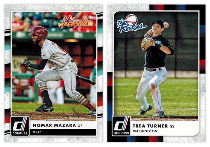
Donruss The Prospects & Donruss The Rookies: Ooh boy. Of all the elements for Panini to pick from the Donruss carcasses, I think the tubes from the 1988 set is very, very far down the list of desirability. Mix in the grungy white texture and it's a match made in hell.