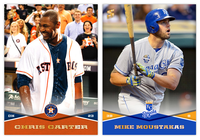
Showing posts with label kurt suzuki. Show all posts

Saturday, September 20, 2014

2014 Spirit Base: 401-410


#401 - Chris Carter
Guessing this was a post-walkoff drenching shot. I'm sure one of his 36 homers this year have been game-enders.

#402 - Mike Moustakas
Looks like he's landed by on his feet after a year of ups and downs. Let's hope he turns it around enough to help the Royals make the playoffs.
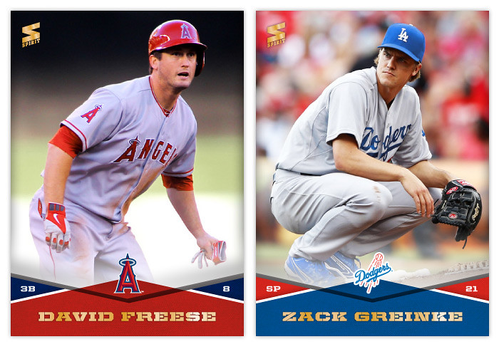

#403 - David Freese
I wonder why he kept one of his batting gloves on?

#404 - Zack Greinke
Poor form by Greinke here, dropping a deuce right there on the mound.


#405 -  Ed Lucas
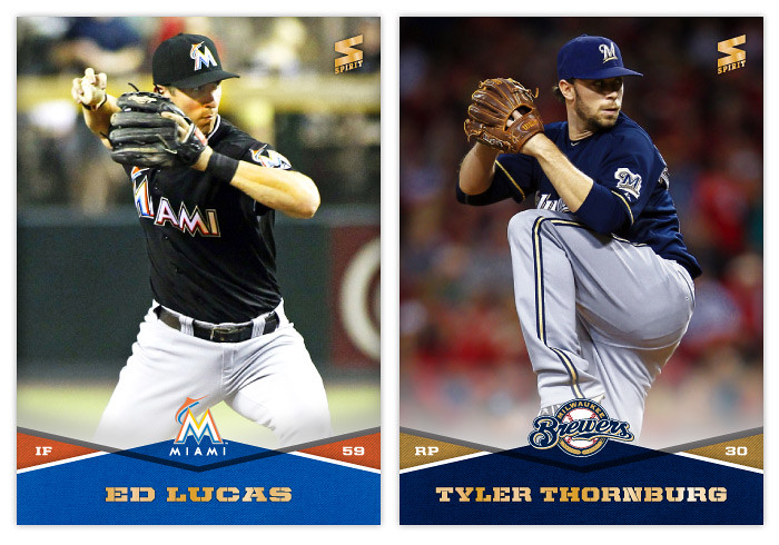
Not a lot of photo options for ol' Ed here.

#406 - Tyler Thornburg
That's some nice looking leather there.
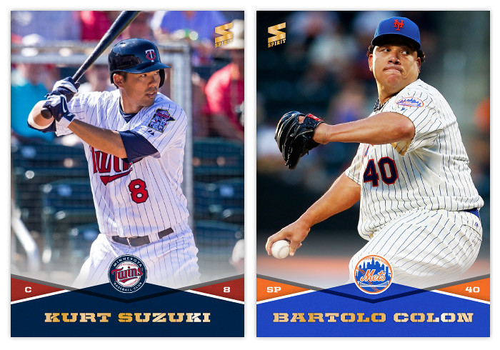

#407 - Kurt Suzuki
Hey, Suzuki was an all-star in 2014! Who woulda guessed it?

#408 - Bartolo Colon
It's really kind of amazing how competent Colon still is after all these years. If he weren't, it'd be too mean to laugh at stuff like this.


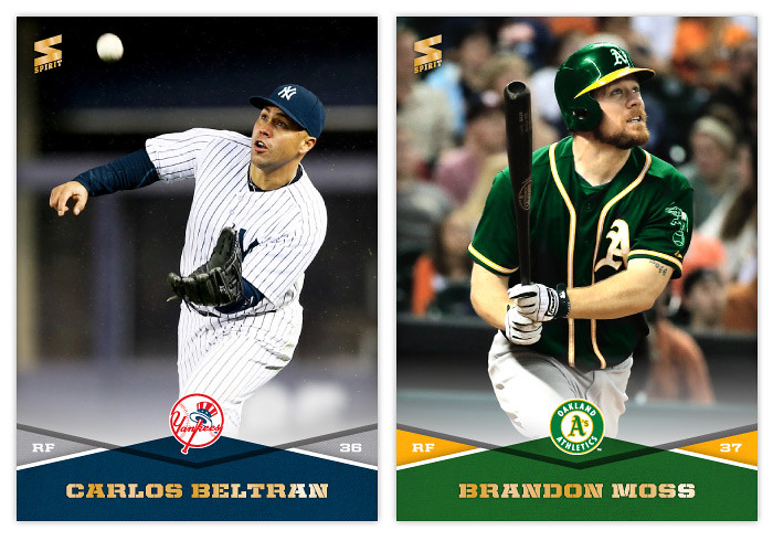
#409 - Carlos Beltran
What do you think, Hall of Famer?

#410 - Brandon Moss
Not sure my green recoloring job here is the most believable. Oh well.

Monday, April 23, 2012

Pennant: Chasing That Old Time Feeling


I've been able to resist it up to this point, but with Heritage and Gypsy Queen being the last two baseball releases, I couldn't help but work on an 'old-timey' set design. Instead of combing through the encyclopedia of trading cards, looking to resurrect the zombie of something 50-100 years old, I decided to just make something up. This is kind of a hybrid between the styles of the old and the current.


Say hi the Pennant line of Spirit trading cards. You'll notice some of the characteristics of other retro sets: photos doctored to look old and weathered, typefaces from decades past, not-quite-white borders. There's a team-color curve on the bottom to house the player name, team and position. I've used some similar curvilinear shapes throughout the other Spirit designs, so this helps keep them in the family. Another point of 'modernization' is the fact the player name is more than just their last name and first initial and it's actually bigger than the set name/logo.


The backside is pretty similar to retro sets of today: 1-color, vertical, a lot of non-informational elements, simple team logos. These here may be printed in a single color, but instead of just black, the ink is the same as their team color. I decided to include players' full names on the back since I really miss that from my youth. Also, there's a simple line of the previous season's stats (hits, homers, rbi, and average) that has numbers instead of 'two thousand and eleven' and such.


I may do some inserts for the Pennant line coming up in the future. I can see myself getting the itch after A&G hits the shelves.