Showing posts with label kemp. Show all posts

Tuesday, May 28, 2013

2013 Spirit Deluxe Duos


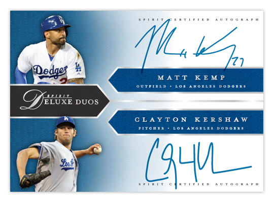
With Deluxe being Spirit's "high-end" product, I figured the dual-autograph Deluxe Duos would be a good place to start with 2013's inserts. These wouldn't be as prevalent as the auto and relic parallels from the base set, maybe about a 1:20 hit.
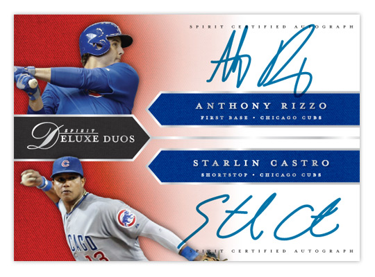

Like last year's version, the design is right in step with the base cards. We have the pointed tabs shooting in from the edges, filled with a team-color twill texture. All of the text (minus the certification small-print) is in shiny silver foil to jump off the glossy finish. It's bisected horizontally with each half of the duo on the top or bottom. A small cutout of the players sits in the left corners on top of another team-color twill texture that fades to white moving to the right, leaving room for the player signatures.
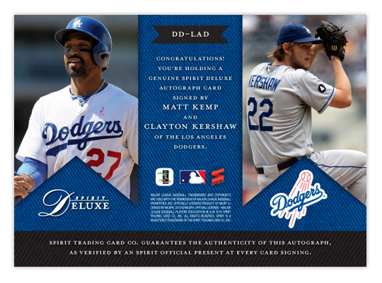

On the back, the tabs are inverted and filled with some bigger action shots. The team-color twill makes an appearance again as a background for the small print and authentication copy. The team logo also finds its way into the mix.

While not every club may have a duo on the level of Kemp/Kershaw here, most would have at least one player of note get excited about. Especially at the SRP of $10-$15 a pack.

Friday, May 18, 2012

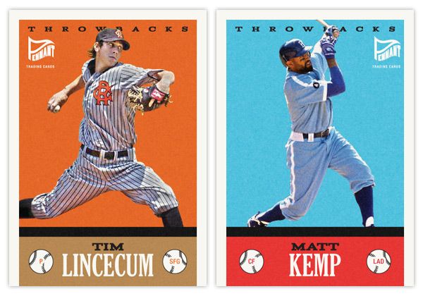
Pennant Throwbacks


So one of the things that really jumps out at me when thumbing through retro sets like Gypsy Queen is when you see a card like this next to a card like this. No matter how many filters you run on photos of current-day players, they'll never quite match that historic feeling you get from old photos of retired players. One way to help bridge the gap would be to feature today's guys wearing throwback uniforms.

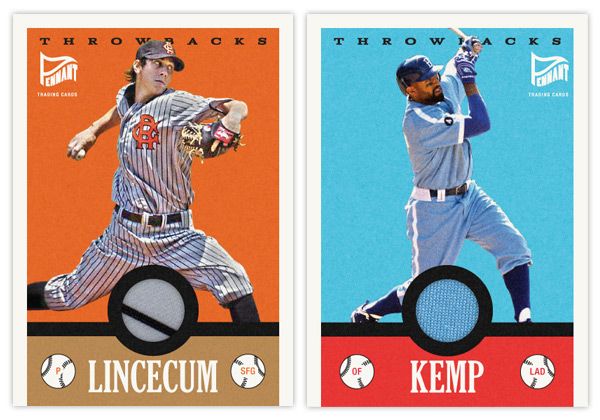
Here's the first insert set for the Pennant brand. The design for Throwbacks isn't specific to a certain era, just a bit of an amalgamation of a handful of characteristics you'll find in various retro sets. It kind of follows the philosophy of the base set, combining a feel for the old and contemporary.

The hard part here is finding the right images in a somewhat shallow pool. There aren't a whole lot of throwback games on the schedule so the odds of finding an actual star wearing these duds in a good photo are a bit smaller than usual. The Lincecum image here is from a 2008 game while the Kemp one is from last season. The color boxes aren't the exact shades you'll find in the teams' styleguides, but they're in the right neighborhood to allow for the sometimes funky colors of the throwback unis.


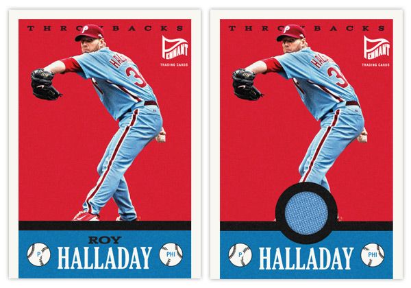
Another wrinkle to add to the set is a relic parallel. With a round cutout just above the last name, it's a perfect place to house a sliver of these throwbacks. And, luckily, since the uniforms depicted are so singularly unique, you know that the swatch is from the actual uniform depicted. Even though it's the Dodgers, you have to love that baby blue relic.

Here's what the base and relic look like side by side.


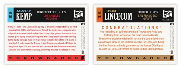
On the backside, you'll see the write-up is specific to the game in each throwback uniform is involved. The base has a game recap along with a little bit of info regarding the throwback worn. For the relic version, it includes the fine print of the swatch being authentic and unique to the player and uniform depicted.

Thursday, February 9, 2012

2012 Spirit Deluxe


So first I did the flagship with a few inserts. Then it was the low-end with an insert. I guess now it's time for some high-end stuff. Topps and Panini have done a good job scouring the thesaurus, locking up every suitable synonym for "best" or "expensive," but luckily they seem to have overlooked "deluxe." So I'm gonna claim that now while I have the chance.


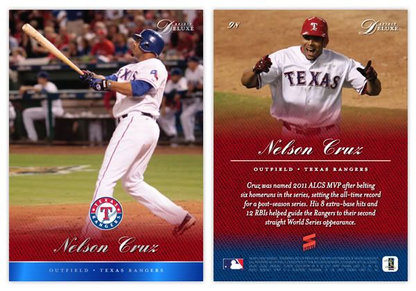
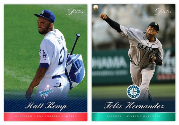
 I'm gonna start off with the base card design here. Much like Marquee, the full-bleed photography takes center stage here, though the bottom of the card is ceded for some color. We've continued the colored knit texture that's shown up on a few other Spirit designs. Here, it softly fades into the photograph with the team logo just above. Below the logo is the player name in an elegant script font and stamped with silver foil. The bottom edge of the card is a shiny stripe of the alternate team color and the player position/team stamped in silver foil.


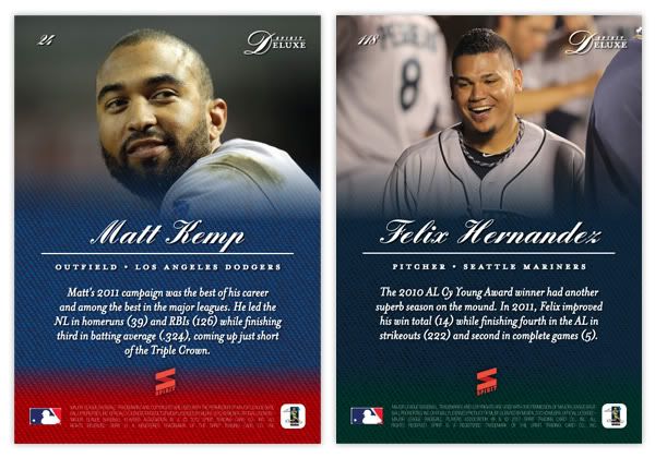
On the back side, the player photo takes up most of the top half with a soft fade into the team color knit. This time, the alternate team color shows up at the bottom in the knit texture instead of a solid block. Player name and position/team are found in the middle with a brief player write-up found below.


I'd say the major characteristics of the Deluxe set are the team colors, soft fade, great photography, and sophisticated typography in a simple design. These elements will continue onto upcoming inserts (auto, relic.)

Trying to keep the Spirit line from getting bogged down into too many different-but-the-same sets like Topps has done, I'll start bouncing back and forth by introducing new inserts for each of the sets. I'm still looking for some innovative ideas to keep from just redesigning what's already out there, so if you have any, feel free to share.

Tuesday, December 13, 2011

2012 Spirit Award Winners

I really miss having an insert set devoted to MLB award winners. To me, it seems like an easy way to chronicle the best players from year to year instead of finding some abstract thread to tie together certain players. What are the criteria to make the 'Diamond Stars' set? Or how about the neverending 'Topps 60'? Instead of trying to figure out a new way to produce another A-Rod or Joe Mauer card even when their on-field production takes a hit, let's give some love to the guys who really stand out each season, even if they aren't household names.

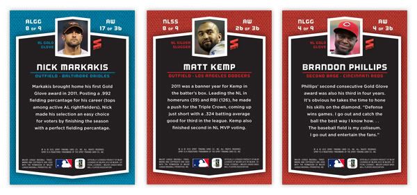
The 2012 Spirit Award Winners insert set consist of each Gold Glove and Silver Slugger winner from the NL and AL. That means 36 cards total with 4 different subsets (wow, an insert set with subsets.) There are a few guys that overlap but those are mostly superstars you can't argue with.

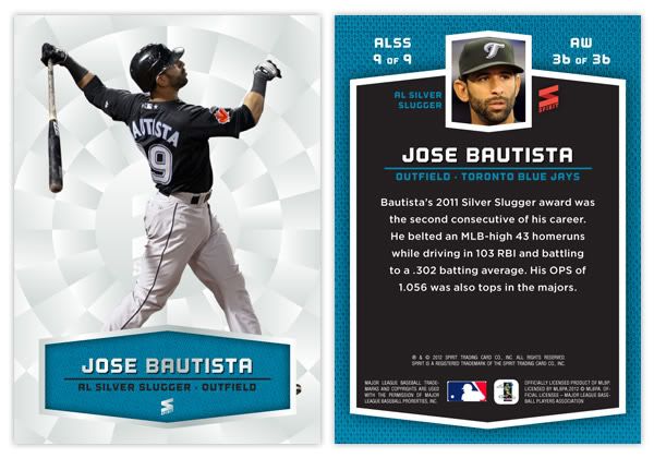
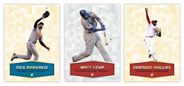
The Gold Glove cards have a nice shiny gold disco ball-like pattern. This is the first Spirit design that's employed on the 'oooh, shiny' factor. The defensive stars are cut-out from a photo of them flashing their gold glovework. For the Silver Sluggers, the pattern is silver with a nice batting image displayed. Toward the bottom of a card is a block for the player name and info. The NL guys have a red mesh backdrop while the AL players have a blue one. So each subset is differentiated by background color (gold or silver) and text box color (red or blue), depending on the league and award depicted.

The back of the cards only have the league color designation with the awards being notated to the left of the mugshot and also the numbering in the upper left corner. Below the player name is their position and ballclub followed by a brief write-up about their award-winning season.

Below is the checklist for all 4 subsets. There are 6 players that appear in both the Gold Glove and Silver Slugger subsets but they definitely earned their spots. If you finished the set, it would fit perfectly in 4 consecutive pages in your binder and look pretty handsome flipping between them.

NLGG
1. Clayton Kershaw
2. Yadier Molina
3. Joey Votto
4. Brandon Phillips
5. Placido Polanco
6. Troy Tulowitzki
7. Gerardo Parra
8. Matt Kemp
9. Andre Ethier

ALGG
1. Mark Buehrle
2. Matt Wieters
3. Adrian Gonzalez
4. Dustin Pedroia
5. Adrian Beltre
6. Erick Aybar
7. Alex Gordon
8. Nick Markakis
9. Jacoby Ellsbury

NL SS
1. Tim Hudson
2. Brian McCann
3. Prince Fielder
4. Brandon Phillips
5. Aramis Ramirez
6. Troy Tulowitzki
7. Justin Upton
8. Matt Kemp
9. Ryan Braun

AL SS
1. David Ortiz
2. Alex Avila
3. Adrian Gonzalez
4. Robinson Cano
5. Adrian Beltre
6. Asdrubal Cabrera
7. Curtis Granderson
8. Jacoby Ellsbury
9. Jose Bautista