Monday, August 20, 2012

REVIEW: 2012 Bowman Platinum

I know it's been out for like 2 months already, but better late than never...


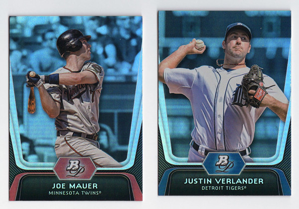
Starting off with the base design, with a note that these look less blue in real life (sad scanner I guess.) They kept the super shiny refractor-y foil board for another year. I like it well enough, though it doesn't have the same impact as last year's did. I'm sure the returns will diminish if they go the same route next year. The design itself is rather futuristic and minimalistic. No team logo (name only), no player position. The Bowman Platinum logo only shows up as a monogram. I think it works for this as a way to differentiate it from the regular Bowman set. The feel is pretty similar but this comes across a little more 'upscale' I suppose.
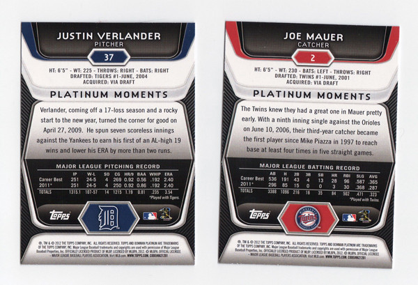


On the back, we get the same glossy-techy elements as the front but with a little more information. I don't necessarily advocate for full-career stats on the back of every base card, but surely someone should have noticed how squirrely it is to have Verlander's 2011 season stats on their twice.
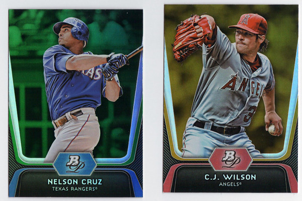


There are green, gold, and ruby parallels again this year with the golds being, once again, the hardest to differentiate from the regular base cards. I'm a little partial to green, but damn if they don't stand out the best.
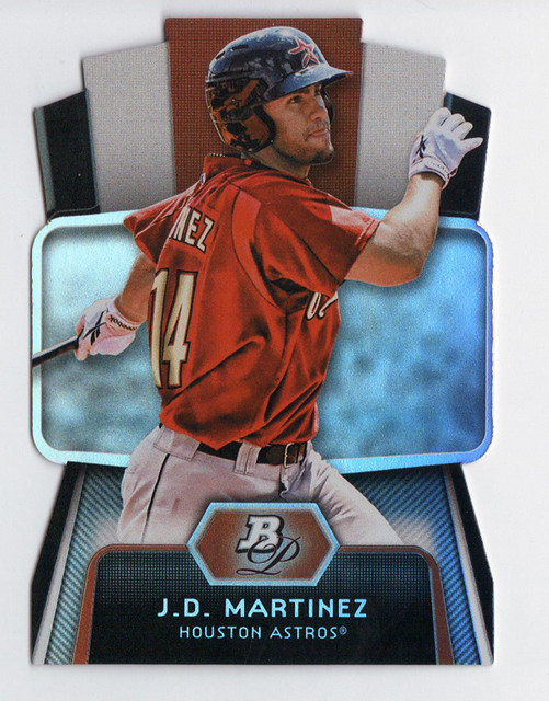


Since Topps has gone die-cut crazy this year, we have a die-cut insert in Bowman Platinum as well.
These are called Cutting Edge Stars. They look nice enough, keeping with the same design elements as the other cards in the set, except for that huge TV-looking shape in the middle. That paired with those movie ticket things cut out at the top make this insert look oddly kitschy. It's strange how off these look from the rest of the set even though they used the same basic elements.


Now onto Bowman's bread and butter—prospects. These were really frustrating to pull out of the pack. First off, the design is exactly the same as the regular base only the negative spaces on the left and right edges are white with dark stripes instead of dark with light gray stripes. The background seem to be feathered out even more on these, probably due to some of the less-than-flattering spring training settings of these photos. And to clarify, the cards in this scan are left-to-right an x-fractor, regular refractor and regular 'base' prospect. The x-fractors are the easiest to make out, but the differences between the refractor and the 'base' take some investigation. The refractors has this rectangular stone-like background, which would be easier to notice if it went to the edges. I say, if you're going to make the base look refractor-y then DO AWAY WITH A REFRACTOR PARALLEL. It's not like they don't have others to fall back on.
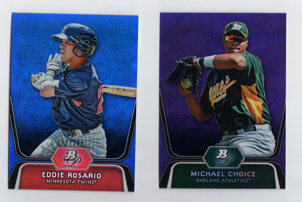

Like these blue and purple ones, and also gold. Why they can't just pick an additional color is beyond me.
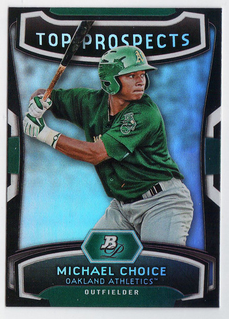

The prospect version of the Cutting Edge Stars insert is called (drumroll please...) Top Prospects. These aren't die cut but still somehow have some cheesiness going on. I think it's the 'TOP PROSPECTS' text. Why they decided to include that but leave 'Cutting Edge Stars' off the front is puzzling.


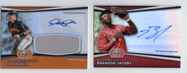
And since I had some to scan, here are a couple of prospect autos. These actually look pretty good, due in large part to the team color bands along the bottom. I think that's what I'm missing from just about every other card in the release. They're throwing all these refractor patches and neutral grays and blacks on there and it kind of drains the life from the card.

Overall, I think these are nice cards that could be better but probably could be a lot worse. My main takeaway is that this looks like it was an option for the 2011 Bowman Platinum release that they just put in their back pocket for this year. In a way, that's pretty much every release from Topps these days I guess. Maybe it's a practical decision from a production standpoint, which I could understand. Then again, part of me thinks it's time to either evolve a bit or just completely blow things up and start anew.

Base cards: 4.5/5
Parallels: 3.25/5
Prospects: 3.25/5
Inserts: 3/5
OVERALL: 3.5/5


Sunday, August 19, 2012

Back to your regular scheduled programming

Okay, now that the Gint-A-Cuffs posts are over, I just thought I'd check in and let you know we'll be back to regular content posts very shortly. I never got around to reviewing Bowman Platinum and I have a couple new design ideas, so look forward to those. Also, I wanted to let everyone know that I've got a Twitter handle for the blog, so follow me if you want some more casual & frequent card discussion. It's definitely a lot easier getting myself to tweet than it is crafting a whole blog post. Click on this button to the right or just go here.

Thursday, August 16, 2012

Gint-A-Cuffs IV: Packs 19-24

Alright, here's the conclusion. Carrying over +167 from the last post.


PACK 19
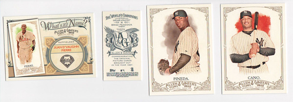
WIN54 Juan Pierre +2
Mini39 Brad Peacock A&G +2
57 Michael Pineda (NYY) -1
153 Robinson Cano (NYY) - 1

18 Kevin Youkilis
30 Carlos Zambrano
204 Adam Dunn
216 Corey Hart
PACK TOTAL: +2
RUNNING TOTAL: +169


PACK 20
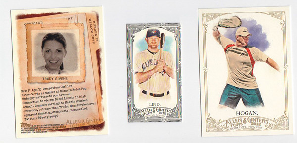
MIWC Trudy Givens +3
Mini123 Adam Lind Black +3
340 Marty Hogan SP +2

49 Jeremy Hellickson
74 Johnny Cueto
79 Yoenis Cespedes
154 Bobby Hurley, Sr.
213 Joe Nathan
PACK TOTAL: +8
RUNNING TOTAL: +177


PACK 21
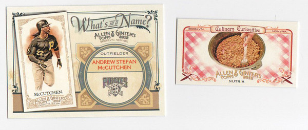
WIN31 Andrew McCutchen +2
CC1 Nutria +3

28 Dustin Ackley
102 Huston Street
168 Jason Kipnis
197 Ty Cobb
264 Brian McCann
295 Drew Pomeranz
PACK TOTAL: +5
RUNNING TOTAL: +182

Mmm, nutria. Also known as rat meat. I'm not very culinarily adventurous, but this gives me yet another good reason to never eat anything in New Orleans.


PACK 22
HTP19 Sputnik +3
181 Joe Dimaggio (NYY) -1
212 Ken Griffey, Jr. (FP) +2
217 Brian Wilson (Giants) +1
301 Adron Chambers SP +2

76 Michael Bourn
108 Martin Prado
Mini89 Edwin Jackson
PACK TOTAL: +7
RUNNING TOTAL: +189


PACK 23
WIN79 Mickey Mantle (NYY) -1
ABR-BK Bobby Knight Relic  +9
200 Matt Kemp (FP) +2

9 Yonder Alonso
147 Tsuyoshi Nishioka
222 Yovani Gallardo
Mini111 Wandy Rodriguez
PACK TOTAL: +10
RUNNING TOTAL: +199

Oh boy, what a vomit-enducing pack here. If the Yankee and Dodger weren't gross enough, my final hit comes in the form of a Bobby Knight relic. What a turd.


PACK 24
BH6 Frank Thomas +3
PB11 Adam & Eve +3
311 Bob Gibson SP +2

43 Josh Johnson
69 Kurt Suzuki
149 Wilson Ramos
157 Roger Federer
234 Carlos Lee
PACK TOTAL: +8
FINAL TOTAL: +207

I guess this is a good palate cleanser. I think these Highlight Sketches are may favorite cards of the set. Other than Jesus, Adam & Eve are probably the big hitters of the Bible minis. Extra thankful Adam wasn't slapped with the non-baseball Yankee tag, though he probably should be.

So 207 is my final tally. From what I've seen of the other scores, that's nothing to be ashamed of. I had a lot of fun tallying all of these up. This was my first box of A&G and I really enjoyed it. Already looking forward to Gint-A-Cuffs V next year.


Monday, August 13, 2012

Gint-A-Cuffs IV: Packs 13-18

Following my last post, my running total starting out here is +125

PACK 13
WTB4 Willis Tower +3
305 Wilin Rosario SP +2

68 Rickie Weeks
138 Josh Willingham
155 Edinson Volquez
236 Scott Rolen
297 Justin Morneau
Mini261 Michael Taylor
PACK TOTAL: +5
RUNNING TOTAL: +130


PACK 14
WTB7 Chrysler Building +3
120 Mariano Rivera (NYY) -1
317 Jason Heyward SP +2

48 Jordan Walden
107 C.J. Wilson
186 Jemile Weeks
260 Alex Liddi
Mini148 Carlos Gonzalez
PACK TOTAL: +4
RUNNING TOTAL: +134


PACK 15
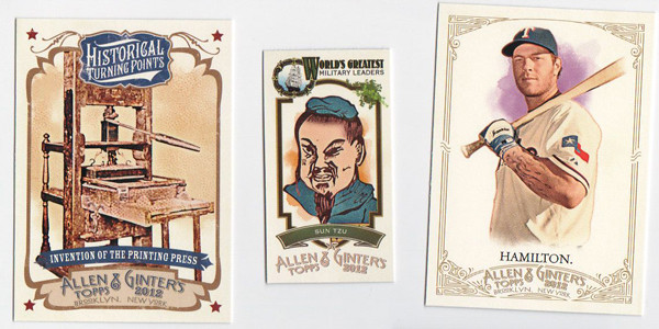
HTP7 Printing Press +3
ML20 Sun Tzu +3
328 Josh Hamilton SP (FP) +4

32 Ben Zobrist
53 Hisashi Iwakuma
64 Mat Latos
183 Darwin Barney
242 Alfonso Soriano
PACK TOTAL: +10
RUNNING TOTAL: +144

A new mini insert here, the World's Greatest Military Leaders. Not a lot to say about it.


PACK 16
WIN58 Rickey Henderson +2
AGR-AP Albert Pujols Relic +10

132 Daniel Hudson
159 Devin Mesoraco
257 Dan Uggla
284 Pedro Alvarez
Mini135 Michael Morse
PACK TOTAL: +12
RUNNING TOTAL: +156

Hit time! Even though he's not one of my personal favorites, I feel like Albert's a pretty good relic to pull if I'm just gonna be getting a regular old player relic. Too bad that doesn't net me any extra points.


PACK 17
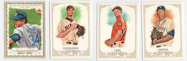
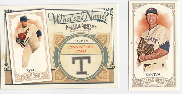
BH11 Nolan Ryan +3
152 Ryan Vogelsong (Giants) +1
281 Matt Cain (Giants) +1
322 Sergio Santos SP +2

31 Jackie Robinson
60 Reggie Jackson
116 Brandon Beachy
55Mini Colin Montgomerie
PACK TOTAL: +7
RUNNING TOTAL: +163

Cool, pocket aces. Throw in the Nolan Ryan and that's a set. Again, I love the color those orange Giants jerseys bring to this set design.


PACK 18
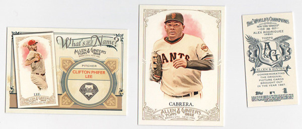
WIN8 Cliff Lee +2
158 Melky Cabrera (Giants) +1
Mini288 Alex Rodriguez A&G (NYY) +1

14 Nick Markakis
88 Stan Musial
137 George Brett
139 Tim Hudson
263 Jason Motte
PACK TOTAL: +4
RUNNING TOTAL: +167

I hope I'm right on the scoring of the A-Rod A&G Back. +2 for A&G -1 NYY = +1???

Heading into the last stretch with one hit to come, I hope +167 is a respectable total. I guess we'll see....

Thursday, August 9, 2012

Gint-A-Cuffs IV: Packs 7-12

As per my first Gint-A-Cuffs entry, we're starting these packs off with a running total of +82


PACK 7
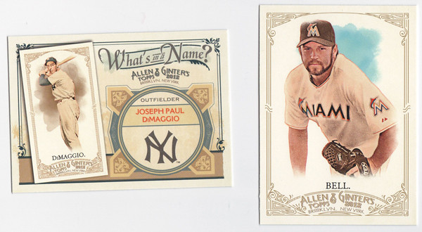
WIN1 Joe DiMaggio (NYY) -1
110 Heath Bell (FP) +2

118 Carl Yastrzemski
146 Josh Beckett
189 Lance Berkman
194 J.J. Hardy
244 Brett Anderson
Mini258 Doug Fister
PACK TOTAL: +1
RUNNING TOTAL: +83


PACK 8
WIN15 Michael Pineda (NYY) -1
MBF10 Poodle +3
279 Brett Gardner (NYY) -1

56 Jordan Pacheco
90 Roy Halladay
94 Geovany Soto
140 Mike Trout
215 Dan Haren
PACK TOTAL: +1
TOTAL: +84


It seems fitting that the dog mini I get to go with these Yankees is a poodle. Poodles are the Yankees of the dog world. Or the Yankees are the poodles of MLB.


PACK 9

Mini350 Howie Kendrick SP Black +14
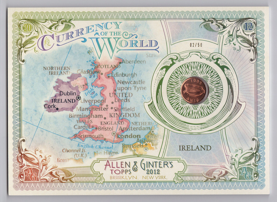
MIWC Willow Cove Trainyard +3
130 Madison Bumgarner (Giants) +1
306 Ryan Howard SP +2

128 Andrew McCutchen
156 Trevor Cahill
188 Tom Milone
300 Robeto Clemente
PACK TOTAL: +20
TOTAL: +104

After two consecutive +1 packs, this baby's a shot in the arm. I've read that some think the black border minis this year are a little lacking and I have to agree. I think they'd have been better off to fill the borders with black and have all the little intricate details of the frame be white. It's just a little too gray as it is now.


PACK 10
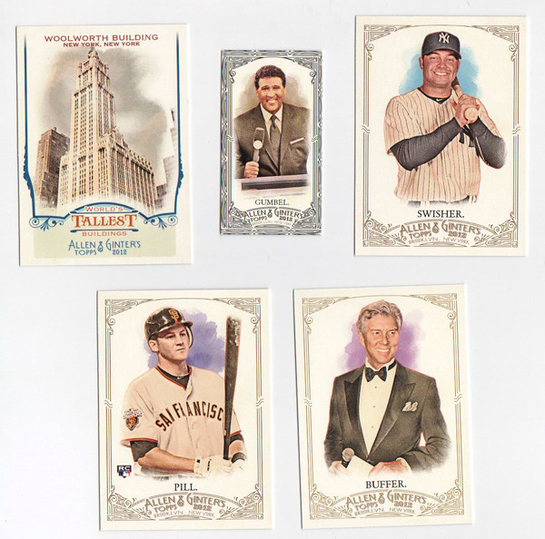
WTB9 Woolworth Building +3
Mini292 Greg Gumber Black (+3 black border / -1 Greg Gumballs) +2
117 Nick Swisher (NYY) -1
192 Brett Pill (Giants) +1
314 Michael Buffer SP +2

29 Hunter Pence
127 Erick Aybar
180 Tim Federowicz
PACK TOTAL: +7
TOTAL: +111

Well, if I have to get Gumbel'd at least it was a black border so I get a little something out of it. Another good pack for me. The World's Tallest Buildings insert fits in the A&G very well, especially considering the Art Deco feel of this year's design.


PACK 11
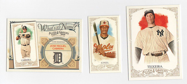
WIN16 Miguel Cabrera +2
Mini224 Adam Jones +3
169 Mark Teixeira (NYY) -1

27 Ricky Nolasco
37 James McDonald
114 Johan Santana
187 John Axford
248 Jed Lowrie
PACK TOTAL: +4
TOTAL: +115


PACK 12
MIWC Larry Mudlin +3
Mini177 Stephen Drew A&G +2
33 Chipper Jones (FP) +2
47 Buster Posey (Giants) +1
338 Prince Fielder SP +2

44 Brandon League
247 Hank Aaron
254 Rickey Henderson
PACK TOTAL: +10
TOTAL: +125

Ah, I love that Buster Posey card with all that beautiful orange. It really makes the awkwardness of the Chipper Jones stand out that much more. First off, these horizontal cards really don't look good next to the standard vertical A&G cards. I don't know if there's any rhyme or reason to who gets an action shot versus a nice portrait, but it seems like these have to be plan B cards. And with the aged effect going on, the action gets kind of hard to make out since the colors are pretty much zapped out. Also, it leads to silly stuff like half of Chipper's hat being bitten off into the ether.

Well, halfway done and I've got a pretty good total so far. Hopefully with my hits still to come, I can break the 200 mark.

Monday, August 6, 2012

Gint-A-Cuffs IV: Packs 1-6

I was lucky enough to jump on this year's Gint-A-Cuffs train before it left the station. While I normally stick to design posts and steer clear of pulls/breaks/trades, I figured I could do a little Allen & Ginter review along the way to keep the blog on topic. So here's the first of 4 consecutive G-A-C posts.

BOXTOPPER


I was really excited to start my box off with this beauty. I was expected just a run-of-the-mill N43 or something so I was damn shocked when I cracked the box open to see this huge cabinet card wrapper.
+ 20


PACK 1
WIN29  Nolan Ryan +2
Mini 322 Sergio Santos SP +3

36 Kirk Herbstreit
97 Max Scherzer
105 Arnold Palmer
126 Justin Masterson
145 Drew Storen
267 Neftali Feliz
PACK TOTAL: +5
RUNNING TOTAL: +25

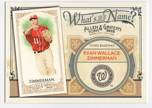
This year's workhorse insert is What's In a Name?, where they show a guy's mini card along with their full given name. Not a whole lot different than the Hometown Heroes cards from last year, though the mini is a neat addition. It's pretty cool to see and read about a guy's full name. It used to be commonplace to know a player's middle name but since it's a bit rarer these days, I like the set.


PACK 2
HTP16 French Revolution +3
Mini124 Jered Weaver A&G +2
335 Alexei Ramirez SP +2
5 David Price (FP) +2

4 Yu Darvish
82 Giancarlo Stanton
206 Joey Votto
266 Carlos Ruiz
PACK TOTAL: +9
RUNNING TOTAL: +34

Another insert is the Historical Turning Points set. They do a good job of running all the way through history, even up to events like the Berlin Wall falling. The image quality of the events themselves don't seem to fit with the borders or the rest of the cards in the whole set.


PACK 3
Stephen Drew Framed Cloth Card +35
WIN5 Troy Tulowitzi +2

118 Carl Yastrzemski
146 Josh Beckett
189 Lance Berkman
244 Brett Anderson
Mini198 Phil Pfister
PACK TOTAL: +37
RUNNING TOTAL: +71

Wow, what a great pack for me! This is my first ever hobby box of A&G so I've never pulled anything like that boxtopper and now this Silk card. Stephen Drew isn't exactly the most sought-after player but I'm pretty happy. Plus the red lines on the border match the D-Backs pretty well. Look at that 01/10!


PACK 4
WIN73 Ryan Zimmerman +2

45 Ewa Mataya
72 Joakim Soria
123 Adam Lind
172 Chris Perez
231 Todd Helton
259 Wade Davis
Mini162 Jeff Francoeur
PACK TOTAL: +2
RUNNING TOTAL: +73


PACK 5
BH14 Mickey Mantle +2
Mini179 Cole Hamels A&G +2
320 Jonathan Papelbon SP +2

39 Brad Peacock
99 Sandy Koufax
124 Jered Weaver
179 Cole Hamles
219 Ian Kennedy
PACK TOTAL: +6
RUNNING TOTAL: 79

Even with 6 points, what a gross pack. I will say that the Baseball Highlight Sketches look a lot better this year. The borders seem to frame the images a little better. It kind of a has the feel of U.S. paper currency, so maybe my reasons for liking it are superficially subconscious. But as far as the guy I pulled in the pack, yuck.


PACK 6
WIN14 Chipper Jones +4
196 Lou Gehrig (NYY) -1

20 Miguel Montero
21 Matt Moore
52 Cameron Maybin
160 Shane Victorino
296 Mark Trumbo
Mini104 Ian Desmond
PACK TOTAL: +3
RUNNING TOTAL: +82

So a quarter of the way through, I've probably got half of points. I could be wrong but I think the Silks are an extra hit and I'll still be getting 2 relics or 1 relic & 1 auto. Stay tuned for the remaining 18 packs.

Tuesday, July 24, 2012

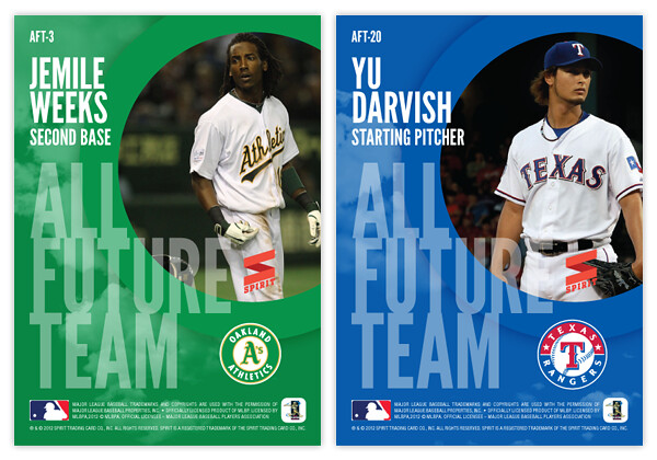
All Future Team


I remember in 1992 when Pinnacle had the Team 2000 insert set. The first guy I pulled was Jim Thome. At that point, I had no idea who Jim Thome was. This was of course the time before a prospect would show up in 2 or 3 different MLB releases before getting called up into the bigs, so it was weird to get an insert card of some "nobody." But this was a forecasting insert, featuring players who many thought would be league leaders in the year 2000. In hindsight, they did a decent job, picking guys like Thome along with your Griffeys, Madduxes, Bagwells and the like. But then again, there were plenty of Cuylers, Naehrings and Plantiers. I believe that's called 'baseball.'

Since it's 2012 and there's not a nice round-numbered year to look towards (I believe 2020 has been covered somewhere,) I decided to just call this the All Future Team. It's comprised of 22 players (2 at each position along with a 5-man starting rotation and 2-man bullpen) that each come in at 25 years old or younger. That extends the prognosticating window about 10 years. Here are the 22 guys I decided fit best.

1B • Mark Trumbo
1B • Freddie Freeman
2B • Jemile Weeks
2B • Jose Altuve
3B • Pablo Sandoval
3B • Brett Lawrie
SS • Starlin Castro
SS • Elvis Andrus
OF • Mike Trout
OF • Bryce Harper
OF • Andrew McCutchen
OF • Giancarlo Stanton
OF • Justin Upton
C • Buster Posey
C • Jesus Montero
SP • Stephen Strasburg
SP • Chris Sale
SP • Madison Bumgarner
SP • Clayton Kershaw
SP • Yu Darvish
CL • Craig Kimbrel
CL • Aroldis Chapman
As you can see, we have some players that already have some accolades accumulated and are among the league's elite, regardless of age. Then there are quite a few that are already achieving beyond what most players their age traditionally do. Whittling the number down to 22 also helps minimize the probability of potential busts.


For the front design, I decided to go with a high-contrast, monochromatic image with a dynamic crop. Behind each cut-out is a big "ALL FUTURE TEAM" screened over some nice cloudscapes. I think this shows 'future' without going the high-tech route that would end up looking cheesy and dated a few years from now. The player position is set in a big silver foil circle in the bottom left-hand corner with the player name in silver foil just to the right of that.


On the back side, we have the cloudscape screened back a bit and the circle from enlarged and moved to the upper right to house another player photo, this time in full-color. The "ALL FUTURE TEAM" text is scaled down a bit and moved to the bottom left, leaving room for the player name/position above and team logo to the right.

Are there any glaring snubs to the 22-man roster? I'm sure there's a starting pitcher or two that could make a very good case for inclusion. What say you?

Wednesday, July 18, 2012

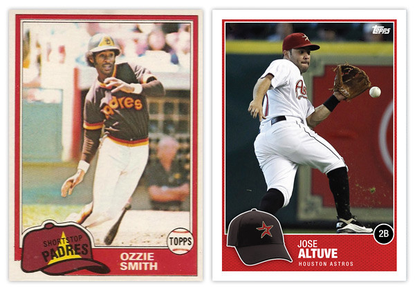
THIS IS THE REMIX: 1981 Topps


As per Johnny's request on the last Remix post, installment number 2 is 1981 Topps.


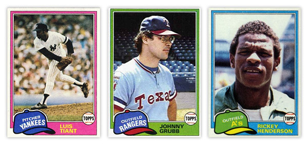
From what I've seen online, the 1981 Topps set is held in somewhat high regard. If I were to wager a guess as to why that's so after 30 years later, I'd say it's probably that floppy old hat. Personally, I think it's a little hokey but I can understand why others find it so endearing. My biggest issue is probably the team name runs arched right at the bottom while the position is on a straight diagonal right on top of it, leaving that negative space above it like it weighs a ton.

I'll give Topps credit for having the hats in the appropriate team colors even though sometimes they really clash with the border color. The Johnny Grubb above is a perfect example.


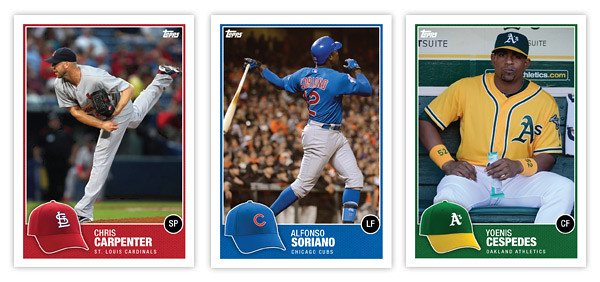
So my first order of business was bringing the hat concept into the 21st century. Instead of cartoony drawings, we have actual photographs of the actual hats. With all the alternate hats that teams wear these days, there might an issue of the logo hat being different than what the player is wearing on the photo (Altuve, Carpenter) but that doesn't really bother me. Just a reflection of current uniform trends.

Since the hat is now the official team hat, I had to find a place for the position. Some have mentioned how the Topps logo inside the baseball was kind of an odd logo treatment on the original. And since Topps' logo is different now and has a lot more flexibility, I figure that was a perfect home for the position markers. The circle is just a black circle since having a ball AND a hat is kind of overkill.

The names are in white on a team-color border so they're nice and legible. I tucked the team name smaller beneath just in case someone new to the game doesn't quite have the team logos down. All in all, the composition is pretty similar with just a few tweaks and updates made to freshen up the design, so good remix.

Be sure and let me know what other sets are begging to be remixed.

Monday, July 9, 2012

Spirit Deluxe Duos


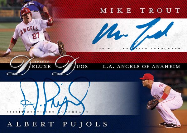
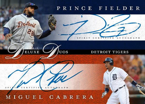
No, not Diamond Duos or Dueling Duos. Deluxe Duos. Two guys on the same team that are among the MLB elite. It may not be the most original concept, but I bet there are lots of people that'd be very excited to pull a Mike Trout/Albert Pujols dual auto. Every good turn deserves another or something like that.


These carry the same hallmarks as the other Spirit Deluxe cards so far. Team color textured backgrounds, sophisticated fonts, silver foil, dynamic fade photos. Hopefully the consistency isn't too boring.


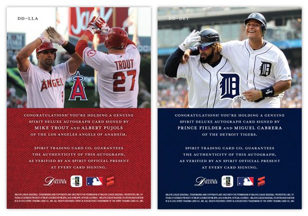
The back features a candid shot of the two featured players together. I really like the Fielder/Cabrera photo. It's nice to see teammates interact with each other like little leaguers do. And for these cards, it keeps the front side from looking like arbitrary pairings of guys who just happen to wear the same uniform.

Some of the other duos in the series would probably be Harper/Strasburg, Kemp/Kershaw, Lincecum/Posey, Halladay/Lee, Pedroia/Ellsbury, Mauer/Morneau.

Thursday, July 5, 2012

THIS IS THE REMIX: '91 Score


Trying out a new feature here on the old design blog. I'll take a look at a previous card design and do a little remixin' to try and freshen them up a bit for today. This will be a cross between what I normally do and customs that other guys out there do.

First up is '91 Score. I've always thought this was a vastly underrated design, especially compared to some other designs from 1991. It has a bit of understated dignity to its benefit.

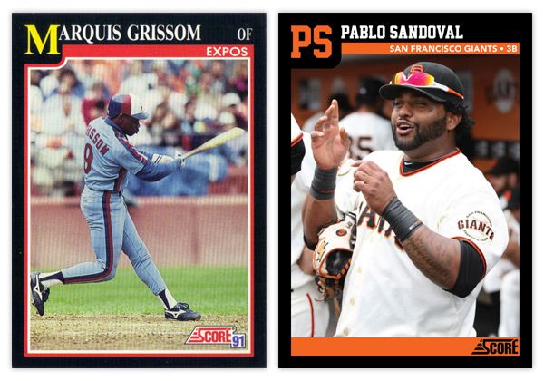
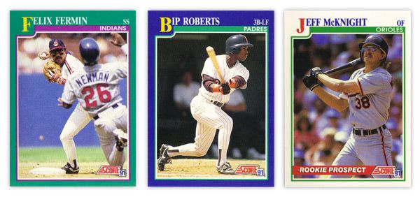
There aren't a lot of elements to the design, so its simplicity is big virtue. The solid color borders add some personality, though I'm not sure the color combinations are the prettiest. That teal & purple combo on Felix Fermin's card just doesn't sit right. In the upper left corner, the first letter in the first name is big and yellow, pushing the colored border down into the frame a bit. This kind of reminds me of playing cards, like a big K or Q in the corner for a king or queen card. It's definitely one of the most prominent and successful features. The rest of the name is spelled out in white at the top, along with team name and player position inside a secondary color bar. There were also some 'Rookie Prospect' cards in the set with white borders and a "ROOKIE PROSPECT" flash across a red streak towards the bottom. Paired with the green inset border, these cards look a little Christmas for a summer sport such as baseball.


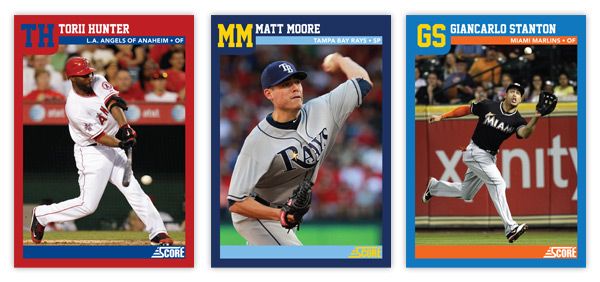
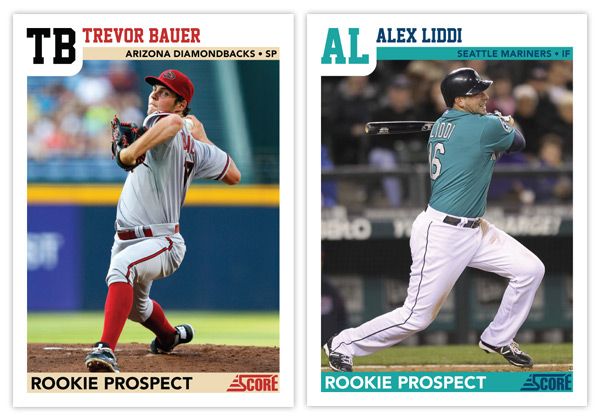
For the remix, I pretty much tweaked every element ever so slightly. The colored borders now reflect the featured player's team, as does the inset stripe. I also removed the strokes around the frame to help clean up the clutter. And instead of having the first letter in the first name biggified, we now have a monogram of the first and last name. This helps with the spacing of the initials and little frame bump. The position has moved from the corner down into the inset bar along with the full team name (city/state and name.) That helps to accommodate some of the longer player names. The one thing that's an addition and not just a tweak is the secondary inset bar I added at the bottom. I though this just helped to balance the top of the card out. Plus...
it makes for a great little spot for the 'ROOKIE PROSPECT' notation to rest, along with the Score logo.

Overall, I think I kept with the tone and feel of the original set but made some minor adjustments to enhance the design a bit. The introduction of the team colors spruces it up along with some different font choices. Hopefully these Remix posts will be sprinkled in alongside some of my original Spirit designs.

What are some sets you think could use a 'remix?'