Wednesday, January 15, 2014

2014 Spirit Base Series 1: 81-90


#81 - Darin Ruf
There weren't a lot of options for good Ruf shots so I settled on this rough one.

#82 - Andrew McCutchen
Cutch is so lanky and lean a lot of his action shots have his limbs hanging off the edges or leave way too much negative space. This pose makes him look pretty bad ass, which is suitable for the reigning NL MVP.


#83 - Michael Wacha
This is a nice action portrait from the mound. I like that the Musial patch is plainly visible as well.

#84 - Cameron Maybin
Maybin spent a lot of time on the DL last season so there weren't a ton of images to choose from. That's why his neck looks absent here.


#85 - Sergio Romo
Romo's one of those guys that I bet fans of every other team hate. He's so demonstrative on the mound I can understand it. That said, I love the dude.

#86 - Abraham Almonte
I can't say I know much about Almonte but I'm digging the Mariners' teal alternate jerseys.


#87 - Evan Longoria
Longoria has to be one of the most photogenic ballplayers active.

#88 - Nick Tepesch
With that pitchface, Tepesch's nickname could totally be The Beast.


#89 - Anthony Gose
If a baseball is anywhere close to the glove, I feel compelled to keep it in the frame.

#90 - Ross Detwiler
It's always crossed my mind to start a PC of guys named Ross since it's not a super common name. Right now I can't think of any other than Detwiler and Ohlendorf and those two guys don't have a ton a new cards coming out. So maybe it wouldn't be too hard to get started.

Tuesday, January 14, 2014

2014 Spirit Base Series 1:71-80


# 71 - Brad Peacock
Peacock's pitch face really limited my photo options here. Luckily, his face contorts back to normal on his follow-through.

#72 - Eric Hosmer
The first appearance of the Royals' baby blue jerseys.


#73 - C.J. Wilson
What are the odds his foot would bend up just enough to leave me space for the Spirit logo?

#74 - Hyun-Jin Ryu
I'll refrain from making the easy joke about cake in the dugout.


#75 - Christian Yelich
DO NOT LOOK DIRECTLY INTO HIS EYES.

#76 - Jonathan Lucroy
Maybe it's the Brewers connection but this card looks very Molitorian.


#77 - Brian Dozier
Dozier had a great 2013 season and a lot of people probably don't know much about him. I wanted to use a nice up-close photo so everyone could get to know him.

#78 - Ruben Tejada
Just a cool shot of a nice defensive play. And he's looking straight at the camera to boot.


#79 - Eduardo Nunez
The Yankees' blue is basically black in real life but I have to go in and add some color to these images. Can you tell I spruced up the helmet and undershirt?

#80 - Jarrod Parker
I don't know what kind of photo library Topps has to work with, but damn can it be hard to find shots of pitchers without goofy looks on their delivery.

Monday, January 13, 2014

2014 Spirit Base Series 1: 61-70


#61 - Cody Ross
I really wish Cody Ross was playing for a team not in the NL West. I love rooting for him but not at the expense of the Giants.

#62 - Jason Heyward
I considered using a photo with his extra long helmet flap since it's unique but it just looked too weird. Plus, I'm sure he doesn't need to be reminded of his broken jaw.


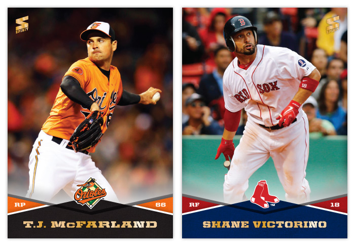
#63 - T.J. McFarland
There weren't a ton of photos to choose from but luckily had a few that were usable. Love those orange jerseys.

#64 - Shane Victorino
If baseball cards could utilize .gif technology, I'd totally use this image instead.


#65 - Edwin Jackson
Thought this was an interesting angle for a pitcher card.

#66 - Alexei Ramirez
Those White Sox uniforms really don't add much chromatically speaking.


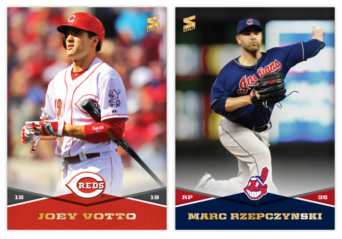
#67 - Joey Votto
Probably one of the nicest combinations of color, lighting, pose and player so far. Very nice looking card

#68 - Marc Rzepczynski
Thank god for copy/paste.


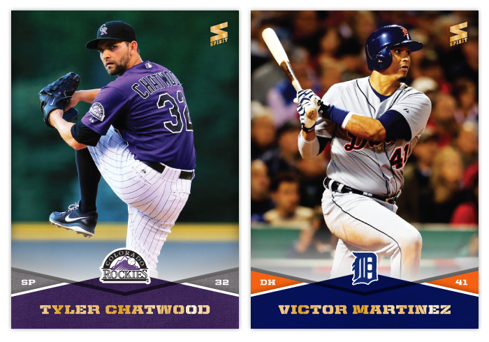
#69 - Tyler Chatwood
I really like when the Rockies embrace their purple-mountain majesty. It's such a unique color in the MLB now.

#70 - Victor Martinez
Maybe it's because I don't watch a lot of AL ball, but I have the hardest time remembering Victor Martinez when it comes to "good hitters." He doesn't seem to have much of a presence on cardboard either. It's really strange when you do realize how good he is.

Friday, January 10, 2014

2014 Spirit Base Series 1: 51-60


#51 John Mayberry
I wasn't sure whether to add the 'Jr.' or not but decided on leaving it off.

#52 Starling Marte
Any chance I get to show a non-collision play at the plate, I'm gonna take advantage.


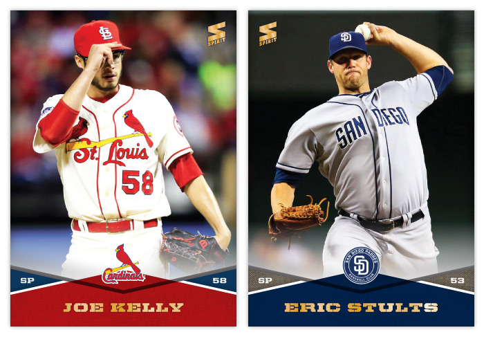
#53 Joe Kelly
I hope Joe Kelly sticks around with those glasses. This generation needs a Chris Sabo. (By the way, I had those exact same goggles as a kid.) Also, those St. Louis alternate jerseys are cool but would make more sense on the road than at home, no?

#54 Eric Stults
Man, the Padres' uniforms are dull.


#55 Brandon Crawford
Just trying to get everyone aware that Brandon Crawford = excellent glove work.

#56 Michael Saunders
I know you've probably seen better Saunders' catches on cardboard but I like how calm and routine he makes this running catch look.


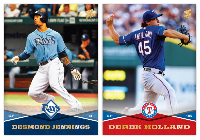
#57 Desmond Jennings
I love the Rays light blue jerseys. They add personality to the rest of their bland visual identity.

#58 Derek Holland
Holland, 1945


#59 Melky Cabrera
Oh, Melky. You were so much fun on the Giants in 2012. The Melkmen. Trollface. All those hits. Why'd you have to go and ruin it? Granted, it was all (obviously) too good to be true. But that sure was some blissful ignorance.

#60 Bryce Harper
It's strange how Harper has pretty much lived up to the hype thus far but he's still overshadowed by Mike Trout and now Yasiel Puig. Strangely, it's made him a little more likable for me.

Thursday, January 9, 2014

2014 Spirit Base Series 1: 41-50


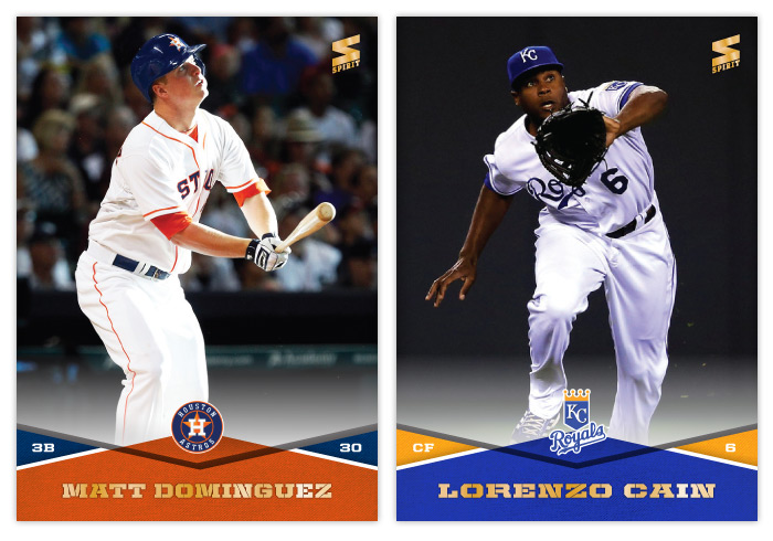
#41 Matt Dominguez
I definitely knew Dominguez's photo was going to be a batting shot. Fielding was not an option.

#42 Lorenzo Cain
Cain had a lot more acrobatic catches but I went with one that actually shows his face.


#43 Hank Conger

#44 Yasiel Puig
Even as a Giants' fan, I can't help but be fascinated by Puig. I decided to go with a shot that's more 'vivacious' than 'hotdoggy,' though there were plenty of examples of the latter.


#45 Steve Cishek
I really hope the Marlins wear their orange jerseys more often in 2014. Having so much uniform black really clashes with the bright team colors on the card design.

#46 Kyle Lohse


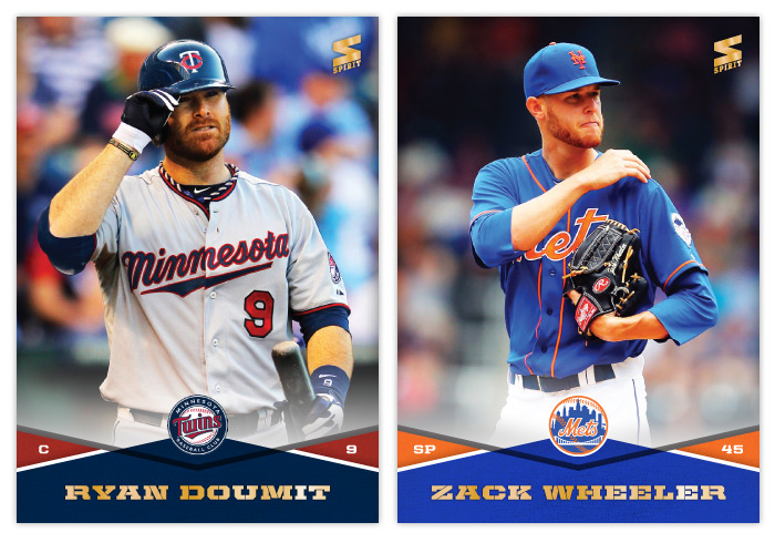
#47 Ryan Doumit
Of all the red and blue teams in the MLB, I think I dig the Twins' hues the most.

#48 Zack Wheeler
I appreciate Wheeler's facial hair matching the team colors.


#49 Derek Jeter
Hey, look, his card number matches his age! (kidding, kidding)

#50 Sonny Gray
This card has necessitated the most Photoshop work for me thus far. Oakland's green is really far more dull than the green here but I can't help but tweak it. The green and gold combo is hard to beat.

Wednesday, January 8, 2014

2014 Spirit Base Series 1: 31-40

I'm gonna try a little bit of a format change here to keep these posts from getting stale. Let's see how this goes...


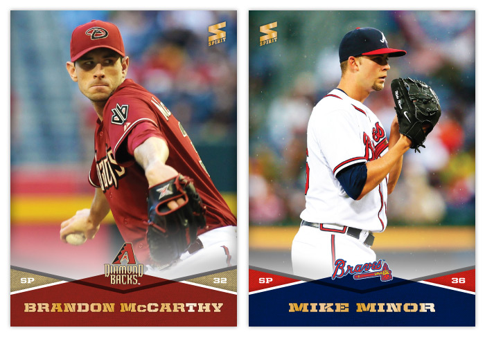
#31 Brandon McCarthy
McCarthy's a lanky fellow so I had to go with a torso-only shot to make the most of the space. If you're on Twitter and you don't follow him, I recommend you fix that. He's pretty funny and very insightful.

#32 Mike Minor
It may look a little like dust but those little specks are raindrops. I don't remember seeing too many rainy cards in the past.


#33 Manny Machado
You've probably seen a lot of Machado cards like this where he's stretched out making the throw to first. He's extra spread out in this one.

#34 Clay Buchholz
I had a hard time finding a photo of Buchholz where he didn't look like Falcor from The Neverending Story. This was the best I could find.


#35 Junior Lake
I don't think I'll ever get tired of seeing that green ivy in Wrigley Field on a baseball card.

#36 Paul Konerko
Before making this card, I had never noticed Konerko's awesome K-face. It's probably too mean to put that on a card, though.


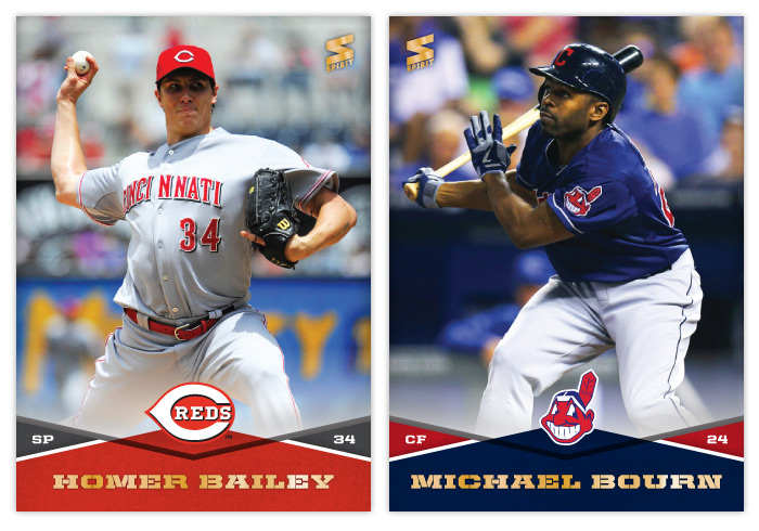
#37 Homer Bailey
"I'm Batman."

#38 Michael Bourn
I'm realizing it's a lot easier to find usable fielding photos than batting ones to fit this design. Whenever I come across one where a guy's limbs aren't hanging off the edges, I feel compelled to use it, even if he's known more for his glove than bat.


#39 Rex Brothers

#40 Max Scherzer
Scherzer's almost as prolific as Hunter Pence when it comes to goofy action faces.

Monday, January 6, 2014

2014 Spirit Base Series 1: 21-30


Here are cards 21-30 to round out the remaining teams. I was worried how some of the red/blue teams color combos would look in comparison to one another but it looks like I was able to get some differentiation between each. It may be subtle but you can tell the Phillies and Cardinals cards have a little different hue for both their reds and blues. My favorites from this batch are the ChaseUtley and Jayson Werth. I am pretty proud I was able to find an action shot of Hunter Pence that isn't creepy/goofy as hell.

Sunday, January 5, 2014

2014 Spirit Base Series 1: 11-20


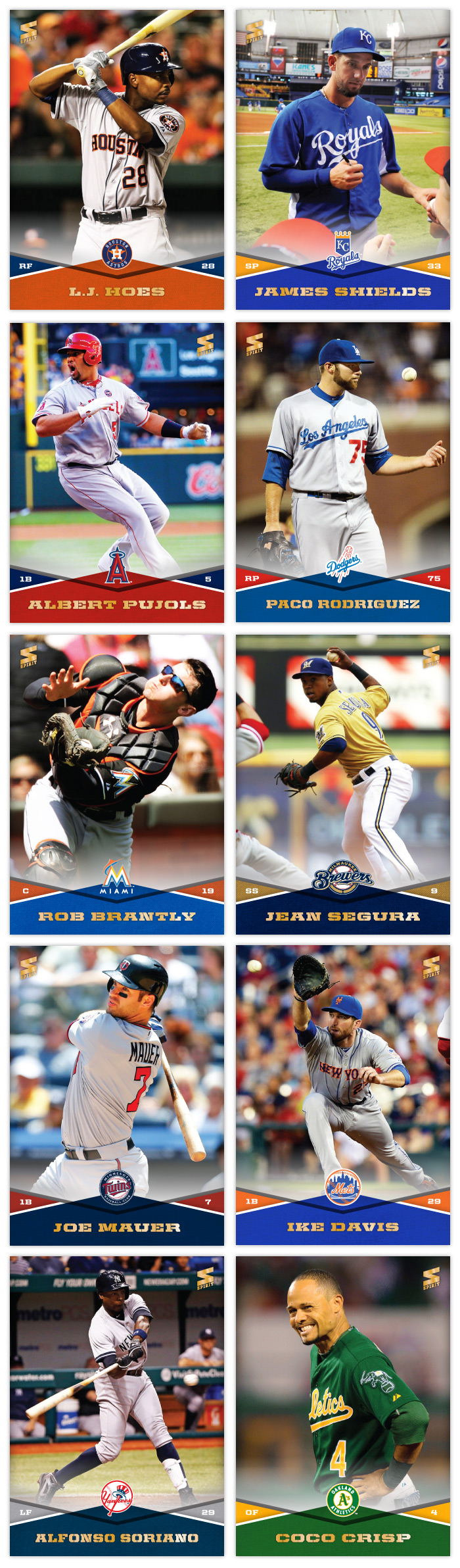
Here are cards 11 through 20, covering from the Houston Astros to the Oakland A's. There's a good variety of colors in this batch. I think my favorites would have to be the Joe Mauer and Coco Crisp. I do like the James Shields card since the photos is him signing for Rays fans on his first visit back to Tampa after being traded.

Thursday, January 2, 2014

2014 Spirit Base Series 1: 1-10


I'm trying something a little different this year. Instead of just posting a handful of cards from the set, I plan on designing and posting them all in increments of 10. Series 1 and 2 will both feature 300 cards with all 30 teams represented on 10 cards each. Players that have changed teams this offseason will be in Series 2, negating the need for airbrushing (which would have rendered this project impossible for me.) I'm still on the fence about what to do for Series 3. It would obviously be a smaller series but I don't want to fill it with crap like Topps does Update. But I know there will be some in-season trades and guys that come out of nowhere that won't make it into Series 2. I guess we'll see what my option are come August or so.

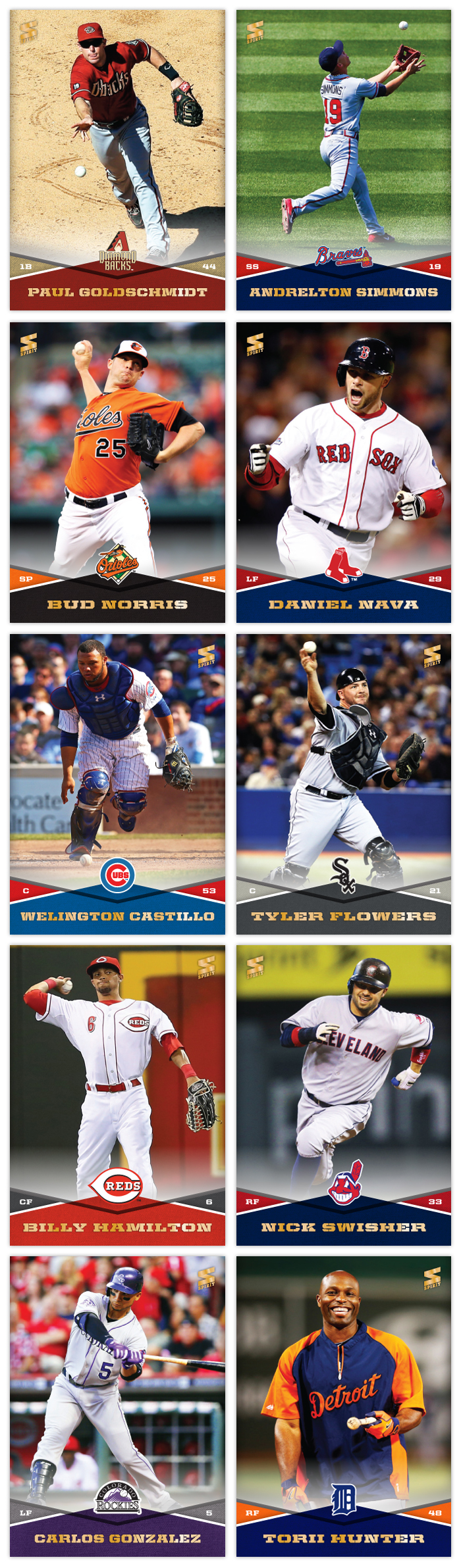
Design-wise, I wanted to make sure I had a template that didn't require me to cut out every photo. I started with a full-bleed photo in the background leaving space at the bottom for the design elements. These criss-cross team color patterns add a lot of vibrancy but leave room for the relevant information without making things too busy. The secondary-color triangles house the player position on the left and number on the right. On the very bottom is the player name in a wide stencil font that matches the angles from the criss-cross. Luckily I have varying widths to accommodate players with longer names. And on top of the center diamond is the team logo. The top and bottom sections have a slight white fade between them that'll be stretched up for future autograph inserts.

The first 10 on the checklist run alphabetically by franchise location, from Arizona to Detroit. There's no particular order for the players on each team. I just kinda grabbed a few stars and non-stars and sprinkled them together. My goal is to avoid having too many similar photos, so there will be a mix of candid non-game shots like Torii Hunter or spectacular angles/actions like Andrelton Simmons. There's no avoiding a cavalcade of standard pitcher delivery photos like Bud Norris' up there but I'll try hard to avoid embarrassing pitch face when possible.

So this was the first of what will hopefully be many more for 2014. I'm just gonna state up front that if I don't make it all the way through Series 3, don't hold it against me.

So this is the new year...

In case you haven't noticed, I've really slowed down on posting anything in the last few months. As the postseason came and went, my desire to create new content evaporated. After a couple months of trades and free agent signings, the fire has been stoked a bit and new posts will be appearing more regularly. So keep your eyes peeled for the 2014 Spirit base designs in the next few days.