Tuesday, July 24, 2012

All Future Team


I remember in 1992 when Pinnacle had the Team 2000 insert set. The first guy I pulled was Jim Thome. At that point, I had no idea who Jim Thome was. This was of course the time before a prospect would show up in 2 or 3 different MLB releases before getting called up into the bigs, so it was weird to get an insert card of some "nobody." But this was a forecasting insert, featuring players who many thought would be league leaders in the year 2000. In hindsight, they did a decent job, picking guys like Thome along with your Griffeys, Madduxes, Bagwells and the like. But then again, there were plenty of Cuylers, Naehrings and Plantiers. I believe that's called 'baseball.'

Since it's 2012 and there's not a nice round-numbered year to look towards (I believe 2020 has been covered somewhere,) I decided to just call this the All Future Team. It's comprised of 22 players (2 at each position along with a 5-man starting rotation and 2-man bullpen) that each come in at 25 years old or younger. That extends the prognosticating window about 10 years. Here are the 22 guys I decided fit best.

1B • Mark Trumbo
1B • Freddie Freeman
2B • Jemile Weeks
2B • Jose Altuve
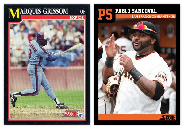
3B • Pablo Sandoval
3B • Brett Lawrie
SS • Starlin Castro
SS • Elvis Andrus
OF • Mike Trout
OF • Bryce Harper
OF • Andrew McCutchen
OF • Giancarlo Stanton
OF • Justin Upton
C • Buster Posey
C • Jesus Montero
SP • Stephen Strasburg
SP • Chris Sale
SP • Madison Bumgarner
SP • Clayton Kershaw
SP • Yu Darvish
CL • Craig Kimbrel
CL • Aroldis Chapman
As you can see, we have some players that already have some accolades accumulated and are among the league's elite, regardless of age. Then there are quite a few that are already achieving beyond what most players their age traditionally do. Whittling the number down to 22 also helps minimize the probability of potential busts.


For the front design, I decided to go with a high-contrast, monochromatic image with a dynamic crop. Behind each cut-out is a big "ALL FUTURE TEAM" screened over some nice cloudscapes. I think this shows 'future' without going the high-tech route that would end up looking cheesy and dated a few years from now. The player position is set in a big silver foil circle in the bottom left-hand corner with the player name in silver foil just to the right of that.
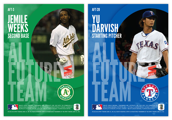

On the back side, we have the cloudscape screened back a bit and the circle from enlarged and moved to the upper right to house another player photo, this time in full-color. The "ALL FUTURE TEAM" text is scaled down a bit and moved to the bottom left, leaving room for the player name/position above and team logo to the right.

Are there any glaring snubs to the 22-man roster? I'm sure there's a starting pitcher or two that could make a very good case for inclusion. What say you?

Wednesday, July 18, 2012

THIS IS THE REMIX: 1981 Topps


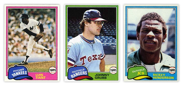
As per Johnny's request on the last Remix post, installment number 2 is 1981 Topps.


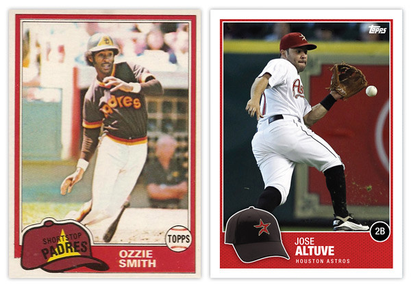
From what I've seen online, the 1981 Topps set is held in somewhat high regard. If I were to wager a guess as to why that's so after 30 years later, I'd say it's probably that floppy old hat. Personally, I think it's a little hokey but I can understand why others find it so endearing. My biggest issue is probably the team name runs arched right at the bottom while the position is on a straight diagonal right on top of it, leaving that negative space above it like it weighs a ton.

I'll give Topps credit for having the hats in the appropriate team colors even though sometimes they really clash with the border color. The Johnny Grubb above is a perfect example.


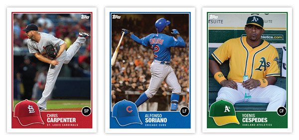
So my first order of business was bringing the hat concept into the 21st century. Instead of cartoony drawings, we have actual photographs of the actual hats. With all the alternate hats that teams wear these days, there might an issue of the logo hat being different than what the player is wearing on the photo (Altuve, Carpenter) but that doesn't really bother me. Just a reflection of current uniform trends.

Since the hat is now the official team hat, I had to find a place for the position. Some have mentioned how the Topps logo inside the baseball was kind of an odd logo treatment on the original. And since Topps' logo is different now and has a lot more flexibility, I figure that was a perfect home for the position markers. The circle is just a black circle since having a ball AND a hat is kind of overkill.

The names are in white on a team-color border so they're nice and legible. I tucked the team name smaller beneath just in case someone new to the game doesn't quite have the team logos down. All in all, the composition is pretty similar with just a few tweaks and updates made to freshen up the design, so good remix.

Be sure and let me know what other sets are begging to be remixed.

Monday, July 9, 2012

Spirit Deluxe Duos


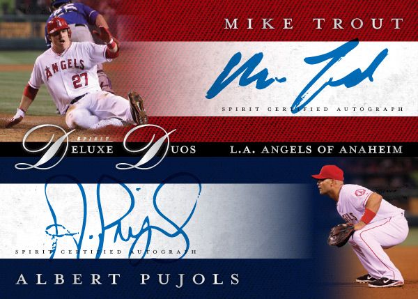
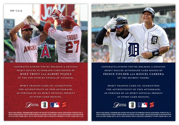
No, not Diamond Duos or Dueling Duos. Deluxe Duos. Two guys on the same team that are among the MLB elite. It may not be the most original concept, but I bet there are lots of people that'd be very excited to pull a Mike Trout/Albert Pujols dual auto. Every good turn deserves another or something like that.


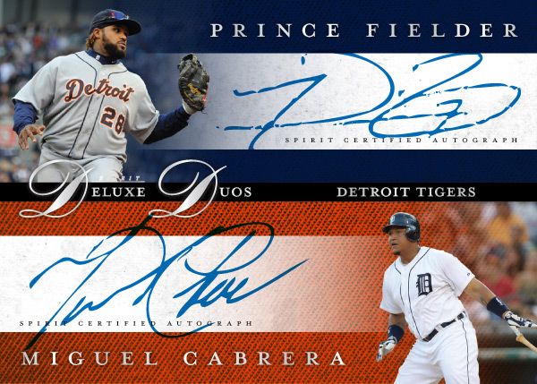
These carry the same hallmarks as the other Spirit Deluxe cards so far. Team color textured backgrounds, sophisticated fonts, silver foil, dynamic fade photos. Hopefully the consistency isn't too boring.


The back features a candid shot of the two featured players together. I really like the Fielder/Cabrera photo. It's nice to see teammates interact with each other like little leaguers do. And for these cards, it keeps the front side from looking like arbitrary pairings of guys who just happen to wear the same uniform.

Some of the other duos in the series would probably be Harper/Strasburg, Kemp/Kershaw, Lincecum/Posey, Halladay/Lee, Pedroia/Ellsbury, Mauer/Morneau.

Thursday, July 5, 2012

THIS IS THE REMIX: '91 Score


Trying out a new feature here on the old design blog. I'll take a look at a previous card design and do a little remixin' to try and freshen them up a bit for today. This will be a cross between what I normally do and customs that other guys out there do.

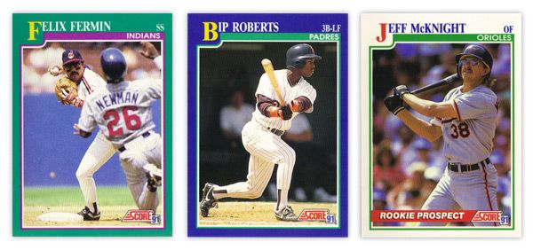
First up is '91 Score. I've always thought this was a vastly underrated design, especially compared to some other designs from 1991. It has a bit of understated dignity to its benefit.

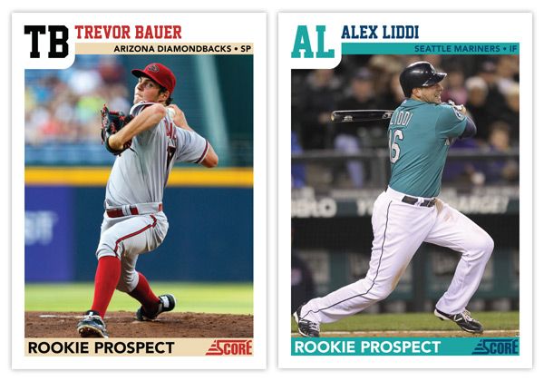
There aren't a lot of elements to the design, so its simplicity is big virtue. The solid color borders add some personality, though I'm not sure the color combinations are the prettiest. That teal & purple combo on Felix Fermin's card just doesn't sit right. In the upper left corner, the first letter in the first name is big and yellow, pushing the colored border down into the frame a bit. This kind of reminds me of playing cards, like a big K or Q in the corner for a king or queen card. It's definitely one of the most prominent and successful features. The rest of the name is spelled out in white at the top, along with team name and player position inside a secondary color bar. There were also some 'Rookie Prospect' cards in the set with white borders and a "ROOKIE PROSPECT" flash across a red streak towards the bottom. Paired with the green inset border, these cards look a little Christmas for a summer sport such as baseball.


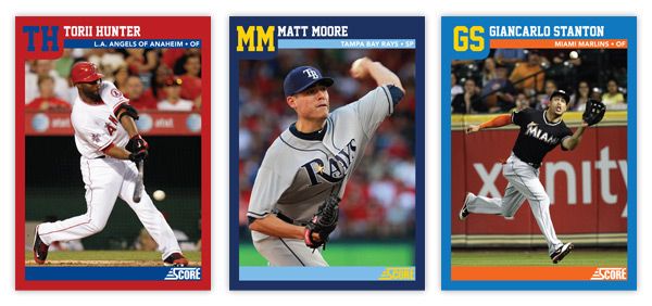
For the remix, I pretty much tweaked every element ever so slightly. The colored borders now reflect the featured player's team, as does the inset stripe. I also removed the strokes around the frame to help clean up the clutter. And instead of having the first letter in the first name biggified, we now have a monogram of the first and last name. This helps with the spacing of the initials and little frame bump. The position has moved from the corner down into the inset bar along with the full team name (city/state and name.) That helps to accommodate some of the longer player names. The one thing that's an addition and not just a tweak is the secondary inset bar I added at the bottom. I though this just helped to balance the top of the card out. Plus...
it makes for a great little spot for the 'ROOKIE PROSPECT' notation to rest, along with the Score logo.

Overall, I think I kept with the tone and feel of the original set but made some minor adjustments to enhance the design a bit. The introduction of the team colors spruces it up along with some different font choices. Hopefully these Remix posts will be sprinkled in alongside some of my original Spirit designs.

What are some sets you think could use a 'remix?'

Tuesday, June 26, 2012

No-Hit Club


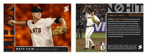
I may be a few weeks late here, but since Matt Cain's perfect game, this insert has been kicking around in my mind. (Plus, how can I resist the opportunity to brag up a Giants milestone?) With the influx of no-nos the last few years, I think there's finally enough members of the No-Hit Club to warrant a full insert set. There are currently 22 active MLB pitchers who have tossed no-hitters (excluding the combined efforts by the Mariners this season and the Astros in 2003.)

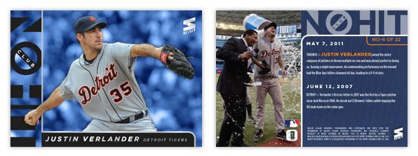
The list includes some marquee guys like Roy Halladay, Justin Verlander (below) and Johan Santana, but it's mostly comprised of some second-to-even-lower-tier guys. I kinda like the idea of guys like Anibal Sanchez and Dallas Braden showing up in something other than base. Through their performance, I think they've earned it.


Design-wise, the front is team-colored with the full-color cut out, along with a "No-Hit Club" logo straight out of Ghostbusters. There's little bit of silver foil here just to keep them from looking low-grade. The back side has a brief write-up along with a celebration photo. The design is pretty clean and uncluttered and fits in very well with the rest of the Spirit line.

Monday, June 11, 2012

Don't Skip Class

The 2012 edition of the MLB Draft happened a week or so ago so I've kinda had it on the brain for a bit. Baseball's draft is really unique when compared to the NFL and NBA versions. Most of guys are complete strangers before getting drafted, unlike the top college football and basketball players who get national attention for a season or two along with the copious amounts of coverage leading up to the draft. And unlike the Cam Newtons and Kevin Durants, the top picks aren't expected to lead their teams the following season. The timeframe for these players to start contributing is stretched much further, so by the time a guy reveals himself to be a bust or not, fans have moved on. Basically, it'll take years before anybody has any clue whether or not a particular class is strong.

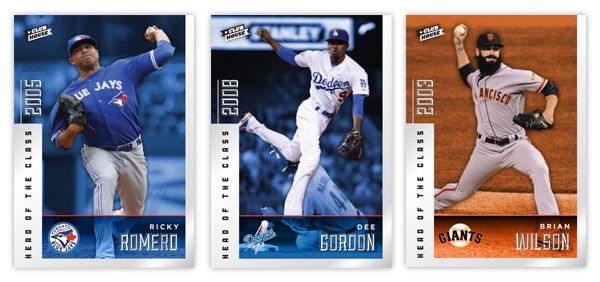
I took a little trip back to the draft results from the past dozen years or so and decided to do a draft-focused set to pick out the best picks and see how they stack up from year to year. Clubhouse Head Of the Class. This is a 100-card insert set that spans 10 drafts, from 2000 to 2009. That's a pretty good cut-off as far as singling out the 10 best players from a draft. Outside of Harper and Chris Sale, I'm not sure anyone from 2010 has made a mark in the big leagues yet.

The first thing I did was compile the checklist. It's pretty interesting to see the stacked 2005 draft (8 of the top 12) compared to bottom-heavy drafts like 2000 and 2001. Some years were a little thinner than others but I think I did a good job find 100 guys that deserved to be featured.

Looking at the design, we have a silver foil border that goes around approximately 2/3 of the card edge. The left side is a bit thicker and has the "HEAD OF THE CLASS" text in black running over it. Above that is the draft year in silver foil as well. This is one of the few asymmetrical inserts I've done, so it was nice to change that up a bit. We've got the team color backgrounds behind the player cutouts along with an info bar at the bottom with the player name and team logo.

On the back, the silver border has been turned the team color and the background is solid black. We have a small player portrait on the right with the card number and player position/team below. The top spells out which year the player was drafted along with the top 10 picks from that respective draft. The picks are listed in order but obviously skips ahead to the pertinent draft slot. The player depicted on the card has his name and draft slot bigger, bolder and italicized. Beneath that is a brief write-up about what makes them one of the 10 best from their draft.

This was a fun insert just to figure out the players to include and to take a look back at drafts of the past. The fun part is, I'm sure that even 2 or 3 years from now, these checklists could look drastically different as some late-bloomers or Renaissance men start to emerge in the league. As a Giants fan, though, I sure hope the #10 pick from 2006 could stay included in the future.

Saturday, May 19, 2012

REVIEW - 2012 Bowman

A full week after it hit shelves, 2012 Bowman finally made its way to the Walmart in my town, so this is the first chance I've had to take a look that the set.

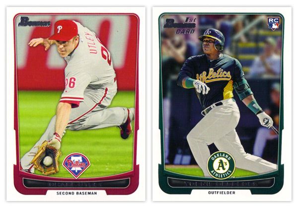
Starting off with the base card design, the first thing you'll notice is the familiar black borders are gone. I'm a little torn on this one. For the last decade or so, Topps did a great job of branding Bowman with something as simple as having a consistent black border on the base design every year. Looking at these all-white borders, I'm kind of missing that Bowman feel. But on the bright side, the black borders are notorious for showing every little imperfection along the edges, so their absence here helps rectify that.

Another change of pace is the introduction of team-specific colors into the design. In years past, the only colors to go along with the black borders were a small bit of red for veterans or green for rookies. Now you'll find blue and purple and a whole host of other colors.  The team logos return in full color after showing up in gold foil last year.

There are a few things I'm not crazy about. The names being in silver foil on top of black is just as hard to read here as the the gold on black was on the flagship design. I'm also not a big fan of all the unnecessary bevels around some of the frame elements. Those are, however, small quibbles. Something that's subtle but really helps the players shine here is the light drop shadow you'll see around the guys. It more noticeable on lighter backgrounds, like the Utley one up there, but helps to add focus to subject of the card. If it were any heavier, I'd probably be bitching about it forever, but they got it about perfect here.


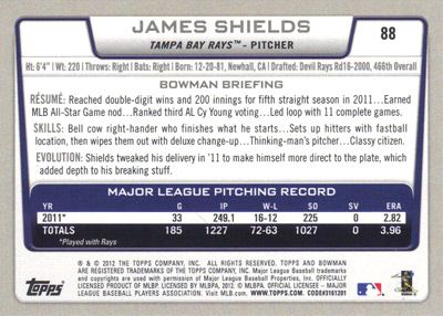
The back side of the base cards continue the same feel as the front, only the border here is gray instead of white. Can't figure that one out. Only having stats from the 2011 season seems like a trade-off they had to make for the veteran cards since Bowman's primary focus is prospects. The 'RESUME' 'SKILLS' and 'EVOLUTION' things are fine, though I prefer the 'UP CLOSE' section on the backs of the prospect cards, which replaces 'EVOLUTION.' One thing they kind of messed up on is having the card number in the right corner instead of the left. BASEBALL CARD LAW: horizontal backs have to be numbered in the upper left corner to help for storage box sorting.


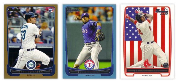
The design for the prospect "inserts" is really, really similar to the base design. In fact, it's almost problematically similar. For the 2011 set, the prospect cards had a white border to differentiate from the black bordered-base, so it didn't really matter if the designs were similar or not. This year, though, the made the designs almost identical on top of having the same colored borders. Not sure what the thinking was there unless they're really trying to test the MLB's patience with the whole Bowman prospect worship thing. Regardless, I think it was a dumb decision.

There are parts where the designs differ, though: prospect has a symmetrically convex border compared to trapezoidally-shaped base border with the little weird notches on each side; the cutout for the position on the bottom is wider and rounder for the prospect design; the base set doesn't have those weird wing things on each side of the logo. I think if the base design didn't have those notches or if the prospect set didn't have the wings, you'd have an all-around better design for one or the other. But holy hell, they shouldn't look this similar.

I'll give them credit regarding the autographs, though. They did away with the facsimile autos on the 'base' prospect cards, which really helps the make the actual auto cards more unique.


Just like every other Topps product, this one comes with lots of parallels. Gold, blue, red, orange, green, blue, international, blue, red ice, silver ice, Dentyne ice, blue. I think the flags on the international is kinda neat. The silver and red ice versions are basically just atomic refractors. Really, they have at least twice as many parallels as they should, if not more. But in honor of the Preakness today, I'll refrain from beating that dead horse.


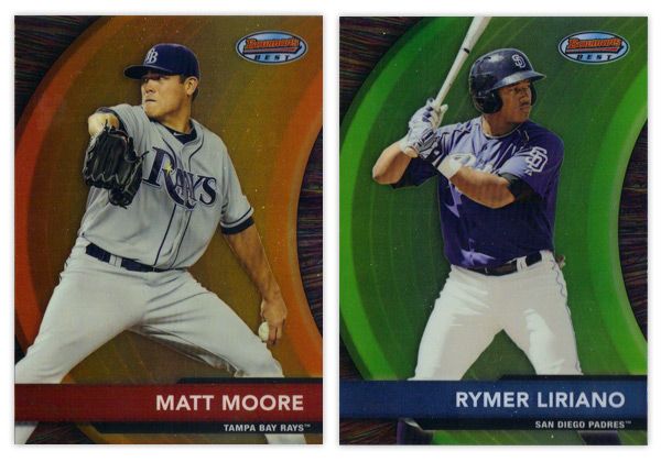
Finishing up here is this year's edition of the Bowman's Best insert. Again, they have the red version for veterans and blue for prospects. There are also die-cut versions, which have all kinds of crazy refractor parallels themselves. Design-wise, I like the different textures on the swoosh and the background. Along with the type and name bar, I appreciate the simplicity of the design.

Overall, I think there's some pretty good, modern design here even if it's not completely "Bowman."

Base cards: 4.25/5
Parallels: 3.5/5
Prospects: 4.25/5
Inserts: 4/5
OVERALL: 4/5

Friday, May 18, 2012

Pennant Throwbacks


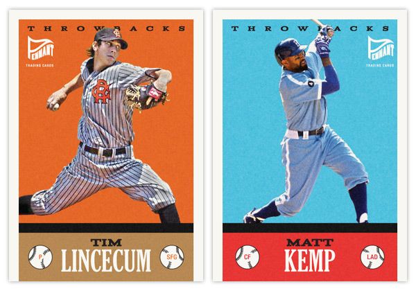
So one of the things that really jumps out at me when thumbing through retro sets like Gypsy Queen is when you see a card like this next to a card like this. No matter how many filters you run on photos of current-day players, they'll never quite match that historic feeling you get from old photos of retired players. One way to help bridge the gap would be to feature today's guys wearing throwback uniforms.

Here's the first insert set for the Pennant brand. The design for Throwbacks isn't specific to a certain era, just a bit of an amalgamation of a handful of characteristics you'll find in various retro sets. It kind of follows the philosophy of the base set, combining a feel for the old and contemporary.

The hard part here is finding the right images in a somewhat shallow pool. There aren't a whole lot of throwback games on the schedule so the odds of finding an actual star wearing these duds in a good photo are a bit smaller than usual. The Lincecum image here is from a 2008 game while the Kemp one is from last season. The color boxes aren't the exact shades you'll find in the teams' styleguides, but they're in the right neighborhood to allow for the sometimes funky colors of the throwback unis.


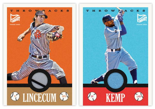
Another wrinkle to add to the set is a relic parallel. With a round cutout just above the last name, it's a perfect place to house a sliver of these throwbacks. And, luckily, since the uniforms depicted are so singularly unique, you know that the swatch is from the actual uniform depicted. Even though it's the Dodgers, you have to love that baby blue relic.

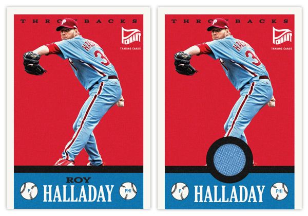
Here's what the base and relic look like side by side.


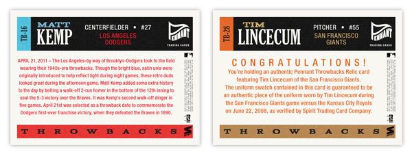
On the backside, you'll see the write-up is specific to the game in each throwback uniform is involved. The base has a game recap along with a little bit of info regarding the throwback worn. For the relic version, it includes the fine print of the swatch being authentic and unique to the player and uniform depicted.

Monday, May 7, 2012

Spirit Deluxe Portraits


Trying to come up with 'new' or 'innovative' ideas for cards isn't as easy as I thought it was going to be. Even though there are plenty of complaints to levy at Topps for some of their product choices, they actually do quite a few things that are pretty successful and cool. At this point, most of their missteps come from constructing releases and not so much the actual cards themselves. People like autographs and minis and parallels and short prints and die-cuts and memorabilia and just about every other 'gimmick' out there to varying degrees. But all in all, these are basic elements that go into constructing a set.

This blog has basically been me just rearranging some or all of these elements into what I think would be fun to manufacture. If there were another licensee out there releasing product in 2012, these are things I could see fitting into the marketplace, acting as either a supplement or an alternative to Topps.

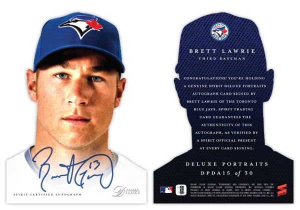
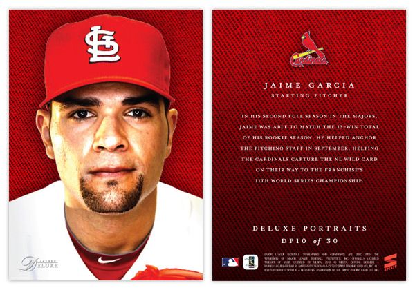
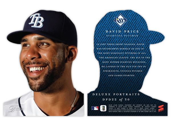
That brings us to the cards in this post. I was looking for another 'insert' or whatever you'd like to call it for the Deluxe set. I didn't feel like doing one of those triple swatch, nickname cutout sticker autos that you find in Triple Threads. Even though Deluxe is Spirit's 'high-end' product, it's probably more in tune with something like Finest (which is definitely the very top of my own personal price range.) I see that Topps plans on having some die-cuts in Finest this year, but hopefully this doesn't come across as copy-catting.

So for the Deluxe Portraits insert, there are 3 different versions you could get your hands on. The first would be the standard Deluxe Portraits insert base, seen here with Jaime Garcia. The design features a tightly cropped portrait with the Deluxe-familiar team-color cloth background. The only other thing adorning the front of the card is the Spirit Deluxe logo in silver foil. Somehow, these seem to come across as more personal and intimate without the player name cluttering the front. The back continues the team-color cloth with a brief write-up.


The second version is the die-cut parallel, here with David Price. The design is basically the same except the obvious die cut edges around the player. And finishing off the trio is the die-cut auto version, seen at the top with Brett Lawrie.

Even though parallels can sometimes be redundant and annoying, I feel like this insert captures the best aspects of paralleling a design. Each version offers something different other than just a different color border or refraction. The whole 'cut-out head' thing may seem a little hokey for a 'high-end' set, but I think it's fun. And if you ask me, fun is definitely something we could all use more of in card design these days.

Monday, April 23, 2012

Pennant: Chasing That Old Time Feeling


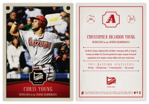
I've been able to resist it up to this point, but with Heritage and Gypsy Queen being the last two baseball releases, I couldn't help but work on an 'old-timey' set design. Instead of combing through the encyclopedia of trading cards, looking to resurrect the zombie of something 50-100 years old, I decided to just make something up. This is kind of a hybrid between the styles of the old and the current.


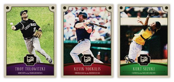
Say hi the Pennant line of Spirit trading cards. You'll notice some of the characteristics of other retro sets: photos doctored to look old and weathered, typefaces from decades past, not-quite-white borders. There's a team-color curve on the bottom to house the player name, team and position. I've used some similar curvilinear shapes throughout the other Spirit designs, so this helps keep them in the family. Another point of 'modernization' is the fact the player name is more than just their last name and first initial and it's actually bigger than the set name/logo.


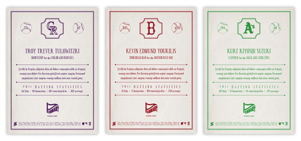
The backside is pretty similar to retro sets of today: 1-color, vertical, a lot of non-informational elements, simple team logos. These here may be printed in a single color, but instead of just black, the ink is the same as their team color. I decided to include players' full names on the back since I really miss that from my youth. Also, there's a simple line of the previous season's stats (hits, homers, rbi, and average) that has numbers instead of 'two thousand and eleven' and such.


I may do some inserts for the Pennant line coming up in the future. I can see myself getting the itch after A&G hits the shelves.